Kibana: [Canvas] Improve UI design to better communicate status/progress when loading a workpad
Kibana version:
Master
Steps to reproduce:
- Go to Canvas
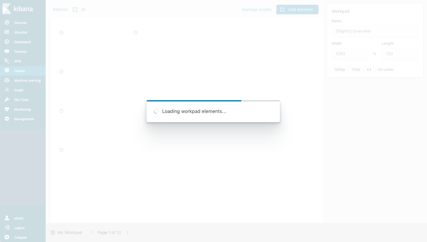
- Open an existing non-blank workpad (see loading icons)
Expected behavior:
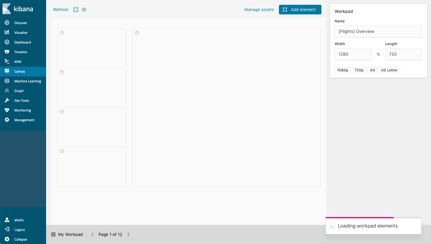
It's not broken currently, it could just be clearer. When a workpad is loading, you see a loading icon in the upper left corner and small clock icons are place on each loading element. As part of a larger discussion around performance, we discussed improving the loading experience so that users are more aware when things are still loading (status) and how much remains (progress).
Screenshots (if relevant):

 ryankeairns
All 5 comments
Pinging @elastic/kibana-canvas
 elasticmachine
on 5 Nov 2018
elasticmachine
on 5 Nov 2018
++ I'd like to see a large loading spinning with a progress bar. We know how many elements there are and how many have loaded. We can easily show a progress bar of how many elements have loaded.
 rashidkpc
on 5 Nov 2018
rashidkpc
on 5 Nov 2018
@rashidkpc @alexfrancoeur below are mockups for the workpad loading design.
The first couple variations use EuiModal (blocking the UI with an overlay) while the latter uses an EuiToast message (allowing interaction). I'm not certain there is much to gain by allowing interaction while elements are loading. One slight alternative might be to 'disable' (visually dim or actually disable) the canvas workarea - keeping the side and bottom nav interactive - but that feels potentially tricky for little gain (also, the left hand nav likely goes away in K7).
The animated chart image in the modal is the same loading indicator we use when loading Canvas, while the placement of the progress bar atop the dialogs is an EUI suggestion/pattern.
Personally, I prefer the modals over the toast messages as the latter seems to get overlooked at the bottom right, particularly when there is just one message. The pink accent color in the progress bar + animated spinner offset that to some degree, if we end up going that route.
Let me know what you think...
1. Modal with progress bar + animated chart

2. Modal with progress bar + animated spinner
3. Toast with progress bar + animated spinner
ryankeairns
on 9 Nov 2018
@ryankeairns I like option 1 here the most probably. It does feel odd that I can't navigate out of the page while it's loading though. I agree though, it may be more effort than it's worth. Something worth nothing though, every time you hit the back button to "undo", we reload the entire workpad. While it's not ideal, that's the world we live in today. With that in mind, any time you do that we'd take over your screen with a modal again.
The benefit of option 3 is that you can get navigate away. I'm struggling with how important this actually is to have. I'd be interested in hearing the groups thoughts.
 alexfrancoeur
on 12 Nov 2018
alexfrancoeur
on 12 Nov 2018
Closed with #32369.
 cqliu1
on 12 Mar 2019
cqliu1
on 12 Mar 2019
Related issues
 timmolter
·
3Comments
timmolter
·
3Comments
 bhavyarm
·
3Comments
bhavyarm
·
3Comments
 MaartenUreel
·
3Comments
MaartenUreel
·
3Comments
 mark54g
·
3Comments
mark54g
·
3Comments
 LukeMathWalker
·
3Comments
LukeMathWalker
·
3Comments
Most helpful comment
++ I'd like to see a large loading spinning with a progress bar. We know how many elements there are and how many have loaded. We can easily show a progress bar of how many elements have loaded.