Kibana: [ML] Horizontal scroll missing from Anomaly Explorer table for category examples
Found in 7.0.0-alpha1 {"build":{"hash":"4b34b3f","date":"2018-08-20T07:24:33.371423Z"}
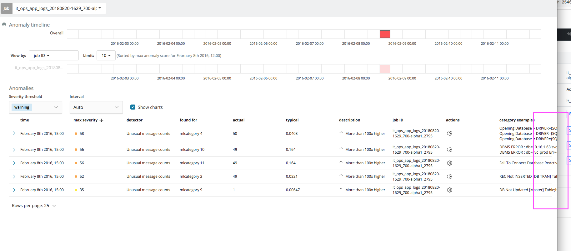
Horizontal scroll is missing from the Anomaly Explorer anomalies table. In the case where category examples are being displayed, it is therefore not possible to scroll to see the full examples.
As a workaround, you can expand the row and view examples.
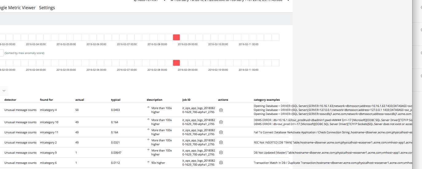
Chrome
Safari
On safari, horizontal scroll is still missing, but you can drag and cause the details to display "off screen".
Part of #18553.
 sophiec20
All 8 comments
Pinging @elastic/ml-ui
 elasticmachine
on 20 Aug 2018
elasticmachine
on 20 Aug 2018
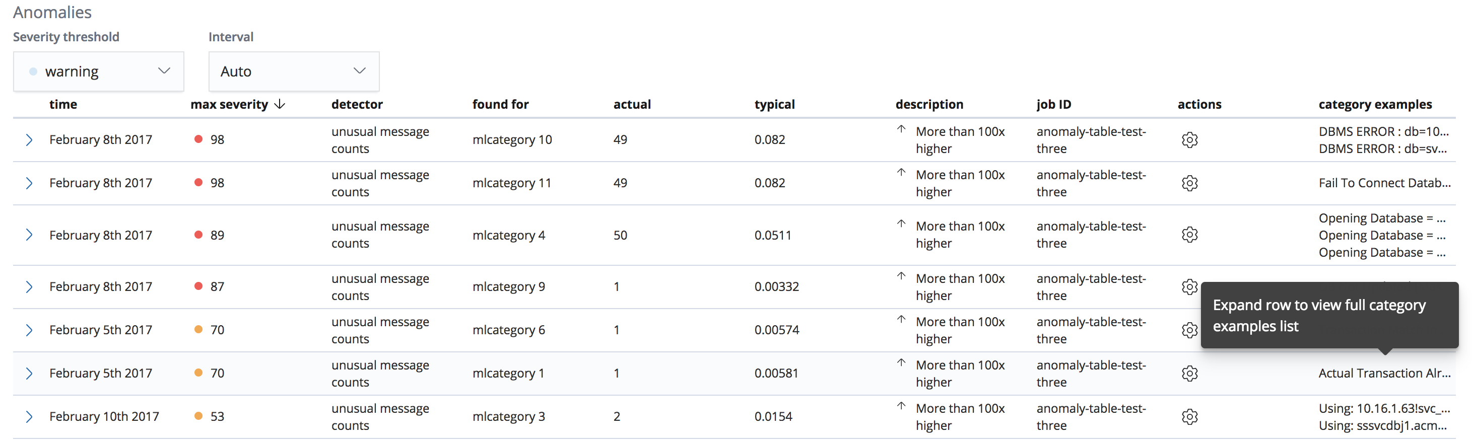
Keen to hear thoughts on screenshots for:
- Since these are already listed on expansion of the job row, we can truncate the text with ellipsis and show tooltip on over directing user to expand row to view the full list
- Another option is to add the examples themselves into a popover - though this could be hard to read when there are many. NOTE: using the ToolTip component in this example for speed but if we did this the EuiPopover component should probably be used - though it'd be more work to set up since it'd need a bit of a refactor.

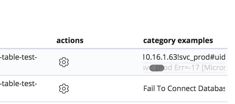
- Adding horizontal scroll bar works but fades the text beneath the scrollbar:
- Adding some padding to the contents can mitigate that issue:

cc @peteharverson, @walterra, @jgowdyelastic
 alvarezmelissa87
on 2 Jan 2019
alvarezmelissa87
on 2 Jan 2019
Was it possible to add a horizontal scroll for the whole table, rather than a column?
sophiec20
on 3 Jan 2019
i prefer the first example.
We could add an Examples tab to the expanded row where the examples are listed in a more readable format.
 jgowdyelastic
on 3 Jan 2019
jgowdyelastic
on 3 Jan 2019
Of the two tooltip options, I think the first is probably good enough. Displaying the examples in the tooltip as in the second example seems a bit of a wasted effort as the user can just expand the row to view the full examples. Could there be a link in the tooltip to auto expand the row?
I like the idea of using an Examples tab in the expanded row to make them more readable, using a monospaced font perhaps to list each example, with dividing lines between each one - it can be difficult to tell where each example starts and end in the current view:
Would providing a width prop for the examples column give it a larger width than the rest of the columns as a quick (small) win? And perhaps move it across to the left, say after the detector column?
One of the downsides of the old table, which was scrollable, was that on scrolling across to view the examples, you could lose the context of which examples went with each anomaly as the columns on the left of the table dropped out of view.
 peteharverson
on 3 Jan 2019
peteharverson
on 3 Jan 2019
Hey there, @alvarezmelissa87 asked me to jump in here with some suggestions.
I think the main struggle here is the amount of columns and content inside each cell. Since you are already using expanding rows, there may be ways to simplify the table. A couple of options:
- Is there any column that could be removed and just displayed within the expanded section?
- I see there are some highly repeated cell contents like the
detectorandjob ID. Could these be just visible in the expanded section but also pulled into the filter bar as a way for the user to filter down to the ones they want to see? - Are there any contents that could be combined into one cell and use some text formatting to show significance?
However, if you can't do any of those, I'd suggest using the truncation and displaying the truncated text within the tooltip. You can go further and allow truncated rows or cells to have an onClick that will trigger the row expansion so they can see the full details.
As your content grows, you may also want to consider switching from using expanded rows to flyouts which can give you more space to work with.
As a _side_ note, also try to ensure that the actions column is always the last if nothing more than to be consistent with the rest of the tables within Kibana.
 cchaos
on 3 Jan 2019
cchaos
on 3 Jan 2019
Thank you to everyone for all your comments and thoughts!
After a quick chat with Pete - looks like the best solution here currently is:
- Truncate the text
and display within the tooltip - Allow the truncated cell to be clickable to trigger row expansion
- Ensure expanded row contents are easy to read
- Move actions column to be the last column to be consistent with tables in Kibana
alvarezmelissa87
on 3 Jan 2019
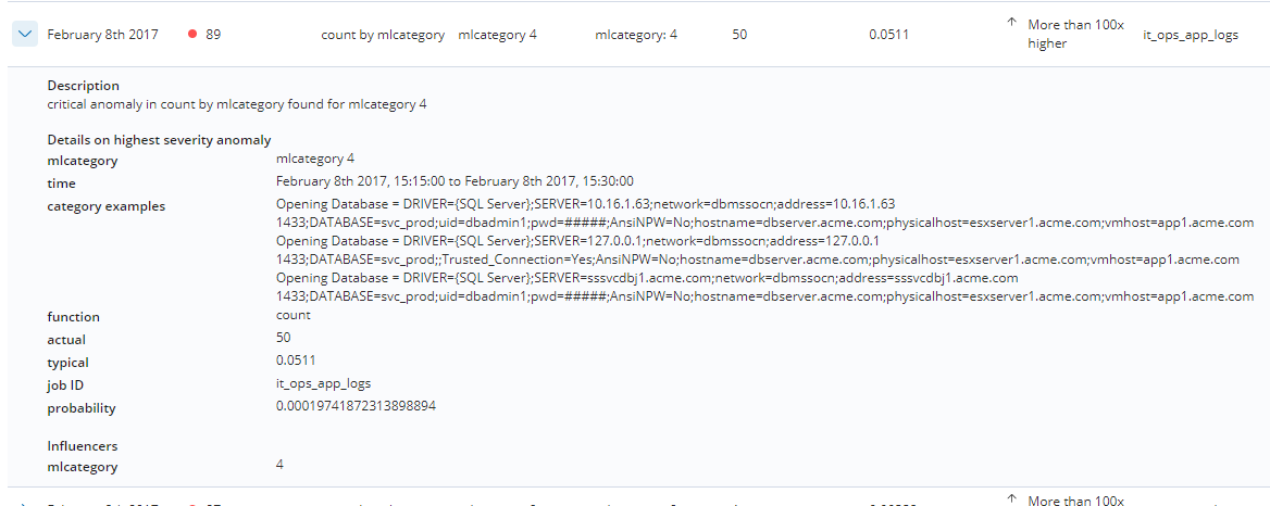
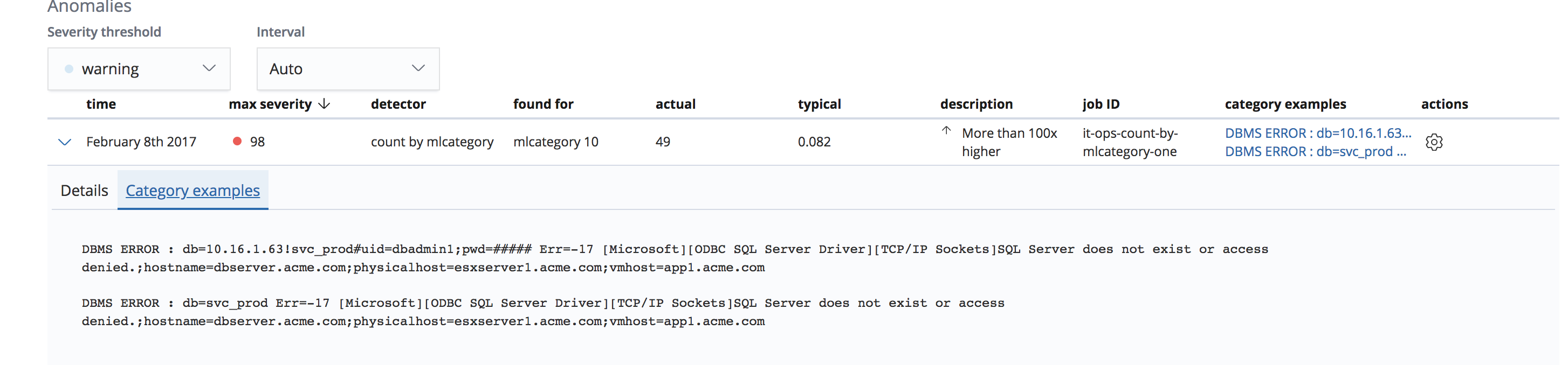
Example of separate tab for category examples. Expanding row from category examples column opens with Category examples tab selected.
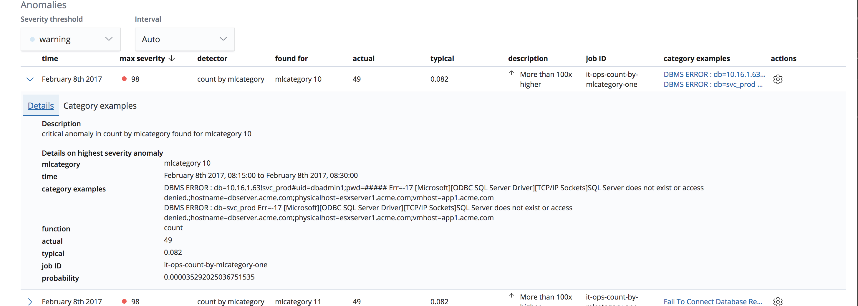
Category examples tab:
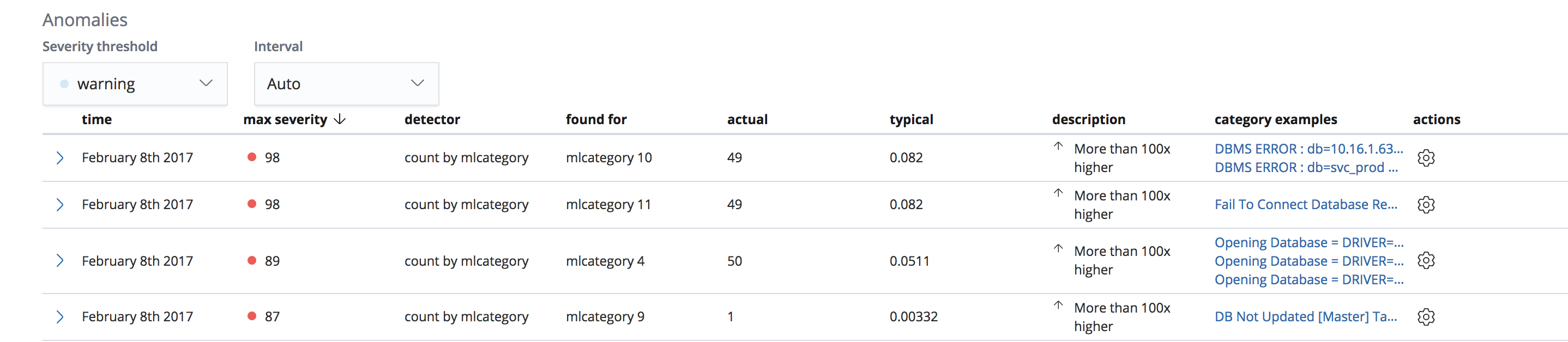
Remove jobId column when only one job is being viewed:
cc @cchaos - keen to hear what you think of what we ended up coming up with. Thanks!
alvarezmelissa87
on 3 Jan 2019
Related issues
 ctindel
·
3Comments
ctindel
·
3Comments
 stacey-gammon
·
3Comments
stacey-gammon
·
3Comments
 bradvido
·
3Comments
bradvido
·
3Comments
 cafuego
·
3Comments
cafuego
·
3Comments
 mark54g
·
3Comments
mark54g
·
3Comments