Kibana: [Home] Highlight Sample Data for Net New Users
After some discussion, we feel that we should make sample data just a little more prominent for new users in 6.4. Ideally, we'd prefer a splash screen to guide a user in bit more explicitly (https://github.com/elastic/kibana/issues/18828) but since we do not have time before feature freeze, we've decided to make a few more tweaks to the homepage.
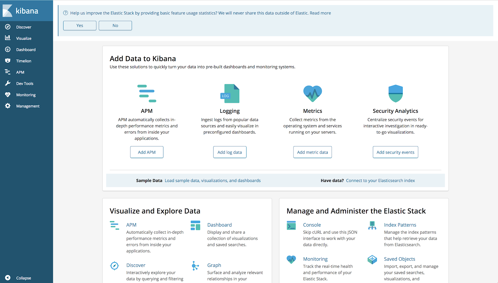
- We plan to highlight the background of the sample data and index pattern sections to a color defined by design. It looks like the "callout blue" in EUI, but I'd like @cchaos to weigh in here.
- Rather than saying Need data? we would like to bold Sample Data as it's easy to skip of the URL text. @gchaps, any changes we need to make if we switch the text out?
- @nreese has mentioned that we should be able to conditionally highlight this section. If there are no index pattern saved objects, this background color should be blue. If there are index pattern saved objects, we will leave the normal styling (white)
We plan to take this approach with the expectation that we'll have an vetted and approved splash screen from design implemented in an upcoming minor version.
cc: @Stacey-Gammon @snide @formgeist @skearns64 @tbragin @rayafratkina
 alexfrancoeur
All 4 comments
Can I make a suggestion to change the highlight colour to use the Eui highlight colour? I think it makes them stand out a little more, without clashing with the telemetry callout.
 formgeist
on 13 Jul 2018
formgeist
on 13 Jul 2018
I'm not sure that the using the same blue "clashes" with the telemetry banner, but I can see that it _could_ lessen the attention. However, I'm not sold on this yellow. It reminds me of bad highlighter days. I do like the separation of boxes and making sure the content is centered in each.
 cchaos
on 13 Jul 2018
cchaos
on 13 Jul 2018
Here's a recommendation for switching the text to use the terms "Sample Data" and "Your Data"

 gchaps
on 13 Jul 2018
gchaps
on 13 Jul 2018
I also prefer the blue, I think it actually stands out more than the yellow. I'll leave it to the design team to decide, just adding my 2 cents
alexfrancoeur
on 16 Jul 2018
Related issues
 ynux
·
3Comments
ynux
·
3Comments
 ctindel
·
3Comments
ctindel
·
3Comments
 celesteking
·
3Comments
celesteking
·
3Comments
 cafuego
·
3Comments
cafuego
·
3Comments
 timmolter
·
3Comments
timmolter
·
3Comments