Some suggested rules for the styling of Pie charts in Kibana. Biggest ask is that we should make donut charts the default display if possible. Users can still switch to pie, but there's a lot of research that says Donuts are more readable. They also happen to be prettier! Note the changes to how we handle hovering (we should drop the opacity hover states we use now).

 snide
snide
All 13 comments
@snide regarding the hover state, could you please provide an example with multi level pie chart ? (one that has more than 1 ring, like 2 or 3 ... the hover state indicator of 1st ring would cover the second ring ? )

 ppisljar
on 23 Aug 2017
ppisljar
on 23 Aug 2017
also note, that on hover of a slice on second ring multiple slices will show hover indication
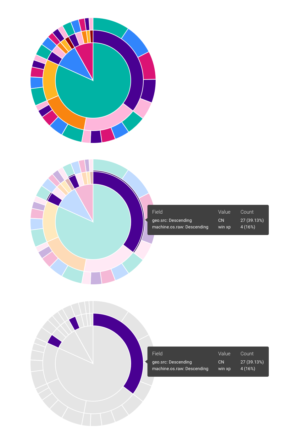
for example in below scenario i have first split slices by country, then i split them by machine os
for every country there is a windows xp slice ... and when i hover on it in one country all the slices are higlighted

ppisljar
on 23 Aug 2017
@Adrian-J You have any ideas on how we'd want to handle this? Don't think the bordering would work unless we did it as an inner border inside the pie graph. Other option would be to just set the hovered element to opacity: .8 or something.
What I want to avoid is setting a low opacity to ALL the elements, and only setting opacity: 1 to the hovered one. It mutes all the colors and makes the color blind stuff not work.
snide
on 24 Aug 2017
Hover state is universally wonky in Visualize, not just for Pie charts. We reduce the opacity of all the other chart elements instead of highlight the current feature. I think we should improve on hover separately, as this will effect all charts (not just pies).
 thomasneirynck
on 25 Aug 2017
thomasneirynck
on 25 Aug 2017
@ppisljar @thomasneirynck @snide Here are two options I'm thinking about. First one is reducing opacity, second, changing the rest of the chart to gray. Let me know what you think.
 Adrian-J
on 1 Sep 2017
Adrian-J
on 1 Sep 2017
Visually I like the gray option. Gets rid of the clutter.
snide
on 1 Sep 2017
@alexfrancoeur wanna vote ? :)
i think the grayed one might be confusing for everyone, where lowering opacity is confusing for visually impaired (the reason why are looking for diff approach) ...
ppisljar
on 4 Sep 2017
@ppisljar you took the words right out of my mouth, the third option seems best for accessibility purposes. I also agree that it's cleaner.
Given that we'll likely have a universal hover approach for all visualizations, is the assumption here that we'll apply the same to bar charts, line charts, tag clouds, etc.? How would this work with a combo chart? This discussion may deserve a separate issue in itself. I can make assumptions but I think it might makes sense to vet out all scenarios. Or are we just generically stating that we gray out any series that is not currently being hovered?
 alexfrancoeur
on 5 Sep 2017
alexfrancoeur
on 5 Sep 2017
Just my two cents, but I don't think the grey will look good once you add in mouse moving. Imagine you want to hover over the thin orange slice in the second row above the red. You mouse over the third row and everything goes grey except the one you are on. I would find that really distracting (I'm focusing on the orange slice which is no longer there) and difficult to accomplish (I now have to remember how many slices from the middle is the orange slice).
 trevan
on 6 Sep 2017
trevan
on 6 Sep 2017
I'd keep the highlighting as-is for now. Then we can move on with this PR. OK for you @snide @Adrian-J ? If we want to revisit highlighting behavior, we can do so as separate effort.
thomasneirynck
on 21 Sep 2017
That's fine. I think #2 from @Adrian-J is the closest to what you want. What we don't want is to set an opacity to the non-hovered state (which is how I remember it happening live, it might have changed). Doing something like that (where opacity is .8 or something) in its default, non-hovered state will actually break the color-blind palette.
So....
No hover....
opacity: 1
On hover
element hovered... opacity: 1
everything else: lower the opacity.
snide
on 22 Sep 2017
i think that's our current implementation,.
ppisljar
on 22 Sep 2017
Seems we can close this (?)
Created follow up item: https://github.com/elastic/kibana/issues/14257
thomasneirynck
on 3 Oct 2017
Related issues
snide
·
3Comments
 stacey-gammon
·
3Comments
stacey-gammon
·
3Comments
 ynux
·
3Comments
ynux
·
3Comments
 socialmineruser1
·
3Comments
socialmineruser1
·
3Comments
 LukeMathWalker
·
3Comments
LukeMathWalker
·
3Comments