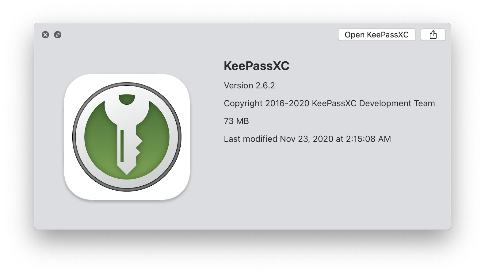
Keepassxc: Adjust app icon for OSX 11 Big Sur
Summary
Like demonstrated on the last week WWDC the new OS X Big Sur changes many things . One is the different style of the icons used for Programms
Examples
Context
Look at this page . Apple changed the icon style from round to square
https://www.cultofmac.com/715717/fantastic-fugly-all-new-app-icons-macos-big-sur/
 F3000
F3000
All 19 comments
We won't be making a custom icon just for this.
 droidmonkey
on 3 Jul 2020
droidmonkey
on 3 Jul 2020
unless....?
 martin-sweeny
on 4 Jul 2020
martin-sweeny
on 4 Jul 2020
@martin-sweeny Take a look at https://macosicons.com/. Maybe we can create an icon for now ourselves
 SebastiaanKloos
on 11 Aug 2020
SebastiaanKloos
on 11 Aug 2020
I don't understand why the devs of this project are so adverse against even little wishes from the community.
Circular shaped icons are ugly as hell, imho.
@F3000 @martin-sweeny @SebastiaanKloos
I have attached two different versions of the keepassxc icons in the macOS Big Sur rounded square shape as svg-files, to this post. Users can do what ever they want with it! Devs of keepassxc, if you use this icons, credit me!
 thrdroom
on 27 Aug 2020
thrdroom
on 27 Aug 2020
The icon is not just some random illustration our brand.
Devs of keepassxc, if you use this icons, credit me!
With all due respect, this is not how it works. You are using and modifying our branding, which makes you subject to our copyright guidelines, not vice versa.
 phoerious
on 27 Aug 2020
phoerious
on 27 Aug 2020
Oh, I don't care. I was making a joke because the issue was reopened lol
martin-sweeny
on 6 Sep 2020
An even more interesting thought: not only the icon would need to be updated, but the name of the app as well... Big Sur is macOS 11, not X ;). (jk)
 whitezo
on 14 Nov 2020
whitezo
on 14 Nov 2020
Luckily, we are already referring to it as "macOS" only.
phoerious
on 14 Nov 2020
Gave this a shot, tried adapting the existing logo to rounded corners, came up with these three versions.

It's worth noting that theses icons absolutely don't adhere to the suggested specifications for MacOS icons in any way other than the shape. I think the middle one is probably the most appealing but also the most iOS like. Happy to make files available of course!
 Shrinks99
on 22 Nov 2020
Shrinks99
on 22 Nov 2020
Looking at them again, I like the left one the best.
droidmonkey
on 22 Nov 2020
Tried giving the borderless option a drop shadow on the key too, this one is definitely my favourite! (See below!)

Should you like this and want to implement it I'll re-make the gradient in Photoshop instead of Illustrator to get rid of the ugly banding.
Shrinks99
on 22 Nov 2020
Why make the icon rectangular? Chrome keeps their logo round and simply adds a white border. We should be doing the same.
phoerious
on 23 Nov 2020
I thought more about the no border one and I dislike it: it is not our logo, we don't have a full key, the top is flattened. The first one is far better and reflects our logo.
droidmonkey
on 23 Nov 2020
@phoerious Thought it might be fun to try some other options! Here's that version, it's definitely the safest choice.

Shrinks99
on 23 Nov 2020
I like that one.
phoerious
on 23 Nov 2020
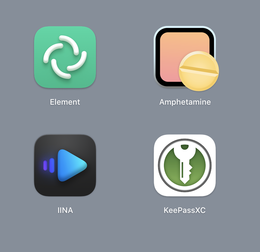
Okay one more version, original logo but with some shading! A lot of applications including Chrome seem to be going this route, Element and IINA are also notable examples. This brings the icon a lot closer to the suggested styling and also seats it within the suggested icon grid defined by Apple.

This one is definitely my new favourite :P Open to shading adjustments and suggestions!
Shrinks99
on 23 Nov 2020
It's too much. I am not entirely sold on going that route. After all, it's still our logo, not just some random illustration. If anything, it should be more realistic with regards to where to "light" comes from. The Chrome example uses Material-style shading. The example you proposed is not Material-like. At least the gradient in the border is too much.
The grid alignment can be done, I am not against that.
phoerious
on 23 Nov 2020
Adjusted the shading, agree on the unified light direction, made the highlight on the border less reflective, everything is top down now and I think it looks much better and the change is definitely subtler. Here it is in context with some other 3rd party applications, I admittedly haven't upgraded to Big Sur yet myself :P
As for staying on brand I'm personally a proponent of changes where applicable to make a brand fit into different contexts, IMO adapting in small ways is an asset and doesn't detract from a brand's overall image. Sometimes these changes are too drastic (remember the original Windows 10 "it's gotta be white on a coloured tile" system?) and so nobody follows them because they're ridiculous. I think Apple's new suggested styling is good because it allows for a fair amount of diversity while setting up _some_ standards that make things cohesive across the whole OS.
Here's the regular vs shaded versions.

Shrinks99
on 24 Nov 2020
I still don't like the shading of the dark ring. It doesn't indicate any direction of where the light may be coming from and I alwasy thought of it as more being behind the logo, not as an bevel around it. It should be more like a block of solid material which the logo is painted onto. The shadow inside the green area could also be a little more subtle still.
phoerious
on 24 Nov 2020
Related issues
 bleepnetworks
·
3Comments
bleepnetworks
·
3Comments
 rugk
·
3Comments
rugk
·
3Comments
 MisterY
·
3Comments
MisterY
·
3Comments
 2tbwXj46BDbdNBRV79DS
·
3Comments
2tbwXj46BDbdNBRV79DS
·
3Comments
 guihkx
·
3Comments
guihkx
·
3Comments
Most helpful comment
I don't understand why the devs of this project are so adverse against even little wishes from the community.
Circular shaped icons are ugly as hell, imho.
@F3000 @martin-sweeny @SebastiaanKloos
I have attached two different versions of the keepassxc icons in the macOS Big Sur rounded square shape as svg-files, to this post. Users can do what ever they want with it! Devs of keepassxc, if you use this icons, credit me!
keepassxc-square-shaped-icons-macOS-Big-Sur.zip