Keepassxc: Develop Simple Mode UI for KeePassXC
This is a discussion/catch-all issue created after a discussion with @droidmonkey
Summary
KeePassXC has some rough edges for tech unsavy people, especially older generations.
This includes the amount of dialogs in use for the browser integration or "unsafe" settings that can break an installation or data.
You may call this the "grandparent" mode, which is my context.
Desired Behavior
KeePassXC could adopt a "easy" mode. In this mode only relevant, day to day and safe options should be displayed.
This mode includes hiding of the Properties page to prevent data invalidation.
There is a multitude of things that should possibly discussed whether we want to include them in the simple mode. For example the top menu includes a multitude of actions buttons, which in my experience overstrained people due to their amount.
We will probably also want to hide the database settings or reduce the amount of knobs that can be (mis-)used.
TOTP is also a thing you probably don't want, as I don't expect such people to decode the QR Code. Most sites don't present the raw data.
Auto-Type is nice but probably also too unsafe, as you can easily type your stuff into the wrong window.
The browser integration is currently sub-par for a pretty dump reason: KeePassXC asks per entry whether you want this to be usable in the browser or not. The problem is the amount of dialogs that look a little bit scary and will probably end up being declined. So although it's possible worse from a security point, we want a "allow all entries with a matching URL in the browser" mode.
Hardware-/Yubi-Key integration
Hardware-Keys like yubikey are pretty comfortable in that you don't have to remember any passwords. Thus they should be ideal for the users targeted with this mode.
The problem currently is that you always have to re-approve any changes as the password is not stored for the current session, like a normal password is. That means at least 2 if not 3 key-approves per new entry*.
A side-issue is currently unlocking via yubikeys. Sometimes the slot selection will stay on "Select slot.." although there is only one to select.
(*)It goes like this:
- create entry & generate password, store
- add URL & fetch icon, store
- allow browser access, store
Especially 1 & 2 are kind of annoying as they happen while editing the entry.
 0xpr03
All 11 comments
I'm not sure to have caught everything but feel free to edit things as we progress forward.
0xpr03
on 3 Nov 2019
For reference I did some UI testing of having a single tree in a stacked view:
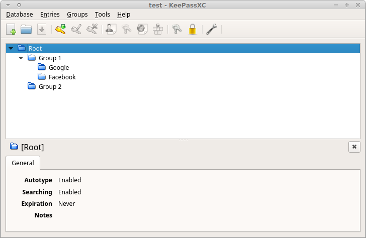
The window is still too wide because inner stacked views enforce it and for demonstration reasons think that "Google" and "Facebook" are the title of entries.
 hifi
on 4 Nov 2019
hifi
on 4 Nov 2019
We should keep in mind that maintaining two UIs basically doubles the number of tests we have to develop, maintain, and run.
 phoerious
on 4 Nov 2019
phoerious
on 4 Nov 2019
For starters I'd just hide some elements, that should be easier than a separate UI.
0xpr03
on 4 Nov 2019
I'd implement that not as an option in KeePassXC but as a new executable, sharing a code base for core functions (file access, crypto, etc.) but with its own UI, so the two can be developed independently. Also, the simplified UI should be designed in cooperating with members of the target group.
 wolframroesler
on 13 Apr 2020
wolframroesler
on 13 Apr 2020
Somehow each time I hear “let’s simplify” it turns out to be more complex in the end. For example, 2.6.0 beta1 introduced a new outlook with a lot of spacing and large yellow icons, which makes the app rather inconvenient to use with 1280×1024 resolution. I wonder then if dear developers are committed to entertain relatively wealthy people with 2-4K displays or to create a truly world-wide solution.
 sergeevabc
on 24 Jun 2020
sergeevabc
on 24 Jun 2020
It's impossible to pick a look that is perfect for everyone on every configuration they may have. The new theme and larger icons are a compromise to modernize the look while not going too far off into the "app" culture of modern days where there's _too_ much spacing and it becomes user hostile.
It's very unfair to claim the decisions on new theming are discriminating where the functionality of the application has not been compromised on smaller screens. There is work going towards accessibility in each release.
For what it's worth, you can disable the toolbar and entry preview panel to see more groups and items on the window at once.
hifi
on 24 Jun 2020
You can also use classic mode theme
 droidmonkey
on 24 Jun 2020
droidmonkey
on 24 Jun 2020
@hifi, “unfair claims” grow out of comfort other apps bring (launcher, editor, player, clipboard manager, not to mention the original Keepass…) instead of suffering, because they let users tune the interface. Perhaps the most evident example is how Sublime Notepad or its open-source alternative CudaText is tuned via font-size and line-padding options. Damn, even cheap indie games without pricey engines under the hood scale gracefully across various devices. Now you let users tune exotics such as delays of AutoType (a hidden option in Keepass with a warning from the author not to mess with it), but hard-code UI constraints, thus arm-twisting in a way Firefox introduced irreversible enlarging address bar in 70+ or Github moved a repository info to a vertical column on the right so now it takes twice as much time to grasp the basics.
@droidmonkey, classic mode has a less spacious toolbar, but the rest is still too spacious, including eyesore orange icons.
sergeevabc
on 24 Jun 2020
@sergeevabc I think the main reason for the feedback you get is the tone of your "requests". It sounds more like you're entitled to get those adjustments or features, like the devs are owing you something.
dear developers are committed to entertain relatively
If you'd phrase this more as a problem you're facing and asking for help or if there's enough interest to get adjustments, you may get a more welcoming response.
OT: I really like firefox new big bar, it's tiny in normal browsing, but bigger when I need to read it while editing. So what now ?
These days I'm rather an advocate of not adding the simple UI in keepass. Due to various reasons non-technical users will probably not adopt it anyway (no auto sync, not mobile in itself,..). So we're adding just more technical dept to the dev team. And being an OSS author myself I'm rather surprised how many features are still added and how good they are.
And while you're having problems with a tinier screen resolution, you'll see requests for "finally" adopting 4k or 2k retina compatibility on other projects. As "Everyone" today has more than 1080p displays. I can see your problem, but it's not that easy.
0xpr03
on 25 Jun 2020
I actually think this feature request is unnecessary with the new UI changes and better documentation.
droidmonkey
on 25 Jun 2020
Related issues
 rugk
·
3Comments
rugk
·
3Comments
 n1trux
·
3Comments
n1trux
·
3Comments
 MountainX
·
3Comments
MountainX
·
3Comments
 guihkx
·
3Comments
guihkx
·
3Comments
 813gan
·
3Comments
813gan
·
3Comments
Most helpful comment
We should keep in mind that maintaining two UIs basically doubles the number of tests we have to develop, maintain, and run.