Keepassxc: Increase size of icons and buttons
Summary
I give digital security workshops and some people have commented that the icons and buttons are small, even on normal screens (not hi-dpi).
Desired Behaviour
Normal and bigger icons and buttons.
Possible Solution
An option on general settings to make icons and buttons bigger.
 ventolinmono
All 15 comments
Can you be more specific please?
 droidmonkey
on 28 Sep 2019
droidmonkey
on 28 Sep 2019
The icons on the top bar and the icons for each entry are too small for some people, even with an average screen size (1920 - 1080 px).
I was thinking maybe an option on general settings to choose between normal and bigger icons will do.
ventolinmono
on 28 Sep 2019
I think this option should also apply to the tree view.
 kemalsecer
on 30 Sep 2019
kemalsecer
on 30 Sep 2019
475/#4066 change all icons from fixed-size (PNG) to scalable (SVG), maybe that facilitates making the tool bar size configurable.
 wolframroesler
on 27 Dec 2019
wolframroesler
on 27 Dec 2019
Yes we can change the toolbar size in the UI file for MainWindow
droidmonkey
on 27 Dec 2019
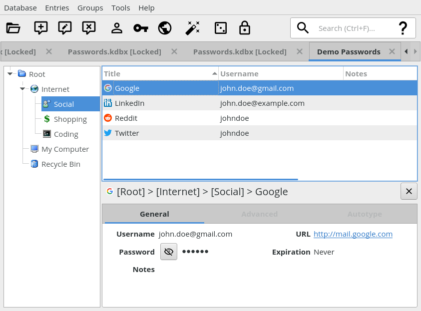
Here's what the toolbar currently looks like with the re-designed icons (as of #475/#4066):

There's some vertical space left due to the height of the search field. How about increasing the icon size from 16x16 to 32x32, and maybe removing some rarely used icons (like Password Generator or Lock Databases) to clean it up a bit? If it looks good then maybe we don't even need the icon size to be configurable.
wolframroesler
on 4 Jan 2020
We will definitely catch flak for removing some toolbar icons, like the lock icon. The password generator icon, to me, is about discoverability for new users, there is also not a good keyboard shortcut to open that up (Ctrl+G ??).
I personally think there should be a database settings button to the left of the application settings button. Like the barrel with a cog wheel.
droidmonkey
on 4 Jan 2020
I mentioned that in the other thread. I would remove "New", "Settings", and "Save" when auto-save is enabled. "Lock" should stay, so should the pw generator button.
 phoerious
on 4 Jan 2020
phoerious
on 4 Jan 2020
@phoerious wrote in #4066 ("it" refers to the Settings toolbar icon):
If we don't want to remove it, we could perhaps replace the settings icon with a less obtrusive hamburger icon and place it somewhere else. Can we do CSDs in Qt?
Hamburger means "menu", I wouldn't use it for "settings". The most common icon for "settings" these days is the cogwheel. BTW, to avoid confusion of "settings" and "database settings", I suggest renaming the former to "preferences". ("Application settings" would also do but is too technical IMHO.)
What are CSDs?
wolframroesler
on 4 Jan 2020
This is what the toolbar looks like with 32x32 Material Design icons, Save and Settings removed, and a separator between Copy URL and Auto-type. Full window screenshot for better orientation.
Really like the size, looks much better than the 22x22 we had before, and goes much better with the height of the search field. Do we really need to support smaller icons in the tool bar?
wolframroesler
on 4 Jan 2020
I still have a problem with the username, key, and world icons. They are pretty generic representations of exactly those concepts, but none of them really convey the affordance of "copying" something.
phoerious
on 4 Jan 2020
The Auto-Type icon is also very abstract. This could be a decent option: http://materialdesignicons.com/icon/keyboard-settings-outline
droidmonkey
on 4 Jan 2020
@phoerious, @droidmonkey Adding alternative suggestions for the icons to #4066.
wolframroesler
on 4 Jan 2020
Toolbar icons have been enlarged from 22x22 to 32x32, #4066 has been merged, is there anything left to do here?
wolframroesler
on 19 Jan 2020
Nope we are done
droidmonkey
on 19 Jan 2020
Related issues
 amvasilyev
·
3Comments
amvasilyev
·
3Comments
 MisterY
·
3Comments
MisterY
·
3Comments
 mstarke
·
3Comments
mstarke
·
3Comments
 guihkx
·
3Comments
guihkx
·
3Comments
 haroldm
·
3Comments
haroldm
·
3Comments
Most helpful comment
Here's what the toolbar currently looks like with the re-designed icons (as of #475/#4066):
There's some vertical space left due to the height of the search field. How about increasing the icon size from 16x16 to 32x32, and maybe removing some rarely used icons (like Password Generator or Lock Databases) to clean it up a bit? If it looks good then maybe we don't even need the icon size to be configurable.