Keepassxc: Improve application icons [$50]
I apologize for the somewhat light-minded request, but… no plan to switch to vector icons? On macOS, at least, they do not look so gorgeous… (the app icon is beautiful, though).
I know that resources are tight and there are other priorities. A good-looking UI, however, may attract a wider public to KeePassXC, making it eventually more popular.
 lifepillar
All 25 comments
I agree. IMHO the current icon theme looks bad and outdated, I would love to see something more modern, like the elementary icon set maybe. Nuvola is ~12 years old already.
 weslly
on 6 Apr 2017
weslly
on 6 Apr 2017
I'm going to table this until 2.3.0, but I am open to seeing some suggestions and sample icon sets posted here. I totally agree the current set of icons is.... dated
 droidmonkey
on 8 Apr 2017
droidmonkey
on 8 Apr 2017
Maybe, something among these sets: https://tagliala.github.io/vectoriconsroundup/.
lifepillar
on 9 Apr 2017
Here, there are several open source icon sets: https://icons8.com/welovesvg.
lifepillar
on 9 Apr 2017
The icons we are currently using are from KeePass. I don't really like the myself. Neither are they especially beautiful nor do we have any high-res versions of them. 22x22px is all we have. We need to replace them at some point.
 phoerious
on 9 Apr 2017
phoerious
on 9 Apr 2017
A related note about the "add a new entry". This icon is not understandable (at least for my mum). It should have a + I guess so it' easy to understand it for "add".

This is specially perturbing because the "New database" icon do have a +.

Anyway, I think the "new database" should not be in the toolbar to avoid confusion.
 gagarine
on 12 Aug 2017
gagarine
on 12 Aug 2017
Why not taking https://github.com/mstarke/MacPass icon?

gagarine
on 15 Aug 2017
How about Material Icons?
 CoalaJoe
on 23 Aug 2017
CoalaJoe
on 23 Aug 2017
As a GNOME user, I really appreciate the integration with the look and feel of the desktop, so the application should use the icons provided by the theme I'm using when possible.
 edubxb
on 23 Aug 2017
edubxb
on 23 Aug 2017
That won't change. We are only talking about fallback icons.
phoerious
on 23 Aug 2017
On HiDPI screens the icons look pretty horrible. It would be really great to have a new set with higher resolution icons.
 cryptomilk
on 8 Jan 2018
cryptomilk
on 8 Jan 2018
For openHAB I improved a script (https://github.com/mueller-ma/openhab-mdi) that generates icons from https://www.materialdesignicons.com/ (Community driven material design icon). The script renames and changes the color of the source icons.
If you want to use material icons, I can help you with that.
 mueller-ma
on 28 Feb 2018
mueller-ma
on 28 Feb 2018
@cryptomilk HiDPI is #548, but #756 should solve it. BTW, #756 is what you are looking for @edubxb.
 ArchangeGabriel
on 8 Mar 2018
ArchangeGabriel
on 8 Mar 2018
For clarification, we're talking about the application icons here (toolbars and menus), not the "default icons" for groups and entries. The latter should remain unchanged (KeePassium has redesigned default icons, and they look awesome unless you have downloaded custom icons, in which case they look terrible).
If we agree upon material design, https://materialdesignicons.com/ seems to have most of what we need. @mueller-ma's script looks interesting however I'm not sure we really need it.
 wolframroesler
on 26 Dec 2019
wolframroesler
on 26 Dec 2019
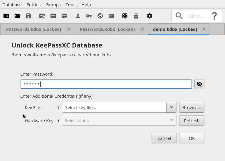
Wrote a shell script that converts the existing KeePassXC icons to Material Design. Here are the first screen shots:
- Unlock screen
- Main screen

The general idea is a mapping from the existing icon names (e. g. document-new) to the icon name in the Material Design repo (https://github.com/Templarian/MaterialDesign; e. g. folder-plus). The shell script (makeicons.sh in the utils folder) uses this mapping to re-create the png file in the KeePassXC source from Material Design's svg file. That makes the conversion fairly easy (detailed instructions are at the beginning of the script).
In order to be able to test it, I introduced an environment variable to deactivate the operating system's Qt icon theme. The default is to take icons from that theme if possible, which of course makes it impossible to see all the new icons. To ignore the theme and show built-in icons only, run KeePassXC like this:
$ KEEPASSXC_IGNORE_ICON_THEME=1 keepassxc
I consider the env variable a (hopefully temporary) hack. If anyone knows a better way to accomplish the same thing, let me know.
wolframroesler
on 26 Dec 2019
Note, if we decide to stick with the Material Design icons, someone should add proper credit to the about dialog or wherever appropriate (https://materialdesignicons.com/, https://github.com/Templarian/MaterialDesign).
wolframroesler
on 26 Dec 2019
How does the settings screen look? IMO the icons for search and help can be a bit smaller.
If you want to use these icons, I recommend you creating an icon request for key-add, key-edit and key-remove: https://github.com/Templarian/MaterialDesign
Edit: There are already icons for key-add and key-remove.
mueller-ma
on 26 Dec 2019
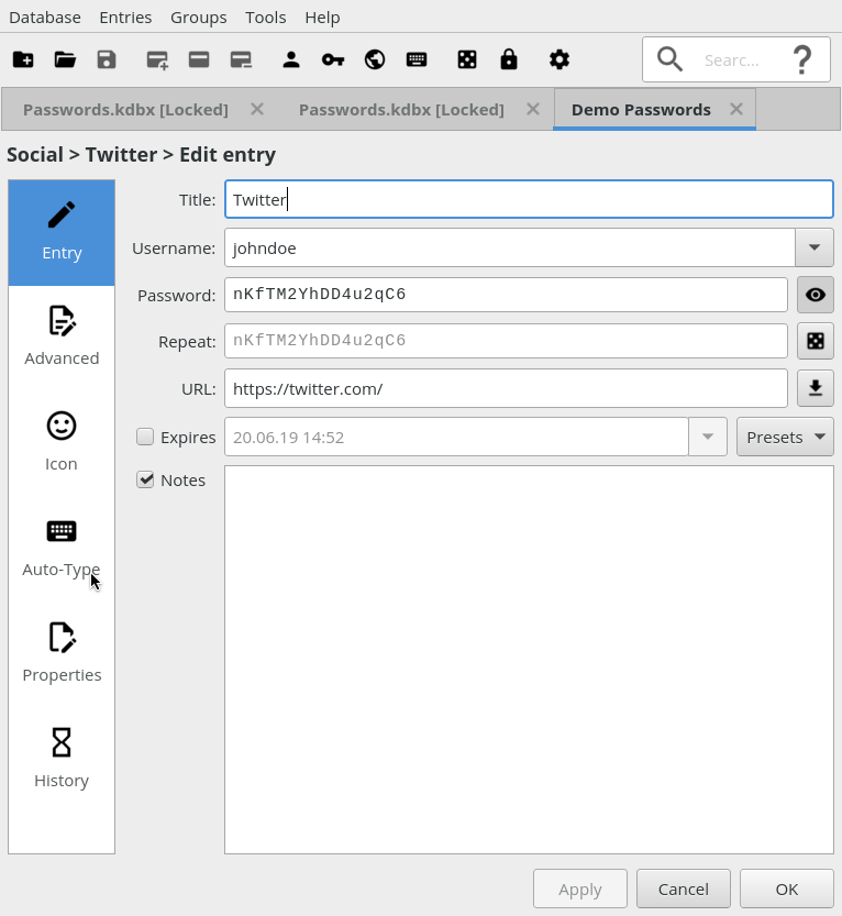
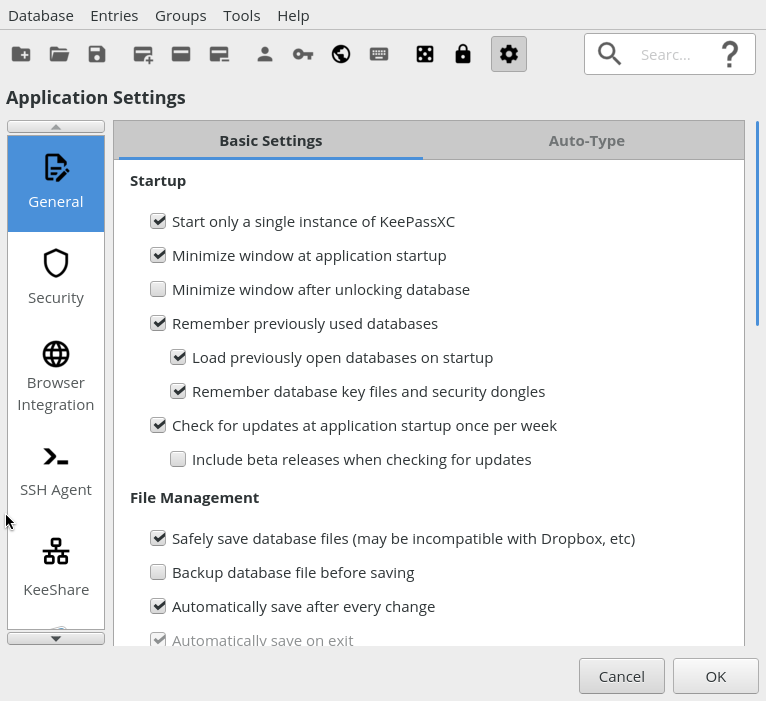
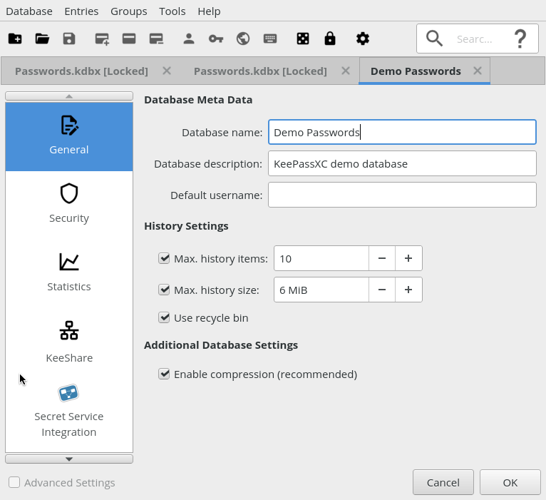
Here are a few more screenshots:
- Entry editor
- Application settings
- Database settings
@mueller-ma You're right about the sizes of the looking glass and question mark, however I didn't change anything about the icon sizes, not even the encoding; what was a 22x22 png before is still a 22x22 png now, just created from an svg. I hope that eventually we'll do without the png files entirely and use svg natively, but that will be the second step. I used the "credit-card" icons instead of key-add/edit/remove because these icons refer to the entire entry, not just the password (=key).
By the way, "Secret Service integration" is still blue because it's not a png file in the source, and so far I'm handling the png files only. Will handle it in the second step when switching everything to svg.
wolframroesler
on 26 Dec 2019
This could use a bounty
droidmonkey
on 27 Dec 2019
Since I'm working on this, I've been noticing that lots of applications use Material Design-style icons these days: Vivaldi, Nextcloud, Twitter, GitHub, GitLab, elementary OS Terminal, Plex are just those that are right in front of my eyes. Seems like we're on the right way.
wolframroesler
on 29 Dec 2019
Requested a Material-style version of the KeePassXC icon from the Simple Icons site (https://simpleicons.org/): https://github.com/simple-icons/simple-icons/issues/2268 it could used e. g. in the system tray menu.
Material Design no longer wants to include company or product logos, pointing to Simple Icons instead (https://dev.materialdesignicons.com/roadmap/brand-icons).
wolframroesler
on 3 Jan 2020
One more thing. Here's how it currently looks with the Material Design icons:

... at least that how it looks when system theme icons are disabled (for which I temporarily introduced an env variable that I can set during development). The regular version (as of #756), however, allows the system theme to override icons, which doesn't look too pretty:

How about introducing a check box in the settings dialog that configures whether the system icon theme is to be used or not?
wolframroesler
on 11 Jan 2020
I would not allow any system icons at this point
droidmonkey
on 11 Jan 2020
I would not allow any system icons at this point
You mean, undo #756, and behave as if KEEPASSXC_IGNORE_ICON_THEME (the env var I introduced to disable the system icon theme, cf. https://github.com/keepassxreboot/keepassxc/issues/475#issuecomment-569132947) was set permanently?
wolframroesler
on 11 Jan 2020
Yes precisely. Especially if we package the icons with the executable and eliminate all the filepath nonsense in the code. You either have material icons or you don't. There is no sense in a hybrid icon look.
droidmonkey
on 11 Jan 2020
Related issues
 JosephHatfield
·
3Comments
JosephHatfield
·
3Comments
 n1trux
·
3Comments
n1trux
·
3Comments
 Throne3d
·
3Comments
Throne3d
·
3Comments
 amvasilyev
·
3Comments
amvasilyev
·
3Comments
 shaneknysh
·
3Comments
shaneknysh
·
3Comments
Most helpful comment
As a GNOME user, I really appreciate the integration with the look and feel of the desktop, so the application should use the icons provided by the theme I'm using when possible.