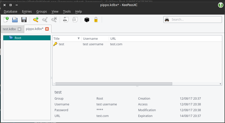
Expected Behavior
The highlighted entry should have a preview pane with the details of the entry i.e. group, creation, username etc
Possible Solution
KeepassX 0.4.x had this feature no idea if you can use the old code.
Context
It's handy to see various info in the pane, especially the clickable urls.
 rwky
rwky
All 45 comments
I too love the idea of a preview panel. Keepass has this feature and and Keepassx 0.43 used to have it, too. I just switched to KeepassXC in the hope that this feature would have been re-engaged here.
With this preview pane one can just go through the entries (e.g. with cursor down) and browse all the comments very fast.
Maybe you can borrow this feature from the 0.43 code?
Furthermore the missing preview pane leads to a security flaw: When I open an entry to copy something and paste it in my browser I often forget to close the entry in KeepassX, and this prevents the programm from locking the database, thinking I'm still editing that entry.
Another problem is: With an "edit open" entry it's easy to type things in here unintentionally, especially when the focus follows th mouse.
 paulsommer
on 13 Jul 2017
paulsommer
on 13 Jul 2017
This would make the program perfect.
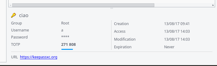
Just one small wish: Please add the current calculated OTP to the preview pane too!
 andusvan
on 31 Jul 2017
andusvan
on 31 Jul 2017
+1
 adrienbresson
on 2 Aug 2017
adrienbresson
on 2 Aug 2017
I was trying something, any suggestion?
the password is hidden by default, in the settings there is an option to always display it, I'm also working on a small button to hide and show it
I'm also working on placing the entry's icon in the first line before the title
valid URLs (with http/https) will be clickable
I'm planning to also add the current TOTP token if the entry has TOTP enabled
 TheZ3ro
on 13 Aug 2017
TheZ3ro
on 13 Aug 2017
That looks great to me! The only thing missing that I would like is the comment field.
rwky
on 13 Aug 2017
Yes the comment field is missing. If you make the preview pane scrollable it even doesn't matter how long the comment is. Otherwise you could make it expandable, if it has more than 3 lines...
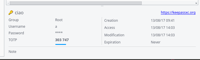
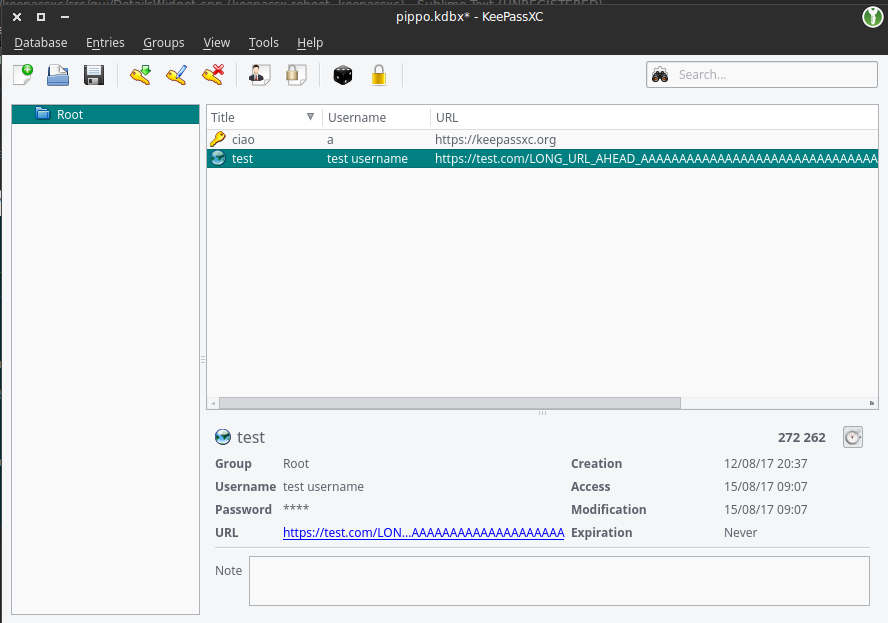
Also to note: The URL could be very long. Either put the URL in the last line using the full width or use ellipsis (...) on it.
Suggestion:
Password      ****          Modification 01.01.2017
TOPT          ****          Expiration 01.01.2018
URL           http://1.2.3.4/This_URL_could_be_very_long,_but_I_use_the_full_width
Comment:
This is the comment area
Yup, I was thinking about cutting long urls but I think your solution is better.
For the comment field, what about an expand button or something like that? There isn't much space left and I don't really want to increase the box height
TheZ3ro
on 13 Aug 2017
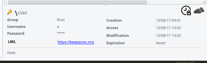
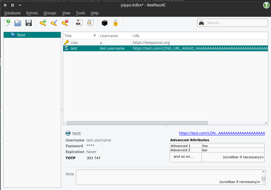
Solution 1: Not much space for the Note below
Solution 2:
What do you guys think? Opinions?
PS: Yes, the TOTP progress bar is not working ATM
TheZ3ro
on 13 Aug 2017
I prefer solution 2.
rwky
on 13 Aug 2017
If you put the URL in the first line, it should be right after the name, not at the right-hand side. It looks very misaligned otherwise. I also don't like the vertical line. Perhaps make the labels bold to separate them from the contents.
To take things to the next level, the preview pane could also have an inline edit feature when you click on a value.
 phoerious
on 13 Aug 2017
phoerious
on 13 Aug 2017
I don't really like the URL after the name, bold labels look good

For the inline edit I think it will be an extra, maybe we can open a new issue in wishlist
TheZ3ro
on 13 Aug 2017
The last one looks ok...
andusvan
on 13 Aug 2017
URL has to go either there or in a field like the rest (would probably make the most sense). If it's too long, I would prefer an ellipsis somewhere in the middle (so you can still see the scheme and the end of the URL).
phoerious
on 13 Aug 2017
I personally find notes, custom entries, and attachments to be the most important to have in the preview, because they are neither visible as a column in the list, nor quickly accessible. Apart from expiration date and clickable URL, the rest are not that relevant to me. (Actually, clicking on fields to copy them to clipboard might be a nice touch, but that's a whole other story.)
This is all my personal opinion/use case and I don't think it is a problem to just have everything in there, I would just like to also have easy access to notes, custom entries, and attachments.
Edit: If space is an issue, then maybe one could have different tabs in the preview panel for basic (notes, etc.) and more technical (access date, etc.) information.
 HifeFish
on 13 Aug 2017
HifeFish
on 13 Aug 2017
If you are going to put all this info in the preview pane it would be incredibly handy to have a little button next to each one to copy to clipboard. URL should be away from the title. Perhaps you can display the title like: [group]\[subgroups]\[title]
Root should just display as \[title]
This would align with the CLI and free up a spot for the URL field.
IMO, in the upper right there should be icons to represent the special fields (TOTP, HTTP always allow, etc). Click the icon and it copies the relevant text into clipboard.
 droidmonkey
on 14 Aug 2017
droidmonkey
on 14 Aug 2017
@droidmonkey the problem with this is that a very long URL will broke the layout since there isn't much space
Anyway I like the group suggestion and the totp/hotp buttons
TheZ3ro
on 14 Aug 2017
That's why you should elide the middle part.
phoerious
on 14 Aug 2017
You have a ton of whitespace in the current layout and you can't control for length of every field. I bet i can make a username that overflows
droidmonkey
on 14 Aug 2017
Just an update to get more suggestions
URL shrinking + TOTP button + Note text area
TheZ3ro
on 15 Aug 2017
I'd be happy with that :+1:
rwky
on 15 Aug 2017
Nice! Is there an easy way to hide/show the preview panel?
droidmonkey
on 15 Aug 2017
Seems quite good to me. I would however put the group together with the
name of entry, one because it's a lot of space otherwise lost unused, and
two because it's clear at a glance what entry (possibly with a duplicate
name) I am looking at.
E.
On 15 Aug 2017 12:31 pm, "Jonathan White" notifications@github.com wrote:
Nice!
—
You are receiving this because you are subscribed to this thread.
Reply to this email directly, view it on GitHub
https://github.com/keepassxreboot/keepassxc/issues/454#issuecomment-322434014,
or mute the thread
https://github.com/notifications/unsubscribe-auth/AMqpZM0IA42hoXDIfhQHDTShoGyhuQ9Fks5sYXNmgaJpZM4MwIHH
.
 seatedscribe
on 15 Aug 2017
seatedscribe
on 15 Aug 2017
@seatedscribe Yes that was already a proposal that I'm working on
@droidmonkey Right now you can drag the spacer down to hide/show the detail view or alternatively you can hide it permanently in the settings
I'm thinking about the group preview as well, then I will submit a PR
TheZ3ro
on 15 Aug 2017
I propose an x or similar in top right of pane that shades of up/down with one click. Perhaps also a keyboard shortcut (ctrl+p)?
droidmonkey
on 15 Aug 2017
create/access/modify/expiration also take up a _lot_ of space. Personally, I practically never look at these timestamps, certainly not on a daily basis.
 ccoenen
on 31 Aug 2017
ccoenen
on 31 Aug 2017
I wonder if the design could not use more work still. Like ccoenen I do not see the point in including information that does not often need quick access - by which I mean the create/access/modified timestamps. Is there still no easy way to view advanced attributes? Or am I wrong? Either way, I often make use of them, but I cannot see them without View/Edit and then clicking on the list item. Here is my (bad) mockup if it's not already resolved, and if anyone is interested:
I just hope I don't seem pushy or anything ;) I don't intend to stir up trouble. (And obviously the URL and TOTP can remain the same. I personally liked the URL right justified in the corner, but I'd be happy just to know that advanced attributes are visible. I don't mind the current design aside from that. It's already a thousand times better than no preview pane after all.)
Oh, and I'd like to add that some people might not include the protocol in the URL field. I don't, since it takes up more space that could go toward my possibly-too-long titles in certain groups. I don't think I would click on the URLs though, so I don't mind a bit - just something to consider. I didn't see anybody else mention it.
 afdsgsg
on 12 Sep 2017
afdsgsg
on 12 Sep 2017
The thing is that people can add N advanced attributes where N is a big number, and it's not possible to show them all in that little space. We can maybe fit the first 2-3 attrbutes. IDK
TheZ3ro
on 12 Sep 2017
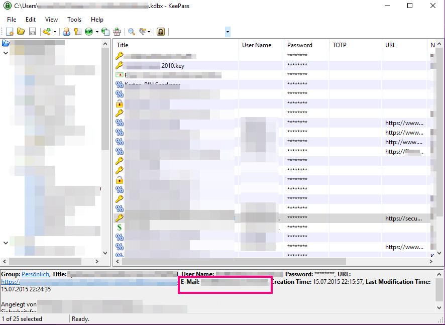
Here's what KeePass does: Custom fields just display at the beginning of the field along with other structured fields. All of it is followed by an entry's "note" field. I've highlighted "E-Mail" which is one of my custom fields I use regularly (I like my username seperate ;-) ).
This is not ideal, too. But it's very compact. For one thing, I dislike that the positions of _everything_ shift around depending on the length of username, url and all the other fields.
ccoenen
on 12 Sep 2017
@TheZ3ro It is true that there might be a lot of custom fields. But how many have you actually ever seen in practise? I know few people who use custom fields, and those that do use them, have perhaps 2-5 custom fields, not all of them at the same time.
KeePassXC should not crash, but I feel if someone has 800 custom fields, they are pretty alone with that use case. And I am OK with not catering to that person's needs.
ccoenen
on 12 Sep 2017
Honestly I think KeePassXC layout is better than that wall-of-text in KeePass :smile:
I will try out some layout and report here ASAP
TheZ3ro
on 12 Sep 2017
I think so, too. As I said: this is not ideal. But it is very compact.
I like the structured proposals better, too.
ccoenen
on 12 Sep 2017
I like the idea to show the custom fields.
Make the custom fields to show in the preview pane selectable.
Just add a list to the settings and maybe restrict this list to 5 items?
The "creation/addess/modification/expiration" fields are seldom of interest.
How about using a notebook widget here? You could put these fields in a second tab called "Metadata". Just ensure that the selected tab isn't changed when selecting a new entry. This way you could browse through the metadata of the entries without additional clicks (only with the up/down keys).
andusvan
on 12 Sep 2017
@andusvan I was thinking exactly about that. Need to see how it fits :wink:
TheZ3ro
on 12 Sep 2017
I've an update on this. Tell me what do you guys think about this
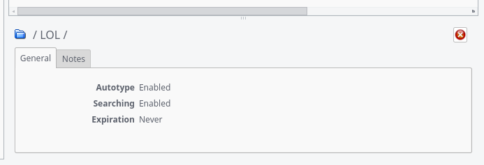
Entry general tab
Entry custom attributes tab
Entry notes tab
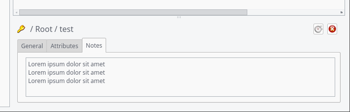
An entry that doesn't have custom attributes and doesn't have notes
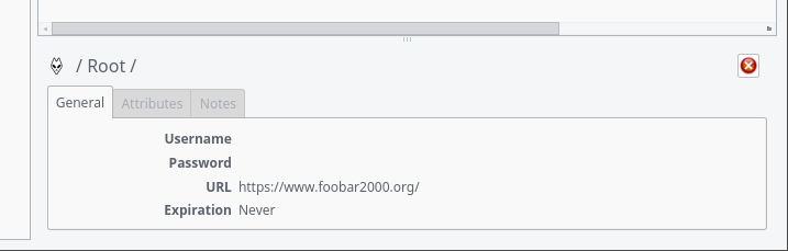
Autotype Association for entry
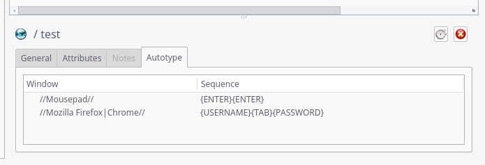
Group (never has attributes or autotype)
TheZ3ro
on 20 Sep 2017
Looks good to me :+1:
rwky
on 20 Sep 2017
I like the tabs.
For groups, I would actually prefer a smaller panel on the left below the group tree instead. Seems more intuitive to me than having group info attached to the entry list. That might require new code though.
HifeFish
on 20 Sep 2017
Look much better.
To be consistent the data of the "General" tab of entries and groups should contain the same infos.
Or the other way around: Why do you show the Creation/Access/Modification dates on a group but not on an entry? Do you think it is used here more often?
Put this infos into it's own tab for both entries and groups.
And if a group can never have attributes and note hide the tabs completely...
Just my 2¢ ;-)
andusvan
on 20 Sep 2017
Actually, Groups can have notes.
@HifeFish The space under the group list is very small. I don't think it will fit.
@andusvan I've maintained the Creation/Access/Modification data just because I haven't touched the Group panel since last time :smile: I agree that we can remove that from groups as well.
Sadly you can't easily "hide" tabs. You had to remove the widget from the QTabBar but keep a pointer to it to re-insert it when displaying an entry
TheZ3ro
on 20 Sep 2017
Sadly you can't easily "hide" tabs. You had to remove the widget from the QTabBar but keep a pointer to it to re-insert it when displaying an entry.
Yes I know. I stumbled across this too. Now, if a group cannot have attributes you only have to store one pointer. Or remove and add the tab as needed...
andusvan
on 20 Sep 2017
Wow that's a beautiful layout!
droidmonkey
on 20 Sep 2017
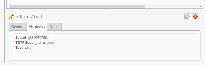
With the last commit on #879 i've added the following:
- Details panel is visible by default (can be hidden permanently in settings, temporary with the slider or the X button)
- Passwords are hidden by default (can be changed in settings)
- Show Autotype association for entries (suggested by @droidmonkey )
- Protected attributes are shown as
[PROTECTED] - Root group isn't shown in entries' path
- Hi-res icons are resized to 16x16 to don't mess up the layout
- Remove Creation/Access/Modification data (suggested by @andusvan)
- Remove Attributes and Autotype Tabs for Groups (they can't have those) (suggested by @andusvan)
- Selected tab isn't changed when selecting a new entry/group (suggested by @andusvan)
Also I've updated the last 2 screenshots here https://github.com/keepassxreboot/keepassxc/issues/454#issuecomment-330925919
Any more suggestions?
TheZ3ro
on 29 Sep 2017
Not at the moment, Great work.
Maybe we will have some new ideas, if we have used it...
Thanks!
andusvan
on 29 Sep 2017
This looks very good! Can't wait to give it a try :)
ccoenen
on 29 Sep 2017
If you want to test this in the meantime you can manually compile the feature/preview-panel branch :smile:
TheZ3ro
on 30 Sep 2017
Hi,
I will apreciate a way to see the password without having to open the element.
Maybe also a simple column in the primary view for the password (better the possibility to choice what colums to be displayed).
Old keepassx had the possibility to select the column to be displayed.
 ogio71
on 24 Oct 2017
ogio71
on 24 Oct 2017
Related issues
 mstarke
·
3Comments
mstarke
·
3Comments
 MountainX
·
3Comments
MountainX
·
3Comments
 2tbwXj46BDbdNBRV79DS
·
3Comments
2tbwXj46BDbdNBRV79DS
·
3Comments
 guihkx
·
3Comments
guihkx
·
3Comments
 shaneknysh
·
3Comments
shaneknysh
·
3Comments
Most helpful comment
I was trying something, any suggestion?
the password is hidden by default, in the settings there is an option to always display it, I'm also working on a small button to hide and show it
I'm also working on placing the entry's icon in the first line before the title
valid URLs (with http/https) will be clickable
I'm planning to also add the current TOTP token if the entry has TOTP enabled