Keepass2android: [Enhancement] Consistent use of password font.
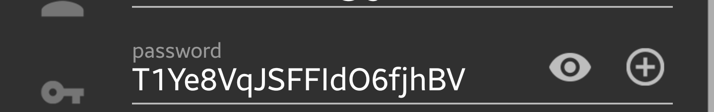
As of 1.04b, the password font (DejaVu Sans Mono) is used when viewing stored passwords, but when editing, creating or generating passwords, KP2A falls back to some default UI font, in which I, l, 0, O etc. are much harder to tell apart. Consistent use of DejaVu Mono, whenever a password is shown, would, I think, make certain user errors less likely, such as, for example, misreading a newly generated password and thus sign up somewhere with a different password than what actually gets stored in the KP2A database.
Personally, I'd be ok with the entire UI using DejaVu, but that might break certain style guides.
 wikholm
All 4 comments
I've also run in to this issue.
 rmgr
on 27 Sep 2018
rmgr
on 27 Sep 2018
Just came to post this bug! Please fix to font that is clear what each letter/number is (ideally one where ZERO has a dot or slash in the middle of it). It's also strange to me that they are two different fonts too... why not use the same font in both screens?!
Not clear:
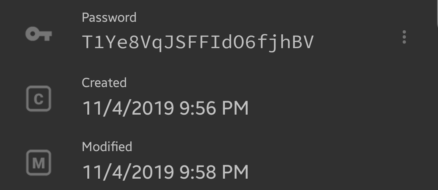
Clear:
 daevidvincent
on 17 Nov 2019
daevidvincent
on 17 Nov 2019
Personally I'm still finding it hard to distinguish between zero 0 and capital oh O in the displayed password
 Zhaph
on 25 Dec 2019
Zhaph
on 25 Dec 2019
Please update font
 vk5880
on 6 Jan 2020
vk5880
on 6 Jan 2020
Related issues
 GuillaumeCz
·
5Comments
GuillaumeCz
·
5Comments
 Erwyn
·
4Comments
Erwyn
·
4Comments
 ghost
·
3Comments
ghost
·
3Comments
 4-FLOSS-Free-Libre-Open-Source-Software
·
5Comments
4-FLOSS-Free-Libre-Open-Source-Software
·
5Comments
 spocko
·
4Comments
spocko
·
4Comments
Most helpful comment
Just came to post this bug! Please fix to font that is clear what each letter/number is (ideally one where ZERO has a dot or slash in the middle of it). It's also strange to me that they are two different fonts too... why not use the same font in both screens?!
Not clear:

Clear:
