Katex: Square root line position is inconsistent (depending on its contents)
This is on a Retina MBP.
The line above the contents of a square root is inconsistently placed. Interestingly, I just tested this on writelatex.com and they have a similar, but not identical, issue.
Some symbols (seemingly dependent on their height and categorization) cause this issue while others do not. All numerical digits cause this issue, along with parentheses. Short letters (like 'a') result in the whole square root dropping, but I think that is expected. Letters like "h" and "l" cause the rendering to be correct, unless a parenthesis is there. It seems like the tallest character determines the behavior.
I'm not sure if the top of the sqrt symbol is supposed to line up perfectly with the horizontal bar, or if there is supposed to be a little tail sticking out there. writelatex.com also has a slight tail sometimes. I don't have a native LaTeX renderer installed, so I can't test that.
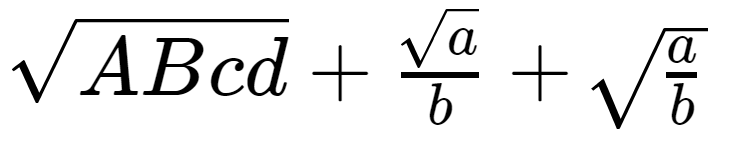
KaTeX:

(blown up:)

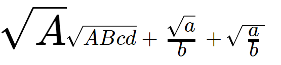
writeLaTeX.com: (PDF output)

 phoenixeliot
All 28 comments
Interesting. It also depends a lot on the font the expression is rendered at, for me. I tend to test things at large font sizes so I can spot differences easier, but this makes me overlook problems like this. Maybe I should make the testing page show in multiple font sizes or something.
 xymostech
on 17 Sep 2014
xymostech
on 17 Sep 2014
Ideally, it would line up exactly. Due to small differences in font rendering, it's hard to make this happen consistently but there may be improvements we can make; not sure.
 sophiebits
on 17 Sep 2014
sophiebits
on 17 Sep 2014
If the content of the square root affects the height of the overline in subtle ways, it might be better to position the overline relative to the radical symbol. Since there's only 4 or 5 different size variants it'll cut down on any tweaking that needs to be done.
 kevinbarabash
on 18 Sep 2014
kevinbarabash
on 18 Sep 2014
s = \int_{a}^{b} \sqrt{ 1 + f'(x)^2 } \, dx

 jasondavies
on 24 Oct 2014
jasondavies
on 24 Oct 2014
Is there any workaround for Windows?
I don't think I do anything fancy - styles on my site are based on Bootstrap, yet every sqrt sign has the line in a bad place.
I am open to solutions like fixing some particular font/size/whatever combination if that would help.
I can add some custom CSS styles if that's needed.
Is there any temporary solution to this problem, which could let me transition production from MathJax to KaTeX ? :)
Not sure if this helps investigating the problem, but I've noticed that the horizontal line gets into correct position in Chrome if I change the browser zoom to 150%. Perhaps this is a browser rendering issue then?
 qbolec
on 4 Nov 2015
qbolec
on 4 Nov 2015
It also seems that only particular font-sizes look bad:
14px - bad
15px - ok
20px - bad
21px - ok
Too bad that Bootstrap uses 14px as the default :/
qbolec
on 4 Nov 2015
Looked a bit into this. One problem is, that the line is implemented using a CSS border property, which browsers render differently than fonts.
See this experiment: On my machine I tried to perfectly align the underscore (representing the square root character) and a <span> with some border. I can observe that,
- the underscore is rendered a bit aliased, whereas the border is a perfect rectangle, and
- scaling down or up using the browser zoom function or by changing the font size shows, that especially in small sizes the border gets visually thinner than the underscore and also moves around a bit.
I assume this is different for other systems and browsers and so on. I thought about using a line character which is embedded into a font, but have not tried anything in this direction yet.
edit: Safari, Mac OS.
 jannschu
on 15 Feb 2017
jannschu
on 15 Feb 2017
@ronkok do you think it's feasible to use the same approach you used with the stretchy elements to fix this issue?
kevinbarabash
on 3 Jul 2017
@kevinbarabash, I doubt that using an SVG image would help. In general, I found that span borders gave better looking renderings than SVG images. Still worth a try, I suppose.
Another thing to try is box-sizing: border-box; CSS to locate the sqrt-line span and its border. Sometimes that method can evade floating point errors in the browser's internal calculations. In this case, I'd rate the likelihood of success to be <50%, but that is enough to make it worth a try.
 ronkok
on 3 Jul 2017
ronkok
on 3 Jul 2017
@ronkok I was thinking that maybe the radical symbol and the radical line could be in the same SVG similar to how the stretchy arrows are. This would guarantee that the top of the surd and the radical line would match up for all font sizes, wouldn't it?
As for avoid floating-point errors, I think the issue is that font sizes are quantized to the nearest pixel. This means that while the radical line is in the right spot, the height of the radical symbol isn't what it should be.
kevinbarabash
on 3 Jul 2017
@kevinbarabash, I had not thought of putting the radical and the viniculum into the same SVG image. That's an outstanding idea!
Here's a general plan for the JavaScript: (1) Make the radicand into a group node. (2) Add padding to the left of that span that equals the width of the radical. (3) Call svgSpan to get the radical/viniculum image. It would be a nested SVG like the arrows, so the viniculum would stretch but the radical would not stretch. (4) Call buildHTML.makeVList to put it all together.
The weak point of that plan is step (4) makeVList. The radical will be taller than 1 em, so step (4) is blocked by issue #746. Or perhaps, we avoid makeVList and use custom code for vertical alignment in this case.
Other than step (4), it looks pretty easy. And I'm sure that (4) can be overcome, too. It just won't be quite as easy as making a call to makeVList.
Does that all seem reasonable to you?
ronkok
on 3 Jul 2017
@kevinbarabash, It occurs to me that IE/Edge do not support CSS mask and so they would not support \color for an SVG radical. That concerns me. I think \sqrt is used much more frequently than anything I added in PR #670. So I offer some options:
- Proceed using the methods from PR #670. Let Edge render all radicals in black.
- Wait until Edge supports CSS
mask. - Make an exception for
\sqrt, and have (Edge|sever-side rendering) write the entire SVG code for a radical inline whenever it is subject to\color. (That would make Edge support\colorright now.) If/when Edge supportsmask, do another PR to make\sqrtconsistent with other SVGs.
Which would you prefer?
ronkok
on 3 Jul 2017
Here's a general plan for the JavaScript: (1) Make the radicand into a group node.
The rest of the plan sounds good. Could you elaborate on (1)?
Which would you prefer?
Let's go with 1 so that things are consistent. That's too bad about Edge not supporting CSS mask. fwiw I voted for it on https://wpdev.uservoice.com/forums/257854-microsoft-edge-developer/suggestions/6261341-css-masking.
The weak point of that plan is step (4) makeVList. The radical will be taller than 1 em, so step (4) is blocked by issue #746. Or perhaps, we avoid makeVList and use custom code for vertical alignment in this case.
Maybe we can add an element with a fixed height that matches the height of the radical. Is this what you meant by "custom code for vertical alignment"?
kevinbarabash
on 4 Jul 2017
By plan step (1), make a group node, I mean nothing more than some code that already exists in groupTypes.sqrt. It starts out with:
const inner = buildGroup(group.value.body, options.havingCrampedStyle());
That's all I meant by plan step (1). Plan step (2) is to add some padding on the left end of inner. That will push it over to the right. Then I can overlay the image, and the radical will overlay into the padded space.
Now the custom code for plan step (4): I'm working up a function to use as an alternate to buildCommon.makeVList . The proposed function will be much simpler than makeVList because it will be purpose-built to deal with just one special case, that is, one element that is located on the base line and a second element that is a tall image.
I'm calling the proposed function makeImageVList. With that in hand, it will be easy to get the correct vertical alignment for \boxed, \overbracket, \underbracket, and these radicals. It's all coming together nicely.
ronkok
on 4 Jul 2017
@ronkok sounds good to me. I'm glad to hear that it's coming together nicely. I can't wait to see the results. This problem has plagued KaTeX for a long time. I excited at the prospect that we may soon have a solution to it. Thanks for taking this on.
kevinbarabash
on 4 Jul 2017
@kevinbarabash, Two items re: \sqrt:
- Do you want a oldsqrt function?
- If I don’t finish this weekend, then this might take several weeks. Time demands are picking up.
ronkok
on 8 Jul 2017
@ronkok don't worry about keeping the old implementation. If it takes a while that's okay.
kevinbarabash
on 8 Jul 2017
Preview of coming attractions:
ronkok
on 8 Jul 2017
That looks awesome! Can you post a screenshot at some smaller font sizes? Small font sizes seem to be where the current approach really breaks down.
kevinbarabash
on 9 Jul 2017
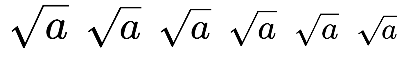
In this shot, there is one normalsize radical, to show the scale. The others are in \tiny font size. Don't worry about the height of the last radical. I just haven't got to that part of the code yet.
ronkok
on 9 Jul 2017
What about if the outer font size is different sizes? Like 16px, 15px, 14px, 13px, 12px, 11px, 10px. It used to be that many of those would be misaligned.
sophiebits
on 9 Jul 2017
Below are tiny radicals, subject to all the outer font sizes that you mentioned.
ronkok
on 9 Jul 2017
Those look much bigger than the sizes I mentioned? Not sure if I'm missing something.
sophiebits
on 9 Jul 2017
I zoomed the browser in to 400%, to get a detailed look. At normal magnification, these are small. Below are the same radicals. This screen shot was done at 100% and magnified afterward.
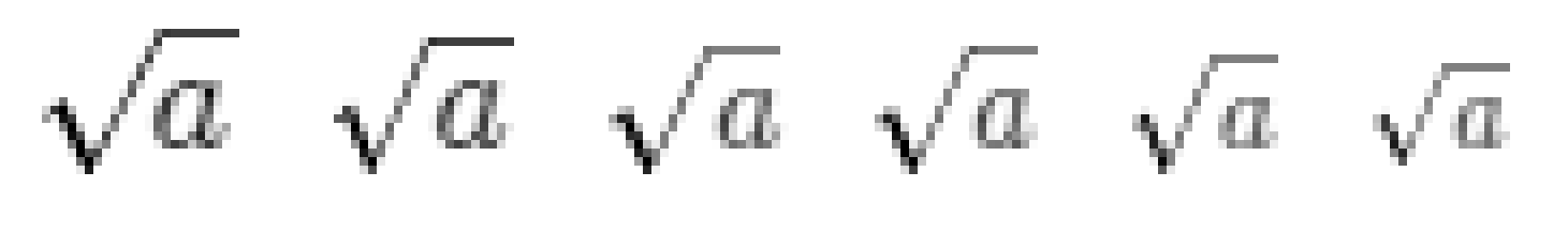
ronkok
on 9 Jul 2017
OK cool. That looks good! Oftentimes in the past I saw that they would not line up at small sizes but would line up if you zoomed in.
sophiebits
on 9 Jul 2017
Progress report: I have prepared SVGs in each radical size. Sizes and styles look good. \color remains to be done and progress is going to slow down tomorrow. But I'm happy with how it looks so far.

ronkok
on 10 Jul 2017
Since PR #768 has now landed, it would be good to get a view of the current \sqrt condition. Below are Chrome images from outer fonts sizes of 12 pt, 13 pt, 14 pt, 15 pt, 19 pt, 20 pt and 21 pt. These sizes had the worst \sqrt rendering.

That may be an improvement over earlier rendering. It's pretty close to spot on. But, since it isn't perfect, I'll go ahead and prepare a PR that uses background SVG images. Then we can compare and pick the better option. It's not obvious to me which choice that will be.
ronkok
on 30 Jul 2017
Fixed by #810.
kevinbarabash
on 23 Aug 2017
Related issues
 yawnoc
·
3Comments
yawnoc
·
3Comments
 oddhack
·
3Comments
oddhack
·
3Comments
 q2apro
·
3Comments
q2apro
·
3Comments
 msridhar
·
3Comments
msridhar
·
3Comments
 pvnr0082t
·
4Comments
pvnr0082t
·
4Comments
Most helpful comment
Preview of coming attractions:
