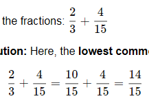
In v0.9.0, I see some good fraction lines and some overly thick grey ones (Chrome on Windows)

Firefox is a bit better in that it is less obvious (at least on my monitor setup). In the fractions on the first line, it appears to have a darker bottom 1px line and a lighter "shadow" above it, the middle line is good, and the last line is mostly thick grey:

So unfortunately it doesn't appear that using path in the svg has completely fixed it.
I'm sticking with v0.9.0-alpha for my production site for now.
 mbourne
All 32 comments
Well, that’s disappointing. I hoped that we had fixed things. @kevinbarabash, I’ll recap below the various ways that I have attempted to help.
| Version | Ink Source | Ink Height | Span Height | Results |
|:-------------|:---------------|:---------------|:----------------------|:---------------------------------------------------------------------------------------------------------------------|
| 0.9.0-alpha | span
border | 0.04em | 0.04em | Base case. Many reports of disappearing fraction lines. |
| 0.9.0-alpha1 | span
border | 0.04em | 0.04em
min-height:1px | Improvement, but not complete success. Reports come in that there are still a few disappearing lines. |
| 0.9.0-alpha2 | SVG
path | Big | 0.04em | Some lines are rendered thinner than standard. This teaches us that browsers handle span.height imprecisely. |
| 0.9.0-beta | SVG
line | 0.04em | 0.2em | Spans no longer pinch down on line ink. @akalin reports a complete fix. |
| 0.9.0-beta1 | SVG
line | 0.04em | 0.2em | No change in the code, but reports come in that some lines are too thick. |
| 0.9.0 | SVG
path | 0.04em | 0.2em | @mbourne reports that some lines have fuzzy edges and some are gray. This is due to anti-aliasing on the paths. |
v0.9.0 looks terrific on my Microsoft Surface and I suspect that the anti-aliasing is a problem that diminishes with higher pixel density. So it may not be a future problem.
Still, it’s a problem right now. I have two more arrows in my quiver.
- Apply
shape-rendering: crispEdgesto the SVG path of a frac-line. - Keep the tall (0.2em) span but switch the 0.04em ink from a SVG path back to a span border. Use margin to align it properly. We haven’t yet tried a border inside a tall span. Maybe it was the span pinching that caused the problem.
I expect the results would be similar in both cases. The good part is that a black line will not have a fuzzy edge. The risk is that we may once again get some lines that are too thick or, worse yet, we may see a currently gray line disappear altogether. If that happens, then we will have to either live with the anti-aliasing or depart from TeX purity and make the frac-lines thicker.
@mbourne, if I build both of those versions and make them available, would you mind downloading and testing them?
 ronkok
on 19 Feb 2018
ronkok
on 19 Feb 2018
@ronkok I really appreciate your hard work on this issue and understand your pain.
Sure - I'm very happy to try out those 2 approaches for you.
(BTW, I think I'm currently sticking to 0.9.0-alpha1- I got a bit lost with the letters/numbers in those releases.)
mbourne
on 19 Feb 2018
Results are in on the shape-rendering: crispEdges approach. In Chrome, on a monitor with 166 pixels per inch, I get many missing frac-lines. It's not acceptable.
I'll move on to the span-border-in-a-wide-span approach next.
ronkok
on 19 Feb 2018
Is shape-rendering: geometricPrecision worth trying? I'd actually never noticed it as an option before, but it sounds like what we want...
 edemaine
on 20 Feb 2018
edemaine
on 20 Feb 2018
I'd also like to point out that, in these examples, the lines span only 1 or 2 pixels. I think it's reasonable for a thin line to render as gray and 1 or 2 pixels wide (depending on alignment with pixels) via anti-aliasing. Of course, it doesn't hurt to search for a better rendering, but this one may be the most "accurate" (in representing subpixel offsets via grays, as antialiasing aims to do).
edemaine
on 20 Feb 2018
It doesn't hurt to try shape-rendering: geometricPrecision. And I will try it, but I don't expect it to help.
it doesn't hurt to search for a better rendering
That's what I'm doing, but it is not a completely open-ended search. If it turns out that occasional anti-aliasing is the price to be paid for always-on frac-lines, then I'll be willing to settle for that.
ronkok
on 20 Feb 2018
Math with geometricPrecision has no missing frac-lines. That's good. And there's more.
On a 267 dpi screen, by my eyeball test, frac-line thickness matches the arrow shaft thickness of stretchy arrows. I expected that.
On a 166 dpi screen, frac-lines look thicker than the stretchy arrows. That surprised me. It might be just what we need. Later this evening, I'll put up a build so that @mbourne can test it.
ronkok
on 20 Feb 2018
On a 166 dpi screen, frac-lines look thicker than the stretchy arrows
Only in Chrome, not in IE 11.
ronkok
on 20 Feb 2018
@mbourne I have temporarily put a zip file here. It contains a copy of katex.js and katex.css built with the shape-rendering: geometricPrecision suggested by @edemaine.
I would appreciate it if you would try it out and tell me how it works with your test cases.
ronkok
on 20 Feb 2018
@ronkok Here's the same portion from my earlier post, once again Windows/Chrome. The fraction lines are still thick, but a little darker, which is better:
On Firefox that particular portion looks good:
Sometimes there is slight fuzziness, but acceptable:

Sometimes thick with descending shadow as in the middle line of this portion:
Opera tends to be thick and dark:
While here's IE11:
Here's the production page https://www.intmath.com/factoring-fractions/7-addition-subtraction-fractions.php where I'm still using 0.9.0-alpha1 (I think). I get uniformly good fraction lines with none disappearing. The fraction line is given by: <span class="frac-line" style="border-bottom-width: 0.04em;"></span>
My preference would be to go back to that fraction line setting!
I'm using .katex{font-size:1.15em} For the cases where lines were disappearing in 0.9.0-alpha1, is it possible to suggest they tweak the .katex class font-size and see what happens?
mbourne
on 21 Feb 2018
@ronkok thanks for the recap.
I'd rather have some anti-aliasing fuzziness in the short term as opposed to the line disappearing in certain situations. I think there are two things that we might look at in the future to address the anti-aliasing:
- round the height to the nearest pixel (probably not that hard)
- try to adjust the vertical position such that it lines up with pixel boundaries (hard)
I think we'll want to look at the vertical positioning. When testing nested fractions I noticed that sometimes the fraction bar is higher than it should be, sometimes lower, and sometimes just right. If you look carefully you can see this in some of the screenshots that @mbourne posted.
 kevinbarabash
on 21 Feb 2018
kevinbarabash
on 21 Feb 2018
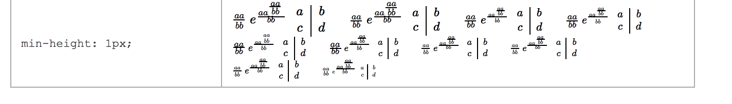
@mbourne may be on to something. I've run some tests and they were surprising. I've put up a test page with the results.
ronkok
on 22 Feb 2018
Given what I see on the test page, I propose to change frac-lines from SVG paths back to span borders and apply the min-height CSS found on the bottom row of the test page tables. Span borders, so long as they appear, are better than SVG paths. They look better, they probably render faster, and their underlying code is cleaner and simpler to maintain.
I would be happy to write the PR to make this happen. Comments?
ronkok
on 23 Feb 2018
This sounds good to me. How does this differ from 0.9.0-alpha1, and why did we switch? (I'm guessing there's an added CSS rule?)
edemaine
on 23 Feb 2018
We switched because we got two reports that some frac-lines were still disappearing in 0.9.0-alpha1.
The proposed differs from 0.9.0-alpha1 only by deleting one CSS rule. We would keep:
@media screen {
  .katex .mfrac .frac-line {
    min-height: 1px;
  }
}
But we would delete:
@media screen and (-webkit-min-device-pixel-ratio: 2), screen and (min-resolution: 192dpi) {
  .katex .mfrac .frac-line {
    min-height: 0.5px;
  }
}
I now believe that second rule was not helping much and in fact it was causing some MacBook Airs to not render the frac-line. Without that second rule, I believe we would have reliable lines.
It would be good to see this thoroughly tested. Our current release, 0.9.0, has reliable lines, so we have a minimally viable product. The proposed step will improve the rendering but we should do it only if we're sure that the lines never disappear.
@akalin, @kkiningh, You once reported that v0.9.0-alpha1 was omiting some frac-lines. Would you mind going to the test page and tell me what you see in the bottom rows of each table?
ronkok
on 23 Feb 2018
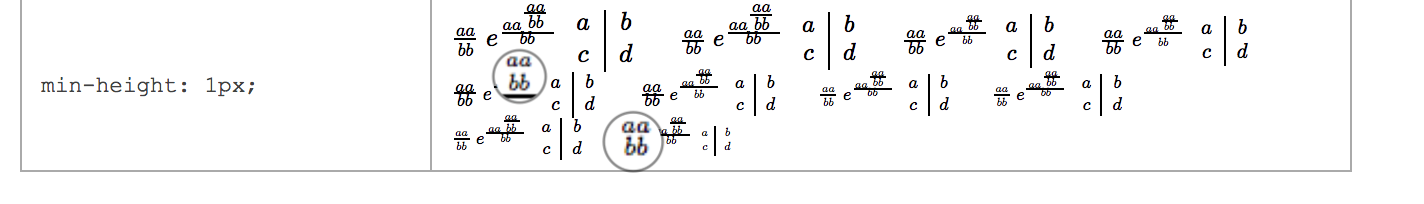
Table 1:
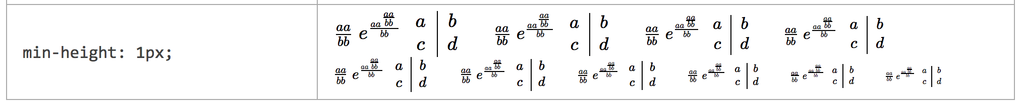
Table 2:
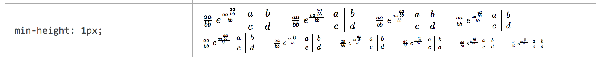
Table 3:

 kkiningh
on 23 Feb 2018
kkiningh
on 23 Feb 2018
@kkiningh Thank you. That corroborates what I've seen. All the frac-lines appear. A few of the lines in scriptscript style are a bit thick, but that drawback is, I think, less serious than the fuzzy edges and gray lines reported by @mbourne in v0.9.0.
@kkiningh When you looked at the test page, were you using the same screen as when you reported some missing lines in v0.9.0-alpha1?
ronkok
on 23 Feb 2018
Same screen (15" 2017 MBP), although my chrome and OSX version have changed.
kkiningh
on 23 Feb 2018
It'd be good to test on a non-retina device if we haven't already done so.
kevinbarabash
on 24 Feb 2018
@ronkok: Thanks for your efforts on this. Fairly obviously, I agree with your proposal! Hopefully all is good on non-retina devices. (FWIW: The last line of each table shows each frac line successfully on the non-retina touch laptop I'm currently using.)
mbourne
on 24 Feb 2018
Here's what i see on my 2015 retina Macbook pro:
Table 1:
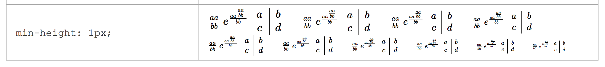
Table 2:

Table 3:

 akalin
on 24 Feb 2018
akalin
on 24 Feb 2018
It'd be good to test on a non-retina device if we haven't already done so.
Below are screen shots from a screen whose resolution is 166 dpi, per http://dpi.lv/. Since it's resolution is less than 192 dpi, the bottom row of each table matches the middle row.
Table 1:

Table 2:

Table 3:

Once again, all the frac-lines appear. Again, the scriptscriptstyle lines eat up the top and bottom kerns, but I that's to be expected at 166 dpi.
ronkok
on 25 Feb 2018
I believe this may be an issue with the rendering of sub-pixel borders since Chrome 62. A workaround/fix is to use a 'thin' line instead of 0.04em.
 arnog
on 27 Feb 2018
arnog
on 27 Feb 2018
@ronkok Definitely sounds like there's plenty of evidence to make this switch. I also like the relative simplicity of CSS borders over SVG for such a common feature.
@arnog thin seems pretty imprecise according to the spec. For example, MDN says "the specification doesn't define the exact thickness denoted by each keyword, the precise result when using one of them is implementation-specific. Nevertheless, they always follow the pattern thin ≤ medium ≤ thick, and the values are constant within a single document".
edemaine
on 27 Feb 2018
Also, I can't think of a way to use thin and also support authors who write math in 72pt font. The frac-line needs to scale with external font-size.
@kevinbarabash I can write up a PR. I want to avoid merge conflicts with PR #1152, so I would like to either (1) Wait until after PR #1152 lands, or (2) revise #1152 to use span borders for frac-lines. Which would you prefer?
ronkok
on 27 Feb 2018
@edemaine agree that it's extremely annoying and only partially addresses the issue. I think the only viable fix is to have it fixed in Chrome.
To reproduce the problem more easily, in addition to using retina screens, try to vary the zoom level (up or down). In some (apparently) random cases, the borders will disappear. This happens on both Mac and Windows.
arnog
on 27 Feb 2018
@arnog, Would you mind looking at the text page, vary the zoom level as you describe, and tell me if any frac-lines disappear in any of the table bottom rows?
ronkok
on 27 Feb 2018
Yes, there are a few that still do disappear, at 67% zoom level. The same thing happens with both min-height: 1px; and if (resolution > 192 dpi) { min-height: 0.5px;}.
(Tested on Chrome 64 Mac displayed on a Retina screen)
arnog
on 27 Feb 2018
Well, that's disappointing. But let me note some context.
The missing lines are from 12pt scriptscriptstyle and 7pt normal size fractions, depicted at 67% zoom. For people over 50 years old, such missing lines are no loss. We (I'm 60) don't actually read anything of that size. It's not legible to us. Instead, that sort of thing is only an indicator that a text block exists and that we might want bring it into focus by adjusting the zoom level to something readable.
So a missing frac-line is no loss to us oldsters if it only occurs at such a tiny size. Others here no doubt have a different perspective. I'd like to hear them. But my opinion is that these particular missing lines are not a deal breaker. I'm still willing to proceed with span borders in place of SVG paths.
ronkok
on 28 Feb 2018
That's a reasonable course of action. One can hope that this issue will get fixed in Chrome at some point anyway. It's probably related to https://bugs.chromium.org/p/chromium/issues/detail?id=756345 or https://bugs.chromium.org/p/chromium/issues/detail?id=763402.
arnog
on 28 Feb 2018
I'm not sure too many people would zoom to 67% and if they did, they probably would have more than missing frac lines to worry about. It's basically impossible to read any of the text at that zoom level (as Ron indicated).
For the record, on Win10/Chrome, the lines are all still there in the bottom rows for me at 67%:

Some of them start to disappear at 50%, however I don't really think it's an issue. :-)
mbourne
on 1 Mar 2018
This should be fixed by #1249, which is in 0.10.0-alpha.
edemaine
on 31 May 2018
Related issues
 yawnoc
·
3Comments
yawnoc
·
3Comments
 shaunc
·
4Comments
shaunc
·
4Comments
 q2apro
·
3Comments
q2apro
·
3Comments
 hagenw
·
3Comments
hagenw
·
3Comments
 ylemkimon
·
3Comments
ylemkimon
·
3Comments
Most helpful comment
Below are screen shots from a screen whose resolution is 166 dpi, per http://dpi.lv/. Since it's resolution is less than 192 dpi, the bottom row of each table matches the middle row.
Table 1:

Table 2:

Table 3:

Once again, all the frac-lines appear. Again, the
scriptscriptstylelines eat up the top and bottom kerns, but I that's to be expected at 166 dpi.