Is there a way to break formula's if they are to wide (with respect to their parent) ?
 scaljeri
All 33 comments
Not currently, but I was talking to @xymostech and the rules sound simple (breaking is allowed after any top-level rel or bin) so it might not be too difficult to add.
 sophiebits
on 10 Aug 2015
sophiebits
on 10 Aug 2015
+1 I really need this feature. Is responsiveness also included in the equation ?
scaljeri
on 10 Aug 2015
I don't know what you mean by that, sorry?
sophiebits
on 10 Aug 2015
For example, if you switch from landscape to portrait, the formula adjusts to the space it has (responsive)
scaljeri
on 10 Aug 2015
I find responsiveness is a big problem here.
Formules viewed from mobile break all responsive design.
They are too long, the view point is auto scaled to adapt these formulas.
I can not shorten the width of the formulas by setting width to a smaller value.
Really want to know any workaround.
 invkrh
on 1 Apr 2016
invkrh
on 1 Apr 2016
@invkrh: Some possibilities until responsiveness becomes a feature in KaTeX:
(1) Give the enclosing element a style of "overflow:auto". Then your math will be full size and users can scroll the equation left and right to see it all.
For me, this has serious drawbacks, since on most mobile devices there is no indication that the element can be scrolled horizontally (no horizontal scrollbar appears like you get on a desktop browser, until you actually start scrolling the element. So if the page edge comes at an awkward part of the equation, it's possible the user has no idea that scrolling is possible and will never see the hidden part. It's possible to add a horizontal scroll bar with javascript of course).
Another option is display:table
http://netdna.webdesignerdepot.com/uploads7/how-to-create-horizontal-scrolling-using-display-table-cell/table-layout-horizontal/
(2) What I do is
(a) Manually break the equation into pieces at logical places (like equal signs, plus signs, minus signs, etc) so it will wrap logically
(b) For cases where splitting the equation is not possible, (it's a fraction, say), I nudge the font-size down with javascript until it does fit. I get away with that most of the time with the content on my site.
You can see both these things going on in this page (including in the drop-down answer sections):
http://m.intmath.com/fourier-series/2-full-range-fourier-series.php
The elements that cannot be split and that I know will not fit into a 300 px width are given the class "fitToWidth". The function "fitWidth" reduces the font-size if required.
I know it's clunky and could be done better (including the addition of an onRotate handler), but that will need to wait until the next revamp.
For the mobile version of my site, I mostly lay things out vertically when the LHS of an equation is quite wide.
Hope it helps.
Regards
Murray
 mbourne
on 2 Apr 2016
mbourne
on 2 Apr 2016
@mbourne
Thank you for the idea using the horizontal scroll bar and overflow.
Also, I make the bar visible all the time.
The workaround really works.
Looking forward to the responsiveness of Katex. =)
invkrh
on 3 Apr 2016
This would only line break inline equations and make displayed equations scroll.
Took me a while to figure it out, but you may simply copy this into the CSS file.
.katex-display > .katex {
  display: inline-block;
  white-space: nowrap;
  max-width: 100%;
  overflow-x: scroll;
  text-align: initial;
}
.katex {
  font: normal 1.21em KaTeX_Main, Times New Roman, serif;
  line-height: 1.2;
  white-space: normal;
  text-indent: 0;
}
Works perfectly on responsive pages, as far as I'm concerned.
Leave a like if you find this working nice.
 jeffswt
on 4 Apr 2017
jeffswt
on 4 Apr 2017
@invkrh we ended adding a wrapper around each equation that would scale to fit and then if the user tapped it would zoom to the normal size and would allow the user to scroll within the container. It wouldn't not cause the width of the page to expand. The scrolling part is what @jeffswt has suggested. The zooming/scrolling are both workarounds for not being able to break long expressions.
 kevinbarabash
on 16 Apr 2017
kevinbarabash
on 16 Apr 2017
In principle the proposed css resolution works. I'm using the following at the moment:
.katex-display > .katex {
max-width: 100%;
}
.katex-display > .katex > .katex-html {
max-width: 100%;
overflow-x: auto;
overflow-y: hidden;
padding-left: 2px;
padding-right: 2px;
}
But it can lead to some unwanted consequences.
Normal screen size:

Small screen size with overflow scrolling:

 hagenw
on 3 Dec 2017
hagenw
on 3 Dec 2017
@hagenw That's more likely to do with #824.
 edemaine
on 3 Dec 2017
edemaine
on 3 Dec 2017
LaTeX supports automatic line breaking for inline math. Here are some experiments:
Here is a long line of text.
Here is a long line of text.
Here is a $x+y+z+w+a+b+c$. % auto breaks after z+
Here is a long line of text.
Here is a long line of text.
Here is a $xyzabcdefghijklmnopqrstuvwxyz$. % doesn't auto break
Here is a long line of text.
Here is a long line of text.
Here is a $xyzabcdefghij\allowbreak klmnopqrstuvwxyz$. % auto breaks at \allowbreak

In my opinion, this aspect would be super useful, and is maybe what was originally requested. We should try to implement it, with proper line breaking rules (only after ops?).
edemaine
on 17 Dec 2017
We'd like to replace MathJax with KaTeX for a probability textbook at Berkeley: https://textbook.prob140.org/
The line breaking issue is currently a blocker for us since we've already written a bunch of long equations that KaTeX cuts off, for example:

We are currently using MathJax's automatic line breaking functionality (http://docs.mathjax.org/en/latest/output.html#automatic-line-breaking) which gives a reasonable-looking output for these cases:

We can get around this with using:
.katex {
white-space: normal;
}
Which gives:

As you can see, this doesn't produce great output.
It would be great for us if KaTeX could support a rendering option like MathJax's that breaks long block-level equations in a reasonable way.
 SamLau95
on 16 Jan 2018
SamLau95
on 16 Jan 2018
Is there any progress with breaking lines for too wide formulas?
 ItsMeSousuke
on 19 Apr 2018
ItsMeSousuke
on 19 Apr 2018
@ItsMeSousuke not that I'm aware of.
kevinbarabash
on 22 Apr 2018
1287 is a first stab at doing line breaks for inline math (not display math). Testing would be appreciated!
edemaine
on 4 May 2018
PR #1287 is merged; feel free to test it out on the master branch. So the inline case is done. I'm going to close this issue, as issue #1023 covers the display case (in my opinion -- feel free to make alternate proposals if you'd like).
edemaine
on 11 May 2018
This CSS does a good job for me:
.katex > .katex-html {
white-space: normal;
}
.katex .base {
margin-top: 2px;
margin-bottom: 2px;
}
 ccorcos
on 26 Apr 2019
ccorcos
on 26 Apr 2019
The overflow solution sometimes also annoyingly cuts off equations when viewed in desktop

To get around this, it might be better to wrap the css so that it is mobile only:
@media only screen and (max-width: 600px) {
.katex-display > .katex {
max-width: 100%;
overflow-x: auto;
overflow-y: hidden;
}
}
 hanzhihua1
on 17 Jul 2019
hanzhihua1
on 17 Jul 2019
This may not work for you but here:
.katex {
white-space: normal;
}
.katex .katex-html {
overflow-wrap: normal;
}
.katex .mord {
display: inline-block;
}
 MicroDroid
on 22 Nov 2019
MicroDroid
on 22 Nov 2019
This would only line break inline equations and make displayed equations scroll.
Took me a while to figure it out, but you may simply copy this into the CSS file.
.katex-display > .katex {
  display: inline-block;
  white-space: nowrap;
  max-width: 100%;
  overflow-x: scroll;
  text-align: initial;
}
.katex {
  font: normal 1.21em KaTeX_Main, Times New Roman, serif;
  line-height: 1.2;
  white-space: normal;
  text-indent: 0;
}
Works perfectly on responsive pages, as far as I'm concerned.
Leave a like if you find this working nice.
What should I do if need to break a displayed equation?
 Varun-msd
on 26 Oct 2020
Varun-msd
on 26 Oct 2020
For the mobile layout and getting the horizontal scrollbar to show up, I have tried all proposed solutions above, without success. The horizontal scrollbar is still not showing up.
You might try it yourself over here: https://www.mathelounge.de/765244/wieso-konvergiert-a-n-1-1-n-n-gegen-0?show=765257#a765257
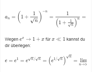
Both equations are wider than the screen, but the scrollbar stays invisible.
I have added this CSS:
.katex-display {
    overflow-x: auto; /* or "scroll" */
}
.katex-display > .katex {
    max-width: 100%;
    overflow-x: auto; /* or "scroll" */
}
Has something changed with Katex or is it maybe Chrome or something complete different? Thanks.
 q2apro
on 27 Oct 2020
q2apro
on 27 Oct 2020
In your example, the scrollbars do appear once the user starts to scroll left-right.
To ensure the scrollbar stays visible all the time, you can use a class "overflowXauto" as follows:
.overflowXauto{
  display:block;
  height:auto;
  padding-bottom:12px;
  -webkit-box-sizing:border-box;
  overflow-x:auto;
  white-space:nowrap
}
.overflowXauto::-webkit-scrollbar{
  height:8px
}
.overflowXauto::-webkit-scrollbar-track{
  -webkit-box-shadow:inset 0 0 4px rgba(0,0,0,0.3);
  border-radius: 7px
}
.overflowXauto::-webkit-scrollbar-thumb{
  border-radius:7px;
  -webkit-box-shadow:inset 0 0 8px rgba(0,0,0,0.5)
}
.overflowXauto::-webkit-scrollbar-thumb:hover{
  -webkit-box-shadow:inset 0 0 4px rgba(0,0,0,0.8)
}
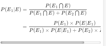
This ensures the user can see scrolling is possible. See it in action here (Method 1 formula):
https://www.intmath.com/counting-probability/10-bayes-theorem.php
Hope it helps.
Murray
mbourne
on 27 Oct 2020
In your example, the scrollbars do appear once the user starts to scroll left-right.
To ensure the scrollbar stays visible all the time, you can use a class "overflowXauto" as follows:
.overflowXauto{
display:block;
height:auto;
padding-bottom:12px;
-webkit-box-sizing:border-box;
overflow-x:auto;
white-space:nowrap
}
.overflowXauto::-webkit-scrollbar{
height:8px
}
.overflowXauto::-webkit-scrollbar-track{
-webkit-box-shadow:inset 0 0 4px rgba(0,0,0,0.3);
border-radius: 7px
}
.overflowXauto::-webkit-scrollbar-thumb{
border-radius:7px;
-webkit-box-shadow:inset 0 0 8px rgba(0,0,0,0.5)
}
.overflowXauto::-webkit-scrollbar-thumb:hover{
-webkit-box-shadow:inset 0 0 4px rgba(0,0,0,0.8)
}
This ensures the user can see scrolling is possible. See it in action here (Method 1 formula):https://www.intmath.com/counting-probability/10-bayes-theorem.php
Hope it helps.
Murray
My question is not about displaying the scrollbars, I need to break the equation which is overflowing out of the screen (Automatic break) i.e in whatsoever the equation shouldn't go outside of the screen (Scroll should not take place)
Varun-msd
on 27 Oct 2020
Thanks Murray. 🙇♂️ So we need to wrap each equation into this self-defined CSS class .overflowXauto?
Update:
I have replaced .overflowXauto with .katex-html in the CSS, now it works! Amazing. I hope there won't be any compatibility issues in the future. But well, then we fix them. ;)
q2apro
on 27 Oct 2020
It needs to be a block-level element, so yes, wrap any expressions that (may) need a scroll bar into a DIV with that class. You can make it skinnier if you want. The bottom padding was necessary because some KaTeX elements would be overlapped by the scroll bar without it.
mbourne
on 27 Oct 2020
@varun-msd; There is discussion on auto line-breaks earlier in this thread. See in particular https://github.com/KaTeX/KaTeX/issues/1023 , where it discusses what is already implemented in KaTeX.
mbourne
on 28 Oct 2020

`Without equation, it is working as overflow: scroll
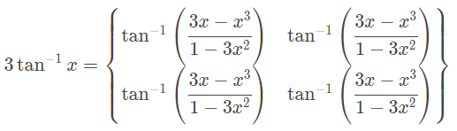
$Ta{n^{ - 1}}\left( {\cfrac{{3x - {x^3}}}{{1 - 3{x^2}}}} \right)Ta{n^{ - 1}}\left( {\cfrac{{3x - {x^3}}}{{1 - 3{x^2}}}} \right)Ta{n^{ - 1}}\left( {\cfrac{{3x - {x^3}}}{{1 - 3{x^2}}}} \right)Ta{n^{ - 1}}\left( {\cfrac{{3x - {x^3}}}{{1 - 3{x^2}}}} \right)Ta{n^{ - 1}}\left( {\cfrac{{3x - {x^3}}}{{1 - 3{x^2}}}} \right)$
Without array it is working as expected (Breaking properly)
begin{equation}
Ta{n^{ - 1}}\left( {\cfrac{{3x - {x^3}}}{{1 - 3{x^2}}}} \right)Ta{n^{ - 1}}\left( {\cfrac{{3x - {x^3}}}{{1 - 3{x^2}}}} \right)Ta{n^{ - 1}}\left( {\cfrac{{3x - {x^3}}}{{1 - 3{x^2}}}} \right)Ta{n^{ - 1}}\left( {\cfrac{{3x - {x^3}}}{{1 - 3{x^2}}}} \right)Ta{n^{ - 1}}\left( {\cfrac{{3x - {x^3}}}{{1 - 3{x^2}}}} \right)
end{equation}
With array and without equation (Not Breaking properly, overflow is scrolling)
- $3Ta{n^{ - 1}}x$$=\left{begin{array}{ccc} Ta{n^{ - 1}}\left( {\cfrac{{3x - {x^3}}}{{1 - 3{x^2}}}} \right), & if\;\cfrac{{ - 1}}{{\sqrt 3 }} < x < \cfrac{1}{{\sqrt 3 }} <= \cfrac{1}{{\sqrt 4 }} <= \cfrac{1}{{\sqrt 4 }} <= \cfrac{1}{{\sqrt 4 }} \ end{array}\right.$
With array and with equation it is not working as expected (Curly braces has problem) - THIS IS MY ISSUE
$3Ta{n^{ - 1}}x$$=\left{begin{array}{ccc} begin{equation}
Ta{n^{ - 1}}\left( {\cfrac{{3x - {x^3}}}{{1 - 3{x^2}}}} \right)Ta{n^{ - 1}}\left( {\cfrac{{3x - {x^3}}}{{1 - 3{x^2}}}} \right)Ta{n^{ - 1}}\left( {\cfrac{{3x - {x^3}}}{{1 - 3{x^2}}}} \right)Ta{n^{ - 1}}\left( {\cfrac{{3x - {x^3}}}{{1 - 3{x^2}}}} \right)Ta{n^{ - 1}}\left( {\cfrac{{3x - {x^3}}}{{1 - 3{x^2}}}} \right) end{equation}
end{array}\right}$
`
ISSUE: Why if I add an equation inside an array it's breaking?
Varun-msd
on 28 Oct 2020
In your example, the scrollbars do appear once the user starts to scroll left-right.
To ensure the scrollbar stays visible all the time, you can use a class "overflowXauto" as follows:
.overflowXauto{
display:block;
height:auto;
padding-bottom:12px;
-webkit-box-sizing:border-box;
overflow-x:auto;
white-space:nowrap
}
.overflowXauto::-webkit-scrollbar{
height:8px
}
.overflowXauto::-webkit-scrollbar-track{
-webkit-box-shadow:inset 0 0 4px rgba(0,0,0,0.3);
border-radius: 7px
}
.overflowXauto::-webkit-scrollbar-thumb{
border-radius:7px;
-webkit-box-shadow:inset 0 0 8px rgba(0,0,0,0.5)
}
.overflowXauto::-webkit-scrollbar-thumb:hover{
-webkit-box-shadow:inset 0 0 4px rgba(0,0,0,0.8)
}
This ensures the user can see scrolling is possible. See it in action here (Method 1 formula):https://www.intmath.com/counting-probability/10-bayes-theorem.php
Hope it helps.
Murray
Sometimes overflow-x CSS which has Katex is creating some extra space on the right side after the block
The hidden div creates the extra space
 varunraghu3112
on 24 Nov 2020
varunraghu3112
on 24 Nov 2020
@Varun-msd For your first case, the equation environment is not implemented in KaTeX at this point in time. You can see what environments are available on this page: https://katex.org/docs/supported.html#environments
In LaTeX, trigonometric function names conventionally appear as all lower case, and non-italic. The following version is simpler and I think is close to what you want for that third example:
3\tan^{-1}x=\begin{Bmatrix}
\tan^{-1}\left({\cfrac{{3x - {x^3}}}{{1 - 3{x^2}}}}\right) &
\tan^{-1}\left({\cfrac{{3x - {x^3}}}{{1 - 3{x^2}}}}\right) \\
\tan^{-1}\left({\cfrac{{3x - {x^3}}}{{1 - 3{x^2}}}}\right) &
\tan^{-1}\left({\cfrac{{3x - {x^3}}}{{1 - 3{x^2}}}}\right)
\end{Bmatrix}
It looks like the following using the KaTeX demo page https://katex.org/
For the second case, please provide a link to a minimal example (or a fiddle) so we can see what is going on.
Regards
Murray
mbourne
on 24 Nov 2020
In your example, the scrollbars do appear once the user starts to scroll left-right.
To ensure the scrollbar stays visible all the time, you can use a class "overflowXauto" as follows:
.overflowXauto{
display:block;
height:auto;
padding-bottom:12px;
-webkit-box-sizing:border-box;
overflow-x:auto;
white-space:nowrap
}
.overflowXauto::-webkit-scrollbar{
height:8px
}
.overflowXauto::-webkit-scrollbar-track{
-webkit-box-shadow:inset 0 0 4px rgba(0,0,0,0.3);
border-radius: 7px
}
.overflowXauto::-webkit-scrollbar-thumb{
border-radius:7px;
-webkit-box-shadow:inset 0 0 8px rgba(0,0,0,0.5)
}
.overflowXauto::-webkit-scrollbar-thumb:hover{
-webkit-box-shadow:inset 0 0 4px rgba(0,0,0,0.8)
}
This ensures the user can see scrolling is possible. See it in action here (Method 1 formula):
https://www.intmath.com/counting-probability/10-bayes-theorem.php
Hope it helps.
MurraySometimes overflow-x CSS which has Katex is creating some extra space on the right side after the block
The hidden div creates the extra space
@mbourne any update on this issue ?
varunraghu3112
on 24 Nov 2020
Yes, as I said at the end of my last reply, "For the second case, please provide a link to a minimal example (or a fiddle) so we can see what is going on."
mbourne
on 24 Nov 2020
@mbourne position: relative solved the issue !
varunraghu3112
on 25 Nov 2020
Related issues
hagenw
·
3Comments
 fabiospampinato
·
4Comments
sophiebits
·
3Comments
fabiospampinato
·
4Comments
sophiebits
·
3Comments
 pyramation
·
4Comments
pyramation
·
4Comments
 jason-s
·
3Comments
jason-s
·
3Comments
Most helpful comment
This would only line break inline equations and make displayed equations scroll.
Took me a while to figure it out, but you may simply copy this into the CSS file.
Works perfectly on responsive pages, as far as I'm concerned.
Leave a like if you find this working nice.