Back in March 2018, the Jenkins X project burst onto the scene as the Jenkins counterpart for automated CI/CD for Kubernetes. As part of that launch featured the logo: a variation of the Jenkins logo, featuring a pipe-smoking ship captain with Kubernetes logo on his cap.
In software, we like to say that naming is hard - because it is. Another thing that is also hard is trying to capture the essence of a project in a logo. Logos pack a lot of meaning into a small space. Icons, such as the Jenkins logo, establish a strong emotional connection with many developers. So with that in mind we always listened closely to feedback on the new logo and how people perceive the project as a result of it.
In listening to various types of feedback from all sorts of different sources we heard many positive things but also some problems and confusion were highlighted.
Not everyone was a fan of the logo and we heard quite a few comments back about aspects that people didn’t like about it, with the ‘pipe-smoking’ featuring high on that list.
Confusion with Jenkins project - we also saw that the logo was more in keeping with other Jenkins mascots, which led to confusion about what kind of project Jenkins X is some perceived it as another plugin in the ecosystem.
- We also heard that use of the Kubernetes logo was confusing or perhaps not completely within the remit of the Kubernetes logo guidelines.
- From a practical perspective we also heard that the logo was too detailed and as a result would not work well as an icon, especially for a favicon. It was seen as more of a mascot than a logo.
With the setup of the CD.Foundation and Jenkins X being one of the founding projects, distinct from Jenkins, we felt the time was right to address this feedback. So we literally went back to the drawing board to think about what logo could better represent Jenkins X as a project. We thought about what we want people to associate with the project: open source, continuous delivery, speed, automation, stability, teams, etc. We also wanted a logo that could improve representation, so we wanted to avoid a human-based logo that might inadvertently encode gender, age and other factors.
Ultimately we focussed on trying to visualize speed and automation which led to the idea of a robot. However, we still wanted to have a nod to the original Jenkins project featured in the logo somehow or the other. We explicitly decided to not stick with the nautical theme traditionally associated with Kubernetes and related projects. We went through a few iterations, refining and cutting down details as we went. The design effort was a close partnership with Craig Ross, Creative Director at the Linux Foundation and his team, who also produced the CD Foundation, CNCF, Network Service Mesh, and Tekton brands.
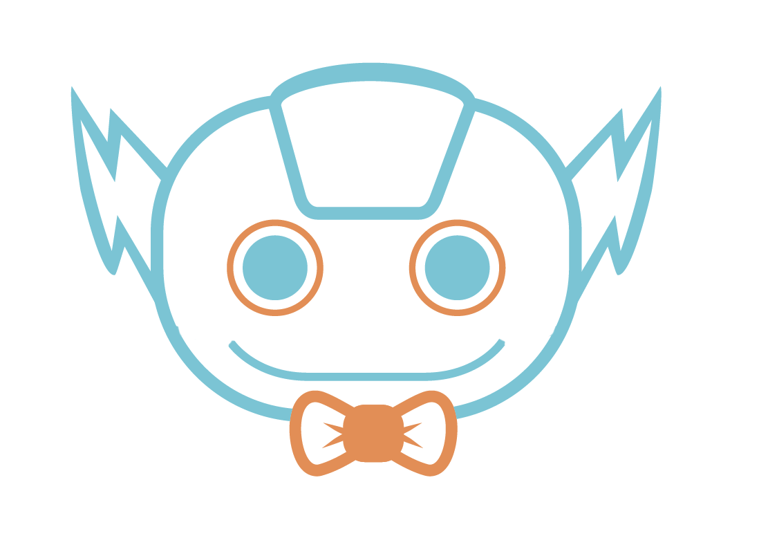
All this has led to our new icon featured below:
:rocket:

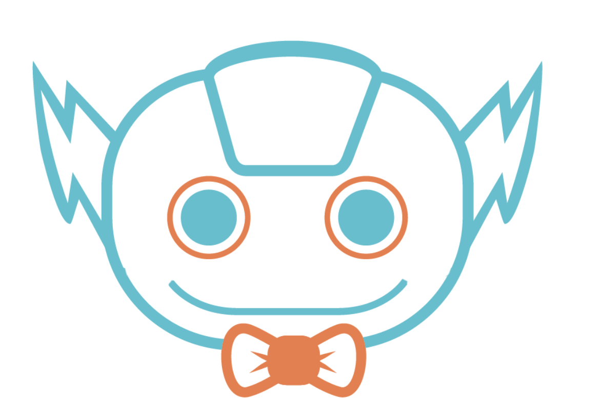
And with a slightly different variation with a fatter "X":
:tada:

We are pretty happy with how it turned out, we think it is awesome. We love the focus on our signature X as well as having the Jenkins butler bowtie featured as well.
We had a chance to get feedback from the community at the CD Summit event and KubeCon Barcelona in person. Happy to say overall people were very positive - acknowledging it is very different from Jenkins or the previous logo but liking the new direction.
It is a big change for the project but ultimately the reason we put so much time and energy into this is that is important to us we represent the spirit of Jenkins X in everything we do. So when you are using Jenkins X, and you see the new logo, we want you and your team to focus on what you really want to focus on: delivering quality software at speed and at any scale.
Let us know what you think
We'd love to hear your feedback on these proposals so please vote 🚀 for the first option and 🎉 for the second.
 rawlingsj
All 31 comments
🎉
 kmadel
on 31 May 2019
kmadel
on 31 May 2019
The robot appears a tad creepy! He doesn't come across as very helping, unlike the community and the tool
 heroic
on 31 May 2019
heroic
on 31 May 2019
Looks awesome, I'm voting for 🚀
Though I think it would look good with the fat X positioned behind and in the middle of the Jenkins text, then I might change my vote
 warrenbailey
on 31 May 2019
warrenbailey
on 31 May 2019
I like it overall. A few comments:
• Maybe it's just me, but the robot looks a bit too angry (vs. helpful/welcoming/etc.)
• Good that it's different from Jenkins because we still share the name so it's the right balance between acknowledging the link and making Jenkins X more independent
• I heard feedback that it looks a tiny bit too much like the Tekton logo
 moritzplassnig
on 31 May 2019
moritzplassnig
on 31 May 2019
🚀
 daveconde
on 31 May 2019
daveconde
on 31 May 2019
I like that it's ginger and white, like me
 edwardmlyte
on 31 May 2019
edwardmlyte
on 31 May 2019
I mean the little captain jenkins was still very cool...
 nukepuppy
on 31 May 2019
nukepuppy
on 31 May 2019
For my part, none of the logos to date really answer the question “Would you trust all of your critical infrastructure to this product?” with the degree of confidence I think is necessary from a corporate logo. The new robot certainly manages to convey a mix of ‘cutesy’, ‘psychopathic’ and ‘snappy dress sense’ that I’ve never seen in any other product marketing…
 tdcox
on 31 May 2019
tdcox
on 31 May 2019
The new design style on the CloudBees homepage is much better, in my opinion. Corporate but still friendly and approachable without being too cute.
tdcox
on 31 May 2019
A little facial hair may not hurt - 
 deanesmith
on 31 May 2019
deanesmith
on 31 May 2019
I agree with all the highlighted issues you mention.
Honestly the awkward smile is an an artifact of our "weird face detection" part of our brains. I think it's because of the lines that go from the corners of the smile to the edge of the face. I removed them here to show you that the smile looks more "happy" and less creepy without them. (Not saying this should be the end result, just illustrating the effect.)
 kyounger
on 31 May 2019
kyounger
on 31 May 2019
All great feedback - keep it coming
rawlingsj
on 31 May 2019
My 2¢ as a random user: so long as its called "jenkins
 surlyengineer
on 31 May 2019
surlyengineer
on 31 May 2019
@kyounger that does look way more friendly
 polothy
on 31 May 2019
polothy
on 31 May 2019
The color design looks like "work in progress": The main blueish color is rather weak (little character). I'd suggest a more saturated color. And the usage of orange seems odd. Why are the eyes orange? I'd suggest a different hightlighting color. The orange bowtie is nice. I'd even make the bowtie bigger as it is the main differentiator - Robot logos are plenty these days and will grow much more in numbers. And maybe put an "X" on the robot as well if it's such a big focus point (on the forehead panel?), as the font won't be visible all the time.
Also he reminds me of a robot "The Flash" Gordon because of the "ears". I don't know if that's good.
 freeo
on 3 Jun 2019
freeo
on 3 Jun 2019
I admire the effort to work on branding but I'm not sure about the logo. Looks a bit like an upside down bird/koala with a bow on its head? Kinda agree with @surlyengineer that the confusion is more about the name than the logo. I quite like the existing logo.
 sdoxsee
on 4 Jun 2019
sdoxsee
on 4 Jun 2019
I don't like it. The color is hideous, the form is much to complex. A logo should be simple, but still express what the product stands for.
 bjfr
on 4 Jun 2019
bjfr
on 4 Jun 2019
Specifically I think it's eyes look creepy like it is trying to hypnotise you into committing <insert some evil act here>.
Subjectively I don't like it. It does not convey the relevance to me and it makes me think of a generic kids toy.
 jtnord
on 4 Jun 2019
jtnord
on 4 Jun 2019
I like it but I don't love it. I'd opt for the "regular" JenkinsX and not the fat one. I can't steer my eyes away from the "X" and the bow tie in the fat version. The bow tie reminds me of Bill Nye, which is cool I guess, but it's close enough to its mouth to chew on. Might want to see what it looks like a little lower.
 schottsfired
on 6 Jun 2019
schottsfired
on 6 Jun 2019
When I saw the photo on #group-xforce and hadn't yet zoomed in (think: person not sitting in the front row but a little bit from the stage) I thought it was a creepy-ized version of the Tekton logo. The mouth disappeared and the bowtie looked like a gas mask. Zombie eyes. Sorry for the negs, but nuh uh.
 aprilkmay
on 12 Jun 2019
aprilkmay
on 12 Jun 2019
I agree we need a new logo and using a variation on the Jenkins Buttler doesn't make any sense now that the default installation relies on Serverless+Tekton.
I also think from this point of view we mostly need a new name, before a logo.
That being said, I don't like much this proposal. Colors are too washy and general concept of a friendly robot looks like a toy (as noted by @jtnord) better than a production grade end-to-end solution. Would be better with more abstraction
 ndeloof
on 13 Jun 2019
ndeloof
on 13 Jun 2019
Thanks for feedback everybody, we will be reviewing it all and hope to share an update after CD Summit China!
rawlingsj
on 19 Jun 2019
Love the idea of a logo! Definitely a great initiative. Not too keen on this particular design, however. I echo a lot of the sentiment I've read from others on this thread. I'm not sure exactly what it is I'm looking at and what point we're trying to get across via the logo. If the "Jenkins X" was taken away, would we know what we're looking at? The character also comes off as a little scary, imo. My 2 cents :)
 pkthunda
on 19 Jun 2019
pkthunda
on 19 Jun 2019
This logo reminds me ...
ndeloof
on 8 Jul 2019
Thanks all, we've come up with our final logo choice. We will share the final version on July 23 in the Jenkins X newsletter (https://jenkins-x.io/community/) and also at the Jenkins X office hours on July 25th - hope you can join us then.
rawlingsj
on 18 Jul 2019
Issues go stale after 90d of inactivity.
Mark the issue as fresh with /remove-lifecycle stale.
Stale issues rot after an additional 30d of inactivity and eventually close.
If this issue is safe to close now please do so with /close.
Provide feedback via https://jenkins-x.io/community.
/lifecycle stale
 jenkins-x-bot
on 12 Mar 2020
jenkins-x-bot
on 12 Mar 2020
Stale issues rot after 30d of inactivity.
Mark the issue as fresh with /remove-lifecycle rotten.
Rotten issues close after an additional 30d of inactivity.
If this issue is safe to close now please do so with /close.
Provide feedback via https://jenkins-x.io/community.
/lifecycle rotten
jenkins-x-bot
on 11 Apr 2020
Rotten issues close after 30d of inactivity.
Reopen the issue with /reopen.
Mark the issue as fresh with /remove-lifecycle rotten.
Provide feedback via https://jenkins-x.io/community.
/close
jenkins-x-bot
on 11 May 2020
deanesmith
on 12 May 2020
/close
deanesmith
on 12 May 2020
@deanesmith: Closing this issue.
In response to this:
/close
Instructions for interacting with me using PR comments are available here. If you have questions or suggestions related to my behavior, please file an issue against the jenkins-x/lighthouse repository.
jenkins-x-bot
on 12 May 2020
Related issues
 vgallissot
·
5Comments
vgallissot
·
5Comments
 kevinsuperped
·
5Comments
kevinsuperped
·
5Comments
 shahnewazrifat
·
3Comments
shahnewazrifat
·
3Comments
 renatoaraujoc
·
3Comments
renatoaraujoc
·
3Comments
 jstrachan
·
4Comments
jstrachan
·
4Comments
Most helpful comment
I agree with all the highlighted issues you mention.
Honestly the awkward smile is an an artifact of our "weird face detection" part of our brains. I think it's because of the lines that go from the corners of the smile to the edge of the face. I removed them here to show you that the smile looks more "happy" and less creepy without them. (Not saying this should be the end result, just illustrating the effect.)