Is there a logo for jupytext? Might be useful for people (like me) that want to give it a shout-out in presentations etc :-)
 choldgraf
All 15 comments
There isn't a logo currently, but for sure I'd love to have one !
The problem is that I don't really know where to start! Or maybe, yes, there is this blog post by @rgbkrk : https://blog.nteract.io/collaborating-on-visual-identity-8b70993f1bba ...
Do you think you could contribute one? Or do you know someone with experience on the subject that would be willing to?
 mwouts
on 20 Jun 2019
mwouts
on 20 Jun 2019
That's outta my skill set - but I bet that you could find someone in the open community to help with this - we did something like this for repo2docker and I think it turned out nicely :-)
choldgraf
on 20 Jun 2019
Hello @choldgraf, I just gave a try to wordcloud, that was fun... what do you think of the image below? Not really a logo, but maybe that could already fit well as a welcome page on the documentation.

mwouts
on 16 Nov 2019
Well, this definitely violates every rule I've ever been taught about logo design 😂 but I really like it as a replacement for a logo until one gets designed :-) I think it's quite clever!
choldgraf
on 16 Nov 2019
Hi @choldgraf, I just gave another try at a logo, actually Inkscape is pretty easy to use. What I have now is this:

What do you think? Where should we go next? (anyone willing to help can edit the svg at https://github.com/mwouts/jupytext/blob/logo/logo/logo_extensions.svg !)
mwouts
on 18 Jan 2020
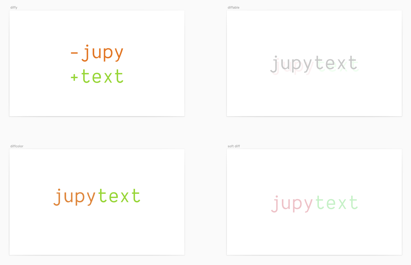
Some concepts, kind of off the cuff this morning:
Option 1:

Option 2:

Option 3:

Option 4:

 rgbkrk
on 22 Jan 2020
rgbkrk
on 22 Jan 2020
Here's a possibly better way to look at them with some whitespace:
rgbkrk
on 22 Jan 2020
Nice to see you here, @rgbkrk ! I love option 2. Let's see what the others think...
mwouts
on 22 Jan 2020
I'm partial to option 2 as well.
rgbkrk
on 22 Jan 2020
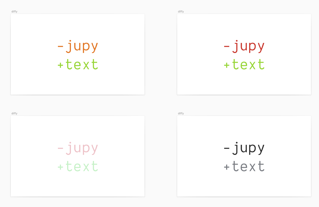
Some color variations on option 2:
rgbkrk
on 22 Jan 2020
wow, I really like number 2! I guess you could also square-ify the logo fairly easily when needed by just taking the first two letters, e.g.:

choldgraf
on 22 Jan 2020
Ooh, I like the compact logo idea for favicons and whatnot.
A slight variation with lower saturation on the + and -:

rgbkrk
on 22 Jan 2020
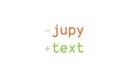
Even lower saturation on the + and -:
rgbkrk
on 22 Jan 2020
I think I like the "even lower" saturation one!
choldgraf
on 22 Jan 2020
:shipit:
Happy to make a PR with the SVG. I did the design in sketch though, so if folks want that I can post it too (though I think it's a binary file).
rgbkrk
on 23 Jan 2020
Related issues
 LukasMasuch
·
4Comments
choldgraf
·
8Comments
mwouts
·
4Comments
mwouts
·
10Comments
LukasMasuch
·
4Comments
choldgraf
·
8Comments
mwouts
·
4Comments
mwouts
·
10Comments
 zhuoqiang
·
6Comments
zhuoqiang
·
6Comments
Most helpful comment
Well, this definitely violates every rule I've ever been taught about logo design 😂 but I really like it as a replacement for a logo until one gets designed :-) I think it's quite clever!