This issue is meant to be a place to discuss how dashboarding could be accomplished in JupyterLab.
Related work:
https://github.com/jupyter/dashboards
https://github.com/jupyter/notebook/pull/1579
 blink1073
All 76 comments
A couple of questions to start the discussion:
- How easy/hard is to port the code from jupyter to jupyterlab ?
- Does anyone have critiques for the original jupyter dashboard?
Working on multiple projects that are basically glorified dashboard I have a few general insights I want to dump here.
Most dashboarding frameworks and software can be divided based on how they manage the space on the screen/paper.
- Basically free, as the actual Jupiter dashboards implementation.
- Places on a thin grid, such as Datadog does. Each element occupies about 20-30 "squares" of the grid. This is a compromise between flexibility for the user and a clear layout.
- A limited number of square-rectangular big tiles, like Dashing and Mozaik.
Screen size
Dashboards are nearly always used at full width, often fullscreen.
I've seen a few projects try to get dashboard developed as a content for a page fit into a fullscreen layout, and it gets messy quite easily.
Developing a dashboard on a 1080p display and showing it in a 4k display is not uncommon nowadays. 4k TVs are very cheap, 4k monitors still expensive and uncommon.
A few dashboard framework just display gigantic widget on such screens and do not use all the available resolution.
Elements content
Widgets in a dashboard are useless without a title or description of sorts. The appearance and position of the title should be standardized to be easy to find. A good example is the Mozaik framework http://mozaik.herokuapp.com/
Many popular data-science graph utility output static images, and their width/height ration can be changed only in the cell code. This is an excellent reason alone to use elements of a fixed proportion, this way the user is not stuck in a loop between moving the widgets around changing their content height/width ratio.
Color
Dashboards by their nature have a lot of empty space and generally require dark low-contrast colors to not tire the eye too much.
Markdown
In a dashboard layout, modifications should be made to the markdown renderer to render the h1 and h2 elements aligned to the center.
Where to write code
I think using the new layout of jupyterlab the cell code should be written separately from the dashboard visualization. I find pointless trying to fit code in a cell that maybe just displays a two digit number.
Examples
Dashing:

Datadog:

Jupyter dashboards:

Mozaik

 ddavidebor
on 7 Feb 2017
ddavidebor
on 7 Feb 2017
Thanks for kicking this off, @ddavidebor!
cc @parente
blink1073
on 7 Feb 2017
I'll be sure to chime in with lessons learned from the implementation in the classic notebook here as the discussion evolves. For the moment, I'll summarize by saying that:
- I / we (the devs of jupyter/dashboards) fully understand there are many ways to "do dashboarding"
- We picked a design that offered a reasonable amount of flexibility given we did not (and still do not) have a good grasp of what kinds of dashboards people would want to build using notebooks, and
- I personally think of the code over in jupyter/dashboards as a reference implementation, one meant to get people thinking about the concept and building things to test what works and what doesn't for the next go-around.
 parente
on 7 Feb 2017
parente
on 7 Feb 2017
How portable is the code from Jupyter dashboards to JupyterLab?
ddavidebor
on 9 Feb 2017
A direct port of the Jupyter dashboards seems like a steep path due how much of the Notebook's JavaScript and CSS APIs it is using, in addition to the assumption of a single notebook being only content on the page.
blink1073
on 9 Feb 2017
@blink1073 How about something that can interface with Kibana (see Mozilla Rust example)
 willingc
on 9 Feb 2017
willingc
on 9 Feb 2017
@willingc, very cool cloud solution, thanks!
blink1073
on 9 Feb 2017
@blink1073 You can run Kibana locally too. 🏄 (dashboards keeps reminding me of surfboards).
willingc
on 9 Feb 2017
Oh, even better. The surfing woman icon doesn't render the way you'd think: 🏄♀️ . Edit: looks like it does once out of edit mode).
blink1073
on 9 Feb 2017
I know I tried to do both emojis. Also Kibana is open source by the same folks that make Elastic (Elasticsearch). I suspect that there are others similar in concept too.
willingc
on 9 Feb 2017
Kibana is quite awesome and extremely expandable with plugins.
With the addition of Timelion they added support for other sources of data. Is not pertinent in this particular case but it's a good move in the direction of supporting broader backends than elasticsearch only.
The main competitor of Kibana is Grafana, but is way way way specialized in timeseries data (exclusively).
Kibana's main developer is always experimenting around new ways of looking into data.
This is a good demo of a vanilla Kibana http://demo.elastic.co/beats/app/kibana . For some reason is missing Timelion.
A dashboard based on Kibana could be implemented as a Kibana app (one of the many in the left sidebar). Graphs and outputs could be exported into dashboards elements quite easily. The dashboarding part is already taken care of.
Both Visualize and Timelion would be a good (core) plugin to fork as a basis for a Jupyter-Kibana dashboard.
Timelion is cleaner and may be a good start. They've procrastinated a long time in implementing a multi-line editor in Timelion and i'm sure Elastic would be pretty happy having someone kicking it towards someting more serious (even if from a fork they would have to merge).
The main downside of Kibana is that it uses elasticsearch to save the user and dashboard data.
ddavidebor
on 9 Feb 2017
I started a comment yesterday and never hit the big green button. Here goes again!
I don't think porting the code from the classic notebook extension makes sense for the same reasons @blink1073 gave. I think some of the concepts are worth preserving based on the use I've seen.
- The extension started with support for grid-mode layout. Almost immediately, we found that people simply wanted top-to-bottom, full width dashboards with some cells hidden and some removed. The fanciness of rows and columns was icing on a cake that users didn't really need for their just-good-enough dashboards. (cc @jtyberg)
- The ability to share a notebook and have it carry its one (or more) dashboard layouts with it for other users to experience is an oft used feature. We solved this by persisting the layout information in the notebook spec in the classic extension, but there are certainly other ways to do it.
- Some users expressed appreciation for the low-bar to entry. Other than the notebook extension, you don't have to setup anything else to create a dashboard layout and share it with other notebook users.
- People are still very interested in the ability to take a dashboard defined in Jupyter and run it as a standalone web app. The jupyter-incubator/dashboard_server is a stab at this, and one that proves that it's a hard problem to solve in the general case: supporting arbitrary notebook content running on an arbitrary web host, securing it, and making it all easy to deploy. (cc @cbcunc)
All of the above assume the notebook-as-a-dashboard model. As @blink1073 pointed out, since Lab can show multiple notebooks at a time, and the Lab UI itself is a sort of a tabbed-based dashboard, you could imagine assembling a dashboard layout from the piece-parts of multiple notebooks. That brings interesting new technical challenges like how to save and share the layout, how to bundle the notebooks with the layout when sharing, how to ensure all the kernels for all those notebooks in a single layout are running, etc. I think Databricks used to follow this approach for their notebooks, but then landed a solution much more like the notebook-as-dashboard design followed by the jupyter/dashboards extension.
Given the plethora of options, I'm wondering if a mailing list post or simple user survey might help here. What are Jupyter users doing to build dashboards today? How would they like JupyterLab to better facilitate that workflow, if at all?
parente
on 10 Feb 2017
@parente - do you know David (Taieb?)'s github username, to CC here? He was interested in participating in dashboard discussions too.
 jasongrout
on 10 Feb 2017
jasongrout
on 10 Feb 2017
Yes indeed. /cc @DTAIEB
parente
on 10 Feb 2017
So glad to see this discussion. It gives me hope. Thank @parente for tagging me.
I'm a user of jupyter/dashboards as deployed by jupyter-incubator/dashboards_bundlers and jupyter-incubator/dashboards_server. Here is how I'm using it:
This is an application developed by scientists and used by emergency managers. An important feature is that each emergency manager using the dashboard gets her own kernel instance so that they can operate independently of one another.
My group was hipped to dashboards_server by the IBM Emerging Technologies blog. I saw it as a way to rapidly present what scientists had done in a notebook to emergency managers who can't be expected to have Jupyter and jupyter_dashboards installed.
If you would like to know more about why they can't be expected to have those things installed, that is a longer explanation that I could go into at your request. Suffice to say, emergency managers would have a hard time even downloading a notebook file and putting it in the right place. But I think they are a target audience with a lot of similarities to audiences for whom dashboards are useful in general. Turning science into operations is also an important topic in most scientific fields.
I very much hope that this concept continues to be supported somehow in Jupyterlab. Having a way to go rapidly from data exploration to zero-install sharing is a huge win for science. The app bundler makes this as easy as clicking a button in Jupyter.
That said, here are some impressions on what has been said so far:
1) While @parente didn't know what kind of dashboards people would want to build while knowing that there are many ways to do dashboarding, I think he was very on target with his reference implementation. It was the last missing piece in the Jupyter workflow puzzle to me. And it worked in an intuitive fashion. I went from thinking Jupyter was close to being an app tool to actually being one. I know that there are those who consider Jupyter a data exploration tool only and not an app platform. But I believe ending up with an app as an artifact of data exploration not only fully exploits a notebook's potential impact in the world, but also makes Jupyter a tool of choice. Dashboards are expected today. And having to create bespoke applications to reimplement a notebook, even with kernelgateway, is usually a non-starter for most researchers.
2) As soon as emergency managers saw the first iteration of the notebook, their first request was for a look that required grid layout. Now, their request can be looked upon as bike-shedding. But I can't emphasize enough the importance of catering to look and feel expectations as they key to gaining acceptance of new science into operations.
3) In particular, there was a tool developed, https://github.com/matplotlib/jupyter-matplotlib (conda install -c conda-forge ipympl), which makes matplotlib output into an ipywidget so that it can be laid out independently of other ipywidgets. This is what enabled the ability to place the storm surge map to the side of the controlling widgets as requested by emergency managers. Top-to-bottom full width layout, while useful to some, is not sufficient for all.
4) Persisting layout in the notebook file was a great design decision that smooths out the workflow, and is consistent with other notebook extensions.
5) I hope decisions such as dashboard color are left to the dashboard creator. There are notebooks producing plots with color ramps which would be inappropriate for dark backgrounds.
6) While is can be useful for widgets to have titles, that is not so in all cases. I would love to be able to get rid of the (redundant) grey title bar above my ipympl plot.
7) I am somewhat worried about dashboards_bundler and dashboards_server. It needs some love. @parente no longer works for the group at IBM who developed it. And that group feels they have passed the torch on to the Jupyter team. Until this discussion, I couldn't tell that the Jupyter team was interested in picking it up. @parente tells me that it's a manpower issue. I don't think researchers who want to deploy dashboards are up to that challenge. There needs to be some attention to governance for how jupyter-incubator projects are transitioned. I am hoping not to feel like I was lured into dropping precious research time and funds on a technology with no future.
cc: @BrianOBlanton
 cbcunc
on 10 Feb 2017
cbcunc
on 10 Feb 2017
Thank you for that terrific insight, @ddavidebor.
I apologize if it seemed that dashboarding was dead. We do have dashboarding support in JupyterLab in our roadmap, and it is a primary feature we wish to support once we have feature parity with the core notebook.
blink1073
on 10 Feb 2017
@parente @jasongrout Yes, I'm very interested to participate in this discussion, thanks for including me.
A complimentary approach I would also like to consider is to provide a mean to publish from the notebook, an individual chart somewhere and get an embeddable url back. The motivation is that in a lot of use cases, users already have their own site where they'd like to embed the output. I reckon that the part that's harder to do is to come up with a mechanism for updating the chart when new data comes in.
Thought?
 DTAIEB
on 10 Feb 2017
DTAIEB
on 10 Feb 2017
I like @DTAIEB idea. An application with a main single content such as the one @cbcunc showed could be deployed as a content of a page easily.
Allowing single cells to be embedded also lowers the bar of entry for users that already rely on other (web based) applications to show their data.
It's also a good start to use dashboarding frameworks.
I'm also thinking >90% of the requests for content in the page do not require user interaction on most scenarios, and a caching mechanism would greatly reduce the load on Jupyter itself.
This could be as easy as a Nginx proxy with a custom config. It could work this way:
- requests for content without strange queries and user input are cached
- request with custom queries are not cached (ex: if a user scrolls a slider)
- The cache could be cleaned
- manually with a command on the cache server/container
- with a request on a specific URL
- when expires
- based on time
- presence of errors
- type of content cached
- presence of headers in the response could modify the cache behavior. For example, the expiry time could be easily set with a custom metadata on a per-cell basis.
Probably there are Nodejs packages that can do this too without external software, but it would be not very Unix.
@cbcunc if you can display some custom CSS you could easily hide that top bar, at least when the page is fully loaded.
A big question:
Any idea on how to take advantage of JupyterLab multi-view capabilities?
ddavidebor
on 10 Feb 2017
@GordonSmith also posted in a Phosphor issue about a dashboarding system he's been working on: http://rawgit.com/hpcc-systems/Visualization/master/demos/dermatology.html?src/layout/Grid.complex&designMode=false, https://bl.ocks.org/GordonSmith
jasongrout
on 27 Feb 2017
I'm stumbling upon this thread and just thought I would share my user experience as well.
I wholeheartedly agree with all that @cbcunc said. I am an enthusiastic user of the Jupyter ecosystem (in a corporate environment) but I do find that sharing my work is by far the biggest limitation of the Jupyter workflow. Static html doesn't do justice to the power of notebooks and so the whole interactive dashboard effort is critically important. In my experience a tiny fraction of the audience who would be interested in viewing dashboards is willing/able to set up an environment to render them locally. In this context I do share @cbcunc worries regarding dashboards_bundler and dashboards_server.
Regarding @parente comment on the grid layout: I personally think they are extremely useful and my guess would be people haven't really warmed up to them yet (the dashboard linked to by @cbcunc appears to use it?) .
In any case thanks all for your effort - I realise there are a lot of priorities on the jupyterlab roadmap, just wanted to say that from my user's perspective sharing should be near the top as I think it would really improve the workflow and drive engagement.
 jhelie
on 23 Mar 2017
jhelie
on 23 Mar 2017
I agree with @cbcunc and @jhelie 100%. They mention exactly the critical issues. I also worry about the future of Jupyter dashboards which provide almost exactly what is needed. A way to show others an interactive notebook without the code.
 rserbitar
on 24 Mar 2017
rserbitar
on 24 Mar 2017
Pretty late to the party, having been pulled on a bunch of other not-directly-jupyter-related things for the last couple months. I'm still quite excited about the prospects of dashboard building and viewing with/from notebooks.
First off, I'll take issue to "dashboard" being the thing we want at the end of the day... or the _only_ thing we want. Slides, sites, posters, etc. all basically require solving the same problem of creating a visual artifact, static or live, that reflects some work that is done, and we can build all of them with the same, slowly-revealed UI.
Things in JupyterLab that will make things less bad than the were when we built RISE, nbpresent and dashboards:
Layout
A key thing, I think, in breaking down layouts is a multi-scale problem. At present we have:
- RISE/slides:
- macro: multiple views, multiple navigation axes (left/right, up/down)
- meso: not-scrolling
- micro: stacked, semi-automated (centering)
- dashboards:
- macro: one view
- meso: maybe-vertically-scrolling
- micro: 12 grid
- nbpresent
- micro: multiple, one navigation axis (left/right)
- meso: not-scrolling (didn't get around to more)
- micro: manual drawing, 12 grid, treemap
Macro: really seems like we can solve many more problems if we get beyond the single pair of axes.
Meso: When viewing "unassisted" (i.e. i just navigated here), everybody can and will scroll, and some things are better when scrolled horizontally vs vertically.
Micro: grid vs. stacking vs. drawing vs. ???... there's certainly a place for all of them, and I started going down that road with nbpresent with customizable (or even automatic) layout engines. Though not for lack of trying, @parente and I couldn't really come up with a satisfactory way to bridge the metadata schemes from nbpresent and dashboards, but we could resurrect that idea, as we shouldn't need two things when one can do. The phosphor layouts are very good, and would cover most of the cases, or could be extended: one of the layouts I didn't get to was a constraint-based, but could really do some nice things, and might be a superset of all of the other layouts, given the right UI.
Interactivity and Events
Going beyond static layouts/navigation, I would love the ability to specify (in a UI)
Color, Typography and Spacing
Adopting CSS var and calc, even if they aren't quite enterprise-friendly yet was one of the missing pieces in moving actual design out of the web developer space and into the scientific user space. Shipping view-specific, scoped _variables_ in the metadata is way more sane than built CSS... or a slightly higher-level construct so we're not parsing css directly. Being able to say, _I want my titles to be 3x my normal text, my spacing between content panels to be 2x_ is ridiculously powerful. Similar with color, though I don't think calc can do things like darker.
Content reuse
Coming in more from the creative/narrative _slides_ angle than strict _dashboards_, it's really important to be able to reuse and remix content. I sorta got there with nbpresent, but only within a single notebook, and the DOM singleton was really painful. The DocumentRegistry/Context/Model approach has great potential for remixing content during "authoring" and "presenting" (quotes, as all of the current approaches allow at least text editing when "presenting") that is the same but different, i.e. they contain the same content, but are represented by _n_ different DOM views. Practically, this means you can have an absolutely normal (or hacked up by other extensions) "authoring" experience open next to a filtered, already-layed-out, themed, (and hacked up by a different set of extensions) "presenting" view, and their content will always be in sync, but you can directly manipulate the cells. Instead of the relatively janky "linking" i was doing in nbpresent, the UI would be no-fooling drag-drop, creating references back to the source notebook.
Moving up a little, I think being able to have your _current_ dashboard (which lives in one notebook) be able to transclude (or fake transclude, with a local copy and relative link) content from other sources would solve a tremendous number of problems. To get here, we basically need cell ids. Notebooks aside, with the mime-focused content rendering, a user should be able to drag _anything_ they can render in lab into a dashboard... this is much cleaner than having to store the file on disk, then have your kernel load it and then marshall it.
Having these connect to multiple live kernels would be amazing, even if at first there was no crosstalk between them... though it sounds like that might happen at some point.
Publishing
I think as we get more fine-grained, UI-based control over nbconvert, as @mpacer is working on, it will become much more plausible to wire these things up, including exporting a single cell/output... especially with embeddable jupyter widgets. Expanding on this, it will be pretty important to be able to (optionally) embed the built state of all the javascript and CSS in HTML, including extensions for custom renderers #2011, such that a document isn't dependent on the state of all the CDNs, etc. For dashboards/slides, this will also mean stuffing whatever custom navigation stuff goes in.
Once you have local static content, an nbpublish with different backends (gist, s3, heroku, etc) would nail down a lot of private sharing things, while keeping nbviewer "pure" (even though it should _also_ support dashboards).
Time and again, though, one of the most requested outputs is PDF, which is probably the best archival format we have. Driving towards a DOM-based rendering mechanism with QTWebEngine would save many people that won't benefit from the turing-complete power of latex from trying to understand even _installing_ an environment would be a massive step forward for the non-hard-core science user.
Live Deployment
This has been brought up a number of times. To be reproducible, a "live" dashboard would not only have to have its kernel dependencies, but also its lab dependencies, locked down real hard. As for the proxy pieces, I feel like a python3 asyncio/uvloop proxy that could be trivially installed with pip (or conda :)) would be huge. However, if we end up needing to ship node/pyminiracer _anyway_ for #2011, (both of which could be distributed through the "first class" package managers), then it's kinda moot.
Having pip/conda or pyinstaller/constructor, as well as Docker flows for creating these apps. I think a lot of people would probably be okay with, at worst:
conda create -n some-dashboard -c some-user -c conda-forge some-dashboard- or
docker pull some-user/some-dashboard && docker run some-user/some-dashboard
But ideally, _click this thing in Navigator or Kitematic, get 🍬 _.
Whew! that ended up being longer than I expected. As we roll into a period of less Phosphor/Lab churn, starting to build these things will become possible and fun!
 bollwyvl
on 5 Apr 2017
bollwyvl
on 5 Apr 2017
First off, I'll take issue to "dashboard" being the thing we want at the end of the day... or the only thing we want. Slides, sites, posters, etc. all basically require solving the same problem of creating a visual artifact, static or live, that reflects some work that is done, and we can build all of them with the same, slowly-revealed UI.
Well summarized @bollwyvl.
willingc
on 5 Apr 2017
So, any activity here? Since the Jupyter Dashboards Server is pretty much dead (see https://github.com/jupyter-incubator/dashboards_server/issues/319 ), im curious what the ideas floating arround are.
rserbitar
on 27 Jul 2017
Me too, but I think the Jlab team is strongly focused on finishing the beta and moving on to the 1.0 release.
ddavidebor
on 28 Jul 2017
I think the Jlab team is strongly focused on finishing the beta and moving on to the 1.0 release.
That's right. In the community, we did have some interesting discussion at Scipy about dashboarding. But from the core team, we are putting dashboarding off until after 1.0.
jasongrout
on 28 Jul 2017
CC @albop
jasongrout
on 29 Jan 2018
Hey community!
A little background, I work at the Met Office Informatics Lab and we are looking at unleashing the the power of 500+ weather and climate scientists and analysts and some of the worlds biggest supercomputers. We are involved with pangeo-data and think that JupyterLab (and associated projects) are going be really important to achieve this.
"Dashboard creation and publishing" (or what is in my head when I say this) is a feature that is key to our strategy. I think our needs are similar to @cbcunc and his example is a simplish example (not claiming the code behind the scenes is simple!) of what we might want to do. What we need is a route by which scientists and analysts can publisher tools but importantly we need to be able to go back the other way so when I'm using a tool and then I can open it in JupyterLab and edit/configure to my needs.
As @blink1073 I understand the core team is sensibly focusing their efforts on the 1.0 release but being impatient we are looking at what we can do in the meantime and would love some steer/hints on work that's most likely to stay relevant.
Some approaches we are investigating:
Running bokeh server in the notebook kernel and using the bokeh widgets, layout components, etc to develop an app. At deploy time the notebook is exported as a .py file and you have a bokeh app you can serve via bokeh server.
Running a 'full fat' JupyterLab instance to server apps but inside a secured container to limit damage. Each user/session get their own container so they can't influence each other. The front end is skinned (much like the app mode extension to hide code etc and display as a 'dashboard'. Under the hood the full Jupyter JS API is there so any code could be submitted to the kernel (hence the need to isolate sessions).
Doing it properly, however from the conversation above and elsewhere online it is far from clear what this means!
Thoughts appreciated.
 tam203
on 13 Feb 2018
tam203
on 13 Feb 2018
We are looking forward to being able to use Jupyter Lab now that it is "Ready for Users", but we will have to wait for a dashboard solution as our users have grown attached to that ability with the dashboard extension on the notebooks. Especially since I added a Run button in the custom.js that will restart and run all and then switch to dashboard view for them.
 rskabelund
on 21 Feb 2018
rskabelund
on 21 Feb 2018
Jumping in here because we had a nice conversation with @jasongrout about this - in many ways JupyterLab provides the foundation needed for "front-end" dashboarding creation. There's still a lot of work to be done, but the more flexible UI should make this much simpler.
The question remains what kind of backend is powering these dashboards. It seems one solution would be something like JupyterHub or Binder. Binder (https://mybinder.org) in particular lets you request arbitrary kernels linked to environments you can specify via a github repository. There are a few proof of concepts for how binder can be used as a backend with thebelab and nbinteract.
There's still much work to be done in making these fast/scalable, but this could be an option worth pursuing. +100 to making it easier for people to share their interactive work on the web!
 choldgraf
on 22 Feb 2018
choldgraf
on 22 Feb 2018
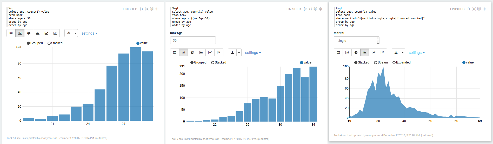
For reference, Apache Zeppelin allows code cells to be aligned in columns:
This may also be related to #3284
 brylie
on 7 Mar 2018
brylie
on 7 Mar 2018
See also our discussion at the ipywidgets workshop in Paris in Jan 2018: https://github.com/jupyter-widgets/ipywidgets/issues/2018
jasongrout
on 24 Mar 2018
Hi everyone, I'm at intern at Jupyter working on JupyterLab Dashboards. I'm currently in the UX research phase of the project, and I'd like to reopen the discussion around this project, particularly around understanding the use cases for the Dashboard, and implications of such a dashboard within the context of JupyterLab. @saulshanabrook @ellisonbg @tgeorgeux @Zsailer @SylvainCorlay
 takashimokobe
on 18 Jan 2019
takashimokobe
on 18 Jan 2019
https://github.com/QuantStack/voila @SylvainCorlay @maartenbreddels et al
 timkpaine
on 18 Jan 2019
timkpaine
on 18 Jan 2019
Also, good news for this issue: there will be a Jupyter community workshop on Dashboarding! See https://blog.jupyter.org/jupyter-community-workshops-a7f1dca1735e
jasongrout
on 18 Jan 2019
How you create the dashboards is one thing, but also how you make them available to your users is another.
I had thought that it might be nice to re-use the JupyterHub infrastructure to also launch other apps/services (such as dashboards) - https://github.com/jupyterhub/jupyterhub/issues/1880
Thinking about it some more, the cards to launch dashboards could live inside JupyterLab itself with the app/dashboard made available via jupyter_server_proxy
 dhirschfeld
on 19 Jan 2019
dhirschfeld
on 19 Jan 2019
@dhirschfeld so long as jupyterhub is not a requirement. I think you'll want to be able to run wither standalone (e.g. jupyter dashboard my_notebook.ipynb) or via lab extension, where in the former it starts a standalone web server and in the latter it reuses the running server. You may also want to run from the existing session, but hit the jupyterhub to launch a new separate server (so maybe 4 total possible deployments: standalone, standalone via hub, via notebook, via notebook using hub).
timkpaine
on 19 Jan 2019
so long as jupyterhub is not a requirement
Yeah, hence my evolving view of deployment. JupyterHub just spawns and proxies a jupyter_server [1] instance so if the dashboard were built on top of that it should Just Work for both Jupyterhub and standalone.
[1]: IIUC it's currently the notebook server but future state will be? the jupyter_server which decouples the server from the apps running on top of it to enable these sort of use-cases.
dhirschfeld
on 19 Jan 2019
(binderhub is another option too!)
choldgraf
on 19 Jan 2019
Quick plug here - but if your looking for a suite of visualizations with a consistent (and discoverable) API, you could take a look at: https://github.com/hpcc-systems/Visualization.
Its initial goal was to simply wrap popular visualizations in a consistent and serializable interface but has subsequently added a lot of custom visualizations as well.
Some samples: https://raw.githack.com/hpcc-systems/Visualization/master/demos/gallery/gallery.html?./samples
 GordonSmith
on 19 Jan 2019
GordonSmith
on 19 Jan 2019
Nice, those draggable tabs are phosphor! (CC @sccolbert for another example of phosphor out in the wild)
jasongrout
on 19 Jan 2019
Indeed - @sccolbert answered a lot of questions while I was doing the integration!
I do have a dashboarding app in progress: http://viz.hpccsystems.com/master/demos/dashy/index.html but I am not sure if the paradigm really fits what (I think) your trying to achieve here...
GordonSmith
on 19 Jan 2019
/cc @oschuett https://github.com/oschuett/appmode
parente
on 19 Jan 2019
great that this is being picked up again! @takashimokobe: I would like to see 'dashboarding' enabling the same kind of use cases which the appmode extension for Jupyter did: Turning notebooks into regular GUIs. We found workarounds to hide code cells and by modifying the toolbar plus using some stacked sidecars. But it's far from perfect. Dashboarding is focused on visual output, if I understand the concept well. We're trying to use Jupyter as an extendable data acquisition tool, allowing us to provide flexible data analysis together with data recording in a pretty unique way. (e.g. if a feature is not implemented in the GUI, simply switch to a notebook cell. Like python consoles in traditional desktop software, c.f. FreeCAD, KiCad etc.)
 ozel
on 11 Feb 2019
ozel
on 11 Feb 2019
A thought on the state of Python interactive viz dashboards in general: Plotly Dash has stepped into the python ecosystem in place of Shiny for R. The big promise of Dash is the ability to run a lightweight open-source flask & react app anywhere, without a jupyter server to serve interactive viz, higher performance crossfiltering/brushing/streaming etc. Unfortunately, unlike Shiny which works with any interactive viz library, Dash is limited to only plotly viz, and interaction quickly becomes complex where shiny has a few tricks to simplify interactivity - eg. see Shiny 'conductors'. We also typically develop interactive viz in notebooks, then progress the code to Dash & there is effort to keep code shared between dash & notebooks.
Does the Jupyter team have the ability/vision to create something like Shiny R where you can create dashboards in notebooks & quickly progress them to standalone interactive viz dashboards, ideally in flask/react, whilst still sharing code? Maybe collaborating with the Plotly Dash team?
 nite
on 12 Feb 2019
nite
on 12 Feb 2019
@nite I'm not sure it is what you want but Holoviews/Panels/Pyviz team does a great job trying to integrate things.
Holoviews integrates matplotlib/bokeh/plotly pretty well.
You can read the end of the FAQ to see how it should compare to Shiny and Dash (it still under active developpments).
https://panel.pyviz.org/FAQ.html
My workflow is as follow.
- Writing a small app with notebooks
- "Panelize it" with panel
- serve it with bokeh serve. You can serve it inside the notebook to test it also.
You have librairies supported here : https://github.com/pyviz/panel/issues/2
Regards
 slamer59
on 12 Feb 2019
slamer59
on 12 Feb 2019
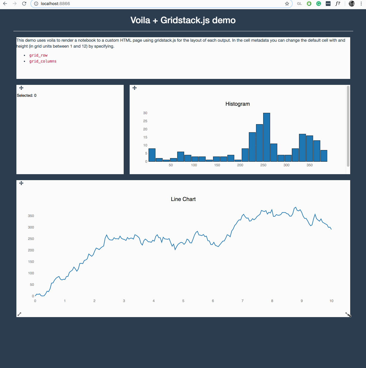
Voila is making quite some progress in this area, where it can execute any Jupyter notebook (meaning also a Julia, R, C++ or Java/JVM kernel) and render them with any template. Voila keeps the kernel alive, but does not allow arbitrary code execution.
It is still early in development, but https://github.com/QuantStack/voila/pull/14 gives a good example of that is possible with voila.
We have a strong focus on ipywidgets/jupyter-widgets (plotly also uses them now) since they allow easy reuse for other languages, e.g.
For pure Python, I have experimented with https://github.com/maartenbreddels/flask-ipywidgets/ for a more light weight flask server, but this is still experimental.
Keep an eye on these projects, get involved, try it out and give us feedback, this is highly appriciated.
 maartenbreddels
on 12 Feb 2019
maartenbreddels
on 12 Feb 2019
@maartenbreddels I'm really excited to start playing with voila :-) I've been wondering how we could incorporate it into jupyter-book (jupyter.org/jupyter-book)
choldgraf
on 12 Feb 2019
I've been working on a design exploration to see how Dashboarding could look like in the context of JupyterLab. Here's the direction I've been heading.
A drag and drop UI that snaps tiles into a grid layout by utilizing the ToC extension (with some added features, such as previewing visualizations and a drop-down menu to toggle between multiple notebooks). The drop-down menu would allow the user to piece together a Dashboard using different notebooks.
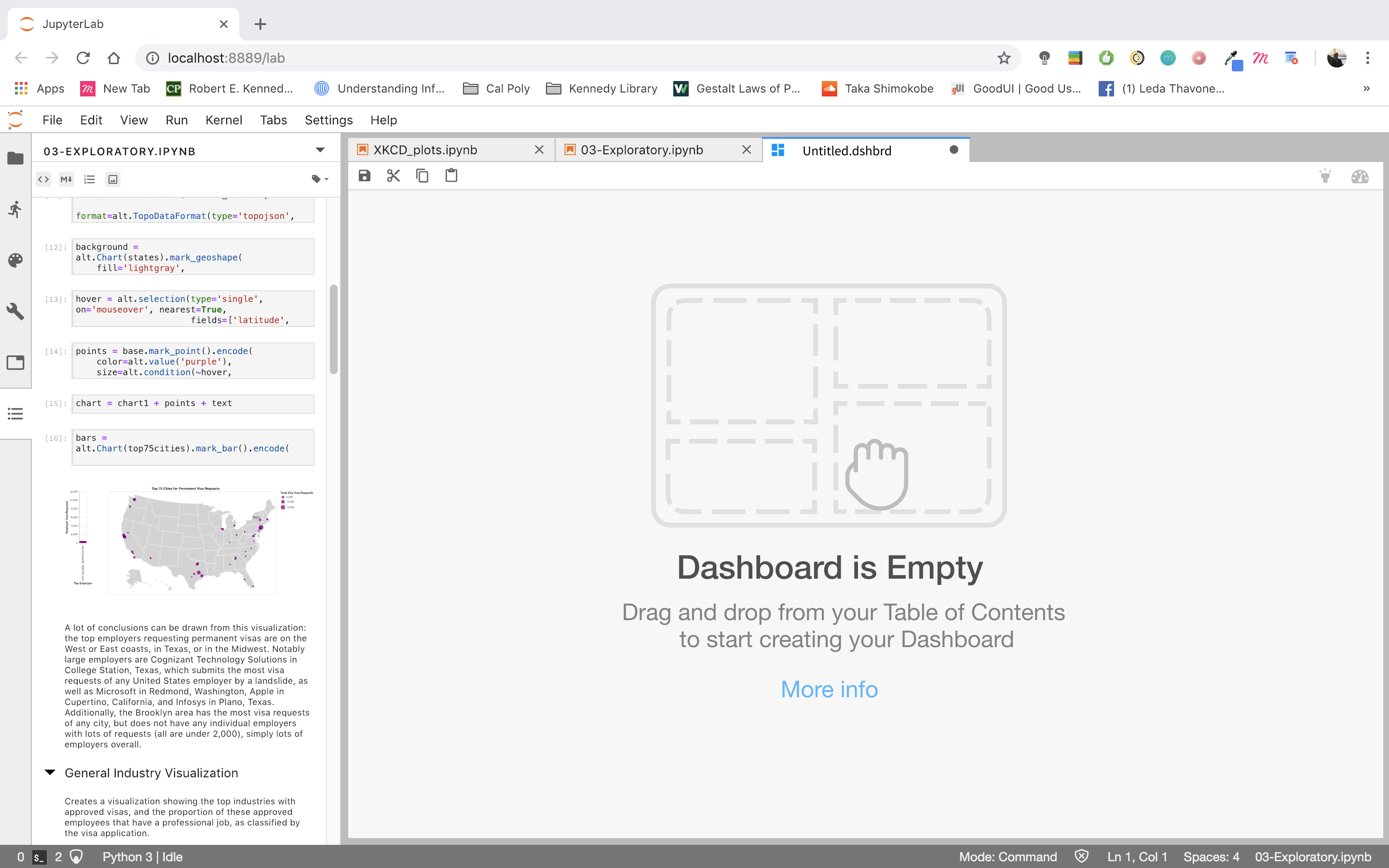

The idea is that users would be able to drag and drop any item represented in the Table of Contents (code, markdown, visualization) into their Dashboard where it would snap to a grid. They then can resize/edit the tile placed into the Dashboard.

takashimokobe
on 19 Feb 2019
whooooah 😍
choldgraf
on 19 Feb 2019
@takashimokobe Dashboards are used to monitor processes as such the graphs may need to be updated? any thoughts around how to make things persistent / update, or is this more aimed at bringing graphs from multiple places together?
 WesleyTheGeolien
on 20 Feb 2019
WesleyTheGeolien
on 20 Feb 2019
@takashimokobe Very cool!
While I like the preview and the cleaner UI a great deal, what about just being able to save your current dock panel as a .dashboard?
This could build on the workspace JSON spec a la #5903 (probably do a schema for it) such that the .dashboard would include all of the activities that went into it in addition to the specific contents... No reason to just use notebooks!
A big part of this, restoring cloned outputs in workspaces, just landed in #5981. Cloned _inputs_ would probably be necessary, as well.
For serialization, all the "parents" could be in tabs behind the dashboard content, and load everything, and have the extension fullscreen the dockpanel and reduce the tab height to 0.
Such an extension could also look for a url param, such that on binder, you could load that workspace and kick directly into "app" mode, like presentation mode, but more severe. App mode could offer going "back to the lab" where you could tweak things.
I'd also love multiple pages...
bollwyvl
on 20 Feb 2019
@WesleyTheGeolien
any thoughts around how to make things persistent / update, or is this more aimed at bringing graphs from multiple places together?
Yes, dashboards are a place to bring multiple outputs together, but it's absolutely conceivable to have a new jupyterlab extension that streams live data on a graph and can be added to a dashboard.
@bollwyvl
what about just being able to save your current dock panel as a
.dashboard?
Yes! This is something that @takashimokobe has already been thinking about (from a design perspective). Each dashboard is a .dshbrd "file". (You can kind of see that in the dashboard's tab). You would be able to save your current state and reopen later.
 Zsailer
on 20 Feb 2019
Zsailer
on 20 Feb 2019
Each dashboard is a
.dshbrd"file".
I guess what I'm talking about is a avoiding a bunch of serializations of _almost_ exactly the same thing. The workspaces JSON isn't really human-editable, _but_ there's supported machinery already in lab core for working with it (python and typescript), and it kinda forces extensioneers to _get on the :bus:_ with their instance trackers and whatnot (which is good for users anyway).
We had a JEP to unite the late nbpresent and jupyter-dashboard-server layout data formats, but in the end the projects had different views of what a (presentation|dashboard) should be, without much developer effort left to actually make a change to either.
Practically:
- a "dashboard" would be a single workspace (you're going to use all the screen real estate)
- a "poster" would be a workspace with a fixed page size that you could scroll around in, but is _meant_ to be printed on a given physical media format (perhaps @gnestor's giant scroll from JupyterCon)
- a "journal article" would be a bunch of those
- an "app" would be a number of workspaces with a state machine
- a "presentation" would just have a very simple state machine
But they would all reuse the existing machinery, be able to use themes, share the same DOM contracts, etc. If we decide we need a "layered drawing program" layout instead of a dock panel, we land that _as a primary editing ui_ in an extension. If we need an "annotated timeline synced to audio/video" (a la Oriole), we land that as _as a primary editing ui_ in an extension. But all of the extensions are just working with the underlying machinery, and not inventing new formats and places to stuff them.
bollwyvl
on 21 Feb 2019
I just saw this extension yesterday: https://github.com/plotly/jupyterlab-dash
This is plotly's approach to dashboarding, of course, but now you can develop your dash apps in the notebook and interact with them in a separate pane in lab, which is pretty groovy.
 gnestor
on 21 Feb 2019
gnestor
on 21 Feb 2019
This is plotly's approach to dashboarding
I was about to make a binder for it, then realized it won't work on binder due to running an arbitrary port and hard-coded localhost.
It is a nice concise way of showing how to use custom comms and adding stuff to the dockpanel, however.
bollwyvl
on 21 Feb 2019
I was about to make a binder for it, then realized it won't work on binder due to running an arbitrary port and hard-coded
localhost.
Oh, true! Can you think of any workarounds for this? It would prob involve using jupyter-server-proxy?
gnestor
on 21 Feb 2019
Yes, I think using jupyter-server-proxy with a tiny entrypoint for the backend could work here.
 ian-r-rose
on 21 Feb 2019
ian-r-rose
on 21 Feb 2019
The dask-labextension has to deal with some similar issues around bokeh dashboard plots.
ian-r-rose
on 21 Feb 2019
https://github.com/jupyterlab/jupyterlab/issues/5847#issuecomment-470235423 references an impressive-looking project to implement dashboarding using jlab components
jasongrout
on 6 Mar 2019
Very excited about this direction and all of the ideas here. @takashimokobe I think it is really helpful to begin thinking about the interaction model and UX of how dashboards would be created in JupyterLab. There are a lot of different aspects of dashboards and I think it is super important to begin separating them out so they can be tackled in an independent manner. Our experience of building the notebook and the lessons learned there are guiding this strongly for me...
1) Start with a JSON based document format that includes cell and layout information. The old Jupyter dashboard project and voila have aspects of this.
2) Build a standalone renderer for these documents for JupyterLab and another frontend. For the work of step 1 to be fully validated, there should be N=2 renderers, probably a pure react based one with nteract, and a JupyterLab one that uses its components.
3) Then begin to think about the authoring UX. Obviously, there needs to be a solid story to go back and forth between notebooks and dashboards. This brings up important design questions:
- Can dashboards contain cells from multiple notebooks?
- Does a dashboard store cells by reference or value?
- Is a dashboard just a notebook with layout information? Or a separate file format?
4) Then tackle deployment separately. This is super important as the deployment questions for dashboards are identical to those of regular notebooks. Tools like JupyterHub and binder have made great progress with that. But let's not confuse the deployment questions with those of the UX design, file format, or renderers.
[as an aside, there is work starting on JupyterHub to introduce oauth scopes, that could make it easy to give someone view/edit authorization to a dashboard, but not code modifications. I know @SylvainCorlay has done work on this in voila, but so far (I think) separate from JHub).]
[a second aside, if layout is stored in notebook metadata, it may be more challenging to enable real time collaboration on this, as most real time systems need a well specified schema, and treat metadata as opaque JSON blobs. I am starting to see a way to handle that case, but it is more complex that having a separate well defined file format with a concrete schema]
 ellisonbg
on 7 Mar 2019
ellisonbg
on 7 Mar 2019
It would be super clutch to have simple guides / docs / examples for how to embed JupyterLab as a component into React apps and sync State JSON between them, because this critical link is poorly documented.
This docs improvement would enable JupyterLab to have great dashboards right away without extra code because then we could drop JupyterLab components into a React dashboard site and hook it up to local or remote kernels so the lab notebook can influence the state of React and React can render the results into a variety of interactive dashboard widget components. We can leverage gazillions of existing resources for React data dashboards and developers can just choose whatever visualizations they want.
We could have a parent component which makes a State json and Dispatch function using useReducer hook. The parent could pass State and Dispatch down into dashboard visualizations and into jupyterlab using either props or React Context. Then the React Dashboard and the Jupyter Notebook can share state, and you can use Python or Julia or R code to programatically control your React data visualizations, and the whole thing could work in the cloud...
TLDR: If JupyterLab can be a React component then JupyterLab Dashboarding can leverage tons of existing React.JS dashboard tools alongside the fun/powerful/interactive JupyterLab environment, but the examples of how to pull this off aren't well documented.
Somebody write a Medium article or CodeSandbox/JSFiddle example of JupyterLab in React and we are good to go!
 bionicles
on 18 May 2019
bionicles
on 18 May 2019
@bionicles Just to make sure I understand you clearly: When you write "embed JupyterLab in React", do you mean to put an entire lab app with menubar, commandpallett etc into a React app, or using lab components in a React app?
 vidartf
on 19 May 2019
vidartf
on 19 May 2019
I responded to @bionicles on the same topic at https://github.com/phosphorjs/phosphor/issues/302.
From "drop JupyterLab components into a React dashboard." I get the impression that he means JupyterLab components.
For components, see nteract components and mybinder components. For JupyterLab-specific components, take a look at how thebelab turns ordinary input fields into runnable Jupyter cells.
gnestor
on 21 May 2019
Ideally we would like to embed the entire lab app as a single coherent chunk into a div in a react app. This would allow us to use all of jupyterlab inside a react app, to make new notebooks, change kernels, edit and run code etc. Then the react stuff can A) manage state and B) render dashboards, forms, interfaces
https://github.com/minrk/thebelab is super cool, thanks for pointing that out!
bionicles
on 21 May 2019
@bionicles - rather than continuing a conversation about this on a dozen somewhat unrelated issues across multiple repos, can you create a single new issue to have this conversation? That will make it much easier for you and everyone else to follow the conversation. Thanks!
jasongrout
on 21 May 2019
Just thought I'd leave this here - someone mentioned binder earlier on, this is a nice way to run jupyterlab in your own free heroku instance: https://github.com/heroku/heroku-jupyterlab
nite
on 12 Jun 2019
@takashimokobe Awesome work showcased with screenshots on https://github.com/jupyterlab/jupyterlab/issues/1640#issuecomment-464945774. Reading you blog https://www.takashimokobeux.com/project-jupyter I see you are using Figma. Did you use Figma to create those screenshots are are they real code (if such, is there a public link to build/try)?
 echarles
on 13 Jul 2019
echarles
on 13 Jul 2019
I think all that work is on Figma, the closest thing being built is voila:
https://github.com/QuantStack/voila
On Sat, Jul 13, 2019 at 1:16 AM Eric Charles notifications@github.com
wrote:
@takashimokobe https://github.com/takashimokobe Awesome work showcased
with screenshots on #1640 (comment)
https://github.com/jupyterlab/jupyterlab/issues/1640#issuecomment-464945774.
Reading you blog https://www.takashimokobeux.com/project-jupyter I see
you are using Figma. Did you use Figma to create those screenshots are
are they real code (if such, is there a public link to build/try)?—
You are receiving this because you were mentioned.
Reply to this email directly, view it on GitHub
https://github.com/jupyterlab/jupyterlab/issues/1640?email_source=notifications&email_token=AAAGXUCLKTGS63K4A5SBVVLP7GFNTA5CNFSM4C7GX7KKYY3PNVWWK3TUL52HS4DFVREXG43VMVBW63LNMVXHJKTDN5WW2ZLOORPWSZGODZ3MTOA#issuecomment-511101368,
or mute the thread
https://github.com/notifications/unsubscribe-auth/AAAGXUCCESFZRECYCNUC5JLP7GFNTANCNFSM4C7GX7KA
.
--
Brian E. Granger
Principal Technical Program Manager, AWS AI Platform ([email protected])
On Leave - Professor of Physics and Data Science, Cal Poly
@ellisonbg on GitHub
ellisonbg
on 17 Jul 2019
Hi everyone! I previously shared a sneak peak of this on another issue, but I'm happy to say that we're releasing MavenWorks as an open-source product!
MavenWorks is UI-oriented, and lets you build dashboards quickly and purposefully. You can see some demos here on Binder, and we also include a lightweight Viewer for end-users (which you can open by clicking on the "eyeball" in the toolbar). MavenWorks is distributed as a JupyterLab plugin, and can also be used as an independent app.
https://github.com/Mavenomics/MavenWorks
We'd appreciate any feedback you can give us!
 quigleyj-mavenomics
on 15 Nov 2019
quigleyj-mavenomics
on 15 Nov 2019
@quigleyj-mavenomics that's an impressive work
ddavidebor
on 18 Nov 2019
I've been working on a design exploration to see how Dashboarding could look like in the context of JupyterLab. Here's the direction I've been heading.
A drag and drop UI that snaps tiles into a grid layout by utilizing the ToC extension (with some added features, such as previewing visualizations and a drop-down menu to toggle between multiple notebooks). The drop-down menu would allow the user to piece together a Dashboard using different notebooks.
The idea is that users would be able to drag and drop any item represented in the Table of Contents (code, markdown, visualization) into their Dashboard where it would snap to a grid. They then can resize/edit the tile placed into the Dashboard.
Hi, are you still working on this extension? DO you have any plan to release it?
Thank you
 davidpasquale
on 12 Apr 2020
davidpasquale
on 12 Apr 2020
Hey everyone my team released a dashboarding extension this past summer with a few of the considerations mentioned in this thread. It utilizes a drag-and-drop interface within the live editor that enables you to build interactive dashboards side-by-side with your notebook.
Simply drag output cells and markdown on to the canvas, and rearrange and resize widgets directly in the live editor easily with our snap-to-grid canvas. We are currently in the process of adding more customization features (i.e canvas color, dimension resizing, etc.).

Check it out here: https://github.com/jupytercalpoly/jupyterlab-interactive-dashboard-editor
I am the UX/UI Design Intern at Jupyter who is constantly improving and iterating on this extension's design, so please contact me for any suggestions or comments. It would be super helpful!
 juliahuynh
on 12 Nov 2020
juliahuynh
on 12 Nov 2020
@juliahuynh A friendly remind that your link points to a wrong address. You might want to fix that.
 dclong
on 13 Nov 2020
dclong
on 13 Nov 2020
Really good!
I don't see how to serve it after without jupyter lab?
slamer59
on 15 Nov 2020
Hi everyone! For the last couple of months, @jtpio and I have been working on updating voila-gridstack with an extension for Lab 3 following the guidelines found here.
There is a blog post explaining what can be done with this extension, but this is an example:
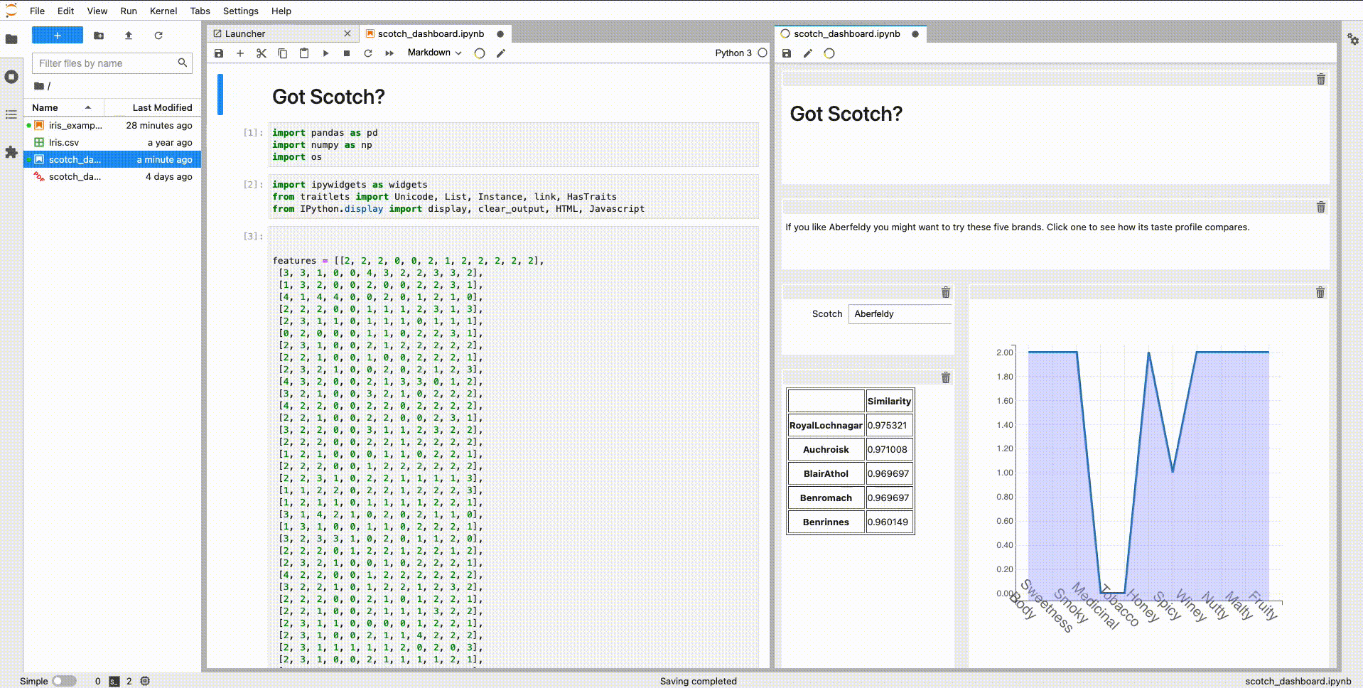
Basically, we implemented as another document widget for a notebook. It uses the same kernel session and does a copy of the cell widget when dragging to the _voila-gridstack_ editor. All the information about the layout is saved on the metadata following the specification introduced by _jupyter-dashboards_.
I hope is useful for some of you, and it would be great to have some feedback! 😊
 hbcarlos
on 8 Jan 2021
hbcarlos
on 8 Jan 2021
Related issues
 discdiver
·
3Comments
discdiver
·
3Comments
 joaonatali
·
3Comments
joaonatali
·
3Comments
 minertom
·
3Comments
bollwyvl
·
3Comments
minertom
·
3Comments
bollwyvl
·
3Comments
 idoDavid
·
3Comments
idoDavid
·
3Comments
Most helpful comment
I've been working on a design exploration to see how Dashboarding could look like in the context of JupyterLab. Here's the direction I've been heading.
A drag and drop UI that snaps tiles into a grid layout by utilizing the ToC extension (with some added features, such as previewing visualizations and a drop-down menu to toggle between multiple notebooks). The drop-down menu would allow the user to piece together a Dashboard using different notebooks.
The idea is that users would be able to drag and drop any item represented in the Table of Contents (code, markdown, visualization) into their Dashboard where it would snap to a grid. They then can resize/edit the tile placed into the Dashboard.
