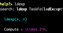
It's very difficult to see on black background.
A. At least for "x \times 2^n." (and "ldexp(x, n)" could also use better color), as seen with:
help?> ldexp
B. I think " \times" should also substitute, as it's LaTeX, while I'm less concerned personally with that.
 PallHaraldsson
All 12 comments
Change your terminal color scheme?
 Keno
on 14 Apr 2020
Keno
on 14 Apr 2020
(The problem here is that the colors look different for everybody, so if we change it to something that looks fine on your terminal, it'll start looking really bad on somebody else's terminal)
Keno
on 14 Apr 2020
Maybe we just use too many different colors. Does math need to be purple? Maybe bold instead?
 JeffBezanson
on 14 Apr 2020
JeffBezanson
on 14 Apr 2020
I mean this bad on a black background, what I have in the terminal, and I think pretty much done (at least default in Ubuntu) and in most editors.
I'm not up to speed on "terminal color scheme" if it's about the background color or something else, and I doubt most users will neither know. I think we should have a sane default for the most common setup, and others can change.
PallHaraldsson
on 15 Apr 2020
The problem is that unless we ship our own terminal emulator on every OS (which I'm not entirely opposed to), there's no way to pick a sane default, because whatever we pick will look different for everybody. For example, the purple is perfectly readable on my terminal, even with a black background:
Blue isn't particularly readable though.
Keno
on 15 Apr 2020
Tangentially, windows updated their default colors not too long ago https://devblogs.microsoft.com/commandline/updating-the-windows-console-colors/.
 KristofferC
on 15 Apr 2020
KristofferC
on 15 Apr 2020
I would suggest changing to the brighter colors, i.e. from magenta ("Palette entry 5") to the lighter magneta ("Palette entry 13") and e.g. 6->14 for cyan. I'm just unsure where to find this in the code to make a PR (I did check, but didn't find, only magenta in other context? See the PR).
I first found "Use colors from the system theme" checked (and I don't think I've ever changed it or to more custom) in the terminal, and toggling the switch doesn't make much difference.
Users redefining the palette in the Ubuntu terminal, might like me first change the lighter magenta to no effect, and even with finding the right color this all seems like a hassle, and not recommend (would screw up other terminal work? or make it better too...)? [EDIT: I found the ENV variable recommended way to change for Julia only.]
[Only changing the background to white DID make for readable, while still also an awful (while less so) scheme.]
PallHaraldsson
on 15 Apr 2020
purple is perfectly readable on my terminal, even with a black background [..]
Blue isn't particularly readable though.
Hmm, I guess it's my eye, and not just my astigmatism. Because that magenta (purple, the source code uses magenta so I changed my edits) in your screenshot isn't too readable for me (while a bit better than in my terminal), but your cyan (blue) IS actually ok to me. Is the PR (currently broken) with a fix ok for you?
[EDIT: Interestingly, now in the evening with Ubuntu's Night Light (blue-light-filtering) feature on, both are readable, with the magenta turning red. If anything the (formerly) cyan is worse. I'm not sure about Keno's timezone, if if it might apply for him too.]
PallHaraldsson
on 15 Apr 2020
If at all possible the default needs to be readable by contrast to the background alone, remember nearly 10% of males have a colour deficiency (rather less females).
 elextr
on 16 Apr 2020
elextr
on 16 Apr 2020
The end of this literal debate about what colors to paint the bike shed is that nothing works well everywhere for everyone except for no color. However, if a color scheme is bad for someone, they know that color schemes are a thing and they can change them. If the default is no color then people don’t know that colors are an option and they don’t ever turn color on. It would be fine to make it easy to design color schemes and share them.
 StefanKarpinski
on 16 Apr 2020
StefanKarpinski
on 16 Apr 2020
If at all possible the default needs to be readable by contrast to the background alone,
See the --color=no command line option. Also, note that we don't really have any fine tuning possibilities since we are only using the system colors of which there are 16 (8 + 8 bright versions).
KristofferC
on 16 Apr 2020
Solution is to change to a colorscheme where the default colors are not bad.
KristofferC
on 26 Oct 2020
Related issues
 sbromberger
·
3Comments
sbromberger
·
3Comments
 wilburtownsend
·
3Comments
wilburtownsend
·
3Comments
 omus
·
3Comments
omus
·
3Comments
 helgee
·
3Comments
helgee
·
3Comments
 ararslan
·
3Comments
ararslan
·
3Comments
Most helpful comment
(The problem here is that the colors look different for everybody, so if we change it to something that looks fine on your terminal, it'll start looking really bad on somebody else's terminal)