Joomla-cms: [4.0] RFC Atum template - Change modal Messages
What needs to be fixed
The modal save messages are really very distracting and as far I remember they also had a11y issues? I could not find an open issue about that but can we please go back to inline messages?
It will be very tedious in the daily workflow to always have the modal overlapping for example the "New" button.
Can we find a better solution?
 coolcat-creations
All 20 comments
I agree on that.
Here an proposal:
- What about introducing a option in the "enque message" that the developer can switch between that message and such kind of messages:

For sure you should force error messages to the big error messages but success messages can be use smaller things.
What do you think.
 zero-24
on 26 Apr 2020
zero-24
on 26 Apr 2020
That message could disapper after X time, when specified by the developer
zero-24
on 26 Apr 2020
See PR #27213
 Quy
on 26 Apr 2020
Quy
on 26 Apr 2020
Thank you for leading me to the PR, but it actually only makes the modal disapear after a while... I think the better solution would be either having it inline or not distracting at the bottom right side...
coolcat-creations
on 26 Apr 2020
It would not be a good solution to have the messages in multiple places depending on the level of message and you absolutely want an error or warning to be distracting
 brianteeman
on 26 Apr 2020
brianteeman
on 26 Apr 2020
It would not be a good solution to have the messages in multiple places
hmm what would be your suggestion to that?
zero-24
on 26 Apr 2020
Hi,
I like the way Gantry 5 goes. It just displays the message in the bottom right area and it will be hidden in a few seconds.

Messages displayed in the bottom right area do not delay you at work and do not bind you anyway. Mostly there is nothing to do in the bottom right area.
Ok, if hiding a message could be a problem, e.g. regarding a11y, then messages should be displayed the same way like in Joomla! 3 because the current display, where part of the text and part of the buttons are hidden, definitely violates more rules.

Jan
 PhocaCz
on 26 Apr 2020
PhocaCz
on 26 Apr 2020
Messages displayed in the bottom right area do not delay you at work
That's fine for a success but not for an error. When its an error it must be displayed prominently.
brianteeman
on 26 Apr 2020
Yes for that reason i proposed a switch in the inject method so you can have a different display when it is an error or success message
zero-24
on 26 Apr 2020
Please do not introduce conditional styling based on the message level. That’s just more confusion in the end.
 mbabker
on 26 Apr 2020
mbabker
on 26 Apr 2020
Imho, we should go back to the same behavior as in 3.x
Inline on top
 infograf768
on 26 Apr 2020
infograf768
on 26 Apr 2020
So, is there anything against using the same style like in Joomla! 3? (standard block at the top)
PhocaCz
on 26 Apr 2020
+1 from me for same style as in Joomla! 3 (standard block at the top).
 richard67
on 26 Apr 2020
richard67
on 26 Apr 2020
+1 for J3 Style
coolcat-creations
on 26 Apr 2020
Not the first time I say:
+1 for J3 Style
 ReLater
on 26 Apr 2020
ReLater
on 26 Apr 2020

PhocaCz
on 26 Apr 2020
I also don't like these overlapping messages:

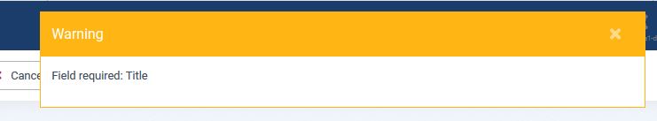
OK, the Alert messages in red of course - don't have at the moment :-)
@PhocaCz Jan
it's much better, but as @zero-24 says: ... success messages can be use smaller things.
 ChristineWk
on 26 Apr 2020
ChristineWk
on 26 Apr 2020
What do we need to go back to J3 Style?
coolcat-creations
on 27 Apr 2020
PR created... #28824
 ciar4n
on 27 Apr 2020
ciar4n
on 27 Apr 2020
Thanks. Closing here so we can test the PR. Thanks @ciar4n
zero-24
on 27 Apr 2020
Related issues
 alex7r
·
4Comments
alex7r
·
4Comments
 Didldu-Florian
·
4Comments
Didldu-Florian
·
4Comments
 B3nito
·
5Comments
B3nito
·
5Comments
 tuts-22
·
5Comments
tuts-22
·
5Comments
 dougbevan
·
4Comments
dougbevan
·
4Comments
Most helpful comment
PR created... #28824