Jitsi-meet: Improve color design of 'Audio muted' and 'Camera off' button / symbol
Hola!
During the recent sessions (and as my headset & OS don't like each other) I wondered very often if I am muted or not. Also, but still more obvious anyway, if the camera was active or not. By personal intuition I always check this by looking at the buttons below. The current state is not very clear in my view.
_Current situation if you are muted and camera is shut off_

I'd rather prefer to see something more obvious. I also suggest to give a written response of that state (only if muted or off). Some users also didn't recognize that they were muted for some reason.
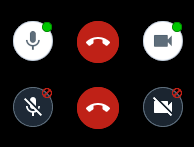
_More clear design of buttons_
_(Sorry for the crappy draft, just that you know what I am talking about)_

Thanks for Jitsi!
Saludos!
 Echolon
All 8 comments
How is a slash through the mic/camera icons unclear, compared to the icons not having the slash?
The SVG resources for the icons are here: https://github.com/jitsi/jitsi-meet/tree/master/react/features/base/icons/svg - draft up what you're suggesting!
 Syonyk
on 9 Apr 2020
Syonyk
on 9 Apr 2020
I can mean both, either "Click to mute" or "It is muted". So actually its not very clear in my opinion.
Will check out, never worked with svg files.
Echolon
on 9 Apr 2020
This is highly related:
5417 Wrong color of buttons if there is no HANGUP button
Echolon
on 10 Apr 2020
My suggestion:
Further darken the background of the "muted" buttons, so they appear really sad.
Use little red/green symbols to indicate the on/off state.
But perhaps the "cancel" icons suggest that the feature is unavailable, and a simple red dot would be clearer.
(Before the dots, I had originally imagined a green check :heavy_check_mark: and a red cross :x: as indicators.)
 joeytwiddle
on 13 Apr 2020
joeytwiddle
on 13 Apr 2020
Another option might be to darken the button foreground as well as the background.

If the shade is now successfully indicating the state, perhaps we should remove the strike from the icon.
joeytwiddle
on 15 Apr 2020
rel. #6191
Echolon
on 25 May 2020
This issue has been automatically marked as stale because it has not had recent activity. It will be closed if no further activity occurs. Thank you for your contributions.
![stale[bot] picture](https://avatars3.githubusercontent.com/in/1724?v=4&s=40) stale[bot]
on 23 Aug 2020
stale[bot]
on 23 Aug 2020
no stale
Echolon
on 23 Aug 2020
Related issues
 dantman
·
3Comments
dantman
·
3Comments
 galvaniccoffee
·
3Comments
galvaniccoffee
·
3Comments
 forteller
·
3Comments
forteller
·
3Comments
 tanvir23
·
4Comments
tanvir23
·
4Comments
 ranjithrajv
·
3Comments
ranjithrajv
·
3Comments
Most helpful comment
Another option might be to darken the button foreground as well as the background.
If the shade is now successfully indicating the state, perhaps we should remove the strike from the icon.