Jetpack: Premium block flows: update nudge styles
@scruffian's design for the premium blocks:
Since the nudge is in the block editor, safe to assume we can follow Gutenberg UI styles instead of Calypso?
Alternatively, it could be seen as a piece of separate over the editor and use Calypso banner component when in .com and Jetpack banner component when shipping in Jetpack.
Even if that would be a goal eventually, we should stick to core styles for now to keep things technically simple, so:
- Block editor's font family and font sizes
- Core button component
- No theme inherited fonts or styles
- Padding/whitespace values from core
Since core doesn't publish block editor's basic styles to NPM, we've been copying them over to Jetpack.
 simison
All 11 comments
@mtias sounds good?
@ockham so this is more like 1st iteration, feel free to expand here how 2nd iteration could look like with properly shared components.
simison
on 3 Jul 2019
We should follow the style used for invalid block / missing block in core. And it might be good to expose this as a "card" UI component in wordpress/packages if it's going to be useful and more consistent for others. (This is not blocking.)
 mtias
on 3 Jul 2019
mtias
on 3 Jul 2019
We should follow the style used for invalid block / missing block in core.
Current upgrade nudge (selected + unselected):

Invalid block (selected + unselected):


Re-usable block (selected + unselected):

Missing block (selected + unselected):

Looking at these I'd conclude that:
Since the customer can interact with unavailable premium block, let's remove the white hue covering the block. So have it more similar to re-usable blocks and invalidated blocks. Hue is not present in the missing block, which is semantically more similar to premium block nudge but you cannot interact with semantic blocks so that the hue makes more sense there. Without the hue, customers get a better sense how it'll look at the site and there won't be color-contrast accessibility issues while they try to edit the block.
Add different border colors while the block is selected. Look for
.block-editor-warningand.is-selectedselectors in the core.Probably doesn't make sense to re-use
.block-editor-warningstyles as-is from the core, since the upgrade nudge should still resemble enough other upgrade nudges in Calypso so that it stays more-or-less consistent?Note how the block warning banner in core stretches across block container, not only across the block itself. Not a blocker, but we could do the same if it's not hacky.
Let's use matching whitespace from
.block-editor-warning:padding: 10px 14px;Keep the button at the right side but make upgrade button center-aligned, similar to action card in Calypso or "invalid block" warning when it's on wider screen:

On narrower screens the button should float under the text left-aligned.We talked briefly with @ockham about making the whole banner a button, like they're often in .com:
I think we can keep the CTA button instead because of "click to select the block" nature of this UI. Fewer chances for accidental clicks.
Should the button become primary-blue when the block is selected? Core itself uses lots of primary buttons but I'd rather not add more to that noise.
Let's use block editor's default fonts.
Ensure all this works nicely with RTL styles
simison
on 4 Jul 2019
Should the button become primary-blue when the block is selected? Core itself uses lots of primary buttons but I'd rather not add more to that noise.
Do we ever change button relevance contextually from default to primary? Seems like a whole new UX pattern :thinking:
(Generally, we were going for default rather than primary, as per paAmJe-ll-p2#comment-741)
 ockham
on 5 Jul 2019
ockham
on 5 Jul 2019
Let's also discuss copy here:
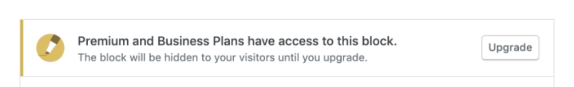
@scruffian's mockups (as seen in this PR's description) orginally had:
Premium and Business Plans have access to this block.
The block will be hidden to your visitors until you upgrade.
Since the 'Upgrade' button directly links to Checkout of the Premium plan, we shouldn't mention the Business Plan IMO. (This also makes it easier to keep the upgrade nudge more generic).
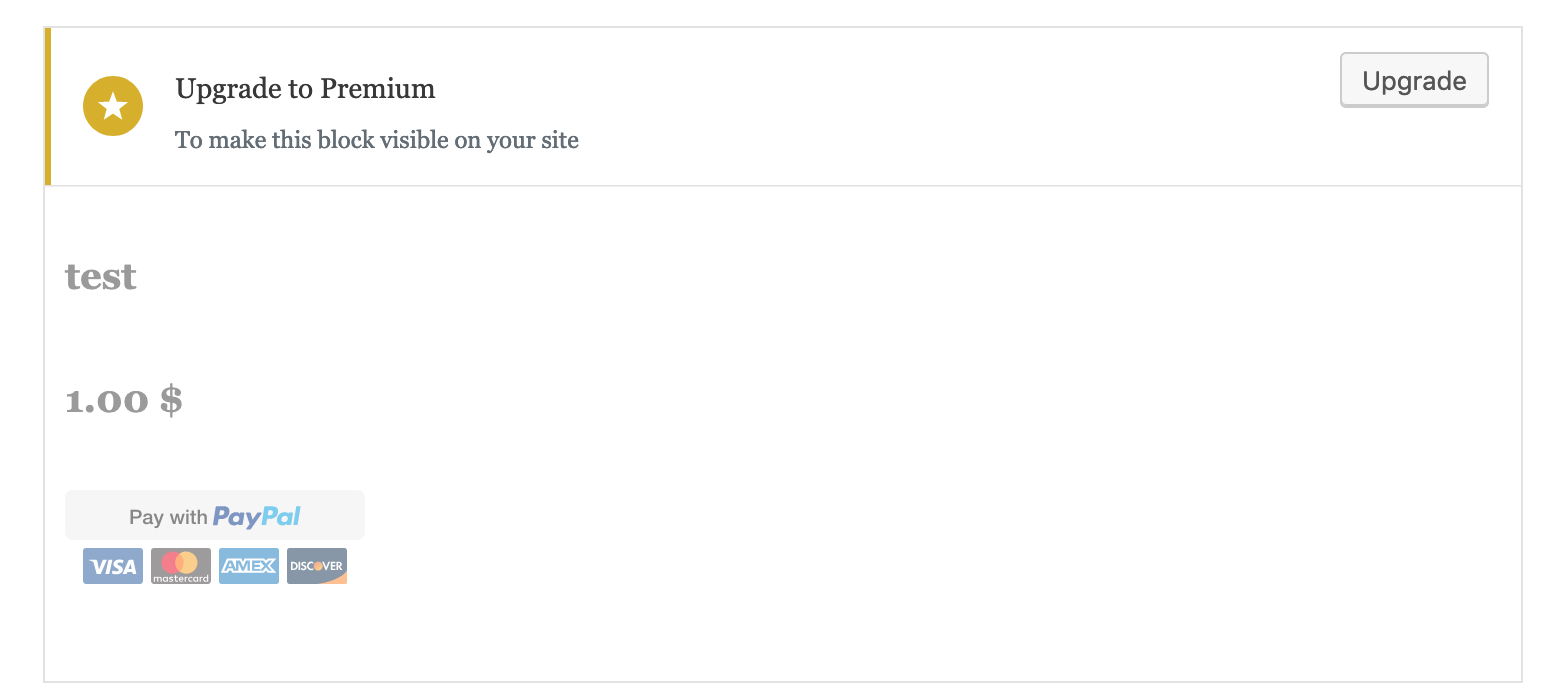
The current copy, which I essentially lifted from some P2 post, isn't stellar however:
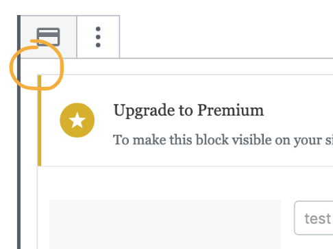
Upgrade to Premium
To make this block visible on your site
(The plan name -- 'Premium' in this case -- is obtained from the endpoint.)
Maybe at least use the second line from Ben's mockup? (It should be 'hidden from', not 'hidden to' though, right?) And maybe change the first line to something like:
You need a Premium Plan (or higher) to make this block available.
The block will be hidden from your visitors until you upgrade.
ockham
on 5 Jul 2019
@Automattic/editorial could you help us out here? :-) See above comment.
TL;DR: Upgrade nudge is shown in the block editor when customer's plan (free, personal) doesn't have access the block they've just inserted in the editor. "Upgrade" brings to checkout with plan pre-selected and then drops them right back to the editor after purchase.
simison
on 5 Jul 2019
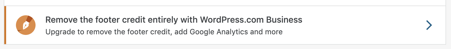
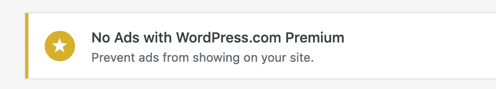
Another question: Which icon do we wanna use? The mockup uses the pencil (premium plan?), whereas the code currently uses the star (generic upgrade?)
ockham
on 5 Jul 2019
I would expect to see the pen icon for consistency with .com, but there are some more generic upgrade nudges in Calypso, too:
via https://wordpress.com/marketing
Let's keep the star for 1st iteration to keep things simple. We can mention it in call-for-testing to get feedback.
simison
on 5 Jul 2019
Yes, the star is fine for now.
mtias
on 5 Jul 2019
Hi @simison, thanks for the ping! Here are some suggestions:
You need a Premium Plan to unlock this block.
It will be hidden from site visitors until you upgrade.
This block is available under the Premium Plan.
It will be hidden from site visitors until you upgrade.
This block will be hidden to site visitors.
Upgrade to a Premium Plan to unlock this block.
 kristastevens
on 5 Jul 2019
kristastevens
on 5 Jul 2019
Should the button become primary-blue when the block is selected? Core itself uses lots of primary buttons but I'd rather not add more to that noise.
It should use the default button unless it's the primary action in the view. In that case, it would be primary.
 davewhitley
on 8 Jul 2019
davewhitley
on 8 Jul 2019
Related issues
 beaulebens
·
3Comments
beaulebens
·
3Comments
 dougaitken
·
3Comments
dougaitken
·
3Comments
 chrisaldrich
·
3Comments
chrisaldrich
·
3Comments
 crunnells
·
3Comments
beaulebens
·
3Comments
crunnells
·
3Comments
beaulebens
·
3Comments
Most helpful comment
Hi @simison, thanks for the ping! Here are some suggestions:
You need a Premium Plan to unlock this block.
It will be hidden from site visitors until you upgrade.
This block is available under the Premium Plan.
It will be hidden from site visitors until you upgrade.
This block will be hidden to site visitors.
Upgrade to a Premium Plan to unlock this block.