Jetbrainsmono: JetBrains Mono taller than before in WebStorm 2020.1
JetBrains Mono got deformed when I updated WebStorm to 2020.1. Here are screenshots of IntelliJ IDEA, PhpStorm (font looks the same on both), and WebStorm, where it looks taller.

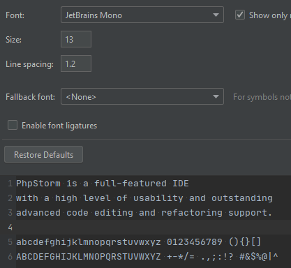
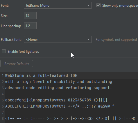
Please let me know how I can fix it.
 adrianboimvaser
All 10 comments
This is Window. Apparently the problem only applies to 13 points. 12 and 14 look the same everywhere.
adrianboimvaser
on 8 Apr 2020
I see the same thing in PyCharm 2020.1. Removing the bundled fonts like in #142 fixed the issue for me.
 kyleseven
on 8 Apr 2020
kyleseven
on 8 Apr 2020
Yes, it's working like intended. All the releases after 1.0.3 have updated hinting which is making letter more tall. It was a tuff decision, but we believe this rendering is more close to the original font concept.
More about this in this issue. https://github.com/JetBrains/JetBrainsMono/issues/131
 philippnurullin
on 9 Apr 2020
philippnurullin
on 9 Apr 2020
Too bad, I already got used to the buggy font :(
adrianboimvaser
on 9 Apr 2020
v1.0.5 looks a lot more like what I have in IntelliJ. I removed fonts from jbr\lib\fonts in all products and installed global OS fonts. Thank you all for the help.
adrianboimvaser
on 9 Apr 2020
@adrianboimvaser Glad to hear you fond a solution. I will close this issue then.
philippnurullin
on 9 Apr 2020
Looks like this should be reopened, I'm having the same issue with 2.001
 Lanayx
on 17 Jul 2020
Lanayx
on 17 Jul 2020
Hi @Lanayx , please provide screenshots of the old font & new.
philippnurullin
on 20 Jul 2020
@philippnurullin Sure, first is 1.6, second one is 2.001
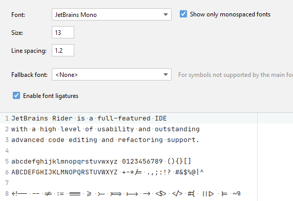
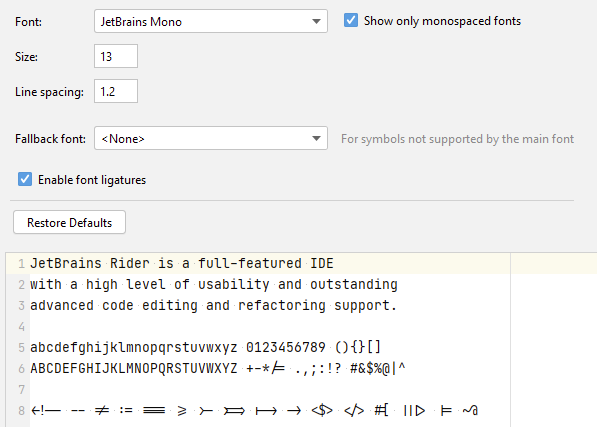
Lanayx
on 20 Jul 2020
@Lanayx as you can see above in one of my comments, this change is intended. So no future fixes will be applied. Sorry to disappoint you.
Yo can give your eyes time to adapt. If after 2—3 days you will find it hard on your eyes, i suggest trying other fonts with wide proportions like Source Code Pro.
philippnurullin
on 29 Jul 2020
Related issues
 N3tFX
·
4Comments
N3tFX
·
4Comments
 mehmandarov
·
6Comments
mehmandarov
·
6Comments
 dinhquochan
·
3Comments
dinhquochan
·
3Comments
 StanislavGrinkov
·
4Comments
StanislavGrinkov
·
4Comments
 thebertster
·
5Comments
thebertster
·
5Comments