Jetbrainsmono: Bold "w" too thin
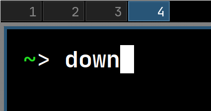
The bold "w" is noticeably thinner than the other characters and looks slightly out of place in my opinion. Any chance it can be fattened up? 🙂
 patrickmcnamara
All 8 comments
Thanks! I'd also mention m here.
 auduchinok
on 24 Jan 2020
auduchinok
on 24 Jan 2020
@patrickmcnamara @auduchinok Fattening the strokes in w & m up will produce bad recognition at small sizes, which are popular when writing code. On HiDpi monitors it may be less of a problem, but it still is. The other way around, may be in lowering the connection point of the strokes in the middle, but that will make the line more ragged, so thats not an option too.
 philippnurullin
on 24 Jan 2020
philippnurullin
on 24 Jan 2020
I ran into this same issue on Cascadia Code—by lightening the strokes to improve legibility / weighting, the /w and /m actually appear weak in comparison with the other letters, and that the overall color is not preserved.
If I may make a suggestion, the way I solved this in Cascadia was to darken the outer strokes, and keep the inner strokes thin:
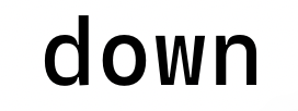
I found that this gives the /w and /m a lot more presence and strength, while not hindering legibility or character recognition.
Though the design language of Cascadia is a bit different that Jetbrains Mono, so doing this might feel a little out of place. :)
 aaronbell
on 24 Jan 2020
aaronbell
on 24 Jan 2020
@aaronbell Thanks for sharing experience! Looks interesting. Will definitely experiment with this approach. I believe it works well in Cascadia because of its more dynamic nature. JetBrains Mono is more of a static font, so i fear it wont look so natural, but we will see.
philippnurullin
on 27 Jan 2020
@auduchinok @patrickmcnamara Did you check the w & m in v1.0.3?
philippnurullin
on 17 Feb 2020
@philippnurullin It looks much better, though, still subjectively not as good as in the suggestion above.
auduchinok
on 17 Feb 2020
I agree that it looks better. I've also gotten more used to it now so I don't really mind either way. Thanks again. :)
patrickmcnamara
on 18 Feb 2020
@auduchinok You just don't like the pronounced ink traps. ) Tuned it a bit more in 1.0.4.
philippnurullin
on 19 Feb 2020
Related issues
 ruffin--
·
4Comments
ruffin--
·
4Comments
 StanislavGrinkov
·
4Comments
StanislavGrinkov
·
4Comments
 Otann
·
5Comments
Otann
·
5Comments
 nuhkoca
·
5Comments
nuhkoca
·
5Comments
 thlinard
·
6Comments
thlinard
·
6Comments
Most helpful comment
I agree that it looks better. I've also gotten more used to it now so I don't really mind either way. Thanks again. :)