Jest: Text Diff coloring bugs in Gitlab CI, Windows, Ubuntu ZSH, and IntelliJ Terminal (25.2.4+)
🐛 Bug Report
Going from 24.9.0 to 25.1.0 causes the coloring to change and no longer be readable in Windows.


To Reproduce
Steps to reproduce the behavior:
- Be on Windows
- Cause an error to occur, such as a snapshot mismatch.
- Run in Command Prompt (cmd.exe) (unreadable)
- Run in Powershell (looks broken)
- Run in Git Bash (no coloring at all)
Expected behavior
Colors should provide context for the logged message and be readable.
Link to repl or repo (highly encouraged)
That PR updates a bunch of stuff, but I tested it with just updating jest on its own to verify that is the cause.
envinfo
  System:
    OS: Windows 10 10.0.14393
    CPU: (4) x64 Intel(R) Core(TM) i7-6500U CPU @ 2.50GHz
  Binaries:
    Node: 12.14.1 - C:\Program Files\nodejs\node.EXE
    npm: 6.13.4 - C:\Program Files\nodejs\npm.CMD
 TheJaredWilcurt
All 14 comments
From #9132
/cc @pedrottimark could you look into this one?
 SimenB
on 24 Jan 2020
SimenB
on 24 Jan 2020
@TheJaredWilcurt Hello, that is an unhappy surprise. Here are a few questions:
- What do you think about the readability 24 versus 25 in Powershell?
- Can you see if there is any theme option for either
cmd.exeor PowerShell? Especially if settings show assignments of basic 16 colors. It is interesting that they look the same for Jest 24. - To get another data point, are you willing to make a comparison picture for Windows Terminal?
https://devblogs.microsoft.com/commandline/introducing-windows-terminal/
 pedrottimark
on 24 Jan 2020
pedrottimark
on 24 Jan 2020
- Powershell's output is ugly and looks broken (because, as seen in CMD, it obviously is)
- The correct answer for a bug in your project is not to ask everyone else to change their console to work around your bug. No customizations have been performed on CMD/Powershell. They are the default values.
- I'd prefer not to have to go through the cumbersome process of setting up Windows Terminal (helped set it on on someone else's machine and it took over an hour). I also do not intend on changing from
cmdas it has literally worked for everything else I've had to do for the last decade (with the one exception of setting up ssh). I also don't see this as an acceptable request for a work around for users. - From my experience with Windows Terminal, it is just a wrapper that can run different command prompts in tabs. So CMD should still function the same inside it.
TheJaredWilcurt
on 24 Jan 2020
@TheJaredWilcurt please do not behave disrespectfully on this issue tracker or that of any other project. Mark was trying to gather information and opinions in order to find the solution that works the best for all system setups. We will not require anyone to configure non-defaults or switch terminal applications to be able to use Jest properly. We will do our best to support each setup as well as possible - the PowerShell one looks reasonably close to what I'd expect given its peculiar default theme.
 jeysal
on 24 Jan 2020
jeysal
on 24 Jan 2020
I have reached out on a private channel to someone who has helped me in the past.
While we work off-line, any additional details are welcome in this issue from Windows community.
pedrottimark
on 24 Jan 2020
Same issue on Windows.
 galishmann
on 4 Feb 2020
galishmann
on 4 Feb 2020
Hello, I don't know if that helps but it doesn't seem to be a pure Windows problem because I ran into the exact same issue on Linux with tmux. Since the new version the diff is unreadable for me. I'm on ArchLinux, using XTerm with tmux and it looks like this:

When I try it only in XTerm without tmux running the diff is at least readable, but still not pretty:

In jest 24.9.0 the diff looked always normal for me (red and green on black background).
 anneFly
on 4 Feb 2020
anneFly
on 4 Feb 2020
We purposefully changed away from green and red in Jest 25 (again, see #9132), but it should definitely still be readable
SimenB
on 4 Feb 2020
I agree that the red/green can be confusing, but all of the "improved" examples shown in #9132 do not look better. Especially anything with a yellow or white background. It's just painful on the eyes.
TheJaredWilcurt
on 4 Feb 2020
An update tested with 25.2.4
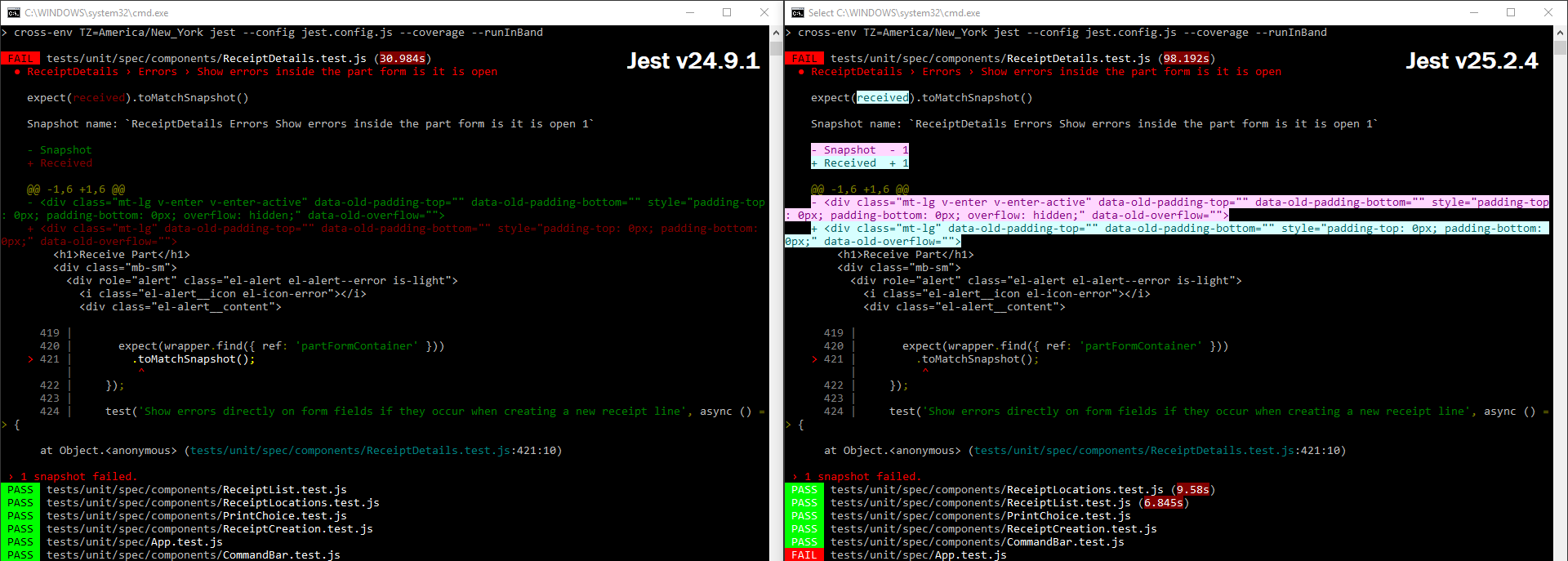
- Bug: As you can see in the screenshot after displaying a diff, the PASS/FAIL text turns to White on Red/Green instead of Black on Red/Green.
- Degraded Experience: The text colors for the diff are no longer Red/Green (👍 ), however they are now inverted with a bright, near white, background. This makes the text harder to read as it inverts the context of the rest of the text.
- Cognitive Confusion: The diffs look as though they are highlighted (to be copy/pasted). When I first scrolled up I actually thought that I had highlighted the text previously. I had to click off of it to stop highlighting it only to find that it wasn't highlighted. Here is an example demonstrating the confusion:
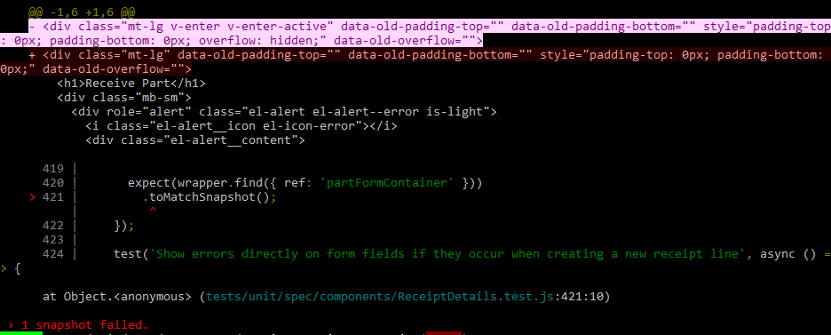
In this image, one of the diff lines is highlighted and the other is not. Which would you intuitively think is the highlighted text? It's actually the + part of the diff, even though most would have thought the - line was the one highlighted.
Is there any way to get an option added for colors? This would be the best solution for those of different disability types (cognitive, low contrast vision, various color blindness), and those on different platforms or command prompt/terminal applications, including those with custom terminal themes. All of these different groups have different "best case" color combinations. This could be set as part of the Jest config file as an object of color variables and allowed values, or even just a set of "themes" for people to pick from to adjust the colors to something closer to their needs. If you go the color variable route that would allow people to just install a Jest plugin for different themes, moving this issue to userland.
TheJaredWilcurt
on 30 Mar 2020
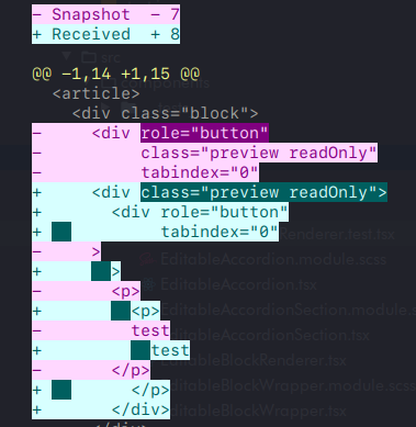
Just to add my two cents in here. This doesn't seem like an issue just for Windows. I'm getting this on Ubuntu using ZSH:
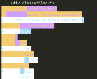
In IntelliJ whilst using the integrated terminal, it can get even more degraded to the point of unusability (depending on the colour scheme used):
To me it doesn't seem like there's an easy solution to this that makes everyone happy whilst background colours are being used (too many variables for things to go wrong). Personally I'd be perfectly happy with just the coloured +/- markings on the left, or only colouring the text (and not the background).
 ntsim
on 31 Mar 2020
ntsim
on 31 Mar 2020
In GitLab CI diff is completely unusable too :(
 7rulnik
on 24 Jun 2020
7rulnik
on 24 Jun 2020
Any progress on this? I've been adding
  "ManifestComments": [
    "Jest 25.1.0 is broken on Windows, Gitlab CI, ZSH, & IntelliJ Terminal. Pinning to 24.9.0 until Jest issue #9459 is resolved."
  ],
to my package.json's for almost a year now.
TheJaredWilcurt
on 4 Sep 2020
Jest 24.9.0 is now responsible for 18,024 vulnerabilities according to npm audit.
TheJaredWilcurt
on 16 Oct 2020
Related issues
 Antho2407
·
3Comments
Antho2407
·
3Comments
 mmcgahan
·
3Comments
mmcgahan
·
3Comments
 paularmstrong
·
3Comments
paularmstrong
·
3Comments
 stephenlautier
·
3Comments
stephenlautier
·
3Comments
 hramos
·
3Comments
hramos
·
3Comments
Most helpful comment
I agree that the red/green can be confusing, but all of the "improved" examples shown in #9132 do not look better. Especially anything with a yellow or white background. It's just painful on the eyes.