Jest: RFC: New Index page for the Jest website
_Note:_ This issue has a bounty on our Open Collective - see https://github.com/facebook/jest/issues/7265#issuecomment-450507843
and this WIP PR: https://github.com/facebook/jest/pull/7566
It is just for the single index page on https://jestjs.io, which is powered by Docusaurus and if you want to see what an example PR would look like see https://github.com/prettier/prettier/pull/3718
OK, a primer before we get to pretty pictures - I'm looking for someone to implement this, but it's pretty well spec'd out. Only a few more cases of lorem ipsum, and I want to re-create all screenshots after ( https://github.com/facebook/jest/pull/7241 ) . Nothing that should block implementation.
My aims with the redesign:
- Highlight Jest's awesome terminal UI (bigger images, more of them)
- Decouple Jest from being the "React testing tool" (the current site mentions react in half of the sections)
- Consistent messaging
- BE COOL, because Jest is cool
Alright, step one, a new Jest logo. I think the foot is cool, and I think it should stick around (I re-use it in the designs) but I also like the simplicity of this idea:
What if we take the runtime symbols Jest uses to indicate how things are going?

Then re-use that symbology:

Pow.
I know, it's a tad underwhelming but It fits, really well. It can work in the terminal during the jest launching scene, it connects to all of the existing messaging people see every day, is simple and recognizable. I think both are useful.
Alright, the site, like with the prettier redesign https://github.com/prettier/prettier/issues/3669 is aimed is to fit naturally in the docusaurus framework. I aimed to extend the Jest as joker metaphor by using cards + deck metaphor.

Highlights:
Mobile Version
Mostly the same, without the splits. I feel like the slanted titles work much better here ( less space, so they stand out more) and tie the identity together.
Headline
The top of the site should animate, the cards flip from the front to the back. They all start off as "RUNS" (e.g. the back) then progressively flip to either "PASS" or "FAIL" - like a good flaky test suite. Maybe clicking on a red could spin to the back ("RUNS"), then flip back to a PASS after a second.


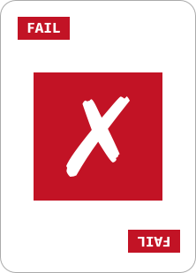
Here's what all the cards look like:
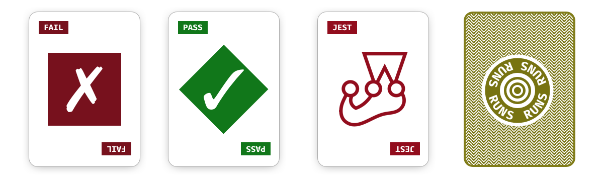
Bonus points - I'd love to see the "RUNS" animating in a circle (to indicate activity)
Grid
I used a 960 grid width, 12 sections, and only used the inner 10 for desktop:
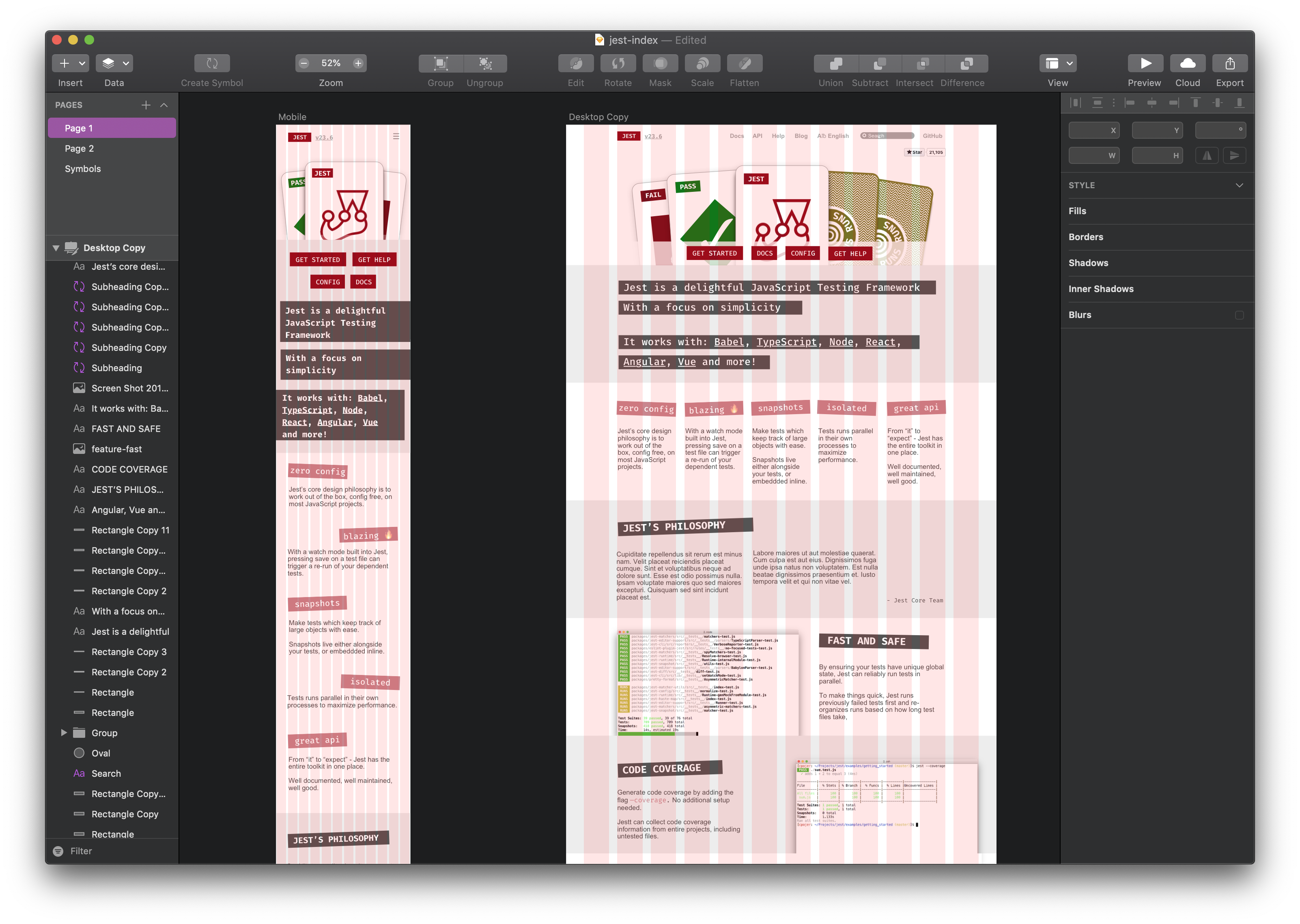
Cards


Assets
I can definitely create a bunch of assets if whoever is working on this isn't used to working with Sketch files directly 👍
 orta
orta
All 27 comments
omg, this is soooo good! I absolutely love it!!
 SimenB
on 24 Oct 2018
SimenB
on 24 Oct 2018
What do you think about an embedded code sandbox somewhere in here? Maybe with a tab for a node app and a tab for a react app? Should in theory work nicely due to https://hackernoon.com/codesandbox-containers-5864a8f26715, right?
SimenB
on 24 Oct 2018
I love the idea of having a runtime environment to run tests!
It might be worth having that added after this, as I feel like the repl.it and codesandbox embeds have tricky interfaces ( you can see examples for codesandbox and repl.it ) when trying to do a quick embed.
Something more like a "Jest cookbook" showcasing a bunch of "how do I mock a class from this import" kinda questions with repls (and the ability to explain to folks how to use it makes sense
orta
on 24 Oct 2018
Something more like a "Jest cookbook" showcasing a bunch of "how do I mock a class from this import" kinda questions with repls (and the ability to explain to folks how to use it makes sense
🥇
SimenB
on 24 Oct 2018
Looks great! Some feedback:
- Maybe a different color from the muddy yellow-green? IMO the color isn't very pleasant to look at.
- Would be nice to have a bit more padding and larger line height. It looks kinda crowded otherwise.
- Maybe the cards would look better with more subtle border?
 satya164
on 24 Oct 2018
satya164
on 24 Oct 2018
Love this, and would be happy to help implement this!
My only feedback is the titles on the features (blazing fast, etc) and the sponsor section, I don't think those have a high enough contrast ratio to be accessible.
Maybe look at using a darker red over top, or darkening up the red background?
 bkd705
on 24 Oct 2018
bkd705
on 24 Oct 2018
I'll have a branch out soon! Ill do preview deployments using surge or netlify
 wuweiweiwu
on 25 Oct 2018
wuweiweiwu
on 25 Oct 2018
Awesome! We have netlify set up, so just opening up a PR should be enough 🙂
SimenB
on 25 Oct 2018
Maybe a different color from the muddy yellow-green
The yellow here is a hue shift from the green and red, I'd rather not break that design patterns. That said, I like that yellow (and use it in my terminal), it's got a good sandy colour 👍
Would be nice to have a bit more padding and larger line height...
Padding I'm pretty fine with, but I agree on the line heights for body text, I'm happy to tweak those in CSS towards the end though - thanks!
I don't think those have a high enough contrast ratio to be accessible
I agree on this, dang, I was trying to lower their visual precedence so the above the fold content had a nice visual hierarchy (and you weren't dragged down too quickly).
Will see if I can figure another way to do it.
orta
on 25 Oct 2018
Hey folks, to get this moving forwards - we've decided to put a $599 bounty on this issue from our OpenCollective account.
If you're interested in doing some Open Source good-will and get paid for it, we're looking to have this index look and feel good on both desktop + mobile and I'll help you get it over any final design hurdles.
To get the bounty you would need to submit an expense via OpenCollective, here's their FAQ
orta
on 29 Dec 2018
@orta Is there a time constraint? I could do it, but not full time.
Edit: I would take me a week or less.
 montogeek
on 29 Dec 2018
montogeek
on 29 Dec 2018
Nope, no time constraint 👍
orta
on 30 Dec 2018
@orta Ok, I will do it
montogeek
on 30 Dec 2018
@orta any opposition to using a styled component library, eg Emotion?
Would still leverage existing class names where applicable, but use styled components for some of the new pieces
 ajwhite
on 30 Dec 2018
ajwhite
on 30 Dec 2018
I don't really have an opinion on implementation details, as long as it's easy for others to contribute and not hard to maintain that's fine with me 👍
orta
on 30 Dec 2018
The site went through another design review last night, with an updated color scheme - I've updated the images in the main comment above for the desktop + mobile, and included a bunch of assets so you don't have to dive into the sketch docs
orta
on 30 Dec 2018
@orta I just opened #7566, I will make those new changes on Tuesday.
montogeek
on 30 Dec 2018
It's amazing that people are making so much progress on this. thank you.
Here is my (highly subjective) feedback on the design:
- The hover effect on buttons and the menu bar should be shortened or removed with the new design.
- The gray background in the description of Jest looks really off, let's just remove it and have gray/black text on white background. Let the text stand on its own.
- I prefer not having a background or rotation for the headers. @orta proposed (not posted here yet I think?) to have a colored block to the left of the header and using a normal font like Menlo on macOS.
- The logo in the center card is missing a horizontal line between two of the circles. Please update it to the latest SVG which has this visual bug fixed.
 cpojer
on 2 Jan 2019
cpojer
on 2 Jan 2019
I've updated the designs + assets again with all the feedback (except the logo SVG, that can be hot-fixed in #7567 )
orta
on 2 Jan 2019
Thank you! I like this a lot more. Here are some more ideas (that can be iterated on in the real PR):
- What if we made the Jest logo and link highlight green instead of red? That way it would match with the PASS color. Otherwise, shall we pick a color other than green/yellow/red?
- "Blazing" is probably not a great description, as it is mostly a joke and a lot of people won't understand it.
- I would probably recommend left-aligning the headers in the selling points, and remove one of them (it looks really dense)
cpojer
on 3 Jan 2019
One more minor request:
- Let's remove the underline from the version number and make the version 2px smaller in the header
cpojer
on 4 Jan 2019
@cpojer Does this look good to you?
 jamesgeorge007
on 4 Jan 2019
jamesgeorge007
on 4 Jan 2019
I think the version font can be a bit smaller still.
cpojer
on 4 Jan 2019
@cpojer Recduced the version font by a factor of 2px.

jamesgeorge007
on 4 Jan 2019
@orta @SimenB I would like to know more about the bounty received as part of resolving this issue.
If I submit a PR and got it merged, am I eligible?
 open-source-explorer
on 13 Jan 2019
open-source-explorer
on 13 Jan 2019
Hi @open-source-explorer - it's pretty unlikely at this point, as we're at the final parts of getting https://github.com/facebook/jest/pull/7566 merged, but yeah, had you found this a bit earlier that would have been it 👍
orta
on 13 Jan 2019
Done :tada:
SimenB
on 25 Jan 2019
Related issues
 stephenlautier
·
3Comments
stephenlautier
·
3Comments
 GrigoryPtashko
·
3Comments
GrigoryPtashko
·
3Comments
 kentor
·
3Comments
kentor
·
3Comments
 benmccormick
·
3Comments
benmccormick
·
3Comments
 gustavjf
·
3Comments
gustavjf
·
3Comments
Most helpful comment
Hey folks, to get this moving forwards - we've decided to put a $599 bounty on this issue from our OpenCollective account.
If you're interested in doing some Open Source good-will and get paid for it, we're looking to have this index look and feel good on both desktop + mobile and I'll help you get it over any final design hurdles.
To get the bounty you would need to submit an expense via OpenCollective, here's their FAQ