Jamulus: Indicate that other client has muted me
Each client can have its own audio mix. So you can be muted by other clients and do not get the information about that. So I will introduce an indicator above each fader which shows if the other client has muted myself.
 corrados
All 12 comments
It is implemented on master -> closed.
corrados
on 21 May 2020
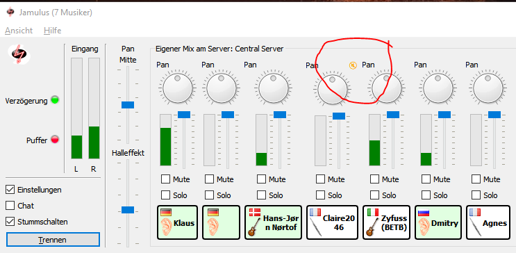
This is how it looks like now:
corrados
on 21 May 2020
Useful feature, but UI-wise it's weird and unclear what it means. You draw a red circle spanning two channels, which resembles my impression that I don't know if it belongs to the right or left channel.
I don't have a good idea how to improve it (yet). My first intuition is to put it below the participants name.
Above the name: my local controls
Below the name: remote status / indicators
 streaps
on 21 May 2020
streaps
on 21 May 2020
Yes, I had the same impression as you that it is hard to identify the fader to which the icon belongs to. I have already changed that in the code that it is more centered. Now it is clear to which fader it belongs to.
corrados
on 21 May 2020
My first intuition is to put it below the participants name.
I thought exactly the same.
 trebmuh
on 21 May 2020
trebmuh
on 21 May 2020
My first intuition is to put it below the participants name.
I thought exactly the same.
The problem is that it takes extra vertical space.
I will start with this implementation for the next release:
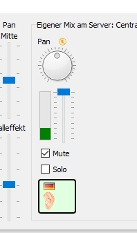
As you can see, the indicator has moved towards the middle.
If everybody is unhappy, this can easily be changed in upcoming releases then.
corrados
on 22 May 2020
This is better, but I'm still unhappy with the placement.
I don't buy the extra space reason. Haven't Google, Apple and Facebook taught us that wasting a lot of space is good design? 😂
More seriously: I don't think these few pixels are really a problem and can be saved somewhere else. The Pan knob is huge. It could be smaller or the word Pan could be put on the knob or completely removed (there is no descriptive word for the volume fader). The rectangle with the name, image, flag and bold border seems to waste some space. There is also extra horizontal space, if the participant's name is longer than a few characters. The elements are also not aligned in any way pleasing to the eye.
My proposal:
- put the icon below the name.
- remove the light grey border and use a vertical line like between "Eingang" and "Pan / Mitte"
- make the border around the name thinner with sharp instead rounded corners.
- put the word "pan" on the knob
I think there are a lot of smaller UI improvements that could be done, but that could be discussed in another issue.
streaps
on 22 May 2020
I think we should discuss these things in this Issue instead: https://github.com/corrados/jamulus/issues/73
put the word "pan" on the knob
Unfortunately this is not possible for the QDial Qt GUI control I am using right now.
corrados
on 22 May 2020
This is how it looks like if two bands are on the Central Server and all of them set to solo to hear only their band mates:
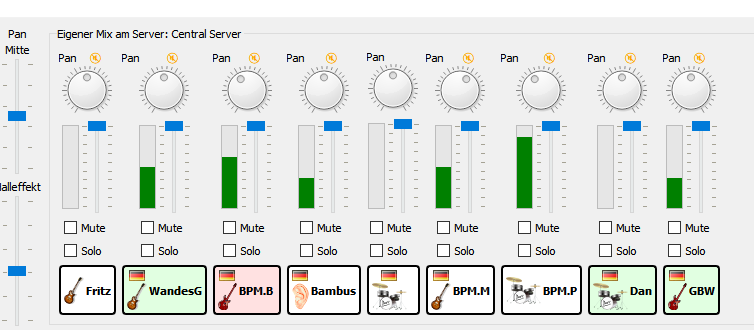
I used to do that with my band, too. But nowadays we don't do that since we do not want to disturb the other musicians. We now play on a private server.
But for this situation the new indicators are very useful.
corrados
on 26 May 2020
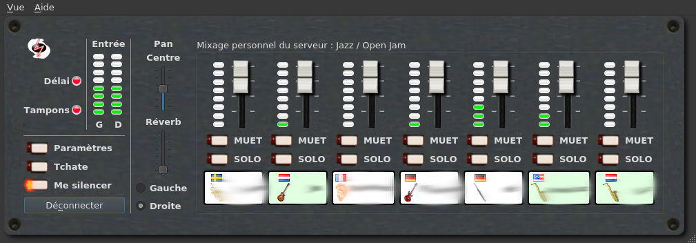
@corrados are those rotative knob supposed to be displayed on a GIT version? (built from 8bf87a3 here)
I only got this:
trebmuh
on 26 May 2020
The server version must be >= 3.5.4 (try out the Central Server) and you have to use Stereo (right now it seems you have Mono according to your screen shot).
corrados
on 26 May 2020
OK thanks for the explanation. It works now.
trebmuh
on 26 May 2020
Related issues
 mawess
·
14Comments
mawess
·
14Comments
 Snayler
·
10Comments
Snayler
·
10Comments
 kwindrem
·
8Comments
kwindrem
·
8Comments
 gilgongo
·
11Comments
gilgongo
·
11Comments
 fleutot
·
9Comments
fleutot
·
9Comments
Most helpful comment
I think we should discuss these things in this Issue instead: https://github.com/corrados/jamulus/issues/73
Unfortunately this is not possible for the QDial Qt GUI control I am using right now.