Ionic-framework: Testing Ionic 4 - Tooltips needed for web apps
Feature Request
Ionic Info
C:\ae\adaept.com\ae-svg-components>ionic info
[WARN] You are not in an Ionic project directory. Project context may be missing.

Ionic:

   ionic (Ionic CLI) : 4.0.1

System:

   NodeJS : v8.11.1
   npm    : 6.2.0
   OS     : Windows 10


C:\ae\adaept.com\ae-svg-components>
Describe the Feature Request
Tooltips needed for web apps.
Option to turn on/off for mobile.
Option to allow call to database for values.
Describe Preferred Solution
Previous Ionic implementation here:
https://github.com/zyra/ionic-tooltips
I would like to be able to do this for web apps (PWA)
using an interface with Stencil components.
Describe Alternatives
https://www.npmjs.com/package/ionic-tooltips
Problems: Tied to Angular. Not component based.
Related Code
https://github.com/zyra/ionic-tooltips
Additional Context
Related to this: https://github.com/ionic-team/ionic/issues/14862
 peterennis
All 4 comments
peterennis
on 29 Jul 2018
Expand the icon on hover shows the effect desired without the div jitter.
CSS options first and javascript second.
https://aesvg.adaept.com/
* {
--color: pink;
}
ion-icon {
color: var(--color);
width: 32px !important;
height: 32px !important;
}
ion-icon:hover {
background-color: rebeccapurple;
box-shadow: inset 0px 0px 0px 2px red;
/* width: 48px !important;
height: 48px !important; */
}
I've put myself through the wringer for too long over finding a suitable, flexible, reliable, easily-implementable tooltip component for ionic/angular. Some pointers that'll preserve fellow seekers some sanity:
- Material's offering, though reliable and easy to add, is severely inflexible
- MaterializeCSS requires too much code and interferes with theming
- ionic-tooltips by Zyra is currently incompatible with ionic 4
- Balloon tooltips have too much helium (...too light)
- Bootstrap (ngb/ngx) is problematic, hard to configure, and also limited (though much better than Material)
- 720kb requires additional work to convert to ts (build for angularJS)
- ng2-tooltip-directive and various others have other minor but disqualifying issues
- Ionic popover controller is too heavy
I considered building one myself, but didn't because, well, surely this problem has been solved by someone?...
Turns out it has, by popper.js, which is easily added to angular project with ngx-popper. The code isn't as minimal as, say, matTooltip, but that's forgivable because you can do everything, and very easily. An example from my code:
module.ts
import { NgxPopperModule } from 'ngx-popper';
...
imports: [
    ...
    NgxPopperModule,
    ...
  ],
html
<!-- Password -->
<ion-item lines="inset">
<ion-label position="floating">Password</ion-label>
<ion-input autocomplete="on"
type="password"
formControlName="password"></ion-input>
<ion-button [size]="password.invalid && password.value ? 'medium' : 'small'"
[color]="password.invalid && password.value ? 'danger' : 'primary'"
fill="clear"
slot="end"
[popper]="passwordInfo"
[popperTrigger]="'click'"
[popperApplyClass]="'classic-tooltip, dark'"
[popperBoundaries]="'ion-slides'"
[popperPreventOverflow]="true">
<ion-icon name="information-circle"></ion-icon>
</ion-button>
</ion-item>
<popper-content #passwordInfo>
Password must contain: <br>
• at least 6 characters <br>
• one capital letter <br>
• one number <br>
</popper-content>
The magic happens with ion-button popper attributes, which include specifications for:
- a template to render inside the tooltip
- a custom class
- overflow prevention (and therefore auto repositioning), by specifying a 'boundary' element
And there's a TON of other attributes and override options. The verdict: ngx-popper wins by a landslide.
For now.
 jaipresto
on 28 Jan 2019
jaipresto
on 28 Jan 2019
@brandyscarney
Any updates regarding progress on this?
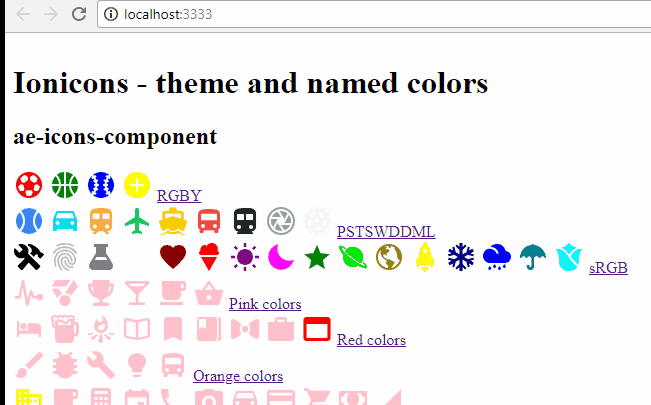
Newer version running as simple component with Stencil 1.0.6 here:
https://aeicons.adaept.com/
Repo: https://github.com/adaept/ae-icons-component
A Stencil tooltip component solution is preferred for Angular/React/Vue support.
peterennis
on 19 Jun 2019
Related issues
 giammaleoni
·
3Comments
giammaleoni
·
3Comments
 danbucholtz
·
3Comments
danbucholtz
·
3Comments
 brandyscarney
·
3Comments
brandyscarney
·
3Comments
 daveshirman
·
3Comments
daveshirman
·
3Comments
 alan-agius4
·
3Comments
alan-agius4
·
3Comments
Most helpful comment
I've put myself through the wringer for too long over finding a suitable, flexible, reliable, easily-implementable tooltip component for ionic/angular. Some pointers that'll preserve fellow seekers some sanity:
I considered building one myself, but didn't because, well, surely this problem has been solved by someone?...
Turns out it has, by popper.js, which is easily added to angular project with ngx-popper. The code isn't as minimal as, say, matTooltip, but that's forgivable because you can do everything, and very easily. An example from my code:
module.ts
html
The magic happens with ion-button popper attributes, which include specifications for:
And there's a TON of other attributes and override options. The verdict: ngx-popper wins by a landslide.
For now.