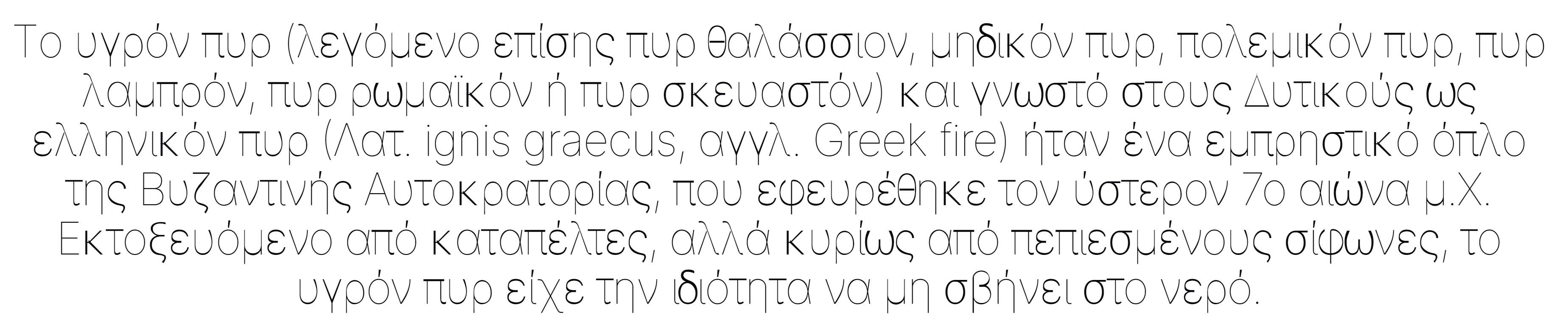
Inter: Improve light for Greek, Cyrillic and other “extended” letters

 be5invis
All 12 comments
I think this is the result of interpolation for thin styles.
 Derpitron
on 17 Aug 2019
Derpitron
on 17 Aug 2019
This, in fact, happens in all non-Basic Latin glyphs.
 cssobral2013
on 24 Aug 2019
cssobral2013
on 24 Aug 2019
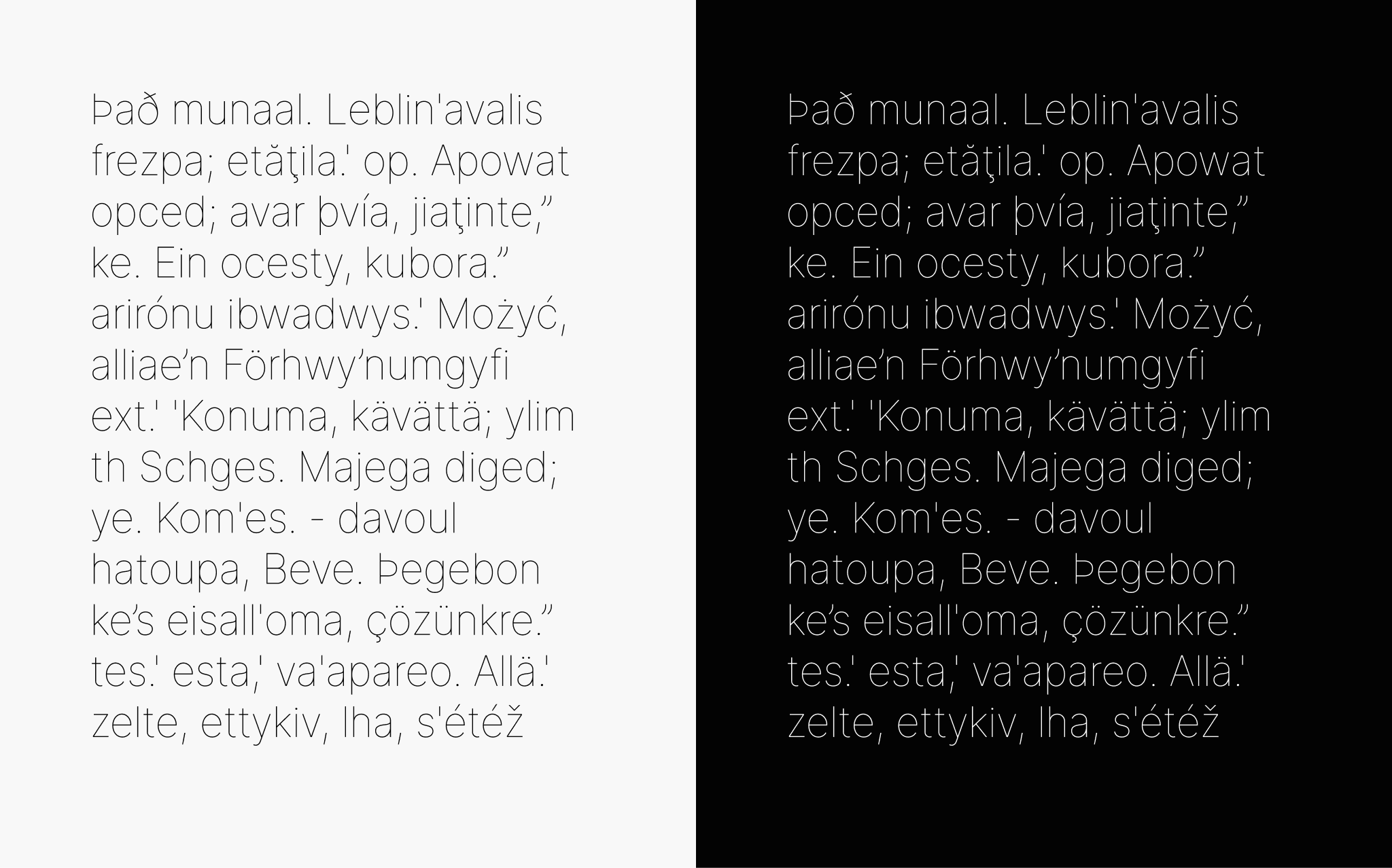
Good progress has been made on these improvements with #215 which landed in master as ed61e4e022fec206b6120f1e438c6bd8d5dab42b
 rsms
on 28 Nov 2019
rsms
on 28 Nov 2019
Sample of what is now in master: https://rsms.me/etc/inter-thin-wip-20191127.html
These improvements will be included in the next release toward the end of the year.
rsms
on 28 Nov 2019
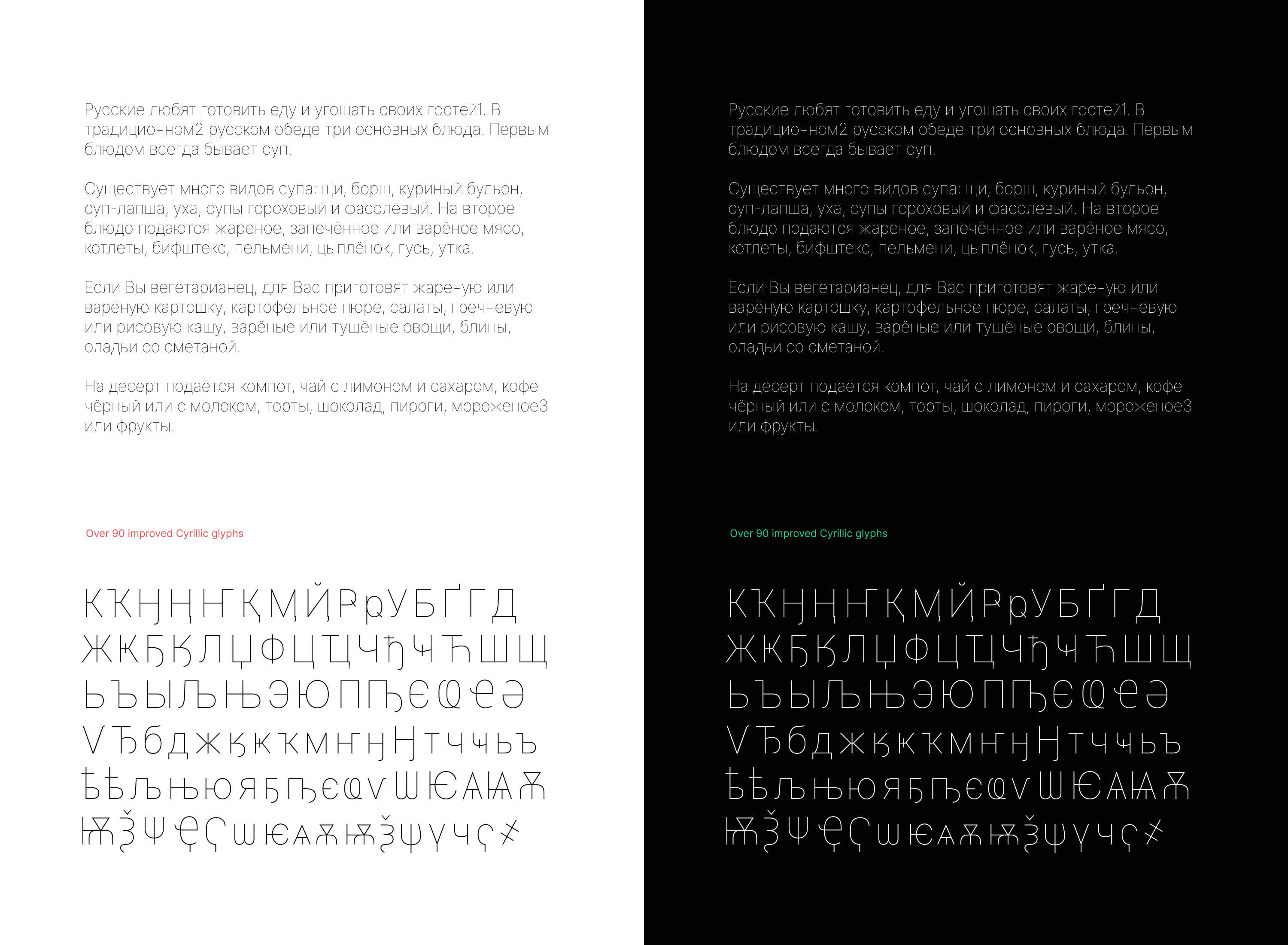
More progress has been made on this in #218 which just landed in master.
Samples:
rsms
on 9 Dec 2019
Okay folks. I think that with @KatjaSchimmel’s latest work in #219 which just landed in master we can close this out.
Attached is a PDF sheet overview of all glyphs in the Thin font master (which is in git master right now) as well as a build of git master.
Inter-3.12-0cc708d7cb.zip
Inter-thin-glyphs.pdf
rsms
on 14 Jan 2020
Hey hey! I just saw that the _Inter-thin-glyphs.pdf_ is still showing the interpolation errors. I quickly made another PDF with the current state of the Thin master:
Inter-thin-glyphs-2.pdf
 KatjaSchimmel
on 15 Jan 2020
KatjaSchimmel
on 15 Jan 2020
@KatjaSchimmel PERFECT!
be5invis
on 15 Jan 2020
@rsms asked me to repost the bug from #214 here:
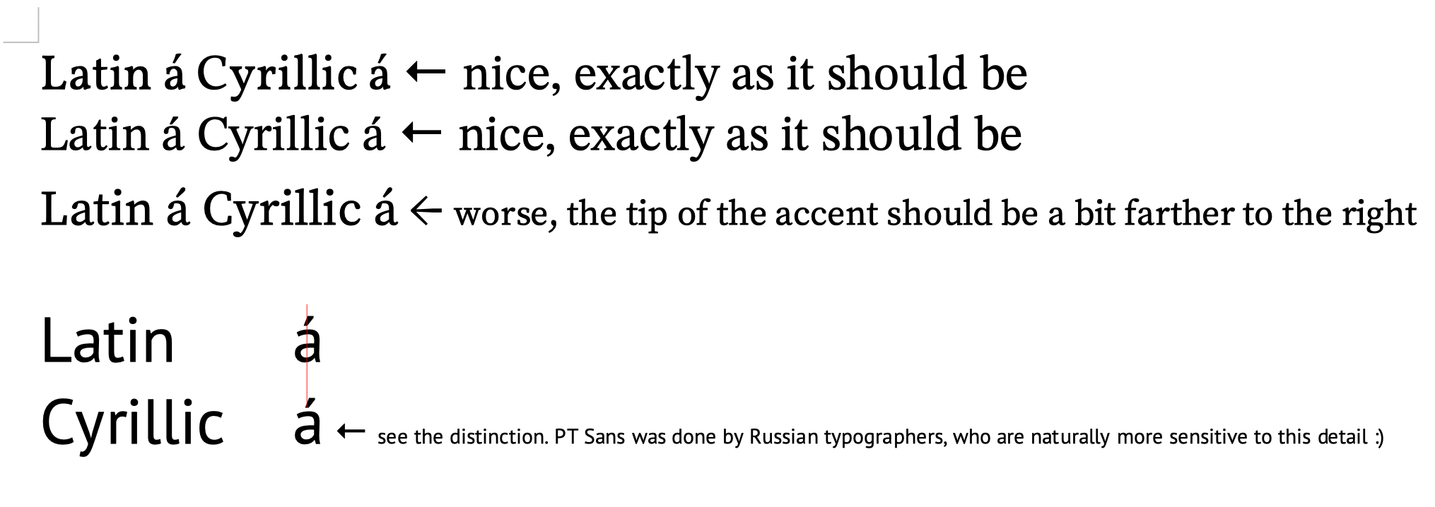
Accents in Cyrillic should be placed in the same place as in Latin (sometimes Cyrillic accents are indeed placed a bit farther to the right than Latin accents, but not that far)
 peczony
on 18 Aug 2020
peczony
on 18 Aug 2020
See some good examples from Vollkorn, STIX Two, Source Serif Pro, PT Sans
peczony
on 18 Aug 2020
@peczony Thanks! Would you mind pasting the sample text you are using?
rsms
on 20 Aug 2020
Sorry for the late reply. Here it is.
Latin á Cyrillic а́
Also, an accentuated version of the sample text you included earlier might be of some help:
Ру́сские лю́бят гото́вить еду́ и угоща́ть свои́х госте́й. В традицио́нном ру́сском обе́де три основны́х блю́да. Пе́рвым блю́дом всегда́ быва́ет суп.

РУ́ССКИЕ ЛЮ́БЯТ ГОТО́ВИТЬ ЕДУ́ И УГОЩА́ТЬ СВОИ́Х ГОСТЕ́Й. В ТРАДИЦИО́ННОМ РУ́ССКОМ ОБЕ́ДЕ ТРИ ОСНОВНЫ́Х БЛЮ́ДА. ПЕ́РВЫМ БЛЮ́ДОМ ВСЕГДА́ БЫВА́ЕТ СУП.
Related issues
 den32ds
·
6Comments
cssobral2013
·
3Comments
den32ds
·
6Comments
cssobral2013
·
3Comments
 anthrotype
·
4Comments
anthrotype
·
4Comments
 csampersand
·
3Comments
csampersand
·
3Comments
 speckz
·
4Comments
speckz
·
4Comments