Incubator-superset: [Design Proposal] Add universal "New" button
We would like Superset users to have a consistent, easily accessible way to jump into the creation flow for SQL Queries, Charts, and Dashboards. Here's what we propose:
- Add a “New” button into the nav as shown. Allow the button to inherit padding, typography, colors as it would by default. (Despite an earlier discussion about this, we would rather reserve the dropdown hover color and padding conversation for a separate ticket which I will create in JIRA. So the hover color for this new dropdown will likely be teal.)
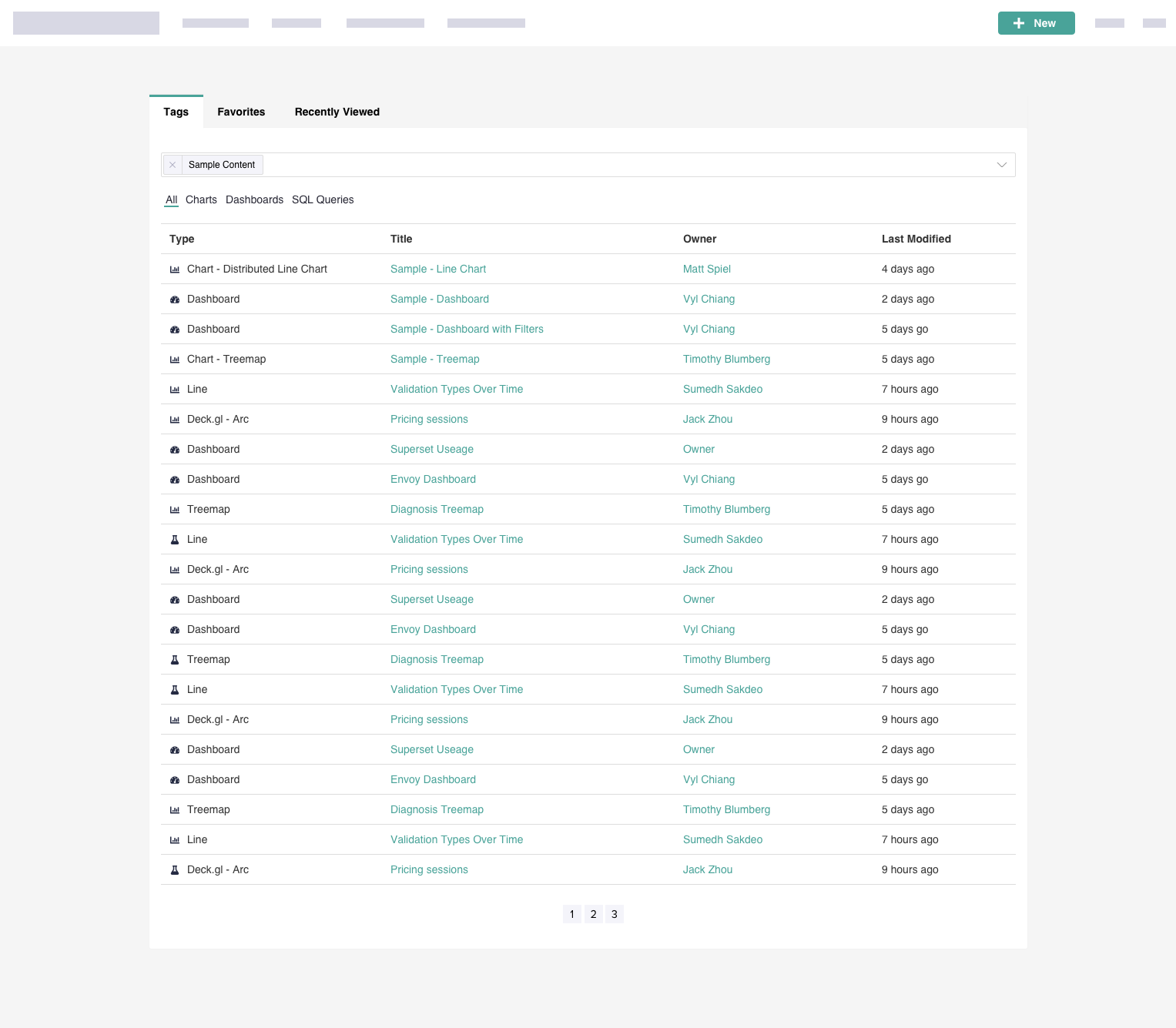
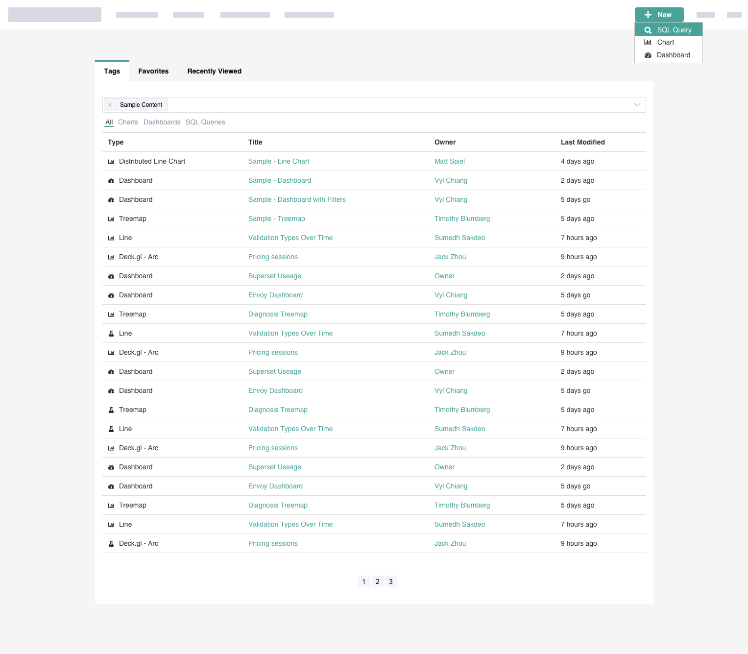
- Remove the “+” button from our CRUD UI for Charts, SQL Queries, and Dashboards. Allow the filter icon and associated text to right align into that space.

- Update the “Add Filter” text to “Filter Results”. Only update the copy; please leave the gray hover interaction as-is.
 dorq
dorq
All 15 comments
cc @elibrumbaugh
dorq
on 12 Jan 2019
This is something I've wanted to see for so long!
SG passing through the standard styles. Will keep an eye out on the other ticket/convo.
Removing the + from the CRUD UI is a huge usability improvement. Placement of this button seems pretty standard which is nice. I like the right aligned Filter action placement.
Q: Just to clarify this [new] button will persist through all pages?
- I think "Add Filter" is a little more clear than "Filter Results". Filtering results sounds to me like I'm filtering on a search query I've already made.
 elibrumbaugh
on 12 Jan 2019
elibrumbaugh
on 12 Jan 2019
Q: Just to clarify this [new] button will persist through all pages?
Yes! It will be part of the nav, so visible anywhere nav is visible.
I think "Add Filter" is a little more clear than "Filter Results". Filtering results sounds to me like I'm filtering on a search query I've already made.
Definitely open to suggestions here! Hopefully we'll hear input from others on this.
dorq
on 12 Jan 2019
Tackled Filter Results here https://github.com/apache/incubator-superset/pull/6670
 mistercrunch
on 12 Jan 2019
mistercrunch
on 12 Jan 2019
"Add Filter" doesn't make sense either. How about "Advanced Search" since the action of clicking on the funnel icon forces you to do an explicit search with parameters?
 vylc
on 12 Jan 2019
vylc
on 12 Jan 2019
I'm tackling most of what's in here in #6670.
Beyond this, we'll need to improve the "New -> Chart" page, notably the "datasource has not yet been created" flow. Also we probably need a decent path to create charts from the context of a dashboard (currently I you can only add charts that have been created before you entered the dashboard edit page).
mistercrunch
on 12 Jan 2019
"Add Filter" doesn't make sense either. How about "Advanced Search" since the action of clicking on the funnel icon forces you to do an explicit search with parameters?
I would take "Filter Results" over "Advanced Search". Describing this as a filter on search results vs another search seems more clear to me.
elibrumbaugh
on 13 Jan 2019
How about "Filter List" or "Filter this List"?
dorq
on 14 Jan 2019
Seems like we are trying to nail down the _right name_ for the content on the page. _Results_ implies some kind of previous search action. List is generic and would work for any page it is on, but perhaps we need to use something specific to the content type on the page.
Would there be a way for us to dynamically name the content that needs filtering? Ala _Filter Charts_, _Filter Dashboards_, etc.
 thinmatt
on 14 Jan 2019
thinmatt
on 14 Jan 2019
Each of the CRUD sections is titled with "List ___" where "___" is Charts, Dashboards, etc. So it feels like it makes most sense to say "Filter List" since 1) it doesn't imply a previous search (like "Results" or "Search" may imply) and 2) user is actually applying the filter to that list.
Any concerns with going ahead with "Filter List" for now?
dorq
on 15 Jan 2019
I'm okay with filter list but if we're going to say filter list should we just say filter?
elibrumbaugh
on 17 Jan 2019
Agreed. We should probably go through and review our copy for things like this. On the same UI it also says "List Charts" which we could change at the same time. I've created a ticket for this: #6710
dorq
on 17 Jan 2019
Merged the related PR. Outstanding items:
- Removing the round "+" button on list view: decided to leave that open for discussion. Currently the template is shared by all entities in Flask App Builder. I could change it to make it such that some models would use an alternate template without the "+" button but it would make the view inconsistent across entities. Also some users might be used in using the button and look for it. Open for discussion/change, but left it out for now.
- Didn't change the color on "Filter List" to our brand-primary, just because it was a bit tricky to do that. It currently uses a borderless button because it's a dropdown button (menu expands as you click it, and it's a bootstrap thing. When removing the hack showing the border, it overflowed and I was not in the mood for css tweaking today :) I agree that this is confusing though. The "Filter List" and plus sign don't seem like 2 different actions...
mistercrunch
on 18 Jan 2019
Thanks for writing this up @mistercrunch. Could you share screenshots?
elibrumbaugh
on 18 Jan 2019
This issue has been automatically marked as stale because it has not had recent activity. It will be closed if no further activity occurs. Thank you for your contributions.
![stale[bot] picture](https://avatars3.githubusercontent.com/in/1724?v=4&s=40) stale[bot]
on 10 Apr 2019
stale[bot]
on 10 Apr 2019
Related issues
 amien90
·
3Comments
amien90
·
3Comments
 deity-bram
·
3Comments
deity-bram
·
3Comments
 joshuacano
·
3Comments
joshuacano
·
3Comments
 kalimuthu123
·
3Comments
kalimuthu123
·
3Comments
 gbrian
·
3Comments
gbrian
·
3Comments
Most helpful comment
Each of the CRUD sections is titled with "List ___" where "___" is Charts, Dashboards, etc. So it feels like it makes most sense to say "Filter List" since 1) it doesn't imply a previous search (like "Results" or "Search" may imply) and 2) user is actually applying the filter to that list.
Any concerns with going ahead with "Filter List" for now?