Incubator-superset: Display Null values as 0 on Timeseries Charts
Make sure these boxes are checked before submitting your issue - thank you!
- [x ] I have checked the superset logs for python stacktraces and included it here as text if any
- [x ] I have reproduced the issue with at least the latest released version of superset
- [x ] I have checked the issue tracker for the same issue and I haven't found one similar
Superset does not represent null values as 0 on timeseries charts.
Related to: https://github.com/apache/incubator-superset/issues/5427
For the dataset:
Date: Value
Jan 1: 10
Jan 3: 7
Superset version
026.3
Expected results
For the above data set, Superset should draw 3 points on the chart:
Jan 1 = 10
Jan 2 = 0
Jan 3 = 7
Actual results
The Timeseries - Line Chart and Timeseries - Bar Chart will not graph "missing" records from the query.
Line Chart:
- If the date range begins at Jan 1, it will draw and then connect the points for Jan 1 and Jan 3, making the relationship between the two dates look linear.
- If the date range begins before Jan 1, the first value on the x-axis will be Jan 1, ignoring previous dates.
Bar Chart:
- Behaves similarly to the line chart, except "null" values will have no bar.
- The only bars drawn will be for Jan 1 and Jan 3 and presented directly next to each other.
- This is visually deceptive, as it inaccurately displays relationships between timeseries values.
Steps to reproduce
See above examples
 aaronbannin
All 9 comments
@mistercrunch I'd love some feedback from the core team on this (not sure who is the right person?) before we get a PR submitted.
aaronbannin
on 17 Sep 2018
For line chart, there's the resample feature that can help forcing null to zeroes:
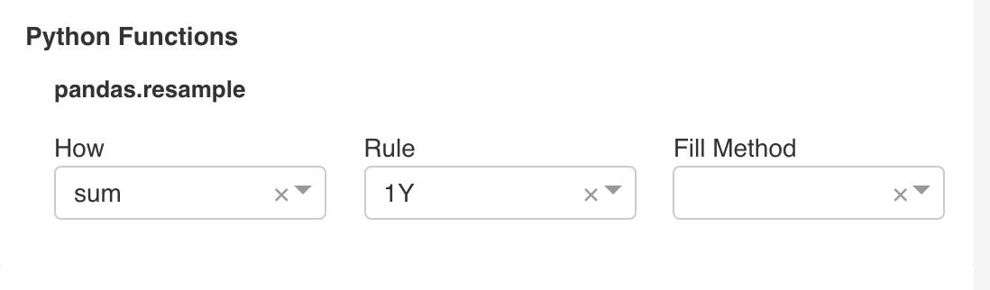
Null handling is trickier than it may seem as people may want:
- null to be replaced by 0
- lines in line chat to be broken off, show a line on the left, and a line on the right
- lines to skip over missing points, connecting the dots on either side
Ultimately we should offer these options in a nice way. For now the resample option and showing markers are ways to mitigate.
 mistercrunch
on 19 Sep 2018
mistercrunch
on 19 Sep 2018
@mistercrunch thank you for pointing out the different display options that people want.
@aaronbannin I would want NULL values to be handled by this option; "lines in line chat to be broken off, show a line on the left, and a line on the right"
 davidhassan
on 19 Sep 2018
davidhassan
on 19 Sep 2018
I don't think NVD3 supports that. We're planning on moving away from NVD3 at some point, that may be a pre-req to implementing this.
mistercrunch
on 19 Sep 2018
Perhaps the underlying problem is that the data being passed into the chart does not have a value for every x-axis tick? This may be solvable without editing the NVD3.
- Generate the x-series based on time duration and grain. If range is Jan 1 - Jan 3 with daily granularity, then generate
[Jan 1, Jan 2, Jan 3]. - Left join generated series into data set. This would generate
{Jan 1: 10, Jan 2: None, Jan 3: 7}. Each metric would need to be left-joined into the source series. - When drawn, lines should then skip over missing points.
This logic should work for time series graphs. Jan 2 occurs between Jan 1 and Jan 3, regardless of if any data is in the returned set. The approach would not work for arbitrary dimensions as Superset does not have knowledge of the set of values. Furthermore, this would mean that the first x-axis bounds would be determined by the date range and not the returned set.
In response to approaches:
- null to be replaced by 0: This does feel like a hack that alters the underlying data.
lines in line chat to be broken off, show a line on the left, and a line on the right: I agree with @davidhassan that this is probably the best solution. It accurately visualizes the returned data.
lines to skip over missing points, connecting the dots on either side: This seems like the worst option as the visual is out of sync with the underlying data (more so than replacing with 0s, in my opinion, as 0 is "closer" to null than other values).
aaronbannin
on 19 Sep 2018
Some examples:
Line chart with disconnected lines for null values. Note that another metric has values for a given x-tick, so the chart "knows" that series A is null while series B has value.
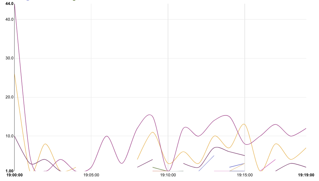
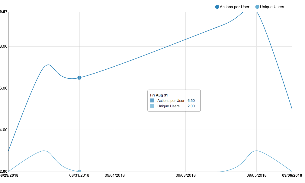
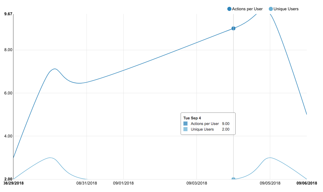
Connecting null values:
There is only 1 series, missing values for Sat, Sun, and Mon. The line is drawn between the two known data points. Inserting null values should produce the same result as the above example, but with one series.
aaronbannin
on 20 Sep 2018
This issue has been automatically marked as stale because it has not had recent activity. It will be closed if no further activity occurs. Thank you for your contributions.
![stale[bot] picture](https://avatars3.githubusercontent.com/in/1724?v=4&s=40) stale[bot]
on 10 Apr 2019
stale[bot]
on 10 Apr 2019
Please do not close
 rumbin
on 10 Apr 2019
rumbin
on 10 Apr 2019
This issue has been automatically marked as stale because it has not had recent activity. It will be closed if no further activity occurs. Thank you for your contributions. For admin, please label this issue .pinned to prevent stale bot from closing the issue.
stale[bot]
on 9 Jun 2019
Related issues
 gbrian
·
3Comments
gbrian
·
3Comments
 eliab
·
3Comments
eliab
·
3Comments
 shyam2794
·
3Comments
shyam2794
·
3Comments
 ghost
·
3Comments
ghost
·
3Comments
 thoralf-gutierrez
·
3Comments
thoralf-gutierrez
·
3Comments
Most helpful comment
For line chart, there's the resample feature that can help forcing null to zeroes:

Null handling is trickier than it may seem as people may want:
Ultimately we should offer these options in a nice way. For now the resample option and showing markers are ways to mitigate.