Incubator-echarts: Axis name padding does not account for axis labels
What problem does this feature solve?
Axis name padding is currently relative to the axis itself without accounting for other elements like axis labels, etc. Padding in the DOM is aware of all other elements and so ensures sufficient white space. This feature would consider all such elements and set the grid padding accordingly to automatically allow enough space for all elements that need to appear between the grid and the edge of the container -- ensuring a predictable amount of whitespace around each element.
What does the proposed API look like?
It would remain the same as the current padding option, but would not be relative to the axis, it would instead be relative to the closest neighboring element.
 adrielsantiago
All 5 comments
Hi! We've received your issue and please be patient to get responded. 🎉
The average response time is expected to be within one day for weekdays.
In the meanwhile, please make sure that you have posted enough image to demo your request. You may also check out the API and chart option to get the answer.
Have a nice day! 🍵
![echarts-bot[bot] picture](https://avatars1.githubusercontent.com/in/20872?v=4&s=40) echarts-bot[bot]
on 27 Mar 2019
echarts-bot[bot]
on 27 Mar 2019
It would remain the same as the current padding option
Do you mean the axisLabel.margin or nameGap or axisLabel.padding here ?
Because I think there is no option named padding for axis name currently.
For the options above:
axisLabel.margin is not a good name (by historical reason) and might bring misleading to users. It actually means the gap between the axis label and the axis line.
axisLabel.padding indeed only consider itself only without the neighboring elements. It is implemented the same as other labels follow the "rich text" module.
ECharts does not have an overall layout system as DOM did in Normal Flow, Floats, etc., which layout DOM elements by the margin/padding automatically without overlap. The layout strategies in echarts are case by case, meeting each chart/component requirements. That makes the code easy to implement but probably less customizable and intelligent.
Go back to this issue. I think what we can do is:
- Enhance the axis label and tick layout strategy to avoid overlap and more customizable and meet some certain requirements (especially in time axis)
- Since the option grid.containLabel already makes the grid auto located considering the axis label without overflow the edge of the echarts area, we probably also need to take axis name into account in this layout (current not consider axis name yet).
- For long axis name, indeed it needs a more intelligent auto adjustment when it will overflow the container.
 100pah
on 27 Mar 2019
100pah
on 27 Mar 2019
I was referring to yAxis.nameTextStyle.padding and I suppose that also applies to xAxis.nameTextStyle.padding. Thanks for pointing out grid.containLabel I will test a bit more to see if it provides a viable alternative.
adrielsantiago
on 27 Mar 2019
grid.containLabel is great for dynamic axis labels, but as you already noted does not consider the axis name:
Since the option grid.containLabel already makes the grid auto located considering the axis label without overflow the edge of the echarts area, we probably also need to take axis name into account in this layout (current not consider axis name yet).
I think implementing this would indeed solve the issue I was noticing.
adrielsantiago
on 17 Apr 2019
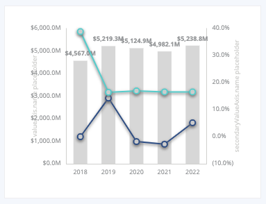
I agree this feature would be very useful. I've tried using grid.containLabel along with various other properties mentioned above, but it leads to a lot of manual calculations to account for the overlap and I can't always predict the data range a particular chart will need to display. Here is an example where the axis label notation (thousands, millions, trillions, etc.) and format can be customized by dashboard users, which means axisLabels have a wide range of potential widths:
 sjcobb
on 12 Nov 2019
sjcobb
on 12 Nov 2019
Related issues
 wm370857724
·
3Comments
wm370857724
·
3Comments
 marine1ly
·
3Comments
marine1ly
·
3Comments
 Thinkpad93
·
3Comments
Thinkpad93
·
3Comments
 liuqz
·
3Comments
liuqz
·
3Comments
 jxffly
·
3Comments
jxffly
·
3Comments
Most helpful comment
Do you mean the axisLabel.margin or nameGap or axisLabel.padding here ?
Because I think there is no option named
paddingforaxis namecurrently.For the options above:
axisLabel.margin is not a good name (by historical reason) and might bring misleading to users. It actually means the gap between the axis label and the axis line.
axisLabel.padding indeed only consider itself only without the neighboring elements. It is implemented the same as other labels follow the "rich text" module.
ECharts does not have an overall layout system as DOM did in Normal Flow, Floats, etc., which layout DOM elements by the margin/padding automatically without overlap. The layout strategies in echarts are case by case, meeting each chart/component requirements. That makes the code easy to implement but probably less customizable and intelligent.
Go back to this issue. I think what we can do is: