 mweststrate
All 8 comments
Hi Michel! I love this project, Mobx is also one of my favs! I did something simple yesterday night, let me know what do you think :)

 diegochavez
on 17 Jan 2018
diegochavez
on 17 Jan 2018
Thanks and looks neat! Will wait a while to see if more contenders show up :)
mweststrate
on 24 Jan 2018
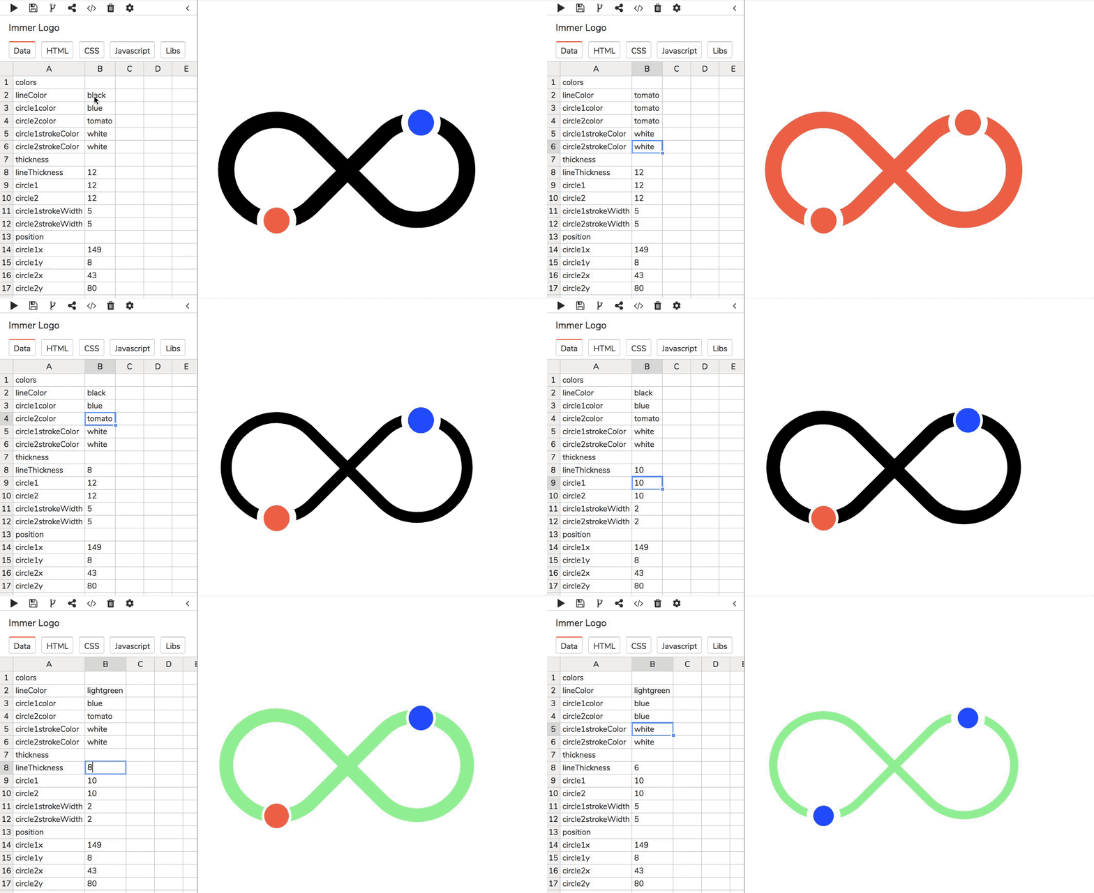
In my humble opinion the infinity sign is a must with a name like Immer... Thanks @diegochavez!
I made a little tool in which people can adjust the colors and properties of the logo. I'm not a designer so I hope other people can jump in and pick the right colors, stroke thicknesses and all that...
 Sventenhaaf
on 1 Feb 2018
Sventenhaaf
on 1 Feb 2018
@diegochavez I think I like your approach best so far :) Maybe you could play a little with shadow or a little gradient (like is done for the mobx-state-tree logo)? Thanks!
mweststrate
on 20 Feb 2018
@mweststrate Awesome! I'll add some style to match mobx-state-tree logo like you suggest. 👍
diegochavez
on 22 Feb 2018

@mweststrate hey time ago I've been quite busy but I get some time this week 👍 .
Take a look this simpler version

diegochavez
on 13 Mar 2018
@mweststrate Some recommendations:
I would recommend against shadows/gradients/transparencies in logos. Good logo design seeks to make the logo recognizable even when only one, flat color is available, such as black-on-white themed icon sets. It should also work with two to six solid colors if it isn't designed to only have a single color variant. (and remember to check these with colorblind modes)
I would recommend that, unless you plan to make a logo significantly asymmetrical, the logo should aim for some symmetry. The infinity sign above could not be bisected and mirrored horizontally or vertically and still result in the same symbol because it is very slightly asymmetrical on both axes.
Personal opinion: with the rise of SVG, designing a logo that can be efficiently expressed in SVG is a good idea, allowing logos to just be inlined to avoid round trips and network failures.
 dwighthouse
on 28 Mar 2018
dwighthouse
on 28 Mar 2018
Picked the first one, also based on the comments by @dwighthouse . Thanks @diegochavez !
mweststrate
on 16 Aug 2018
Related issues
 phryneas
·
5Comments
phryneas
·
5Comments
 vidarc
·
3Comments
vidarc
·
3Comments
 dfadev
·
6Comments
dfadev
·
6Comments
 lizagilman
·
3Comments
lizagilman
·
3Comments
 yuanalexwu
·
5Comments
yuanalexwu
·
5Comments
Most helpful comment
Hi Michel! I love this project, Mobx is also one of my favs! I did something simple yesterday night, let me know what do you think :)