Hi
seems the combo widget has an old style ( the arrow button ) , i hope you consider change it ;)
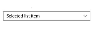
like this :
 codz01
All 5 comments
I am not sure why you employ "old style" vs "new style" here.
I'll probably revisit this when doing a larger pass on the styling system but this is not really something that I expect to be looking at super soon.
If you need it, feel free to create yourself a custom BeginCombo or modify ArrowButton.
 ocornut
on 17 Dec 2018
ocornut
on 17 Dec 2018
it just remind me about the old windows combobox , never mind i just
imagining imgui would be looking good with this combo style.
if i had time i'll try to create this combo
codz01
on 17 Dec 2018
I agree it would be a good look but we need to tackle this at a higher scope that just looking at the combo box. I appreciate this sort of concrete example case, this can be one target to achieve for styling v2.
ocornut
on 17 Dec 2018
Tried changing locally ImGui::RenderArraw to experiment:
```void ImGui::RenderArrow(ImVec2 p_min, ImGuiDir dir, float scale)
{
ImGuiContext& g = *GImGui;
const float h = g.FontSize * 1.00f;
float r = h * 0.40f * scale;
ImVec2 center = p_min + ImVec2(h * 0.50f, h * 0.50f * scale);
ImVec2 a, b, c;
switch (dir)
{
case ImGuiDir_Up:
case ImGuiDir_Down:
if (dir == ImGuiDir_Up) r = -r;
b = ImVec2(+0.000f,+0.750f) * r;
a = ImVec2(-0.750f,-0.00f) * r;
c = ImVec2(+0.750f,-0.00f) * r;
break;
case ImGuiDir_Left:
case ImGuiDir_Right:
if (dir == ImGuiDir_Left) r = -r;
b = ImVec2(+0.750f,+0.000f) * r;
c = ImVec2(-0.000f,+0.750f) * r;
a = ImVec2(-0.000f,-0.750f) * r;
break;
case ImGuiDir_None:
case ImGuiDir_COUNT:
IM_ASSERT(0);
break;
}
g.CurrentWindow->DrawList->AddTriangle2(center + a, center + b, center + c, GetColorU32(ImGuiCol_Text), 2.0f);
}
With `AddTriangle2` (dummy name for sure)
```void ImDrawList::AddTriangle2(const ImVec2& a, const ImVec2& b, const ImVec2& c, ImU32 col, float thickness)
{
if ((col & IM_COL32_A_MASK) == 0)
return;
PathLineTo(a);
PathLineTo(b);
PathLineTo(c);
PathStroke(col, false, thickness);
}
 zejal
on 3 Feb 2019
zejal
on 3 Feb 2019
Hello, I'm trying to make a custom ImGui style, that would look "production ready" (whatever that means). Imgui suffers from this idea, people have, that it's only made for debug UI. So when trying to convince UX designers (or my boss) that it can be used in production and look good, strangely, it's the small details like this arrow that get in the way, and tend to make the conversation shorter...
This arrow is literally everywhere in the UI, and it's one of the rare things you can't really override or customize without changing the library code.
I made some changes so that it looks more like font awesome caret_down/up/right/left, and I think it looks better ( Absolutely biased opinion...). I've included a tab with a font_awesome caret_down as reference in this shot.

Here a glimpse at the smallest ones in TreeNodes
Compared to the regular one

the code change is super light, it's just adjusting the values in the DrawArrow function.
...
    case ImGuiDir_Down:
        if (dir == ImGuiDir_Up) r = -r;
        a = ImVec2(+0.000f, +0.450f) * r;
        b = ImVec2(-0.800f, -0.450f) * r;
        c = ImVec2(+0.800f, -0.450f) * r;
        break;
    case ImGuiDir_Left:
    case ImGuiDir_Right:
        if (dir == ImGuiDir_Left) r = -r;
        a = ImVec2(+0.450f, +0.000f) * r;
        b = ImVec2(-0.450f, +0.800f) * r;
        c = ImVec2(-0.450f, -0.800f) * r;
        break;
    case ImGuiDir_None:
...
The thing is I'm very reluctant to change imgui code, just for this and have to patch the lib with every update etc..
Of course I understand this is a very minor issue compared to everything else, and that's super low priority. But I'm ready to help. I'd happily submit a PR, but I need some directions first, because it can be addressed in many ways.
- "This is OSSOM, just submit the PR like this, everybody will love that arrow".
- I don't have universal taste and it's very likely that people will want to customize this arrow to their liking. So I could
- Add a way to customize this arrow with just 2 floats in the ImGuiStyle (like ArrowBase and ArrowTip, here would be respectively 0.8 and 0.45), But that wouldn't cover the OP request.
- Add a way for users to plug in their own implem of DrawArrow. This one is a bit more complex though and I'd need more guidance. Maybe a define based macro like for custom allocators IM_ALLOC, etc...
- "No"
Thanks.
 Nehon
on 22 Mar 2020
Nehon
on 22 Mar 2020
Related issues
 BlackWatersInc
·
3Comments
BlackWatersInc
·
3Comments
 noche-x
·
3Comments
noche-x
·
3Comments
 the-lay
·
3Comments
the-lay
·
3Comments
 SlNPacifist
·
3Comments
SlNPacifist
·
3Comments
 DarkLinux
·
3Comments
DarkLinux
·
3Comments
Most helpful comment
Hello, I'm trying to make a custom ImGui style, that would look "production ready" (whatever that means). Imgui suffers from this idea, people have, that it's only made for debug UI. So when trying to convince UX designers (or my boss) that it can be used in production and look good, strangely, it's the small details like this arrow that get in the way, and tend to make the conversation shorter...
This arrow is literally everywhere in the UI, and it's one of the rare things you can't really override or customize without changing the library code.
I made some changes so that it looks more like font awesome caret_down/up/right/left, and I think it looks better ( Absolutely biased opinion...). I've included a tab with a font_awesome caret_down as reference in this shot.


Here a glimpse at the smallest ones in TreeNodes
Compared to the regular one
the code change is super light, it's just adjusting the values in the DrawArrow function.
The thing is I'm very reluctant to change imgui code, just for this and have to patch the lib with every update etc..
Of course I understand this is a very minor issue compared to everything else, and that's super low priority. But I'm ready to help. I'd happily submit a PR, but I need some directions first, because it can be addressed in many ways.
Thanks.