Imgui: Child Window using ImGuiWindowFlags_AlwaysAutoResize
Is it possible to have a child windows obey the ImGuiWindowFlags_AlwaysAutoResize flag?
It currently doesn't but I am not sure if there are other child window constraints that make this flag impossible to support or if it's an error.
Thanks!
 Pagghiu
All 5 comments
Ok I have seen where it's overriding the size
// Apply minimum/maximum window size constraints and final size
ApplySizeFullWithConstraint(window, window->SizeFull);
window->Size = window->Collapsed ? window->TitleBarRect().GetSize() : window->SizeFull;
// POSITION
// Position child window
if (flags & ImGuiWindowFlags_ChildWindow)
{
window->OrderWithinParent = parent_window->DC.ChildWindows.Size;
parent_window->DC.ChildWindows.push_back(window);
}
if ((flags & ImGuiWindowFlags_ChildWindow) && !(flags & ImGuiWindowFlags_Popup))
{
window->Pos = window->PosFloat = parent_window->DC.CursorPos;
window->Size = window->SizeFull = size_on_first_use; // NB: argument name 'size_on_first_use' misleading here, it's really just 'size' as provided by user passed via BeginChild()->Begin().
}
And now I understand that to achieve what I want, additionally to modifying the above code I need separate AlwaysAutoResizeX and AlwaysAutoResizeY.
Pagghiu
on 26 Oct 2017
@Pagghiu I'm interested to understand what you are trying to achieve there? If you auto-resize a child window it would essentially prevent scrolling from happening, which maybe cancel out the point of a child window?
About the code you posted: you should update to master before trying to make changes to it because I have recently applied some renaming/refactoring to this, there's no size_on_first_use anymore, BeginChild() just calls SetNextWindowSize() prior to Begin().
 ocornut
on 27 Oct 2017
ocornut
on 27 Oct 2017
Sorry for the delay in the response, so many things going on this week! 😄
I am creating our own thin (or maybe not so thin) wrapper on top of ImGui, mainly to shield our UI systems from any API breakage that future versions of the library may introduce and some other reasons.
While doing that I've decided to experiment and add some kind of styling and animation support, to do transitions, along the lines of modern mobile OS (android/ios).
I am trying to wrap the Push/Pop system with a "style" object that can push multiple things all at once and that one can always override when calling a single control function, with the overall goal of reducing code verbosity when changing styles often.
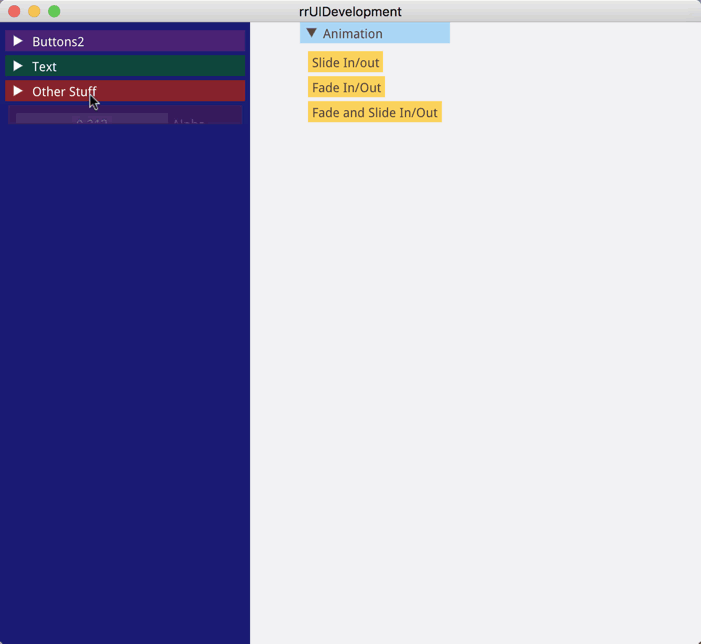
The (currently incomplete) experimental api looks like this.
extern "C" RR_EXPORT int hotReloadDraw(void* _view)
{
    using namespace rrUI;
    ImGui::PushStyleVar(ImGuiStyleVar_WindowRounding, 0);
    ImGui::PushStyleVar(ImGuiStyleVar_FrameRounding, 0);
    ImGui::GetStyle().DisplayWindowPadding   = ImVec2(0, 0);
    ImGui::GetStyle().DisplaySafeAreaPadding = ImVec2(0, 0);

    UserInterface ui;
    vec2          halfButton(150, 30);

    ImGui::SetNextWindowPos(ImVec2(300, 0), ImGuiCond_Once);
    if (ui.begin("Animation"))
    {
        if (ui.button("Slide In/out"))
        {
            ui.animate("Test Window").slideOutLeft().during(600);
        }
        if (ui.button("Fade In/Out"))
        {
            ui.animate("Test Window").fadeTo(0).during(600);
        }
        if (ui.button("Fade and Slide In/Out"))
        {
            ui.animate("Test Window").slideOutLeft().during(600);
            ui.animate("Test Window").fadeTo(0).during(600);
        }
        ui.end();
    }

    ImGui::SetNextWindowPos(ImVec2(0, 0), ImGuiCond_Once);
    ImGui::SetNextWindowSize(ImVec2(250, ImGui::GetIO().DisplaySize.y), ImGuiCond_Always);
    static ImColor col = ImColor(25, 26, 112, 255);
    ImGui::PushStyleColor(ImGuiCol_WindowBg, (ImU32)col);
    if (ui.begin("Test Window", ImGuiWindowFlags_NoMove | ImGuiWindowFlags_NoResize | ImGuiWindowFlags_NoTitleBar))
    {
        static bool isVisible  = true;
        static bool isDisabled = false;
        const style iconButton = style().visible(isVisible).disabled(isDisabled).size(150, 35);
        const style iconHeader = style().visible(isVisible);
        if (ui.headerBackgroundBegin("Buttons2", ImVec2(0, 350), style().backgroundColor(ImColor(125, 40, 125, 200)).textColor(white)))
        {

            ui.checkbox("Buttons Visible", &isVisible);
            ui.checkbox("Buttons Disabled", &isDisabled);
            ui.button("Button Size (150 x 30)", style().size(150, 30));
            ui.button("Button Disabled", style().disabled(true).backgroundColor(ColorDarkPrimary).textColor(TextSecondary));
            ui.pushStyle(iconButton);
            ui.button("Button Icon", style(), buttonOptions().icon(ImGui_fa_folder));
            ui.button("Half Width", style().width(0.5));
            ui.button("Full Width", style().width(1).fontScale(2));
            ui.popStyle();
            ui.button("Red Button with white text", style().backgroundColor(red).textColor(white));
            if (ui.button("Open Dialog"))
            {
                ui.openDialog("Confirmation");
            }
            ui.button("Button Text", style().size(halfButton).backgroundColor(blue).textColor(green).rounding(5));
        }
        ui.headerBackgroundEnd();

        if (ui.headerBackgroundBegin("Text",  ImVec2(0, 250), style().backgroundColor(ImColor(0, 120, 0, 200)).textColor(white)))
        {
            ui.h1("Title of stuff");
            ui.h2("Blue Subtitle", style().textColor(blue));
            ui.h3("Sub-Subtitle");
            ui.paragraph("Text text text text");
            ui.paragraph("Some more text");
        }
        ui.headerBackgroundEnd();

        if (ui.headerBackgroundBegin("Other Stuff",  ImVec2(0, 200), style().backgroundColor(ImColor(200, 40, 0, 200)).textColor(white)))
        {
            const style common = style().size(halfButton.x / 2, halfButton.y);
            ui.h2("Header 2");
            ui.paragraph("This is paragraph text");
            ui.button("Load", common);
            ui.sameLine();
            ui.button("Save", style(common).visible(true));
        }
        ui.headerBackgroundEnd();
    }
    ui.end();

    if (ui.beginDialog("Confirmation"))
    {
        if (ui.endDialogOkCancel("Are you sure you want to delete following files?"))
        {
            // User clicked ok
        }
    }
    ImGui::PopStyleColor();
    ImGui::PopStyleVar();
    ImGui::PopStyleVar();
    return 0;
}
What I am trying to achieve is using child windows in the "HeaderBackground" functions mainly for
- their ability to track the size of what's in them
- the ability to apply a custom color background in the right Z order without channel split etc.
- the ability to clip them to some custom size
- Plus I don't want the scrollbar to appear at all ;)
Unless I am missing something here, even with latest code from master there's no way to have a children "autosize" itself, that is what I need here to avoid hardcoding the headerBackground "child window" size in the associated function call.
Below you can find the running example that I've recorded from the above code:
Pagghiu
on 2 Nov 2017
Hi,
Nice looking stuff :)
I haven't looked very much in details yet, but it looks like you could achieve most of the same thing will only using ImGui::PushClipRect(), animating the height of your clipping rectangle, and after submitting your contents measuring the distance so you can stop growing at that point. You are presumably already storing animation state for that growing height, you'd only need to store two values (height and max height).
Unrelated but in recent commit I added internal values to measure time since Hovering or Activating an item. I wanted it for some effect related to docking, but that data could also be used for animation effects
ocornut
on 3 Nov 2017
Sorry for the delay in the response, so many things going on this week! 😄
I am creating our own thin (or maybe not so thin) wrapper on top of ImGui, mainly to shield our UI systems from any API breakage that future versions of the library may introduce and some other reasons.
While doing that I've decided to experiment and add some kind of styling and animation support, to do transitions, along the lines of modern mobile OS (android/ios).
I am trying to wrap the Push/Pop system with a "style" object that can push multiple things all at once and that one can always override when calling a single control function, with the overall goal of reducing code verbosity when changing styles often.The (currently incomplete) experimental api looks like this.
extern "C" RR_EXPORT int hotReloadDraw(void* _view)
{
    using namespace rrUI;
    ImGui::PushStyleVar(ImGuiStyleVar_WindowRounding, 0);
    ImGui::PushStyleVar(ImGuiStyleVar_FrameRounding, 0);
    ImGui::GetStyle().DisplayWindowPadding   = ImVec2(0, 0);
    ImGui::GetStyle().DisplaySafeAreaPadding = ImVec2(0, 0);

    UserInterface ui;
    vec2          halfButton(150, 30);

    ImGui::SetNextWindowPos(ImVec2(300, 0), ImGuiCond_Once);
    if (ui.begin("Animation"))
    {
        if (ui.button("Slide In/out"))
        {
            ui.animate("Test Window").slideOutLeft().during(600);
        }
        if (ui.button("Fade In/Out"))
        {
            ui.animate("Test Window").fadeTo(0).during(600);
        }
        if (ui.button("Fade and Slide In/Out"))
        {
            ui.animate("Test Window").slideOutLeft().during(600);
            ui.animate("Test Window").fadeTo(0).during(600);
        }
        ui.end();
    }

    ImGui::SetNextWindowPos(ImVec2(0, 0), ImGuiCond_Once);
    ImGui::SetNextWindowSize(ImVec2(250, ImGui::GetIO().DisplaySize.y), ImGuiCond_Always);
    static ImColor col = ImColor(25, 26, 112, 255);
    ImGui::PushStyleColor(ImGuiCol_WindowBg, (ImU32)col);
    if (ui.begin("Test Window", ImGuiWindowFlags_NoMove | ImGuiWindowFlags_NoResize | ImGuiWindowFlags_NoTitleBar))
    {
        static bool isVisible  = true;
        static bool isDisabled = false;
        const style iconButton = style().visible(isVisible).disabled(isDisabled).size(150, 35);
        const style iconHeader = style().visible(isVisible);
        if (ui.headerBackgroundBegin("Buttons2", ImVec2(0, 350), style().backgroundColor(ImColor(125, 40, 125, 200)).textColor(white)))
        {

            ui.checkbox("Buttons Visible", &isVisible);
            ui.checkbox("Buttons Disabled", &isDisabled);
            ui.button("Button Size (150 x 30)", style().size(150, 30));
            ui.button("Button Disabled", style().disabled(true).backgroundColor(ColorDarkPrimary).textColor(TextSecondary));
            ui.pushStyle(iconButton);
            ui.button("Button Icon", style(), buttonOptions().icon(ImGui_fa_folder));
            ui.button("Half Width", style().width(0.5));
            ui.button("Full Width", style().width(1).fontScale(2));
            ui.popStyle();
            ui.button("Red Button with white text", style().backgroundColor(red).textColor(white));
            if (ui.button("Open Dialog"))
            {
                ui.openDialog("Confirmation");
            }
            ui.button("Button Text", style().size(halfButton).backgroundColor(blue).textColor(green).rounding(5));
        }
        ui.headerBackgroundEnd();

        if (ui.headerBackgroundBegin("Text",  ImVec2(0, 250), style().backgroundColor(ImColor(0, 120, 0, 200)).textColor(white)))
        {
            ui.h1("Title of stuff");
            ui.h2("Blue Subtitle", style().textColor(blue));
            ui.h3("Sub-Subtitle");
            ui.paragraph("Text text text text");
            ui.paragraph("Some more text");
        }
        ui.headerBackgroundEnd();

        if (ui.headerBackgroundBegin("Other Stuff",  ImVec2(0, 200), style().backgroundColor(ImColor(200, 40, 0, 200)).textColor(white)))
        {
            const style common = style().size(halfButton.x / 2, halfButton.y);
            ui.h2("Header 2");
            ui.paragraph("This is paragraph text");
            ui.button("Load", common);
            ui.sameLine();
            ui.button("Save", style(common).visible(true));
        }
        ui.headerBackgroundEnd();
    }
    ui.end();

    if (ui.beginDialog("Confirmation"))
    {
        if (ui.endDialogOkCancel("Are you sure you want to delete following files?"))
        {
            // User clicked ok
        }
    }
    ImGui::PopStyleColor();
    ImGui::PopStyleVar();
    ImGui::PopStyleVar();
    return 0;
}
What I am trying to achieve is using child windows in the "HeaderBackground" functions mainly for
- their ability to track the size of what's in them
- the ability to apply a custom color background in the right Z order without channel split etc.
- the ability to clip them to some custom size
- Plus I don't want the scrollbar to appear at all ;)
Unless I am missing something here, even with latest code from master there's no way to have a children "autosize" itself, that is what I need here to avoid hardcoding the headerBackground "child window" size in the associated function call.
Below you can find the running example that I've recorded from the above code:
If possible, could you send the codes?
 alikeser
on 11 Aug 2020
alikeser
on 11 Aug 2020
Related issues
 KaungZawHtet
·
3Comments
KaungZawHtet
·
3Comments
 GrammarLord
·
3Comments
GrammarLord
·
3Comments
 noche-x
·
3Comments
noche-x
·
3Comments
 SlNPacifist
·
3Comments
SlNPacifist
·
3Comments
 mnemode2
·
3Comments
mnemode2
·
3Comments
Most helpful comment
Sorry for the delay in the response, so many things going on this week! 😄
I am creating our own thin (or maybe not so thin) wrapper on top of ImGui, mainly to shield our UI systems from any API breakage that future versions of the library may introduce and some other reasons.
While doing that I've decided to experiment and add some kind of styling and animation support, to do transitions, along the lines of modern mobile OS (android/ios).
I am trying to wrap the Push/Pop system with a "style" object that can push multiple things all at once and that one can always override when calling a single control function, with the overall goal of reducing code verbosity when changing styles often.
The (currently incomplete) experimental api looks like this.
What I am trying to achieve is using child windows in the "HeaderBackground" functions mainly for
Unless I am missing something here, even with latest code from master there's no way to have a children "autosize" itself, that is what I need here to avoid hardcoding the headerBackground "child window" size in the associated function call.
Below you can find the running example that I've recorded from the above code: