Question
I'm trying out the igx-combo, and I'm having some minor issues with it:
- The styling of the combo seems to differ from other components, like igx-input or igx-select, why is that? It makes it hard to use them together. For instance, here is a combo (left) and select (right). The combo has a 2px border, while inputs and selects has 1px. This seems to only be in normal state, for hover (1px) and active (2px) they seem to be the same thickness.
Also, why does the combo have a background color? At least this should have an override in the theme? Currently I have resorted to create a global css overide to set it to transparent, as shown in the screenshot above. Normally it looks like this:
 . Maybe there is something about the theme I'm not getting?
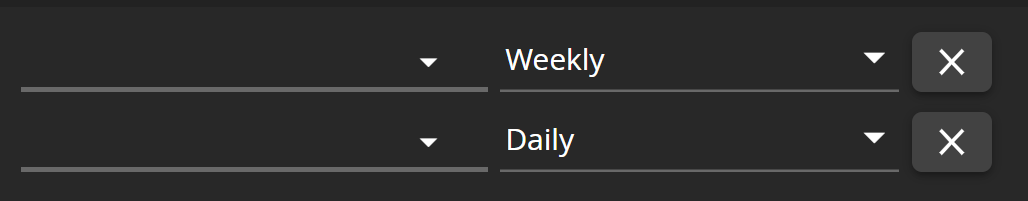
There is a section in the documentation about single item selection. While I would prefer a mode for this (like you implemented for the igx-grid row/cell selection earlier this year), it is ok to handle it with events as well I guess. However, there seems to be no way to get rid of the check boxes, and that's not good. Having check boxes like that indicated multi-selection, and its confusing that you can only select one item. Since the combo dropdown resides on the igx-overlay, it seems difficult to pass a CSS class which could hide the check boxes as well.
- igniteui-angular version: 10
- browser: Chrome
 Eralmidia
All 7 comments
Regarding the first problem.
Under the hood, the igx-combo and igx-select are using the igx-input-group.
By default, they are using input groups of different types.
The igx-combo uses an input of type box and the igx-select of type line.
To make them look the same, you can either change the igx-combo to use the input of type line <igx-combo type="line"></igx-combo> or the igx-select to use the input of type box <igx-select type="box"></igx-select>.
 desig9stein
on 16 Nov 2020
desig9stein
on 16 Nov 2020
Hi, @Eralmidia.
Regarding your second question, here is an answer from @kdinev to you. I guess you remember that and your requirements has changed since then, that's why I will ask you to describe in more details in what scenario you are using the igxCombo (what data you want to show and how you want to view it)? Can some of the other lists from igniteui-angular (like igxAutoComplete or igxSelect) be used instead? If you want to have template for the checkbox and eventually remove the checkbox, do you want to remove or leave the search input (like in this custom combo, without checkboxes. demo for the igxCombo)? Thanks!
 Lipata
on 16 Nov 2020
Lipata
on 16 Nov 2020
@desig9stein Thanks, thats useful information indeed. Might I suggest mentioning this in the docs, as (as far as I know) input type line and box are not standard types of an input?
@Lipata The requirements were basically an igx-combo, but it was, as the first screenshot shows, supposed to be placed in line with other elements like an input, and hence should look more like the input and selects. Also, it should be single select, and thus should not have checkboxes. So essentially, it should be a select, but with a search field at the top. I did manage to solve this by using the igx-dropdown, and using an input-field in the first drop down element, and preventing the drop down from closing when this item is clicked. This works fine. The only tiny issue with this, is that when the input is clicked, the drop down item becomes focused, so it changes background color of the item according to the theme. I haven't looked into whether its easy to override the CSS for that particular drop-down item yet.
Eralmidia
on 18 Nov 2020
@Eralmidia, we will update combo topic. Thank you!
Lipata
on 20 Nov 2020
Thank you. I think we can close this :)
Eralmidia
on 20 Nov 2020
@Eralmidia for the line and box inputs, what do you mean that they are not standard types?
For your tiny issue with the dropdown item, I can suggest adding a class on that item and then override the background on :hover and :focus to be transparent, something like this:
<igx-drop-down>
       <igx-drop-down-item class="my-custom-item">...</igx-drop-down-item>
       <igx-drop-down-item *ngFor="..."></igx-drop-down-item>
</igx-drop-down>
.my-custom-item {
    &:focus,
    &:hover {
        background: transparent;
    }
}
@desig9stein Thank you, I'll try out the CSS. I think you can disregard the comment on line and box inputs, I think I misunderstood what you meant the first time I read it.
Eralmidia
on 20 Nov 2020
Related issues
Eralmidia
·
3Comments
 tkiryu
·
3Comments
tkiryu
·
3Comments
 ymita
·
3Comments
ymita
·
3Comments
 SAndreeva
·
3Comments
SAndreeva
·
3Comments
 jdk339
·
3Comments
jdk339
·
3Comments
Most helpful comment
@desig9stein Thank you, I'll try out the CSS. I think you can disregard the comment on line and box inputs, I think I misunderstood what you meant the first time I read it.