Igniteui-angular: Grid active element styling
Description
Except for the header, cell, summary cell (and “selected” equivalents) active element style should be applicable also to:
- Column headers with collapsible column groups
- Grouped row
- Master detail view
- Active styling on “tab stop” element? @Stefan, this is something that should be considered as well. Currently we do not have active element indication for the tab stops (except the thin blue line, which is browser default from Chrome).
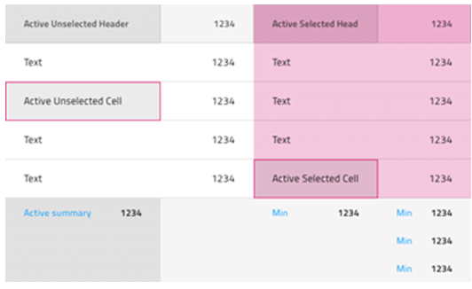
Proposed design by @StefanIvanov :
“I am adding designs based on the approach we use for body cell activation"
With border:
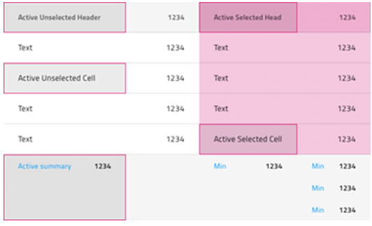
Without border:
 zdrawku
All 8 comments
@StefanIvanov have you got a chance to look at point 4.
Active styling on “tab stop” element? @Stefan, this is something that should be considered as well. Currently we do not have active element indication for the tab stops (except the thin blue line, which is browser default from Chrome).
zdrawku
on 23 Apr 2020
I am not very sure about any specific to be done on point 4, but IMO we should do 1 to 3 as they have very prominent value for the end-user with the amazing keyboard features we will be adding, whereas the last point gives little to no value to the end-user and we can postpone it until someone requests any special treatment.
@simeonoff what is your opinion?
 StefanIvanov
on 23 Apr 2020
StefanIvanov
on 23 Apr 2020
I want to mention the wai-aria practices explanation for this particular functionality
Visibility of the focus indicator: Users need to be able to easily distinguish the keyboard focus indicator from other features of the visual design. Just as a mouse user may move the mouse to help find the mouse pointer, a keyboard user may press a navigation key to watch for movement. If visual changes in response to focus movement are subtle, many users will lose track of focus and be unable to operate. Authors are advised to rely on the default focus indicators provided by browsers
I like the advice to rely on the default focus indicators provided by browsers, although such default focus indicator exists only in Chrome browser. So here we may consider the following statement:
If overriding the default, consider:
- something about ... Colors and gradients can disappear in high contrast modes.
- Users need to be able to easily distinguish between focus and selection as described in § 6.3 Focus VS Selection and the Perception of Dual Focus, especially when a component that contains selected elements does not contain the focus.
I personally like the idea of having a consistent and common visual indicators for the focused elements for all browsers.
@simeonoff @radomirchev what are your thoughts on the subject?
zdrawku
on 24 Apr 2020
@StefanIvanov I can't give you an answer. It really depends on what the expected visual direction is when tabbing between elements in the grid. If you deem it not important, well, then it's decided, isn't it?
 simeonoff
on 24 Apr 2020
simeonoff
on 24 Apr 2020
@StefanIvanov According to the new wai-aria
Success Criterion 2.4.7 Focus Visible
(Level A) [Changed]
Any keyboard operable user interface has a mode of operation where the keyboard focus indicator is visible.
Having product compatible with ARIA best practices out of the box is important.
 radomirchev
on 24 Apr 2020
radomirchev
on 24 Apr 2020
Since the suggestion is to reply on the browser default indicators, and since we're not overriding them, we shouldn't worry about such indicators not being preset in certain browsers at the point of development. If this is a requirement by the accessibility specification, then browser vendors that do not provide such will surely implement them. The issue really is with browsers that do not provide such and not with our implementation.
 kdinev
on 24 Apr 2020
kdinev
on 24 Apr 2020
@StefanIvanov and @simeonoff, I believe the visual representation of the focusable grid elements is important because even the current _default style_ looks broken. Our containers are overlapping part of the default browser styling, examples:
- Body container (Chrome) _Only one right border, the rest are overlapped_ (thin blue line)

Body container (Firefox) _Only one right border_ (black dots)
Header container (Chrome) _Two borders - bottom and right, the rest are overlapped_ (thin blue line)
Header container (Firefox) _One right border_ (black dots)
zdrawku
on 24 Apr 2020
@StefanIvanov and @simeonoff, I believe the visual representation of the focusable grid elements is important because even the current _default style_ looks broken. Out containers are overlapping part of the default browser styling, examples:
- Body container (Chrome) _Only one right border, the rest are overlapped_ (thin blue line)
Body container (Firefox) _Only one right border_ (black dots)
Header container (Chrome) _Two borders - bottom and right, the rest are overlapped_ (thin blue line)
Header container (Firefox) _One right border_ (black dots)
I share your sentiment.
simeonoff
on 24 Apr 2020
Related issues
 furugen
·
3Comments
furugen
·
3Comments
 nikunjgajera
·
3Comments
nikunjgajera
·
3Comments
 ChronosSF
·
3Comments
ChronosSF
·
3Comments
ChronosSF
·
3Comments
ChronosSF
·
3Comments
 jdk339
·
3Comments
jdk339
·
3Comments
Most helpful comment
@StefanIvanov I can't give you an answer. It really depends on what the expected visual direction is when tabbing between elements in the grid. If you deem it not important, well, then it's decided, isn't it?