Igniteui-angular: Condense grid summaries
Is your feature request related to a problem? Please describe.
The grid summaries take a lot of space away from the grid body, especially when 3 or more functions are defined per column, which degrades UX because less content is visible to the user.
Describe the solution you'd like
We should update the spacing of the summary rows and cells to shrink the height of grid summaries for all grid components.
Additional context
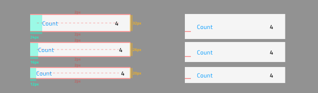
The condensed summaries on the left compared to their current look on the right for the three display densities comfortable, cosy and compact ordered on from top to bottom.
 StefanIvanov
All 6 comments
@desig9stein will be working on the issue
StefanIvanov
on 9 May 2019
Currently, the height of the summary row is set by TypeScript, because the grid needs to know what is the height of summary columns in order to calculate its own body height. I spoke with @ddincheva, she will make the change.
 desig9stein
on 10 May 2019
desig9stein
on 10 May 2019
@desig9stein & @ddincheva please take a look at the updated screenshot that also accounts for some adjustments to the horizontal paddings in the summary row
StefanIvanov
on 15 May 2019
@ddincheva I will handle the padding.
@StefanIvanov The padding of the summary cell should be the same as the grid cell padding, otherwise the text of the summary column will look misaligned with the text in the grid columns.
Are we going to change grid cell padding as well?
desig9stein
on 15 May 2019
@desig9stein ok, and I started working on the necessary changes related to grid size calculations, but @StefanIvanov let me just confirm that for comfortable the whole summary item should be 32 or 36 px, because I am not sure if I understand correctly the image above.
 ddincheva
on 15 May 2019
ddincheva
on 15 May 2019
So for the comfortable summary item that you are referring it will have total height of 36px with top and bottom padding of 2px rather than the 6px it currently has, this will leave us with the 32px that you see between the paddings.
StefanIvanov
on 15 May 2019
Related issues
 Hypenate
·
3Comments
Hypenate
·
3Comments
 ChronosSF
·
3Comments
ChronosSF
·
3Comments
 lorenzo-iovino
·
3Comments
lorenzo-iovino
·
3Comments
 furugen
·
3Comments
furugen
·
3Comments
 nikunjgajera
·
3Comments
nikunjgajera
·
3Comments
Most helpful comment
Currently, the height of the summary row is set by TypeScript, because the grid needs to know what is the height of summary columns in order to calculate its own body height. I spoke with @ddincheva, she will make the change.