Igniteui-angular: Reducing component themes only to the ones I'm using
Description
I wonder if there's a way to reduce the stylesheet size to only the components I'm using in my application, without having to include all component themes and their dependencies separately.
- igniteui-angular version: 7.1.3
- browser: N/A
Example
I'm using only the IgxAvatar, IgxNavbar, IgxList, IgxIcon and IgxDialog components. Currently my styles.scss looks like this:
@import "~igniteui-angular/lib/core/styles/themes/index";
@include igx-core();

$primary: #0c030a !default;
$secondary: #990116 !default;

$app-palette: igx-palette($primary, $secondary);

/* Avatar */
$avatar-theme: igx-avatar-theme($app-palette);
@include igx-avatar($avatar-theme);
/* END Avatar */

/* Navbar */
$navbar-theme: igx-navbar-theme($app-palette);
@include igx-navbar($navbar-theme);
/* END Navbar */

/* List */
$list-theme: igx-list-theme($app-palette);
@include igx-list($list-theme);
/* END List */

/* Icon */
$icon-theme: igx-icon-theme($app-palette);
@include igx-icon($icon-theme);
/* END Icon */

/* Overlay - Dialog dependency */
$overlay-theme: igx-overlay-theme($app-palette);
@include igx-overlay($overlay-theme);
/* END Overlay */

/* Button - Dialog dependency */
$button-theme: igx-button-theme($app-palette);
@include igx-button($button-theme);
/* END Button */

/* Dialog */
$dialog-theme: igx-dialog-theme($app-palette);
@include igx-dialog($dialog-theme);
/* END Dialog */
 kdinev
All 4 comments
Yes, you could use the global igx-theme mixin and include only the component themes you want by doing something like this:
$include: (igx-avatar, igx-navbar, igx-list, igx-icon, igx-overlay, igx-button, igx-dialog);

@include igx-theme(
    $palette: $app-palette,
    $exclude: map-keys(map-remove($components, $include...))
);
 simeonoff
on 30 Jan 2019
simeonoff
on 30 Jan 2019
@simeonoff I implemented what you suggested, and it works beautifully, but with two exceptions:
This is my new styles.scss:
@import "~igniteui-angular/lib/core/styles/themes/index";
@include igx-core();

$primary: #0c030a !default;
$secondary: #990116 !default;

$app-palette: igx-palette($primary, $secondary);

$include: (igx-avatar,
           igx-navbar,
           igx-list,
           igx-ripple,
           igx-icon,
           igx-overlay,
           igx-button,
           igx-dialog,
           igx-input-group,
           igx-drop-down,
           igx-badge,
           igx-card,
           igx-chip,
           igx-time-picker,
           igx-checkbox,
           igx-tabs,
           igx-expansion-panel,
           igx-radio,
           igx-snackbar,
           igx-progress-circular);

@include igx-theme(
    $palette: $app-palette,
    $exclude: map-keys(map-remove($components, $include...))
);
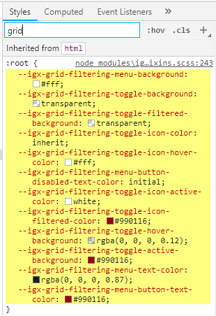
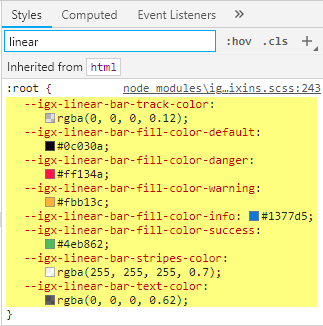
And I find these, which should be excluded:
kdinev
on 31 Jan 2019
Hi guys. Would love to see some of this info in the docs if not present. We do see that especially IE seems to suffer a bit under the weight of the igx themes (not that we plan on supporting that browser much longer, but still). Some tips on optimizing the css size would be nice to have in the docs.
 Eralmidia
on 31 Jan 2019
Eralmidia
on 31 Jan 2019
@Eralmidia Basically, the code in the question, and the code in the answer are the two approaches you can take in order to reduce the theme to a subset according to what you're using.
- Instantiate only the themes for the specific components and their theme dependencies. (in the question)
- Instantiate an entire theme, but exclude everything you're not using. (in the answer)
Technically, this is documented, but in order to get the whole picture, you would need to read the theming section, as a whole, which means this article, as well as all the sub articles under it:
https://www.infragistics.com/products/ignite-ui-angular/angular/components/themes/index.html
Not only that, but you would need to refer to the SASS api. Bottom line, it's not that easy to extract this information. Another issue is that SASS doesn't support modules, which means that component theming dependencies cannot automatically be included, but instead you need to manually include them. The issue with that is that you cannot easily extract the theming dependencies from the docs. E.g. IgxDatePicker theme depends on the overlay, input group, dialog, calendar, icon and button.
What I'm going to do is update each component's documentation articles to include a section, similar to the api section, on theming dependencies, so these are easily discoverable. E.g. This article will have an additional section after API References named Theming Dependencies:
https://www.infragistics.com/products/ignite-ui-angular/angular/components/date_picker.html
kdinev
on 31 Jan 2019
Related issues
 lorenzo-iovino
·
3Comments
lorenzo-iovino
·
3Comments
 ChronosSF
·
3Comments
ChronosSF
·
3Comments
 Hypenate
·
3Comments
Eralmidia
·
3Comments
Hypenate
·
3Comments
Eralmidia
·
3Comments
 tkiryu
·
3Comments
tkiryu
·
3Comments