Igniteui-angular: Research and implement number-of-records-based rendering for igxGrid
This item includes but is not limited to:
- add an input for the number of records the grid should display fully in the view
- the height of the grid should not depend on the parent elements
- the height of the grid should not be an input
- the grid should work nicely with height set through css
- possible igxforof changes related to points above
As discussed with @kdinev, most web apps flow vertically based on the items rendered and their height instead of having explicit height to fit into. This makes setting height of components a chore for developers. Ideally we'll want the grid height to naturally add up from the sum of its separate areas with the body height being an user set value of number of records * their height _or_ a default number.
 ChronosSF
All 12 comments
After discussing this with the team we came up with a list of changes in how the igxGrid control is set up and sized.
What we plan for 6.2 is the following:
- the
widthandheightproperties will be deprecated. Instead users can size the grid's host element with CSS. By default we'll set the width to 100% and the height will not be specified. The idea is for the grid to grow in height based on its content. - a new input
visibleRowsis introduced. The user may set it to specify how many rows should be visible at once. It will default to something like 10. A vertical scrollbar will be shown if the number of data records to be displayed is higher than this number. We plan to allow setting this tonullwhich will mean that all records will be visible without a scrollbar (at least one rendered by igxGrid).
These two changes provide a couple of benefits. First, the grid will work more like other HTML elements - it will grow according to its content. The content is set by the user - what type of headers, footers are rendered come from the features used and the number of items in the body will be determined by the aforementioned option. Second, we will be able to stop the guessing game about how to size the grid when the user provides no input for it and put it in containers we can't infer it from.
There are two drawbacks that we identified:
- If the user absolutely must have a grid that is certain pixels in height, setting that height through CSS is not enough to get him a meaningful render - he will need to play around with the
visibleRowsoption until he finds a number that covers the amount of space that the body will have in his configuration. - The grid will not be responsive vertically because even if height is set to percentages and the container itself reacts to external changes, the amount of rows that are rendered at once won't.
Here are some gifs of how the change works:
- grid with no
heightand no inferrableheight- its height changes with what we set for it to render:
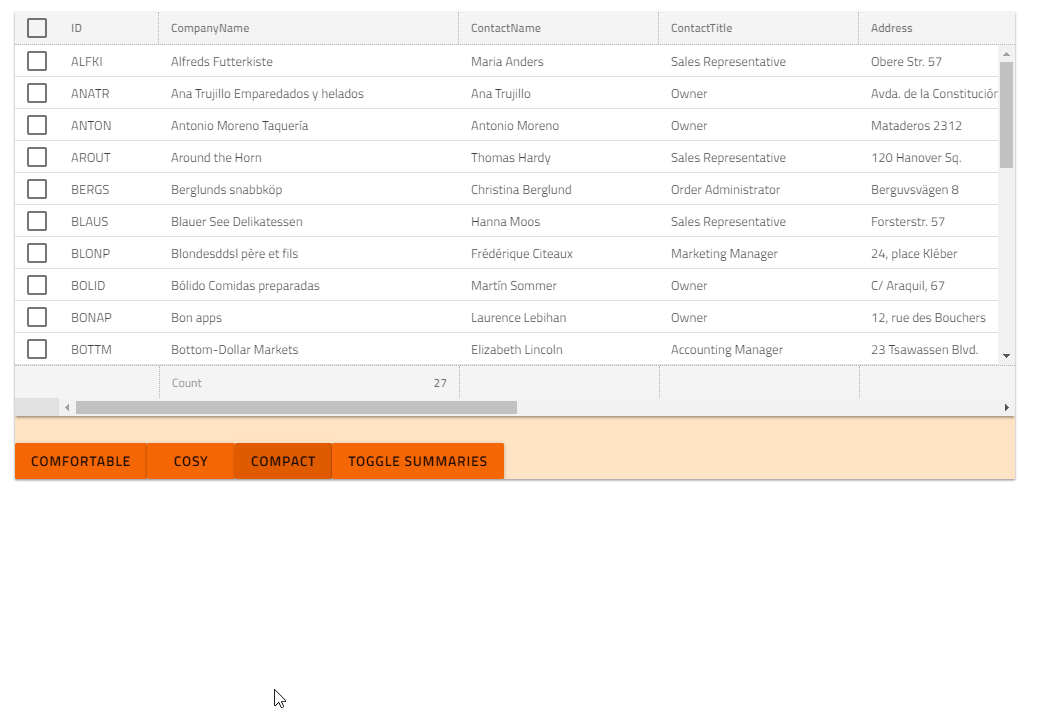
- same thing but inside a container with set height - behavior is consistent
- finally how the first drawback manifests - we have height for the grid through CSS but unless the user specifies a higher number of visible rows they may not fill the body
(we do plan to move the horizontal scrollbar up to where the body ends)
@SlavUI , @Eralmidia - We would love to get some feedback from the community about the change, especially if it would adversely affect the applications they are making with Ignite UI for Angular.
ChronosSF
on 10 Sep 2018
@kdinev @ChronosSF
We certainly welcome changes to how the grid is rendered, as we are currently having some issues with height and virtualization. In order for the grid to use the virtualization currently, we have to specify a height in pixels and not percent. This means that we basically listens to window resize changes and changes the height manually for this to work. Now, I have seen the Stackblitz grid sample uses percentage, so I know its not a bug in the grid, but I hope this might make the grid work a bit more out-of-the-box for us.
When it comes to the actual implementation, I really like the sound of "First, the grid will work more like other HTML elements - it will grow according to its content". Most of the time, this is the way to go when in comes to design imo. But I am a bit confused about the drawbacks. Are these meant as limitations or issues which must be solved? If you must define a height, as stated in the first drawback, doesn't that contradict the sentence saying it will grow to fit its parent?
For us the end goal is almost always the same: A grid taking up 100% width and height of whatever we wrap it in, and has vertical virtualization to enable thousands of rows without lag if needed.
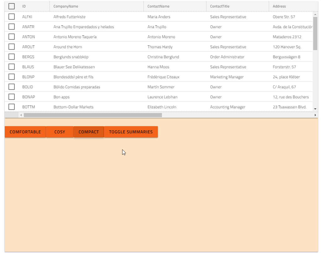
As for the different sizes we are very happy with this implementation. The compact mode is exactly the same size (height) we have used previously for a desktop first, but still fairly touch friendly design. Often having the need to show a lot of data, this will be invaluable to us.
 Eralmidia
on 12 Sep 2018
Eralmidia
on 12 Sep 2018
@Eralmidia What @ChronosSF calls drawbacks is really the standard DOM element behavior, as explained in previous remarks.
The only thing I see wrong, is that when the grid is inside a container that is larger than the grid content, the footers are going on the bottom. Instead, the footers should just be below the content, and the parent container would just have empty space on the bottom.
This case is very specific: the parent container has a fixed height in CSS, say 800px, but the grid content (rows) + static elements (headers + footers) add up to less than 800px. What the developer needs to do in this case is increase the number of rows to be rendered by the grid, if it needs to fill the container. Having the grid at exactly 800px, though, might not be possible as the elements may not add up exactly to 800px in height.
 kdinev
on 12 Sep 2018
kdinev
on 12 Sep 2018
@ChronosSF Btw, one thing that I noticed. If you want to render all records without virtualization, the setting should be [visibleRows]="Infinity", rather than [visibleRows]="null". This will make the type of visibleRows to be a number. You also wouldn't have to perform null checks.
// with visibleRows always a number
visibleRows = Infinity;
records.length < visibleRows; // true

// otherwise
return visibleRows !== null ? records.length < visibleRows : true;
How would this affect existing applications using the current Height and Width properties?
Also, would this be responsive to resizing the container. IE I have the css height set to 50%, and I also shrink the window to 1/2 the height will the size of the grid automatically adjust to 50% of the new smaller height. Similarly if I then set it back to the original height or larger, will it resize to take up 50% of the new height of the window?
 MikeTechSpeak
on 12 Sep 2018
MikeTechSpeak
on 12 Sep 2018
We first deprecate the inputs but we won't remove them. For 6.2 they'll just set the corresponding CSS rules which will size the grid's host element to whatever the user wants.
The result of setting 50% height will be the same as setting 50% height for a DIV element in the same place. We won't touch the amount of rows to be rendered. It will be up to the user to find a setting that works for his application if he wants for the rows to cover all possible sizes of the container.
ChronosSF
on 13 Sep 2018
@ChronosSF @MikeTechSpeak Since the document height is the most misunderstood feature, I think I should add that setting 50% height to a container in the body doesn't make it take up half the screen, please test it to verify. The default height of the body is 0px and the body grows in height according to it's contents. If you set 50% height to a container in the body, and that is the body's contents, then the container's height is 0.5 * 0px = 0px.
kdinev
on 13 Sep 2018
@kdinev Fair enough, I can follow that. But as a number of people do ask about it, is there an accepted browser agnostic way that will allow for percentage height of the screen that works for our grid?
MikeTechSpeak
on 13 Sep 2018
@MikeTechSpeak Depends on what "works for our grid" means. Does this mean that the assumption would be that setting height in percentage on a container would make the container take up that percentage of space relative to the parent container size? Or does it mean that a certain other assumption is made, which is contrary to what the relative height is supposed to do?
What I mean to ask is, if we have the above example, would the correct behavior be for the grid to take up space equal to it's static elements' height combined, and no data would be displayed (this is the current behavior btw). The newly proposed sizing changes would make the grid behave in a different way, where if you have a container in parent container without explicitly set fixed height, then the grid would render its static elements + 10 records of data (or less if the total data size < 10) and would virtualize the rest. If the developer wants the grid to show twice as much data in the container, then they need to simply set [visibleRows]="20", when with the current behavior, they would need to calculate exactly how much height they need to set, in order for 20 records of data to be displayed.
kdinev
on 13 Sep 2018
@kdinev Perhaps the proposed method would work. But after some testing, it seems like the the desired results, and the expected results follow how CSS currently handles it.
As an example:
If I put a grid on a page by itself in a div when the div has style="height:50%", and no height set for the grid, The grid sizes as I would want.
Similarly, if I remove the div, and set the grid's style="height:50%" it works as expected as well.
But if I remove the outer div, and set the grid's height property to 100% it sizes it self to the height of the browser at the time, and when I resize the browser, the grid doesn't resize with it.
My guess is currently it flat out ignores percentage values, as if I set the grid's height to "50%" a number of times it crashed stackblitz, but otherwise it treated itself like 100% the same as if I didn't include height at all.
Now how that would work with virtualization, and how many records to load, and when, that I can see as being problematic, especially when you have the customer set VisibleRows. Instead of just automatically adjust it as the grid\screen resizes. But another flaw I see in the proposed solution, is for some developers, they don't really care how many records are visible, as much as that the grid "fits" on the screen with everything else. If you base it on it's content, you are still effectively forcing a pixel height, but instead of basing it on the container you are basing it on the sum of it's content.
MikeTechSpeak
on 13 Sep 2018
@MikeTechSpeak The current behavior is only for specific scenarios (you have only a grid on the page), which is not even remotely close to a real application. We try to do some magic internally to figure out how large the grid should be in height when the parent container has no dimensions - this is the case you describe. When the grid is alone on the page, our magic works, because we take the screen height and perform calculations on top of that, but this magic only yields fixed results - pixels, since as I mentioned the grid is in a container with no dimensions (setting 50%, or any % for that matter, to a container with 0px height parent yields 0) we calculate based on the current screen height, and cannot set % back, because this will yield 0px, so we set fixed pixels.
So this cannot be responsive. In fact, I have yet to see any application with responsive height, since it's unachievable - containers grow according to their contents, they don't determine their contents according to their dimensions. Content determines dimensions. The only thing that can respond is container positioning - more than one container. Responsiveness is to organize containers horizontally or vertically according to different screen widths. Now the grid is a single container, so what we can reorganize is columns into row views, like Ignite UI's igGrid, hiding columns, etc.
Now, why are we trying to escape the current magic that we perform, which as I already explained, is a very niche scenario magic, and not at all generally applicable.
Example: You have an application, with host (header + footer + side menu), and you also have a heading branding jumbotron. Then there's a grid in the content area, and you want to tell the grid to take up 100% of the remaining area. Now what the grid would do is see a container with no dimensions, thus try to calculate based on the screen dimensions, and it would become 100% of the screen height, which means that, depending on a screen size, half of it, or more would be out of view, but rendered. So in this scenario, we don't achieve the expected behavior.
Btw, what you're seeing with the latest version, is actually a temporary implementation of the fixed-record-number rendering, which is what @ChronosSF and the rest were working on to refine in this proposal. The current behavior in the latest version is to render a grid body height of 500px if no dimensions are found on the parent container. 500px because 10x50px per record. The pitfall is that this only works if records have no templates inside that make their height variable, or even different from 50px. If the records content is higher than 50px, then they don't fit in the container we create. The refined proposal will make the grid work with variable records hight. It currently doesn't. We would stop calculating pixels on a container and try to fit content inside, but instead will render content and let the container grow with it, as is natural for DOM elements.
kdinev
on 13 Sep 2018
We are dropping this idea :) closing the issue
 SlavUI
on 28 Jan 2019
SlavUI
on 28 Jan 2019
Related issues
 nikunjgajera
·
3Comments
nikunjgajera
·
3Comments
 ymita
·
3Comments
ymita
·
3Comments
 jdk339
·
3Comments
jdk339
·
3Comments
 tkiryu
·
3Comments
ChronosSF
·
3Comments
tkiryu
·
3Comments
ChronosSF
·
3Comments
Most helpful comment
@kdinev @ChronosSF
We certainly welcome changes to how the grid is rendered, as we are currently having some issues with height and virtualization. In order for the grid to use the virtualization currently, we have to specify a height in pixels and not percent. This means that we basically listens to window resize changes and changes the height manually for this to work. Now, I have seen the Stackblitz grid sample uses percentage, so I know its not a bug in the grid, but I hope this might make the grid work a bit more out-of-the-box for us.
When it comes to the actual implementation, I really like the sound of "First, the grid will work more like other HTML elements - it will grow according to its content". Most of the time, this is the way to go when in comes to design imo. But I am a bit confused about the drawbacks. Are these meant as limitations or issues which must be solved? If you must define a height, as stated in the first drawback, doesn't that contradict the sentence saying it will grow to fit its parent?
For us the end goal is almost always the same: A grid taking up 100% width and height of whatever we wrap it in, and has vertical virtualization to enable thousands of rows without lag if needed.
As for the different sizes we are very happy with this implementation. The compact mode is exactly the same size (height) we have used previously for a desktop first, but still fairly touch friendly design. Often having the need to show a lot of data, this will be invaluable to us.