Igniteui-angular: Disabled dates
Description
I would like to see the calendar supports disabled function eg past-dates, single dates, holidays etc
so when the calender is displayed the default feature should be all past dates and future dates are disabled. and the current date is selected with background color like its now
- igniteui-angular version:
- browser:
[Update] - Calendar will supports "special" dates as well. These dates are going to have the same behavior as Disabled dates, although the difference would be the color.
"special" dates examples:
- National holidays of a country
- PTO dates in a company calendar
- Recurring monthy Company/Team meetings
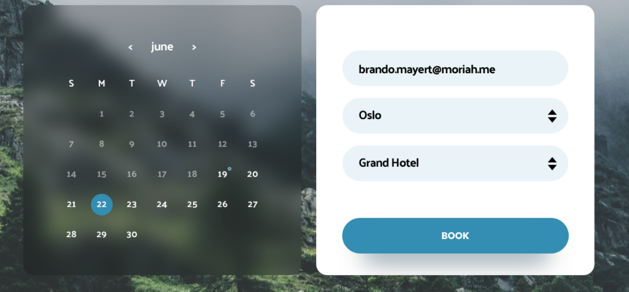
Attachments here is screenshort how it suppose to look
 throne1986
All 16 comments
Hi @gruby-murzyn thanks for the Feature request we will plan it after the end of July and will update the issue accordingly.
 SlavUI
on 11 Jul 2018
SlavUI
on 11 Jul 2018
@gruby-murzyn We're about to start working on a design for this item. We will post some sample configurations for you to take a look at, because this item would require some non-trivial description of set of dates. We need to cover the scenarios of:
- Disabled before a certain date
- Disabled after a certain date
- Set of specific disabled dates
- Disabled types of dates (weekends, weekdays, holidays (we don't support holidays ATM, so this also needs to be made settable)
- Disabled range of dates
Also mix of all mentioned above, e.g. Disabled before a date + Disabled after a different date + Disabled specific dates in between
 kdinev
on 6 Aug 2018
kdinev
on 6 Aug 2018
API proposition:
min: Date - disabled before a certain date
max: Date - disabled after a certain date
disabledDates: Date[] - set of specific disabled dates
disabledDatesRanges: DateRange[] - disabled ranges of dates, DateRange has min and max.
disableWeekdays: boolean - disables weekdays
disableWeekends: boolean - disables weekends
disabledHolidays: boolean - disables holidays
 tiliev
on 7 Aug 2018
tiliev
on 7 Aug 2018
How about changing the min and max for the DateRange with start and end ? Sounds more correct to me.
 hanastasov
on 7 Aug 2018
hanastasov
on 7 Aug 2018
@hanastasov why do you think is correct to use dateRange instead of max and min? For me max and min is much better and readable and easy to understand for all levels of programmers? Even the best commercial calendars use the same methodology min and max .
throne1986
on 7 Aug 2018
I would personally go for start and end, because in general it just makes more sense that a time period has a start time and an end time, rather than min time and max time. Translated to API that may may convert to min and max, obviously.
hanastasov
on 7 Aug 2018
We will consider all possible options, its okay to have different oppinions. As for minDate and maxDate, I prefer this naming, because it better describes "defining a minimum/maximum possible date selection after/before that dates are not selectable".
 zdrawku
on 7 Aug 2018
zdrawku
on 7 Aug 2018
@gruby-murzyn Unfortunately, min and max don't really cover all of the scenarios that we need to satisfy.
My proposal is the following. disabledDates, as well as any other input that needs to receive one or more dates, as well as ranges should be of a type DateRangeDescriptor []
export enum DateRangeType {
  Before, // dateRange expected is array of 1 item - the date before which to disable
  After, // dateRange expected is array of 1 item - the date after which to disable
  Between, // dateRange expected is array of 2 items - the dates between which to disable
           // The boundaries of the range are also disabled
  Specific, // dateRange expected is array of N items - all dates to disable listed
  Weekdays, // dateRange expected is null
  Weekends // dateRange expected is null
}

export interface DateRangeDescriptor {
  type: DateRangeType;
  dateRange: Date [];
}
This way if we want to achieve the following scenario: disable all dates before January 1st, 2018, all dates after January 1st, 2019, as well as all weekends, the whole of March, and August 7th, August 9th, and August 15th, 2018, then the configuration will look as follows:
const disabled: DateRangeDescriptor[] = [
  {
    type: DateRangeType.Before,
    dateRange: [new Date(2018, 1, 1)]
  },
  {
    type: DateRangeType.After,
    dateRange: [new Date(2019, 1, 1)]
  },
  {
    type: DateRangeType.Weekends,
    dateRange: null
  },
  {
    type: DateRangeType.Between,
    dateRange: [new Date(2018, 3, 1), new Date(2018, 3, 31)]
  },
  {
    type: DateRangeType.Specific,
    dateRange: [new Date(2018, 9, 7), new Date(2018, 9, 9), new Date(2018, 9, 15)]
  }
]
Btw, I know that all this sounds like a bit of an overkill, but it covers scenarios, which we will surely be asked for sooner or later.
kdinev
on 7 Aug 2018
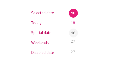
For disabled dates we will be using the grays.500 color with an additional 60% opacity, while for the special dates we have background color grays.100 and text color is grays.900.
On the image below we can see how these new styles interplay with the existing categories: ordinary dates grays.900, current date secondary.500, weekends grays.500.
Feedback @SlavUI @kdinev @simeonoff @desig9stein @DaniMarinov ?
 StefanIvanov
on 7 Aug 2018
StefanIvanov
on 7 Aug 2018
I find:
- weekends are almost similar with ordinary dates
- the special date is not outstanding enough
- disabled dates are quite not visible
Now I can give suggestion only for the 2 and 3:
- if special date is in secondary 500 (or similar) but if possible to be semibold
- disable dates to be set with 55-60% opacity because they need just a little bit more visibility
 DaniMarinov
on 7 Aug 2018
DaniMarinov
on 7 Aug 2018
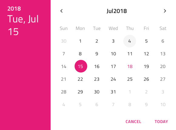
Updated the proto-spec and images above
StefanIvanov
on 8 Aug 2018
@StefanIvanov Disable date as well as special date looks almost the same. Shouldn't we choose another color to represent them ?
SlavUI
on 8 Aug 2018
Special date has the font color of the normal date and a background like the current date but rather than secondary.500, it is a grays.100 circle. If it looks to subtle we may update it to grays.200 once the feature is in, but let's delay this decision until then.
StefanIvanov
on 8 Aug 2018
@gruby-murzyn This feature is done. I can make it available for you in a beta npm package prior to the official 6.2.0 release. Do you need it now?
kdinev
on 29 Aug 2018
Ok, good job guys, keep it up, thanks
throne1986
on 30 Aug 2018
@gruby-murzyn I just tagged a new beta version so you can try the feature out. The publish will happen in a minute or so when the CI passes.
https://github.com/IgniteUI/igniteui-angular/releases/tag/6.2.0-beta.1
npm i [email protected]
kdinev
on 30 Aug 2018
Related issues
 nikunjgajera
·
3Comments
nikunjgajera
·
3Comments
 tkiryu
·
3Comments
tkiryu
·
3Comments
 Hypenate
·
3Comments
nikunjgajera
·
3Comments
Hypenate
·
3Comments
nikunjgajera
·
3Comments
 Eralmidia
·
3Comments
Eralmidia
·
3Comments
Most helpful comment
@gruby-murzyn Unfortunately,
minandmaxdon't really cover all of the scenarios that we need to satisfy.My proposal is the following.
disabledDates, as well as any other input that needs to receive one or more dates, as well as ranges should be of a typeDateRangeDescriptor []This way if we want to achieve the following scenario: disable all dates before January 1st, 2018, all dates after January 1st, 2019, as well as all weekends, the whole of March, and August 7th, August 9th, and August 15th, 2018, then the configuration will look as follows:
Btw, I know that all this sounds like a bit of an overkill, but it covers scenarios, which we will surely be asked for sooner or later.