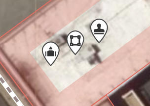
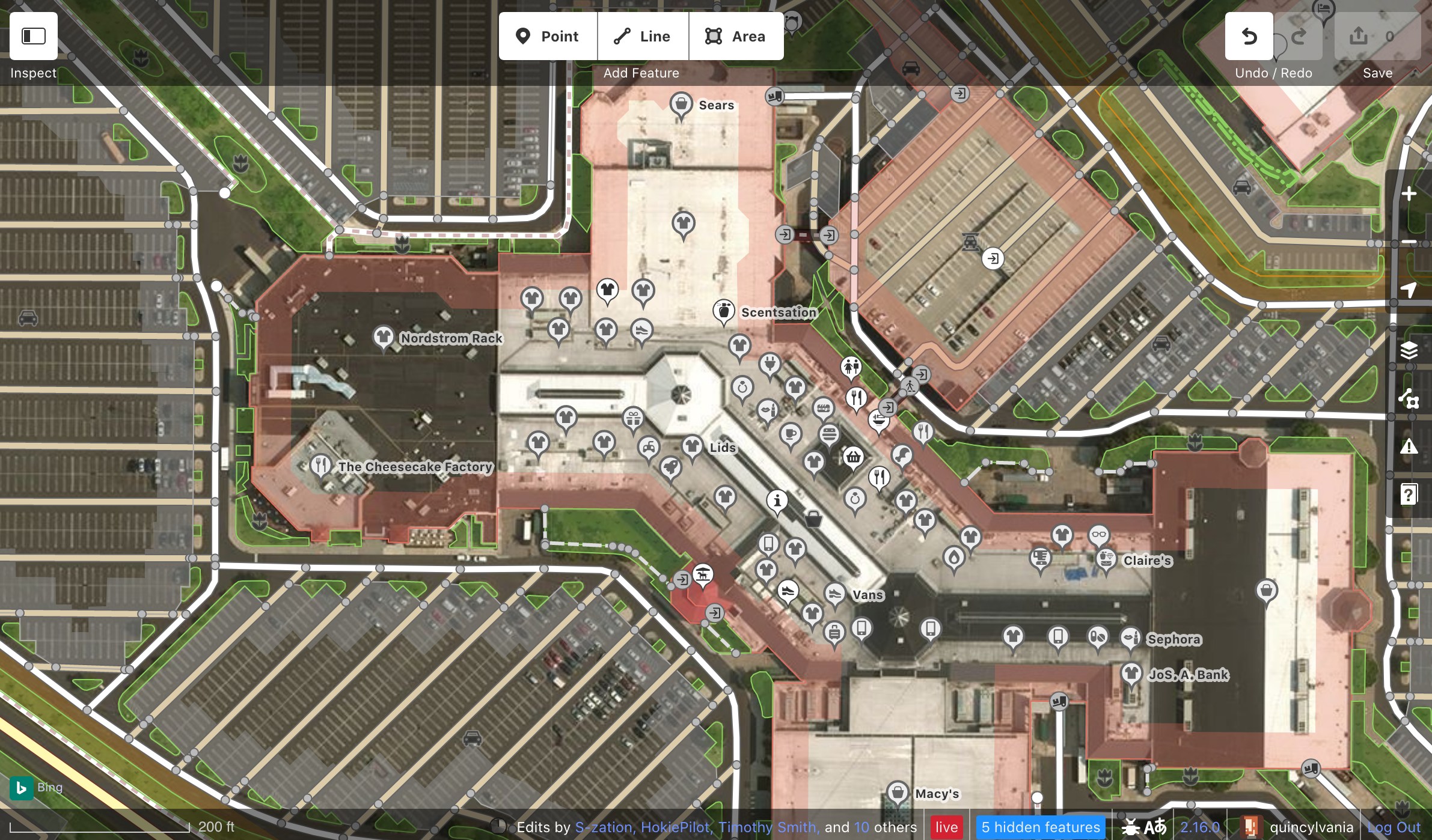
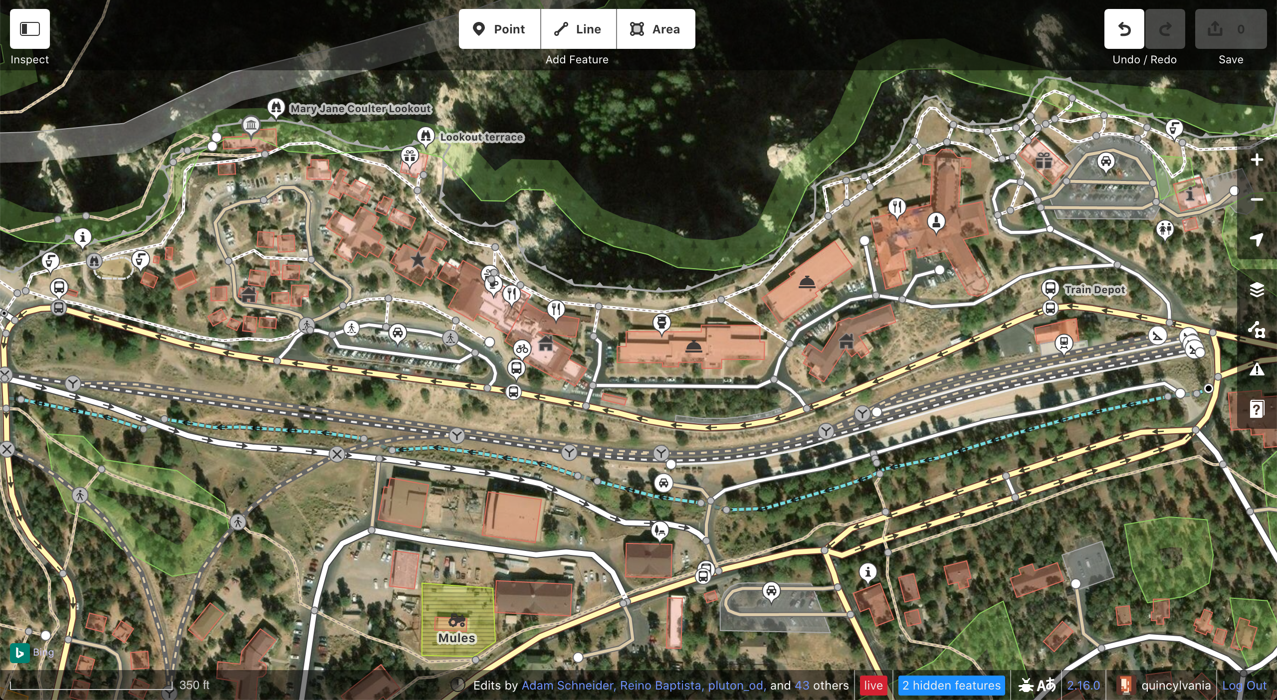
Some of the boxier icons look crunched for space on the current point markers.
We should make them more circular but leave a tiny pin part to indicate the exact location of the feature.
This would also be more consistent with current trends in POI marking.
 quincylvania
All 8 comments
Can we just make them circles? I don’t think we need a pin point.
 bhousel
on 9 Apr 2019
bhousel
on 9 Apr 2019
Can we just make them circles?
_Maybe_. One issue is that they would look identical to vertices.
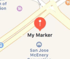
The main issue with circles though is that that lat/lon of the feature is the center of the circle, meaning the marker obscures the most relevant area of the imagery. This isn't a big deal for large features like parks and business, but for tiny garbage bins and road signs, many users will want to place points more exactly. With pins the lat/lon is less obscured, which I think is better for an editing app. Apple Maps even uses pins when you add markers via the MapKit API:
quincylvania
on 9 Apr 2019
Some of the boxier icons look crunched for space on the current point markers.
This does not seem like an issue to me, but if everyone else thinks it is, another solution would be to just display the image slightly smaller inside of the place icons. This would fix the issue of a couple icons looking crunched.
I really like how smooth the current design is, and also how the main icon is farther away from the point of the POI.
Another good way to keep the existing shape while solving the issue you mentioned would be creating a more beautiful version of this:
... basically just making the existing icon wider at the bottom to accommodate square icons.
 BjornRasmussen
on 9 Apr 2019
BjornRasmussen
on 9 Apr 2019
My two cents:
- I don't feel the design pain in this case; IMO the current design is good (of not perfect)
- I like the proposed design; it solves the given issue; however, it is a bit harder to see the prick/pierce point (the old design is better in this sense)
- Whatever the design, IMO it needs to be a pin (not a circle), so there is no question about the lat/lng and also the pin does not obscure/overlap the prick/pierce-point.
PS: Thanks for making this easy to "consume", Quincy, with the preview images and such. Also for looking at those "small" design details <3.
 tordans
on 9 Apr 2019
tordans
on 9 Apr 2019
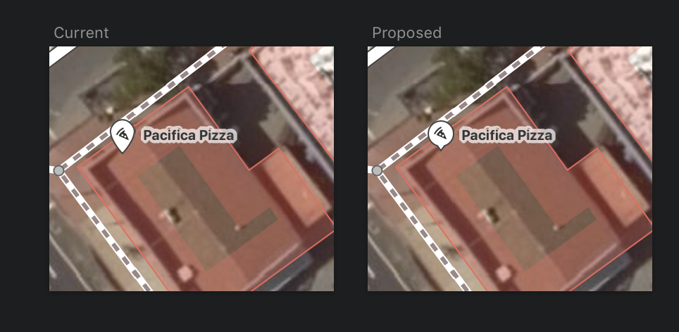
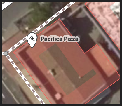
I finally did this. I made the stem slightly longer than in the prior design so the head doesn't obscure the location so much. A big benefit I see is that the icons are now slightly larger and thus easier to discern.
quincylvania
on 9 Dec 2019
Ok, not to be critical or anything, but I _really_ don't like this new shape.
Here's the new design created by @quincylvania for reference:

The main problem is that it ends up looking really squashed on the bottom when the icon is small, and is therefore not very visually appealing. Due to an optical illusion, the perfectly crafted circular pin looks like some kind of squashed, upside-down pumpkin shaped thing.
Here's a good example of what I'm talking about:
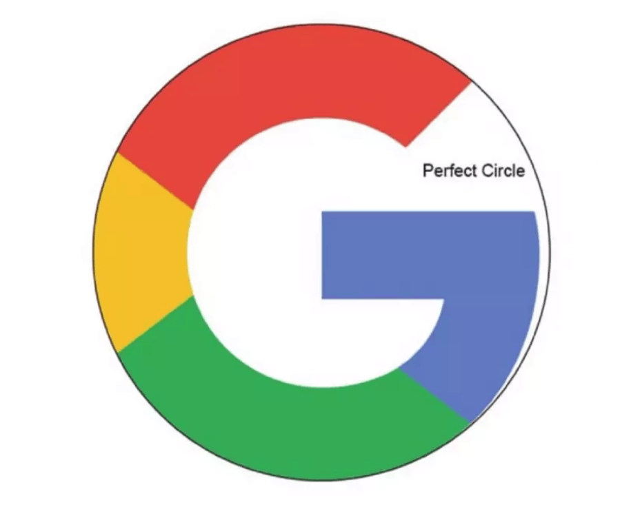
The Google logo isn't circular, but rather intentionally misshapen to _look_ more circular, and is, as a result, more aesthetically pleasing:
So, what I think the new design you created it missing is some sort of transition between the icon and the pin that reduces the irritating squashed look.
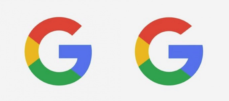
Here is what Google Maps uses:

Its pinhead is not _actually_ circular at the bottom, but by adding a more gradual transition from icon to point, making the icon less circular, they managed to make the pinhead _look_ more circular. iD should employ a similar technique to ensure that the pinhead looks as good as possible.
In sum, I _do_ think that having a more circular icon is a good idea, but would prefer it to _look_ circular rather than actually _be_ circular if that makes sense.
BjornRasmussen
on 10 Dec 2019
A happy medium of these both shapes
would be nice :-)
 sun-geo
on 10 Dec 2019
sun-geo
on 10 Dec 2019
@BjornRasmussen @sun-geo Yeah, you're right the shape could still be improved. I don't really want it to look just like the Google or Apple pins but we'll see.
quincylvania
on 10 Dec 2019
Related issues
 jidanni
·
3Comments
jidanni
·
3Comments
 thibaultmol
·
3Comments
thibaultmol
·
3Comments
 1ec5
·
3Comments
1ec5
·
3Comments
 naoliv
·
3Comments
1ec5
·
3Comments
naoliv
·
3Comments
1ec5
·
3Comments
Most helpful comment
My two cents:
PS: Thanks for making this easy to "consume", Quincy, with the preview images and such. Also for looking at those "small" design details <3.