Hope you're sitting down, because this one is big.. To unblock #3097, #2699, #1761, #590 and many others, I'm going to add a taskbar to iD.
iD works well because we work hard to keep it simple. We don't want to add buttons or menus or toolbars. UI scope creep is something that I take very seriously. I think about this probably more than people realize.
However we are running into a bunch of situations where we want to add useful things to iD but we have no good place to put them. Building drawing. Indoor editing. Repeat tags. And other stuff. Maybe someday plugins.
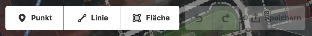
These things are not "modes" in the traditional iD sense. Modes are _exclusive_ and they live on the top bar:

It would be really easy to add more buttons here - but we shouldn't.
Tasks
If they aren't modes, what are they? I'm calling them tasks, to differentiate them from modes. Modes are exclusive, tasks are not. For example, take "square drawing":
- It should be toggle-able with UI. I'm not going to make this a key combination, because that is not discoverable, and I would like for somebody on a surface pro with a pen to be able to draw square buildings just as easily as somebody with a dedicated shift key.
- It should be visible. Users should not forget that it is on. It needs an icon someplace visible but out of the way that can be tapped when the user says "I'm done drawing square things". A feature like this should not be hidden in a drawer like the Background or Map Data toggles.
Repeat after me: "Modes are exclusive, Tasks are not." This runs a bit contrary to how non-programmers think about the world, but we already have "modes" in iD so let's just run with it.
The Taskbar
The taskbar / notification area metaphor is something that is, by now, universally understood. You probably have a taskbar on your screen now.
If you use Windows, it looks like this:

If you use Mac, you have this:

These are icons that you don't need to pay attention to, but are there when you need them.
_Did you know:_ iD has something that looks like a taskbar already:

But this is not a taskbar. These are just some interesting (or not really) links. This confuses people because it looks like a taskbar but is not one.
_I am proposing to move these interesting links into the Help pane, and use this space as a for-real taskbar._
An empty taskbar will just have a single icon that opens up a drawer from the bottom. That drawer can contain all kinds of things that can be toggled on and off - and when on, an icon for that thing will appear on the taskbar. Simple. Users can ignore it if they want to. And someday plugins can add themselves there. And we don't need to touch any of the other iD UI that we love.
I'm going to keep saying taskbar to build acceptance around this idea. Because changing the UI in iD is scary. Taskbar. Here are some bar-related emojis to make this idea less scary: 😉 📊 🍫 💈 🍸
Thanks for listening!
 bhousel
All 19 comments
I really like the direction you are taking. As you say it is important to keep iD simple but that does not mean that it should not have additional user friendly components.. The task bar is something a lot of people can relate to so would not be difficult to promote.
Thanks for all the great work you are doing on iD Editor.
Ralph
 RAytoun
on 20 May 2016
RAytoun
on 20 May 2016
Using the task bar space seems to be worth to think about, but I don't think that the concept of the non-exclusive tasks is user friendly. In addition there would likely be conflicts between multiple active tasks.
We should have an application mode setting. This needs a single visible icon showing the current application mode that opens a drawer with all available application modes which could for example be:
- General editor
- Building editor (including 3d)
- Landuse editor (with special area modification operations)
- Highway editor (including area:highway support)
- Public transport editor
- Indoor editor
- Data and history viewer
- Plugin defined application mode
Each application mode should be able to define the available modes. I think we should allow 5 or 6 available modes for each application mode, because most application modes will likely need to include the three standard modes point, line, and area.
In addition each application mode should be able to filter selectable data and to influence available radial menu operations.
The taskbar can be used to place operations which don't fit into the radial menu, and/or show some editing hints.
 slhh
on 20 May 2016
slhh
on 20 May 2016
Especially I dislike the idea of the square drawing as a "task". This is just a modification of the standard area drawing mode (or maybe a building drawing mode), we can consider it as a sub-mode. It is not user friendly to let the user search for the setting which is hidden in a drawer at the other end of the screen. Instead the sub-mode setting should be available where the mode button is.
A special kind of selection of the mode button could open a menu for selecting available sub-modes.
This special kind of selection could be:
- Click at a small dropdown arrow at the side of the mode button
- Hold down mouse button for some time over the mode button
- Click mode button with Shift or Ctrl pressed
- Right click mode button
In oder to make it discoverable the hover box of the mode button should indicate how to select the submode setting.
The icon and text of the mode button should slightly change according to the selected sub-mode.
Another possible solution would be to show shortcut keys to switch submodes as an editing hint in the taskbar when the mode is active.
slhh
on 20 May 2016
The application mode concept, which I have proposed above, would also allow to split the General editor mode into a simple and a more advanced general editing application mode.
The simple one might have the current three drawing modes only (point, line, area) and have some more limitations.
slhh
on 20 May 2016
I propose to call the area in the right bottom corner toolbar. We may have an indoor tool, a building tool and a mass attribute tool and more tools.
I dont like the idea of plugins, because having a simple unified user experice with iD is what helps me and maybe other people using it without the need of learning how to.
I don'tsee why tools (or tasks if you stay with that name) habe to be non-exclusive.
In any case i really like what @bhousel does!
 manfredbrandl
on 20 May 2016
manfredbrandl
on 20 May 2016
Hey @slhh,
Instead the sub-mode setting should be available where the mode button is.
A special kind of selection of the mode button could open a menu for selecting available sub-modes.
I did consider this - it is how programs like Photoshop hide their tool options. If the task bar idea ends up not working, we could always switch it later.
The icon and text of the mode button should slightly change according to the selected sub-mode.
Yes, I still might do this to make it more obvious that iD is working differently than usual.
bhousel
on 20 May 2016
Hey @manfredbrandl,
I propose to call the area in the right bottom corner toolbar. We may have an indoor tool, a building tool and a mass attribute tool and more tools.
I think "toolbar" is maybe too generic. iD has a bunch of toolbars already, but yes this change would amount to "turning that bottom area into another toolbar".

I dont like the idea of plugins, because having a simple unified user experice with iD is what helps me and maybe other people using it without the need of learning how to.
Yeah plugins are scary to me too. My approach to that will be more like "remove existing things from iD and make them plugins". iD is starting to be used in other sites, and it is accumulating a lot of features that these other sites don't need.
I don'tsee why tools (or tasks if you stay with that name) habe to be non-exclusive.
The ones I want to add right now are "square drawing", "indoor editing", and "repeat tags". Those things are not exclusive (i.e. you might want to draw square things indoors, or repeat tags on square buildings).. I agree that we have to consider very carefully what tools can go here so that they don't interfere with each other.
bhousel
on 20 May 2016
iD's workflow does not require to switch directly between (drawing) modes because the mode is automatically terminated when the feature has been drawn.
Therefore, another method to make tool options of the drawing modes accessible and visible is to replace the top toolbar with option settings while the drawing mode is active. Users dont need to have access to the mode buttons or save button during this time. Undo and Redo are at least not required during the time between mode selection and setting the first node.
slhh
on 20 May 2016
I have just recognized that we have plenty of space available for options of the drawing modes: #3124
I assume that remember tags is intended for features which are newly drawn. In this case it can be handled as a drawing mode option too.
The indoor mode can reside in the task bar, but we will likely have to define groups of tasks to be mutually exclusive soon. I think a task should have three states in general:
- active
- inactive, but still in the task bar
- inactive, shown in the drawer only
An additional option to hide tasks in the taskbar dependent on context could increase scaleability of the concept, but preferably we should place such context dependent settings elsewhere.
slhh
on 22 May 2016
I like the idea of tasks – we can show several small icons in the taskbar, and hint user how to activate them. (For example - "Select a building to enable indoor mode").
I'd prefer showing all the tasks at the same time, toggling drawer could be confusing. You could argue it could overwhelm the (begginer) user, but I think unobtrusive icons would be fine - the user wouldn't care if he doesnt want to.
 zbycz
on 22 May 2016
zbycz
on 22 May 2016
Hello @bhousel ,
your idea "taskbar is a special toolbar" is okay.
Concerning plugins we think the same way.
Converning non-exclusive tasks I was on the wrong side, having them exklusive would be bad.
Thank you for making iD the easiest OSM-Editor!
manfredbrandl
on 22 May 2016
@bhousel I am not sure I understand what the issue is that you want to solve.
I suggest writing down a few usecases / usage-szenarios to make it easier to finde similarities for the UI.
From what I understand the Interface is structured like this
Current editor structure
(a) Editing toolbar
Goal: Hands on editing on the map surface.
(b) Map toolbar
Goal: Interact with the map surface itself.
![]()
(c) Map panel
Gaol: Configure the map within detailed configuration panels.
![]()
Only the first two icons belong in this category.
(c) Help
Goal: Provide help. A general overview and links to further information.
![]()
(d) Status bar
Goal: Random low priority information.

(e) Contextual (left) sidebar
Goal: Provide editing options like Tags and the Save Menu.
This is contextual based on what "(a) Editing toolbar"-Option and/or "(f) Map editing area"-Element is selected.
(f) Map editing area
Goal: Show the map, show the tags, allow editing with live preview.
Other application
For reference lets have a look at what others do.
_Update 2017-12-31 15:50:_ To clarify, I don't list those UIs as examples for a good interface but for the high level interaction pattern and naming conventions that they introduces. It helps to use similar names for similar things. And it helps to learn – the good and the bad – from existing interface interaction patterns.
_Update 2017-01-01 9:50:_ Apparently this part is still easy do misunderstand (see comment by @RAytoun https://github.com/openstreetmap/iD/issues/3123#issuecomment-354624078), so I will update it again and more drastic this time:
- I checked other applications for their naming of interface areas, it fits with what I used above.
- For the placement check see my comment on "help" below.
- If we look at some other applications with more complex toolbars than iD Editor we can learn from their interaction design patterns. The only one that seems possibly fitting would be the concept of tabs in (editing) toolbar. But only if a lot new actions are required and only if the use case is "structure a lot of (icon base) functionality", not if the usecase is "introduce modes that change the UI completely".
Applications I looked at: Microsoft Office UI with Ribbon, Microsoft IE Developer Tools, Open Office Calc, Apache Office
Comparing "Other application" with "Current editor structure"
IMO those patterns overlap nicely. Mainly two things jump out:
a. Help area.
Comparing the iD UI and other applications it becomes clear that the help are is not well placed.
- It should be a (?) icon or "help" label/text, the current I does not should "help" or "information" (i)
- It should be placed at the top right (see (?) icon in office or "help" menu item in the other apps)
- It should not be part of the "(c) Map panel" group since it has nothing to do with those
b. Toolbar tabs / toolbar modes
The office ribbon interface introduced a very nice pattern to handle toolbar icon bloat by using tabs to twitch toolbars. However, this is only a good solution to only switch the tools. Its not the solution to also change the behaviour of the map area for example.
For me, this is where a detailed use case analysis for indoor editing, building-adding etc. is required to find the right UI for the job.
 tordans
on 31 Dec 2017
tordans
on 31 Dec 2017
@tordans I support your ideas about placing "Help" or "?" in the top right corner, people expect it there. @bhousel You proposed "to move these interesting links [Issues, Translation, Source Code, Version from the bottom right corner] into the Help pan, and use this space as a for-real taskbar." The first part is already done and I think it could be time now to do the second part.
manfredbrandl
on 31 Dec 2017
@bhousel I am not sure I understand what the issue is that you want to solve.
see: https://github.com/openstreetmap/iD/pull/2699#issuecomment-354606457
The issue I'm trying to solve is to add things to iD without cluttering the top bar.
For reference lets have a look at what others do.
Yes. Every single example you posted is an example of what we don't want for iD. Office UI with Ribbon, IE Developer tools, Open Office Calc, and Apache Office are all great examples of the exact opposite of what we are trying to achieve with iD.
bhousel
on 31 Dec 2017
@bhousel
The issue I'm trying to solve is to add things to iD without cluttering the top bar.
My message is, that not all tasks are the same and each task needs to be analysed separate. The #2699 is different from indoor mapping. And so on. To find a great wireframe the tasks need to be laid out. That was my question.
Every single example you posted … (are) great examples of the exact opposite of what we are trying to achieve with iD.
I agree and clarified my post above:
Update 2017-12-31 15:50: To clarify, I don't list those UIs as examples for a good interface but for the high level interaction pattern and naming conventions that they introduces. It helps to use similar names for similar things. And it helps to learn – the good and the bad – from existing interface interaction patterns.
I think it not helpful to write more on this for now. Lets see what is proposed. :)
tordans
on 31 Dec 2017
@tordans I am in full agreement with @bhousel that iD should be kept simple for the beginners so do not clutter the top bar. We already have JOSM for those who want a more advanced Editor. Lets rather concentrate on making iD better for the beginner by making it less possible to make mistakes rather than trying to turn it into an advanced Editor. I know there are some very active users of iD out there and some added features will help them but please keep these as additions and not standard.
I would like to see the building tool (#528; #2699) renamed as building mode and added as a mode on the top bar between line and area as it would be an essential for beginners and anyone else for that matter and would probably end up being the most used. But agree that the top bar should be kept separate from the more advanced additions.
I also agree that the 'help' button should be taken out of the side bar and made as a more prominent stand alone.
What would also help the beginner (and the standard of mapping) is a method of flagging bad basic mapping similar to the one in JOSM. When they save their work it gets flagged if there are untagged ways or nodes, crossing buildings or roads, duplicated nodes and also a means to jump to that error so they can correct it before saving the work.
I also like the ability to select multiple objects (#1761; #2131; #2350) to apply the same tag to each, or to square them all in one go, or to copy and paste tags (#839).
I certainly would not be very happy if iD Editor went down the road of the examples given by @tordans (Microsoft and Apache Office) which would give way too many choices for beginners and lead to a lot more headaches for validators.
I look forward to seeing the new developments and finding out which direction we will be going.
Thanks again to @bhousel and the team.
RAytoun
on 31 Dec 2017
@bhousel this issue did not resolve for milestone 2.8. I suppose you know.
manfredbrandl
on 20 Apr 2018
this issue did not resolve for milestone 2.8. I suppose you know.
yes 😢
bhousel
on 20 Apr 2018
Obviously the UI is going in a different direction than I had hoped, so might as well close this.
bhousel
on 19 Aug 2019
Related issues
 1ec5
·
3Comments
1ec5
·
3Comments
 Chaz6
·
3Comments
Chaz6
·
3Comments
 jidanni
·
3Comments
jidanni
·
3Comments
bhousel
·
3Comments
jidanni
·
3Comments
jidanni
·
3Comments
bhousel
·
3Comments
Most helpful comment
Using the task bar space seems to be worth to think about, but I don't think that the concept of the non-exclusive tasks is user friendly. In addition there would likely be conflicts between multiple active tasks.
We should have an application mode setting. This needs a single visible icon showing the current application mode that opens a drawer with all available application modes which could for example be:
Each application mode should be able to define the available modes. I think we should allow 5 or 6 available modes for each application mode, because most application modes will likely need to include the three standard modes point, line, and area.
In addition each application mode should be able to filter selectable data and to influence available radial menu operations.
The taskbar can be used to place operations which don't fit into the radial menu, and/or show some editing hints.