Icingaweb2: No way to select multiple items on mobile browsers
Describe the bug
Icingaweb2 works great on mobile browsers (on Android/iOS) but there does not appear to be a way to select multiple items in order to acknowledge, set a downtime for them etc. This makes dealing with outages on mobile rather tedious.
To Reproduce
- Open any list of items on an iOS or Android device
- Try to select multiple items
Expected behavior
There should be a way to select multiple items. On desktop browsers, this works great with CTRL or SHIFT. This should be possible on mobile browsers as well.
Additional context
This problem was mentioned in a comment on issue 634 but I'm unable to find a followup.
 episodeiv
All 13 comments
Hi,
thanks for opening up the issue. Helps to raise its importance. :wink:
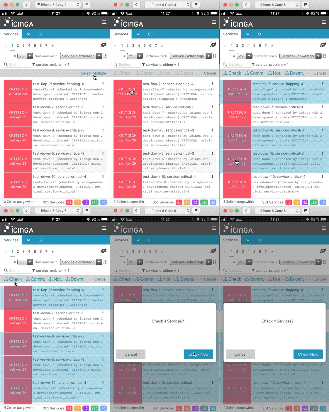
Since CTRL and SHIFT are not available on mobile I can think of something like this: (That's the bar at the bottom what's shown)
- User clicks on Choose Multiple

- Tapped onto 4 services

- Open Selection shows the usual multi-selection view
Or something completely different. @flourish86 or @theFeu any idea?
 nilmerg
on 12 Apr 2019
nilmerg
on 12 Apr 2019
The mobile behaviour I am used to (from Andriod devices, can't speak for iOS) is, that if you tap and hold an item, it switches to the 'select multiple mode' and you can then select more items by just tapping them.
Your idea sounds absolutely fine as well - maybe even implement both?
That would be my suggestion :)
 theFeu
on 12 Apr 2019
theFeu
on 12 Apr 2019
Yeah, any of those would be great. iOS Apps usually have a button you can press in order to enter a separate mode where you can select multiple items via checkboxes. I wouldn’t call that the pinnacle of good UI design though and probably prefer any of the two options mentioned here!
episodeiv
on 13 Apr 2019
The status bar shouldn't be misused to place actions in there. I'd rather suggest an additional bar for mobile. Something like this.
 flourish86
on 6 May 2019
flourish86
on 6 May 2019
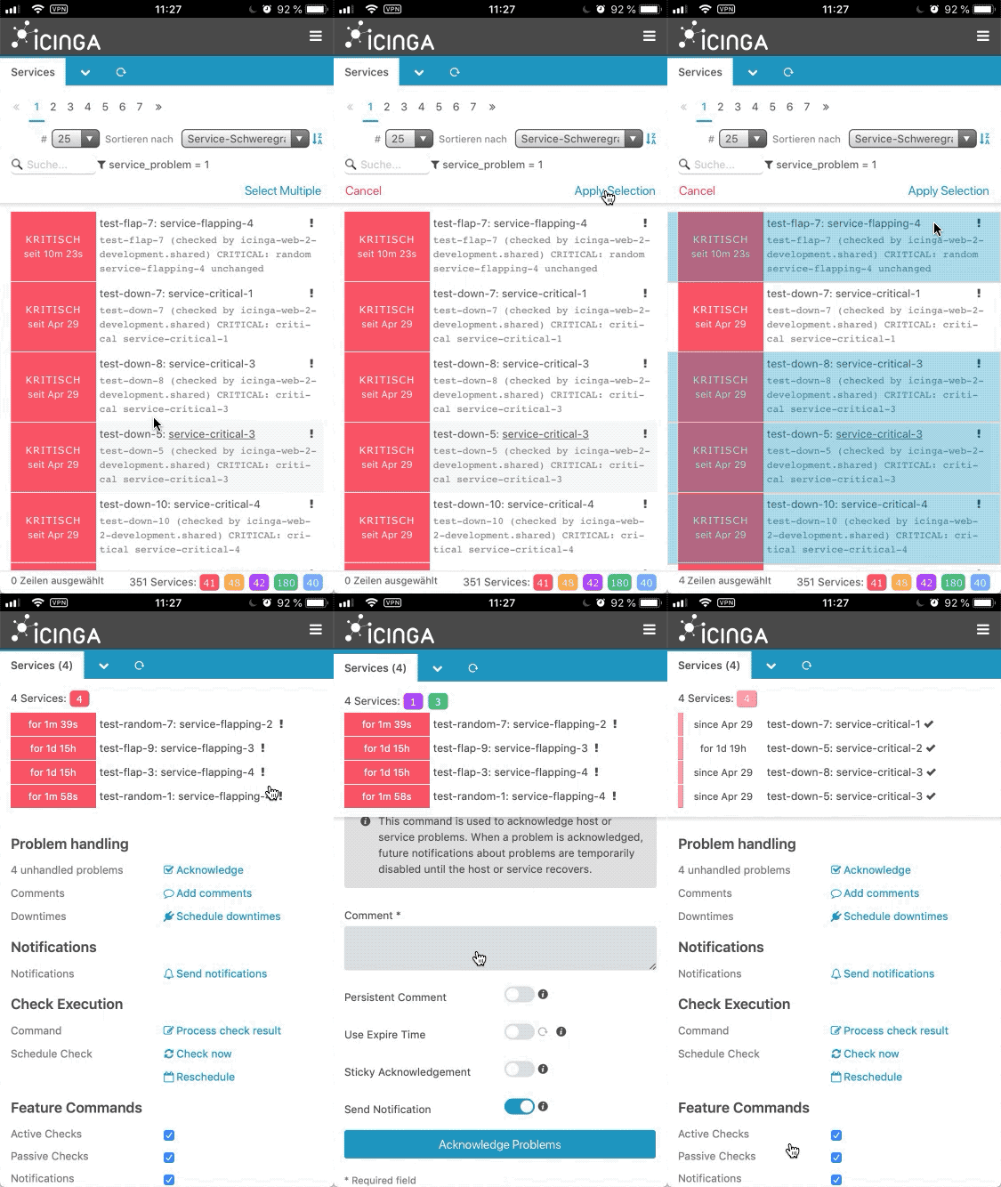
As discussed with @lippserd, we should stick to the already available views. Instead of the alert overlay, we could also use the already implemented multiselect view.
flourish86
on 8 May 2019
Why wasting precious space at the top while there's already enough at the bottom that has also no advantage unless multiple rows are selected? I mean, why not replacing the 0 lines chosen as shown in my example? This has zero advantage unless the user chooses multiple rows which he can't at the moment to begin with.
nilmerg
on 8 May 2019
Because of consistency. Actions are expected to be at the top, status at the bottom.
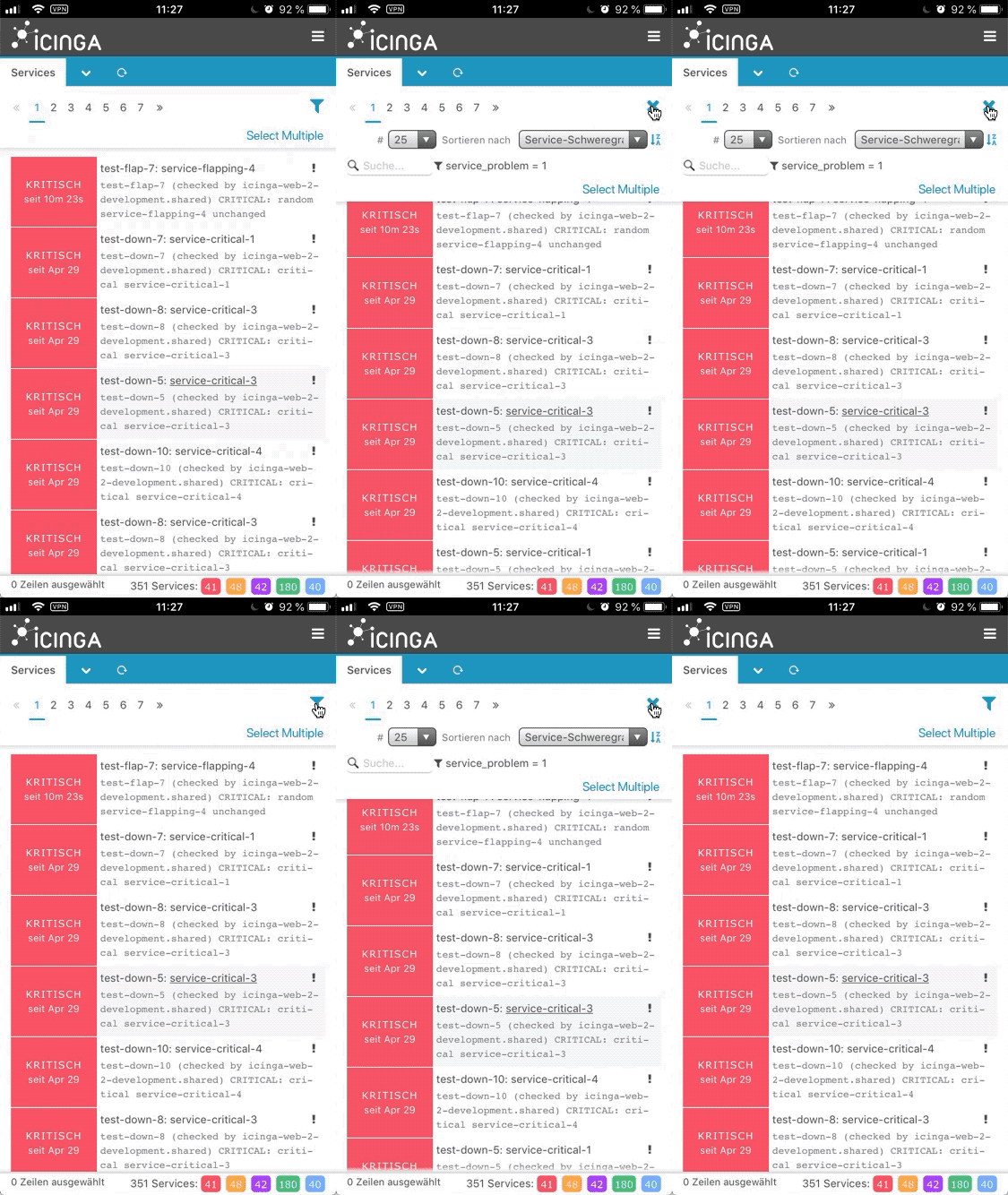
A way to solve the space problem is to hide the filter and sort controls behind a toggle.
flourish86
on 8 May 2019
Actually I would prefer the actions at the bottom, being able to use my thumb with just one hand :)
 dnsmichi
on 8 May 2019
dnsmichi
on 8 May 2019
I see, that a bottom action bar would generally make sense in terms of reachability. But that would require a deeper rethinking of the mobile UI.
We try to keep the code base as lean as possible and at the moment the UI is desktop first. That’s why we are forced to make some compromises with the mobile UI.
flourish86
on 8 May 2019
I feel like it is a bit odd to hide both filter and sorting controls under the filter icon - that might turn out a bit confusing
Other than that just having a text link for select multiple feel a bit out of place too, because everything else is hidden under an icon
theFeu
on 5 Jun 2019
I feel like it is a bit odd to hide both filter and sorting controls under the filter icon - that might turn out a bit confusing
»Filtering« and »Sorting« aren't that far apart from each other, are they? Which solution would you come up with instead?
Other than that just having a text link for select multiple feel a bit out of place too, because everything else is hidden under an icon
It makes sense to have the »select multiple« written out, because it's an unobvious action. So does its prominence. On mobile UIs you would rather need the select multiple available for quick access than the more granular »filtering« and »sorting« functionality.
We should discuss though, if the collapsing should be available on the desktop version, as there is sufficient space.
flourish86
on 19 Jun 2019
Which solution would you come up with instead?
I do agree with the similarities filtering and sorting share, all I was concerned about was the icon. It is already known by the users.
I assume it was just a placeholder, but we should think of something fitting there - first thing that came to mind is a combination of the sorting and filtering icons, since our users know both of them already?
Your explanation as to why the spelled out link sounds absolutely plausible :)
theFeu
on 24 Jun 2019
Postponed for a general mobile rework sprint after version 2.7 has been released.
 lippserd
on 9 Jul 2019
lippserd
on 9 Jul 2019
Related issues
 fireba11
·
8Comments
fireba11
·
8Comments
 wopfel
·
5Comments
wopfel
·
5Comments
 log1-c
·
5Comments
log1-c
·
5Comments
 mateusz-gozdek-sociomantic
·
4Comments
mateusz-gozdek-sociomantic
·
4Comments
 Al2Klimov
·
6Comments
Al2Klimov
·
6Comments
Most helpful comment
Postponed for a general mobile rework sprint after version 2.7 has been released.