Hyrax: Text Contrast Errors for Foreground and Background Colors
Descriptive summary
In Hyrax 2.0.0 rc1 and on the dashboard, there are several text contrast errors for the foreground and background colors.
Rationale
Adequate contrast is necessary for all users, especially users with low vision or forms of color blindness.
Expected behavior
Expected at least AA Compliance of all text colors.
https://webaim.org/standards/wcag/checklist#sc1.4.3
Actual behavior
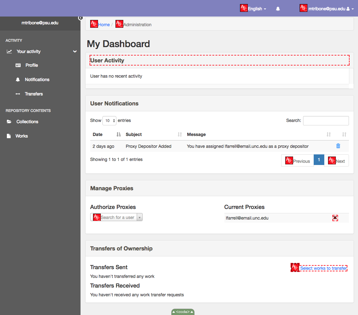
Text color in banner, breadcrumb link color and text color , previous and next link color for pagination, search placeholder text, transfer link text don't have sufficient contrast.
Steps to reproduce the behavior
- Run an accessibility validator or color contrast validator
- Review report on contrast errors
Related work
 mtribone
All 20 comments
@mtribone Can you suggest colors for these changes?
 mjgiarlo
on 31 Oct 2017
mjgiarlo
on 31 Oct 2017
The purple banner at the top will pass AA if we darken it a bit (#6b6bb6). The same goes for the foreground color of the breadcrumb text, pagination text of prveious/next, and search for a user or placeholder text in general (#686868). The linked home and select works to transfer seem to be false positives and are good to go.
mtribone
on 1 Nov 2017
Text color in banner:
- Cannot reproduce in Vanilla Hyrax, this is specific to Nurax.
TODO: change navbar to a darker shade in Nurax
breadcrumb link color (Home
<a>tag)- This is meeting the contrast ratio for WCAG AA and AAA standards (See attached screenshot)
TODO: @mtribone Is this a false alarm?
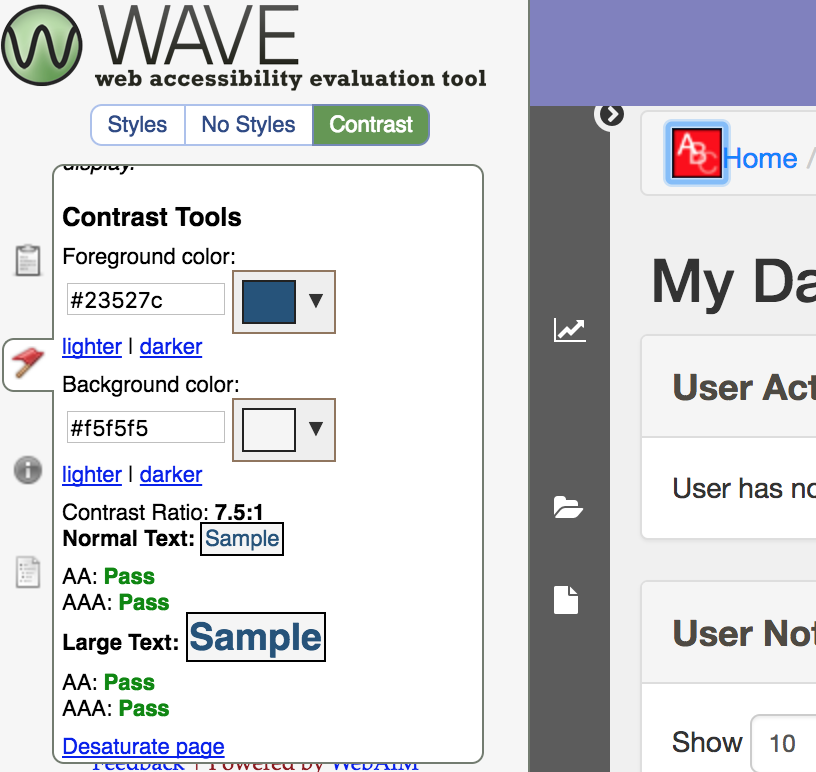
breadcrumb link color and text color
TODO: Make the color of the text darker. Text color is being set by bootstrap CSS v3.3.7 in application.css
# Current:
.breadcrumb>.active {
    color: #777777;
}
# Change to:
.breadcrumb>.active {
    color: #494949;
}
- previous and next link color for pagination
TODO: Make the color of the text darker. Text color is being set by bootstrap CSS v3.3.7 in application.css
# Current:
.pagination>.disabled>span, .pagination>.disabled>span:hover, .pagination>.disabled>span:focus, .pagination>.disabled>a, .pagination>.disabled>a:hover, .pagination>.disabled>a:focus {
    color: #777777;
    background-color: #fff;
    border-color: #ddd;
    cursor: not-allowed;
}
# Change to:
.pagination>.disabled>span, .pagination>.disabled>span:hover, .pagination>.disabled>span:focus, .pagination>.disabled>a, .pagination>.disabled>a:hover, .pagination>.disabled>a:focus {
    color: #595959;
    background-color: #fff;
    border-color: #ddd;
    cursor: not-allowed;
}
- search placeholder text
TODO: Make the color of the text darker. Text color is being set by select2-rails 3.5
# Current:
.select2-default {
    color: #999 !important;
}
# Change to:
.select2-default {
    color: #5f5d5d !important;
}
- Transfer link text
- Cannot reproduce in Vanilla Hyrax
TODO: Change text color settings in Nurax
I thought about a couple of options to fix 3,4,5:
- Upgrading to bootstrap v4 will not fix these issues.
- Add an additional hyrax_a11y.css file to the Hyrax application: That way even if we upgrade bootstrap at any point we will still continue to have these changes. Also, this can serve as a single point for all a11y changes, perhaps?
@mtribone @adamjarling Thoughts?
 h-parekh
on 15 Nov 2017
h-parekh
on 15 Nov 2017
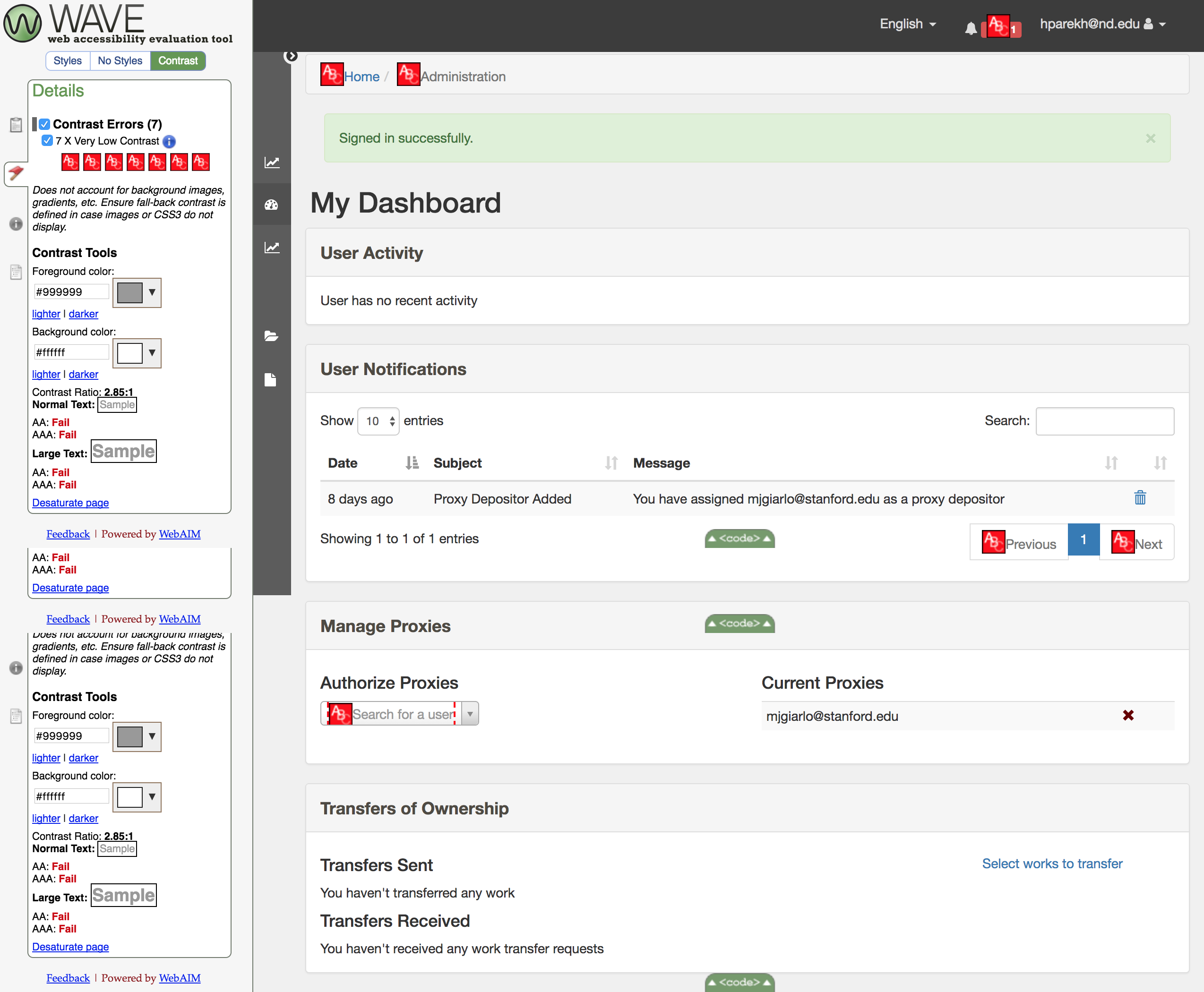
Screenshot for contrast ratios on dashboard page of Vanilla Hyrax
h-parekh
on 15 Nov 2017
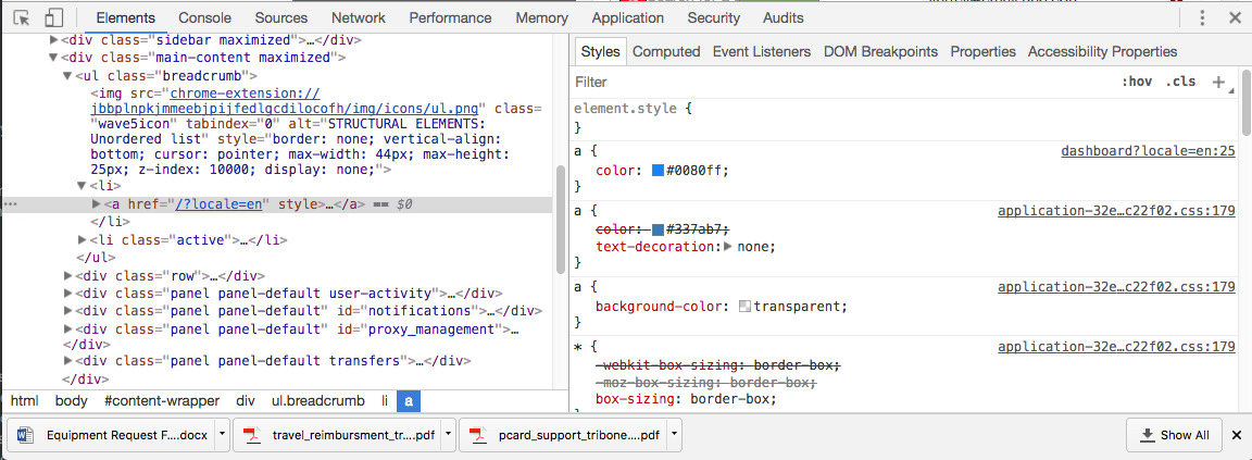
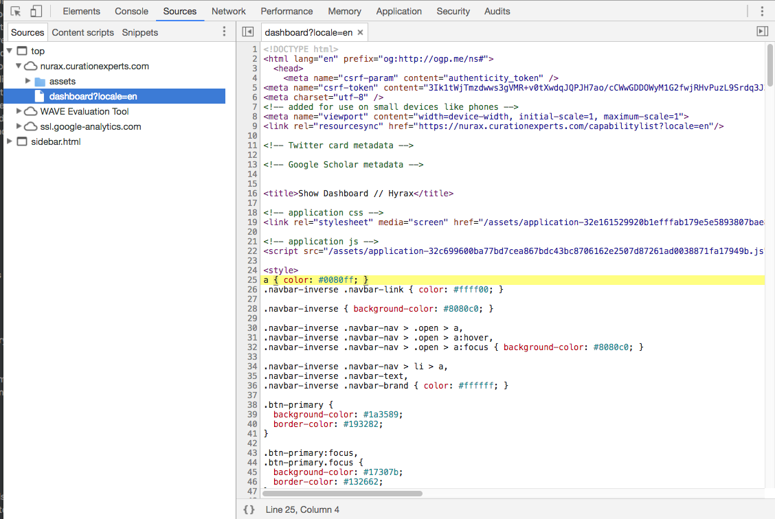
@h-parekh As for the breadcrumbs foreground color , it appears that the color is being overridden in the dashboard style sheet to #0080ff which fails because it is 3.48:1. It looks like the order of the stylesheets is affecting the outcome because that link color for home is a lighter blue than what is in the WAVE output.
My screen shot from Nurax:
mtribone
on 15 Nov 2017
@h-parekh Aaahhh the link colors for the breadcrumbs and transfer are coming from inline styles.
mtribone
on 15 Nov 2017
I like the idea of a stylesheet specifically for a11y issues!
mtribone
on 15 Nov 2017
So the color for item 2 (breadcrumb link color (Home tag)) and item 6 (Transfer link text) are both coming from inline styles. Both Vanilla Hyrax and Nurax are showing the same behavior.
But on Vanilla Hyrax the breadcrumb link fails contrast ratio and the transfer link doesn't.
h-parekh
on 15 Nov 2017
Link to the vanilla Hyrax instance i am looking at: https://a11y.demo.hydrainabox.org
h-parekh
on 15 Nov 2017
@h-parekh Hmmmm...looks like we have differing versions of the codebase. Nurax versus Hyrax versus Hyku.
mtribone
on 15 Nov 2017
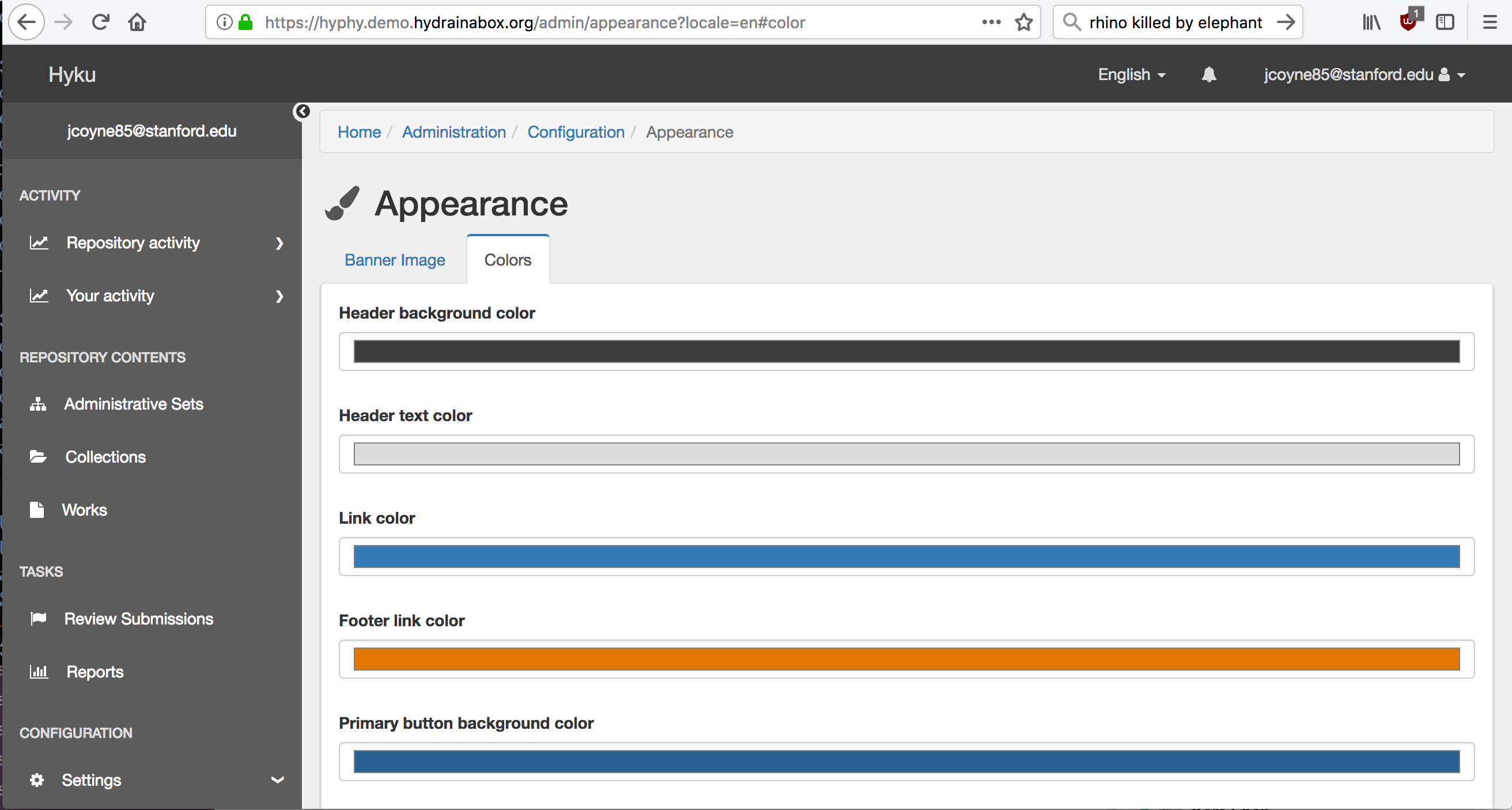
Are the defaults a problem or is it how the user has chosen to customize the colors that is the problem?
 jcoyne
on 15 Nov 2017
jcoyne
on 15 Nov 2017
@mtribone: Aah, that's a rookie mistake. Hyku should map to a specific Hyrax release I think?
@mjgiarlo Can you confirm the Hyrax version for https://a11y.demo.hydrainabox.org/?locale=en The footer says 'Hyku v1.0.0.beta1' but I don't know which version of Hyrax its running on.
@jcoyne As far as I can tell from the analysis above, items 1,2 and 6 are due to customizations in Nurax and 3-5 are due to defaults in Hyku v1.0.0.beta1
h-parekh
on 15 Nov 2017
Hyku is running a new enough Hyrax, @h-parekh.
mjgiarlo
on 15 Nov 2017
@mtribone Help me understand this, if we just look at the Hyku dashboard, 'Home' link in breadcrumb and 'Select works to transfer' link are using the same inline styling. But only the 'Home' link reports a contrast error. Am i missing something?


h-parekh
on 15 Nov 2017
@h-parekh earlier you said:
Upgrading to bootstrap v4 will not fix these issues.
but the article you posted references an early alpha release of bootstrap 4. Have these issues been addressed since then?
jcoyne
on 15 Nov 2017
@h-parekh
But only the 'Home' link reports a contrast error. Am i missing something?
the home link is on a darker (panel header) background.
jcoyne
on 15 Nov 2017
@jcoyne
Great catch! There is a very slight difference in the background colors. The Home link has a 7.5:1 contrast that's meeting AA and AAA standards so not sure why the WAVE tool still throws an error.
As for the bootstrap v4 accessibility fixes, I just checked the documentation for the current release v4.0 and it says that:
Authors will need to manually modify/extend these default colors to ensure adequate color contrast ratios
h-parekh
on 15 Nov 2017
@jcoyne @h-parekh The tricky thing is that the foreground/background contrast ratios are also affected by text size. So for example, a color combo at 14px for text may not pass but at 20px it might.
mtribone
on 15 Nov 2017
@mtribone Really tricky stuff! Took much longer to get a PR in that I thought.
h-parekh
on 16 Nov 2017
Confirmed with @mtribone, this contrast issue has been fixed in master.
h-parekh
on 23 Apr 2018
Related issues
 tworrall
·
5Comments
tworrall
·
5Comments
 tahirpoduska
·
6Comments
mjgiarlo
·
3Comments
tahirpoduska
·
6Comments
mjgiarlo
·
3Comments
 mbklein
·
4Comments
mjgiarlo
·
4Comments
mbklein
·
4Comments
mjgiarlo
·
4Comments