Hyrax: Update the UI for Add New Work to improve UX
Descriptive summary
Suggestions for cleaning up the UI that the user works with when adding a new work.
@hannahfrost Please review if you have a chance to make sure this reflects your understanding of our discussion.
Rationale
Currently there is inconsistency in wording and visual presentation of form elements among the four tabs of the page. These suggestions also (sort of) address @newmanld's comment in #675 about the tab order, although after discussing, @hannahfrost and I would like to try putting the Files tab first and leaving the others in their current order. So the new tab order would be:

As shown in the mockup above, I'd also suggest removing the icons from the tabs. There are a lot of icons in the application and I'm not sure using them here provides enough value to justify the additional visual clutter and inconsistency with other tabs that don't use an icon.
Files tab
The mockup below represents new and updated text, removing headings, and moving the cloud upload button to be inline with the other upload buttons:

For copy and paste purposes, here is the text in the first two paragraphs:
Each work must have one or more files associated with it. Add files from your local system or a cloud provider.
Note that if you use a cloud provider to upload a large number of files within a short period of time, the provider may not be able to accommodate your request. If you experience errors uploading from the cloud, let us know via the contact form.
(where "contact form" is linked as before)
Add the plus icon to, and remove btn-lg from, the cloud button for consistency.
I understand there might be some complications with where to show the progress bar, etc. with this rearrangement but I'm hoping we can figure that out after the visible elements are rearranged.
Descriptions tab
The only update here is to remove the first two intro paragraphs.

Relationships tab
New intro paragraph text, updates to the form labels, and removing the "This Work..." heading:

This work must be a member of one administrative set. Optionally, it can belong to one or more collections.
Sharing tab
Rename tab. More significantly, we suggest rearranging the form elements to more closely match the pattern we are using the Add/Edit Admin Sets Participants tab, since they are very similar features.

Specific updates here are:
- Intro text (I wonder if we can remove the text next to the "Private" choice in the Save Work sidebar with this update?):
Regardless of the visibility settings for this work, you can also share it with other users and groups.
Move the add user/group controls to the top, under the "Add Sharing" heading.
Show "Add group/user" labels for each row of controls.
Replace the plus icon with an Add button (to match what we do on the Participants tab).
Update to the heading "Currently Shared With" and list the users/groups the work is shared with.
 ggeisler
All 23 comments
@ggeisler Quick comment - I note that the Files tab is first on the Add New Works by Batch, so it's best to be consistent.
 hannahfrost
on 4 Apr 2017
hannahfrost
on 4 Apr 2017
@ggeisler Thanks for gathering these details together. It correctly reflects what we discussed yesterday.
hannahfrost
on 4 Apr 2017
@ggeisler These changes look good. The only thing that stands out to me as inconsistent is the size of the headings on the Sharing tab. "Add Sharing" and "Currently Shared With" are significantly larger than any of the text on any of the other tabs.
 elrayle
on 10 Apr 2017
elrayle
on 10 Apr 2017
Thanks for the review of style issues. I'd like to push back against some of the other changes.
Each work must have one or more files associated with it.
This is not necessarily true; it can be turned off in configuration, so this text should not show if the requirement is turned off.
Similarly, all the text about the 'cloud providers' should not display if browse-everything is not in use.
The reason the description tab is first in this create workflow (but not in the batch upload workflow) is because it's irrelevant to users who want to create a work but not attach a file. Switching the tabs is not helpful for our use case.
These changes regress hyrax back toward the 'self-deposit IR' use case, which we had been attempting to broaden away from. I would prefer to see them as configuration if they are made.
 hackartisan
on 10 Apr 2017
hackartisan
on 10 Apr 2017
We have configured our self-deposit IR to allow works without files. I agree with @hackmastera that for our use case switching the tabs may not be helpful. We would discuss with our product owners overriding locally to switch the order of tabs back to description first, which supports the suggestion from @hackmastera to make the order of tabs a configuration option.
Per the note that this may sort of address my comments in #675: That comment was not about tab order per se, but whether the choice of admin set is something that belongs on a relationships tab that is (appropriately for other relationships) third in order. We may need to amass more use cases about admin sets to understand if the choice (if a given user is authorized to choose between two or more admin sets) should be made before choosing work types, i.e. before seeing this form?
 newmanld
on 10 Apr 2017
newmanld
on 10 Apr 2017
@elrayle The headings on the Sharing tab are actually the only headings on any of the tabs; the other bolded text you see in tab pages are labels. That said, I do think the headings on the Sharing tab are too large. What you see in the mockups is what is currently in the app. I plan to revise the heading sizes throughout the app at some point but want to do it consistently so it might be better to be done separately from this work.
@hackmastera @newmanld Our goal is definitely not to move back towards the self-deposit IR use case. Neither @hannahfrost nor I were aware that there was a current use case of works without files. Given that is a valid use case, I'll update the mockups to reflect your feedback. Also, without thinking through the details yet, I'd like avoid unnecessary configuration (e.g., omit or reword text instructions rather than have to have a configuration to display specific text instructions) if possible.
ggeisler
on 10 Apr 2017
@ggeisler sounds great, thanks! 👍
hackartisan
on 10 Apr 2017
One approach for the instructions is to drive it from the locales file. If a site doesn't want it to display, the label can be set to an empty string. The only down side is that the empty string, in some cases, effects spacing.
elrayle
on 10 Apr 2017
Two thoughts on admin sets...
- There are several circumstances in which a user cannot select an admin set.
- The site only defines the default admin set.
- The user only has permission to create works in the default admin set.
- There are multiple admin sets, but the current user only has permissions to create works in one.
In the case where the user can only create works in the default admin set, should the selection be hidden to avoid confusion? Users of this app are unlikely to know the concept of an admin set.
- Use Case: We have an app that has two work types. For one type, at least one file is required. For the other type, files are not allowed. In our app, we overwrote the code for the tabs and only show the Files tab for the work type that requires files. It is hidden for the other work type. It's always better to not have to customize the code. Are others hiding tabs?
elrayle
on 10 Apr 2017
I just saw issue #678 which is related to 1 in the previous comment.
elrayle
on 10 Apr 2017
I'm not sure I understand the discussion about not moving hyrax back toward self-deposit here. Isn't self-deposit an ongoing and intentional use of hyrax?
 julesies
on 11 Apr 2017
julesies
on 11 Apr 2017
@julesies absolutely; I meant narrowing back onto an exclusively self-deposit use case. The current intention of the project as I understand it is to continue broadening to include more use cases in addition to self-deposit IR.
hackartisan
on 11 Apr 2017
@ggeisler thanks for sharing these, they are looking great. I have a few thoughts on the suggestions.
Generally, I think for many students and faculty users, they may never use the relationships and sharing tabs. I would hate to lose the "private" functionally from the visibility section. Private remains to be one of the most consistently understood terms in our repo. If you are just looking at numbers, I find that the majority of self-deposit users are students, using the repository 1 time as a requirement of graduation. Though these users might not even use "private" I'm worried about moving essential functionality from those first two tabs. And I was also wondering if it would be terrible to have the visibility settings "repeated" on the sharing tab - maybe not editable but viewable? So it is more obvious that it's an additive action?
Regarding the text on the relationships page. Isn't the behavior that the deposit will go into the "default" admin set? I wonder if some more language about how it work would be appropriate?
Not suggesting exact wording, but thinking of getting across something like...."this work will be added to the admin set listed, unless you select another. A work must belong to one admin set. "
julesies
on 11 Apr 2017
@julesies Thanks for your use case and sharing your concerns. As @hackmastera said, I didn't mean to imply that the direction is away from self-deposit, just broadening beyond that (sorry for the confusion). Your other feedback is useful; I think our next step is to look at all the discussion in this ticket, as well as #674, #675, and #678, and work out a design that supports the various related use cases. I think we can make progress on that next week, when @hannahfrost might be available to add her feedback.
ggeisler
on 13 Apr 2017
Based on the comment thread above, below are some updates to consider:
Tab order
Based on @hackmastera's explanation about how adding works are different in the batch upload case, we should not change the tab order as previously suggested.
Descriptions tab
No change from the original mockup design proposed above.
Files tab
Updates to deal with 1) works are not always required to have files, and 2) an implementor might not have browse_everything configured:
If browse_everything is in use:

If browse_everything is not in use:
- Don't display the introductory text except the first sentence
- Don't display the browse_everything button

Relationships tab
There has been much related discussion about configuring administrative sets: limited types of works per admin set, specifying workflow per work type, etc. After reading through all the relevant tickets, I don't think any of that really affects the Relationships tab, other than deciding what a user sees on this tab if their choice of admin set is restricted because of work type or user/group permissions. So perhaps there are just two variations to consider here.
1. User has choice of admin set
When a user actually does have the choice of more than one admin set with which to associate the work, the tab is pretty much as in the original mockup above:

2. User does not have a choice of admin set
In cases where the user does not have a choice of admin set (e.g, the work type or user/group permissions dictate that the work goes to the default admin set, or other specific admin set), two options to consider:
A. Disable admin set select menu
The screenshot below doesn't illustrate it too well, but in this approach we still show the admin set select menu (so a new user learns it plays a role in things, and a user who already knows about admin sets from other deposits doesn't wonder why the selection is not where it was before) but disable it with the specified choice indicated, so the user knows what admin set the work is going into but can't change it.

B. Hide admin set select menu
Alternatively, we could hide the selection of admin set entirely when the user can't change it. The advantage here is for one-time users or users who will never deposit a work that allows admin set selection, since it effectively hides something they never need to know exists.

(These updates don't incorporate any changes to address the additional wording suggestion @julesies made in a comment above about the Relationships tab. I understand the suggestion and am willing to make updates to the mockups if others think they are necessary but I personally feel that if users see a select menu and can change the options, we don't need to explicitly tell them they can change their admin set choice.)
Sharing tab
I didn't make any updates to the Sharing tab. The main comment on this tab was @julesies point that -- if we followed my earlier suggestion that maybe with the proposed redesign of the Sharing tab we could get rid of the wording next to the Private radio button in the Visibility section of the sidebar -- we'd lose explanation important for one-time or infrequent users. @julesies proposed some additional text that might go on the Sharing tab.
@julesies explanation convinces me that we should not remove the wording next to the Private radio button. But I'm not so excited about adding more explanatory text to the Sharing tab or repeating things that are already in the sidebar next to the tab; I think we can actually make things more clear with less, rather than more, explanation by keeping the UI simpler. But if others feel more clarity is needed I'm happy to make further updates to the Sharing tab design.
ggeisler
on 18 Apr 2017
👍 @ggeisler thanks for these updates!
hackartisan
on 18 Apr 2017
@ggeisler This looks really good. I really appreciate your thoughtful consideration. I totally agree less than more! It seems really challenging to serve the needs of infrequent vs frequent users where we have both (trained) library staff and self-deposit users who the service managers may never have the chance to talk to/train.
I was trying to think about faculty or students who might click on the Relationships tab (options a and b above) and I think my concern is really the terms and potential confusion between Admin Set and Collections. And this really hinges on how a repo's admin sets are set up and maybe I need to understand the implications of Admin Sets better.
I was thinking...if a general self-deposit repository has the following Admin Sets:
- Default Collection (zero step workflow) (could be named any faculty/student research output)
- ETDs (unique workflow)
- Senior Honors Theses (unique workflow)
...A user might see the collections part only listed and not understand why the ETD or the Senior Honors Theses would not be listed, when they could Navigate/or discover their work within an admin set from the homepage (and it will appear on the work view?). In other words do you think self-deposit users would assume that Collections=Admin Sets? I wonder if we could do some usability testing around these terms or if any has already been done?
It may be that in our instance we solve this by renaming Admin Sets and Collections to something else (not that I know what!).
julesies
on 18 Apr 2017
@ggeisler @julesies @hackmastera et al. Post-spring-break catching up is now underway. Lots of good stuff here.
With regard to the terms "admin set" and "collection" in the UI - I also struggle with what will make sense to users. Admin set makes sense to us (maybe? finally?), but I expect it will often break down into confusion once presented to general users. I've spent time trying to come up with alternatives, but have yet to find anything satisfying. Maybe we need a brainstorming session over beer sometime.
For the relationships tab, I'm in favor of option 2A. I think transparency about the admin set relationship is important and helpful for all users, including us insiders, at least during this early stage of the app and the introduction of this kind of functionality.
And +1 to use cases of deposits without files. We need to support this. It was on my radar, but not in mind when @ggeisler and I were working on this earlier. Thanks.
hannahfrost
on 18 Apr 2017
I agree with comments from @julesies and @hannahfrost about confusion currently between Admin Sets - presented as collections on opening page I think of Hyrax 1.0 - and Collections - presented as a facet under Type? The Display Sets working group of which I'm a participant and @elrayle chairs, has also discussing this and I think there is an opportunity when the UI/UX and Dev work are done to incorporate display sets to resolve the UI/UX issues with Collections.
I lean toward 2A on the relationships tab and also +1 to use cases of deposits without files.
newmanld
on 18 Apr 2017
@hannahfrost this might not be the best venue for this question, but is there any discussion about making collections an optional feature? i'm not sure we have a real need for them need for them ATM and since they are so present in the UI, maybe it would make sense for me to disable them. I might not be getting the need to make the user collections so prominent.
Maybe we could just call everything collections and collapse the concept in the discovery UI, but in edit form label the type like "Professor Plum's"/"User Collections" or "University Library's". @newmanld is this the kind of thing you all are discussing in the display sets group?
julesies
on 18 Apr 2017
@julesies - I recommend the high level document just shared on hydra tech and hydra community by @vantuyls, and the documentation from the Display Sets WG (see also child pages) here: https://wiki.duraspace.org/display/hydra/Display+Sets+Working+Group. In particular https://wiki.duraspace.org/display/hydra/Requirements+-+Display+Sets The initial work of the Display Sets WG is complete and a UI/UX WG is starting.
newmanld
on 18 Apr 2017
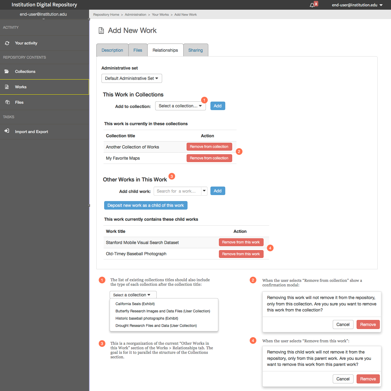
As part of the Collections Extensions WG, we've further refined the Relationships tab for New/Edit Work. The goal is to make the Relationships tab for Collection and Work have the same basic layout and affordances.
When someone is ready to start work on this ticket, we should probably create separate tickets for each Work tab, because of the amount of changes and updates that have occurred since the original creation of this ticket.
ggeisler
on 4 Aug 2017
In a post hyrax 2.1 world, a lot has changed since these recs were made so I'm going to close this one.
julesies
on 25 Sep 2019
Related issues
 mjgiarlo
·
6Comments
mjgiarlo
·
6Comments
 svanschuyver
·
5Comments
svanschuyver
·
5Comments
 tworrall
·
5Comments
svanschuyver
·
5Comments
tworrall
·
5Comments
svanschuyver
·
5Comments
 revgum
·
4Comments
revgum
·
4Comments
Most helpful comment
@julesies absolutely; I meant narrowing back onto an exclusively self-deposit use case. The current intention of the project as I understand it is to continue broadening to include more use cases in addition to self-deposit IR.