Hypothesis: New Hypothesis Dragonfly branding
:wave:
@Zac-HD
I have volunteered myself to create some new branding for hypothesis as the current 'limited edition' branding is not Hypothesis' intellectual property. I've created a couple of sketches of a dragonfly that might work and am beginning to do some rough vectors of them for use. Please provide feedback if you have any! I only have a few hours i can dedicate to it today during the sprint so hopefully i can get something completed by then. If not i'll be working on it off-and-on probably for the net week.
Below are some preliminary sketches:
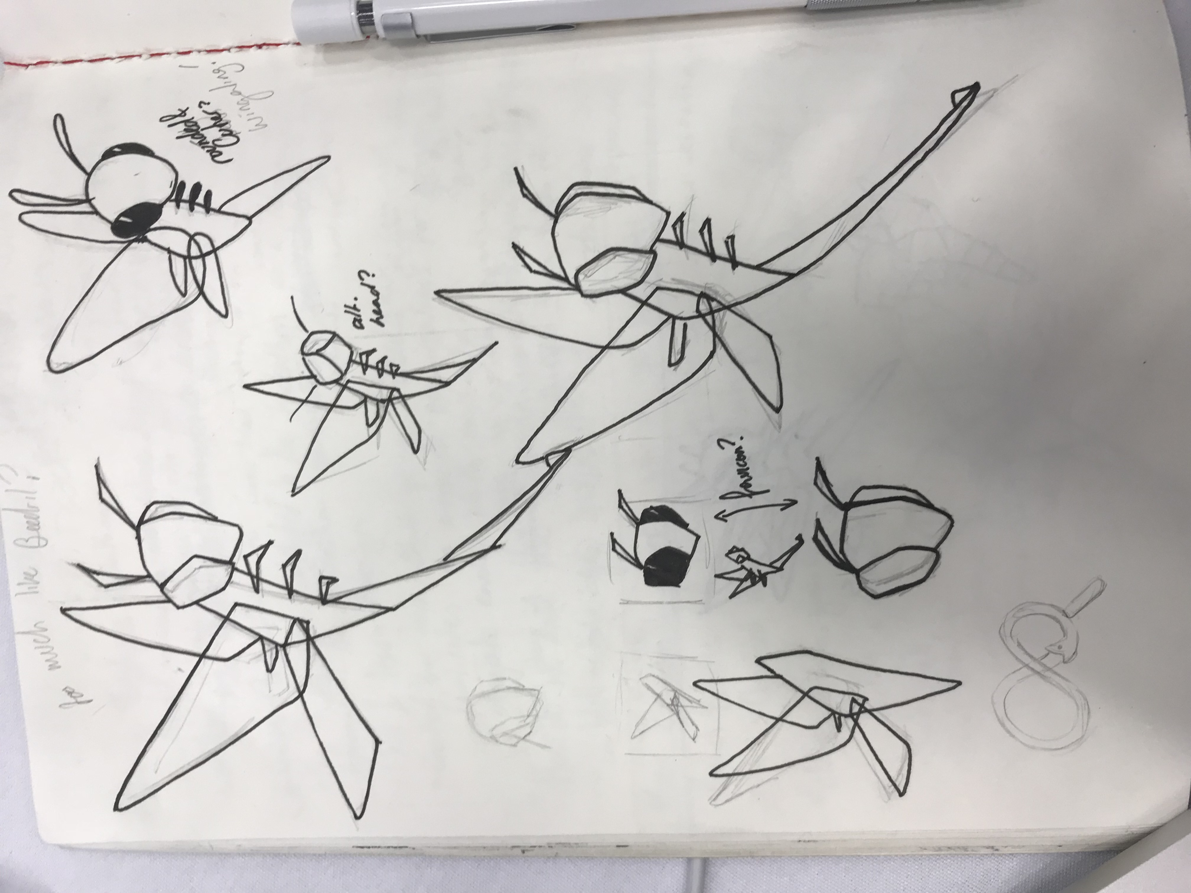
Thanks in advance for your input!
 libbyberrie
All 23 comments
Thanks so much @libbyberrie - really exciting to have some lovely art for Hypothesis :sparkling_heart: :dragon::bug:
CC @HypothesisWorks/contributors; comments welcome especially from @DRMacIver. I'm fairly set on replacing the circle with something though, even if we replace that in turn eventually as part of a larger brand overhaul. I'm also pretty keen on sticking with the dragonfly concept, since it's quite distinct from the BSD dragonfly and we're not using it in a name.
 Zac-HD
on 27 Aug 2018
Zac-HD
on 27 Aug 2018
Hey Zac - No problem! 😄
Can you link me to the BSD dragonfly you're referencing so I can make sure the branding remains distinct?
I would also be interested in getting feedback on general style guides -- colours or fonts you would like me to stick to. I'm currently using a combination of #44425F and #A3E9FF for the main dragonfly (see attached preview)
Thanks :)

libbyberrie
on 27 Aug 2018
Flats are in. need to add some cel-like detail shading to add more definition to the 'tail'* cause at the moment the segments looks a little messy.

*Apparently it's called an intersegmental annulus
libbyberrie
on 27 Aug 2018
https://www.dragonflybsd.org/ has 
As to brand and colour guidelines, we don't have any! I suggest creating 2-3 options for consideration by @DRMacIver and myself :smile:
Zac-HD
on 27 Aug 2018

🎉 I think it's pretty much there! I was tossing up adding details to the wings but i think that may be overkill.
I'll work on the text/colour styles now but i doubt i'll get that done before the end of my time in Sydney. Do you guys want the SVGs now?
libbyberrie
on 27 Aug 2018
What would be the best way to deliver an SVG to people? Github doesn't support SVG uploads in comments. In the meantime, here's a PNG.
Nevermind! here 'tis
I will be heading home in 20 mins so i'll leave it there for now. I'd love to hear feedback on what colours people would like. Are we set on the blue?

libbyberrie
on 27 Aug 2018
These are cute! I'd be happy to stick with the blue, but if you've got other colour schemes in mind I'd be up for seeing them.
 DRMacIver
on 27 Aug 2018
DRMacIver
on 27 Aug 2018
Same here - I love it, but would also love to see some colour options like e.g. a darker blue body and green legs? Not a visual artist though :blush:
Zac-HD
on 27 Aug 2018
This looks pretty awesome! :)
 PiDelport
on 27 Aug 2018
PiDelport
on 27 Aug 2018
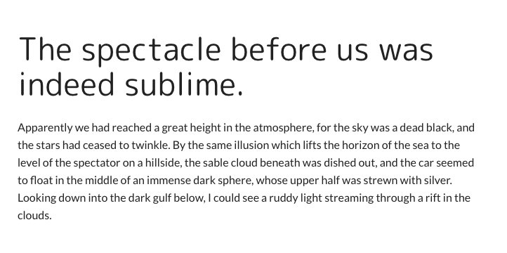
Hello! Attached are a couple more colour experiments for the dragonfly. I am also looking into font branding for you now. I think for simplicity we should stick with the base body font (Lato) but we can incorporate a google font pretty easily for h1-h3s. The attached screenshot is a decent suggestion: M PLUS Rounded 1c



libbyberrie
on 29 Aug 2018
@libbyberrie these look fantastic! I (and everyone I've shown them to) especially love the shading on the last example, though opinions on the colours of the purple and yellow dragonflies are mixed. Further ideas:
- do a version of the original color scheme with two changes: body shading similar to the last, and the wings with a thin dark outline for visibility on stickers and other white backgrounds?
shamelessly rip offtake inspiration from the Beeware Pride stickers. Rainbow wings maybe?
Finally, so we can calibrate our expectations: how much would you like to do for Hypothesis' branding? You've drawn some beautiful stuff and we're now talking about fonts too - should we also be thinking about a website touchup, varieties of swag (e.g. I'd love the T-shirt...), etc? No pressure intended at all but knowing the rough scope would be great :heart_eyes:
Zac-HD
on 29 Aug 2018
Great work @libbyberrie !
I really love the last one (as @Zac-HD said, shading effect make it sooo cool ^^)
varieties of swag (e.g. I'd love the T-shirt...)
Need :laughing:
 touilleMan
on 29 Aug 2018
touilleMan
on 29 Aug 2018
Hey @Zac-HD -- Just got home so i won't be finishing the dragonfly versions you suggested tonight but i can definitely answer some of the questions you asked!
_how much would you like to do for Hypothesis' branding?_
At the moment, I am happy to do most of your branding and collateral design/vector work. If you are interested in a website touch up, I can make some wireframe mockups for someone else to go off, as well as style guides, but until a large webdev project i have going on at work is finished (probably will happen mid-nov) i would like to spend as little time outside of work doing that. :P If you're happy to wait until after that though, we're gravy. Vector work also includes shirt ideas, of course. :)
Personally, I think the dragonfly would look beautiful as an enamel pin, or an iron on patch!
libbyberrie
on 30 Aug 2018
We would be delighted by whatever and whenever you want to contribute! Personally I'm more excited about the art than anything else, and I don't think we have anyone offering to do a website overhaul earlier anyway 😄
And I'm super excited for pin/patch/sticker/shirt/other amazing ideas!
Zac-HD
on 31 Aug 2018
Hello~
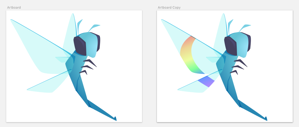
Here is a modified version of the first dragonfly, the gradient has been deepened and I also added a small outline on the top of the wing. I had tried outlining the whole wing but when zooming out, as the wings are transparent it just looked too cluttered when it got to smaller sizes.
And here is a potential rainbow wing design also!
libbyberrie
on 2 Sep 2018
👋 Hi just want to say that I'm sorry I've not been more involved with these discussions. I'm super-excided by these @libbyberrie (and very grateful for the offer to help fix our website branding! Whenever you have time, energy, and motivation is of course fine and November or later is no problem at all) and really like the new dragonfly.
As far as variants go, personally I really like the slight colour contrast in the last one as well as the shading. Having a different base colour for the wings and the body works well for me.
(Big fan of the idea of having a 🌈 variant too)
DRMacIver
on 2 Sep 2018
I ❤️❤️❤️ the most recent one so much! It's literally better than I was imagining 😍
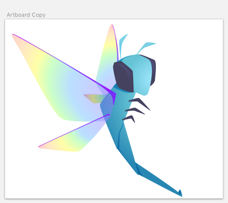
For the rainbow variant... can we do more rainbows? eg shade the whole area of the large wing (or every wing?) from purple at base to red at tip - I just worry that the current :rainbow: is a bit small and could look like an addition rather than a variation.
If we're doing pride, it should be totally fabulous!
Zac-HD
on 2 Sep 2018
How's this for a gradient?
libbyberrie
on 2 Sep 2018
:heart_eyes: I love it!
Zac-HD
on 2 Sep 2018
Awesome! Once I get home from work i'm going to neaten up the wing top-line (i am not super happy with the way it is connecting to the body on second glance) and then i can send over the SVGs if you want to use them immediately. :)
libbyberrie
on 3 Sep 2018
Sounds great! In terms of sending things over, we're going to want them in the repo so a PR seems appropriate! I'd suggest a new top-level directory logos/, with all the source and final files plus a one-paragraph readme (so we link of e.g. print on demand swag later). And add yourself to the contributors list!
Zac-HD
on 3 Sep 2018
Hello! Just letting you know that I'm not dead :P
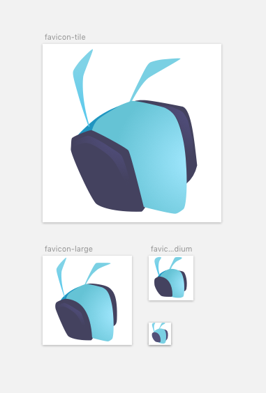
made some favicons for you today. Decided to limitthe favicon to just the head as anything more would be too cluttered. Here is it zoomed into 2x actual size (White background won't be there. will be saved with transparency)
Need to work on logotyping and a styleguide next! still not sure what else to do in terms of branding and swag...
libbyberrie
on 17 Sep 2018
@libbyberrie can you please send over the SVG(s) for this? The wing top-line looks fine to me, and anything is better than our current logo...

(you're obviously welcome to keep tweaking it in future! Nothing needs to be final but we would really like to have a better logo in time for Hypothesis 4.0 (#1696) in a few weeks 😸)
Zac-HD
on 20 Dec 2018
Related issues
 garry-jeromson
·
3Comments
garry-jeromson
·
3Comments
 whatevergeek
·
3Comments
whatevergeek
·
3Comments
 a3kov
·
4Comments
Zac-HD
·
7Comments
a3kov
·
4Comments
Zac-HD
·
7Comments
 rlgomes
·
3Comments
rlgomes
·
3Comments
Most helpful comment
How's this for a gradient?
