Hydrogen: Make noteKey more visible by adding a white outline
Currently, when editing note keys on its editor, when putting a note on the black keys on the piano roll, they get unseeable:
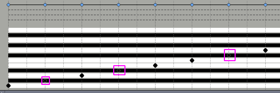
Adding a white outline or something similar would solve this problem.
 Porrumentzio
All 17 comments
Perhaps this could be best done by lightening the sharp/flat background colour, to match the piano roll editor?
 cme
on 30 Sep 2020
cme
on 30 Sep 2020
Ah, yes. The colors are really unfortunate :(
 mauser
on 2 Oct 2020
mauser
on 2 Oct 2020
Some options:
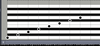
White circle background:
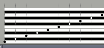
Alternating black / white notes for contrast:
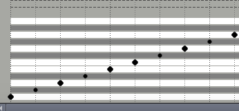
Lighter background on the sharps & flats:
cme
on 3 Oct 2020
I prefer the "Lighter background on the sharps & flats" (the last one). The 2 others are more "aggressive" to my eyes.
 trebmuh
on 3 Oct 2020
trebmuh
on 3 Oct 2020
I like the second one but it's too hard in contrast.
So I think third option would be better.
Anyway, I propose three changes:
- Make the sharp/flat keys end more abruptly, not with current lighter border.
- Make the notes on sharp/flat keys the same size as others (bigger). I think it has to see with the first proposal.
- Add key names at the left. If user does not know piano very well, it is easier this way.
Porrumentzio
on 3 Oct 2020
@Porrumentzio Good ideas, I'll try those and see how they look.
cme
on 4 Oct 2020
I like this a lot better! It's much cleaner and easier to follow I think.
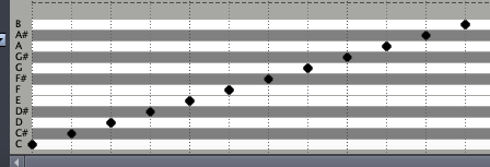
cme
on 4 Oct 2020
It is very nice like that.
Can you make the ABCDEFG be translatable then I can make these Do Ré Mi Fa Sol La Si (as an example in French)? Thank you
trebmuh
on 4 Oct 2020
Can you make the ABCDEFG be translatable then I can make these Do Ré Mi Fa Sol La Si (as an example in French)?
Done. The same thing should probably be done at some point in the piano roll editor I guess, since it also annotates rows with note names?
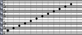
cme
on 4 Oct 2020
The same thing should probably be done in the piano roll editor I guess?
Yes, it'd be very useful for the non English notation users.
trebmuh
on 4 Oct 2020
Good for internazionalitation!
I like the new look and I have more proposals:
- Notes on sharp keys look a bit tinier than others. Could they be exactly same size?
- I would like to see how it looks having sharp keys darker (almost black) and notes brighter (inverting the colors). I'm not sure about this anyway
- Although the black outlines on the keys of piano roll make it look old-fashioned, I think they look clearer that way. What do you think?
Porrumentzio
on 4 Oct 2020
- Notes on sharp keys look a bit tinier than others. Could they be exactly same size?
They're technically the same size with this change, pixel-for-pixel, but the grey background of the sharps being closer to the outline colour makes it appear smaller. The same thing would happen unless the outline were a contrasting colour. I might try an explicitly dark pen colour to see if that minimises the effect.
- I would like to see how it looks having sharp keys darker (almost black) and notes brighter (inverting the colors). I'm not sure about this anyway
- Although the black outlines on the keys of piano roll make it look old-fashioned, I think they look clearer that way. What do you think?
I will try those when I can get the time but from the first set I tried, the alternating colours seemed the most jarring of the bunch so I don't hold much hope for it!
cme
on 6 Oct 2020
Re: 1, @cme what if you add the same black horizontal lines than in :
?
trebmuh
on 7 Oct 2020
Keeping visual similarity with the piano roll editor is probably a good idea anyway.
(I'm going to ignore the increasing temptation to refactor them to use the same code though!)
cme
on 9 Oct 2020
Black lines, black-edged note:
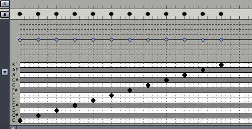
I think this addresses all the issues and looks much better and clearer. Any objections? :)
cme
on 10 Oct 2020
No objection from me, it looks very good like that.
_PS: don't refrain your temptation too much :wink:_
trebmuh
on 10 Oct 2020
Pushed to master. Thanks for the focus group everyone! :)
cme
on 10 Oct 2020
Related issues
trebmuh
·
10Comments
 38github
·
6Comments
38github
·
6Comments
 elpescado
·
7Comments
elpescado
·
7Comments
 gnzgg
·
9Comments
gnzgg
·
9Comments
 theGreatWhiteShark
·
13Comments
theGreatWhiteShark
·
13Comments
Most helpful comment
Pushed to master. Thanks for the focus group everyone! :)