Hugo-coder: Recent posts below portfolio
I'd like a list of recent posts, ideally with the post summary/description, below the "portfolio" container on the home page (below the social links). Basically, I'd like to achieve this:
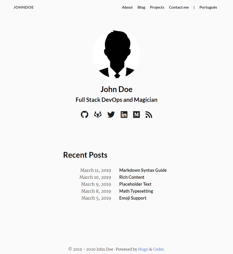
How exactly would I go about this? Can I achieve this without modifying the upstream hugo-template but just by adding my own layout?
I tried to give this a go but unfortunately I didn't manage to get any further than having the Recent Posts container show up to the right side of the avatar.
I'm an embedded developer so working with web technologies us usually a very slow & inefficient process for me. I'd appreciate any kind of pointers, tipps & help.
I assume in a perfect world one would add an option to the hugo-coder theme that allows turning this feature on & off.
 Tectu
Tectu
All 9 comments
Hi @Tectu,
I tried to do that, here is my result :
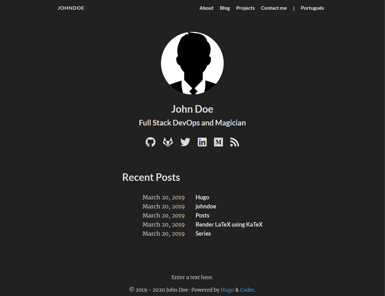
I've done that by adding these lines to /layouts/partials/home.html before </section>:
<div class="recent-posts">
    <h2>Recent Posts</h2>
    <ul>
    {{- range first .Site.Params.maxSeeAlsoItems .Site.Pages -}}
      <li>
        <span class="date">{{ .Date.Format (.Site.Params.dateFormat | default "January 2, 2006" ) }}</span>
        <a class="title" href="{{ .Params.ExternalLink | default .RelPermalink }}">{{ .Title }}</a>
      </li>
    {{- end -}}
    </ul>
  </div>
I used maxSeeAlsoItems because it was defined to 5 in the config but I think it's better to create a new parameter for this purpose.
Also change the first line from <section class="container centered"> to:
<section class="container centered column list">.
Finally, in the custom.css file or in a SCSS file add this:
.column {
   flex-direction: column;
}
 clement-pannetier
on 2 May 2020
clement-pannetier
on 2 May 2020
Thanks a lot, this is definitely a good starting point!
I noted that the list will not only contain posts but also other content pages such as tags. To change this behavior, I changed .Site.Pages to .Site.RegularPages in the range.
Does it make sense to finalize this and put it in a PR or is upstream (@luizdepra) not interested in this?
I think that simply adding a new setting for this which controls the number of posts shown there should be universal as this can simply be disabled if the max count variable is set to 0.
Tectu
on 3 May 2020
Out of interest, would it be possible to have the two sections appear next to each other, rather than one after another? I'm imagining two columns, with the original homepage content on the left and the recent posts on the right. I guess it would have to be responsive, too, so that recent posts would move below on smaller devices?
 charlieharrysmith
on 3 May 2020
charlieharrysmith
on 3 May 2020
Out of interest, would it be possible to have the two sections appear next to each other, rather than one after another? I'm imagining two columns, with the original homepage content on the left and the recent posts on the right. I guess it would have to be responsive, too, so that recent posts would move below on smaller devices?
Of course, copy the html code above.
Change the SCSS code (_content.scss) from:
.centered {
  display: flex;
  align-items: center;
  justify-content: center;
to:
.centered {
  display: flex;
  align-items: center;
  justify-content: center;
  @media only screen and (max-width : 768px) {
    flex-direction: column;
  }
To add a margin between the two columns, you can change the property justify-content: center to justify-content: space-between for example.
Also change the first line from <section class="container centered"> to <section class="container centered list">.
You don't need the column class so don't copy the css code.
clement-pannetier
on 4 May 2020
Does it make sense to finalize this and put it in a PR or is upstream (@luizdepra) not interested in this?
I prefer to keep the home page as it is. Of course nothing is blocking anyone to fork the theme and make their own modifications, as Clement did.
 luizdepra
on 4 May 2020
luizdepra
on 4 May 2020
.centered {
display: flex;
align-items: center;
justify-content: center;
@media only screen and (max-width : 768px) {
flex-direction: column;
}
Thanks for your advice @clement-pannetier! I've tried to implement what you kindly suggested above, though rather than listing recent posts I'm actually trying to include a little bio next to my avatar and information. So, I've also added an _index.md file at the root of my blog/context folder with some text in. Then, my added code in /layouts/partials/home.html looks like this:
  <div class="shortbio">
    <article>
        {{ .Content }}
    </article>
  </div>
With that in mind I've then tried to use the HTML and SCSS that was recommended. It's definitely close to working, as the two columns stack properly when I resize the window to be very narrow, but I'm getting this unusually squashed version of the old home content when viewed at fullsize:
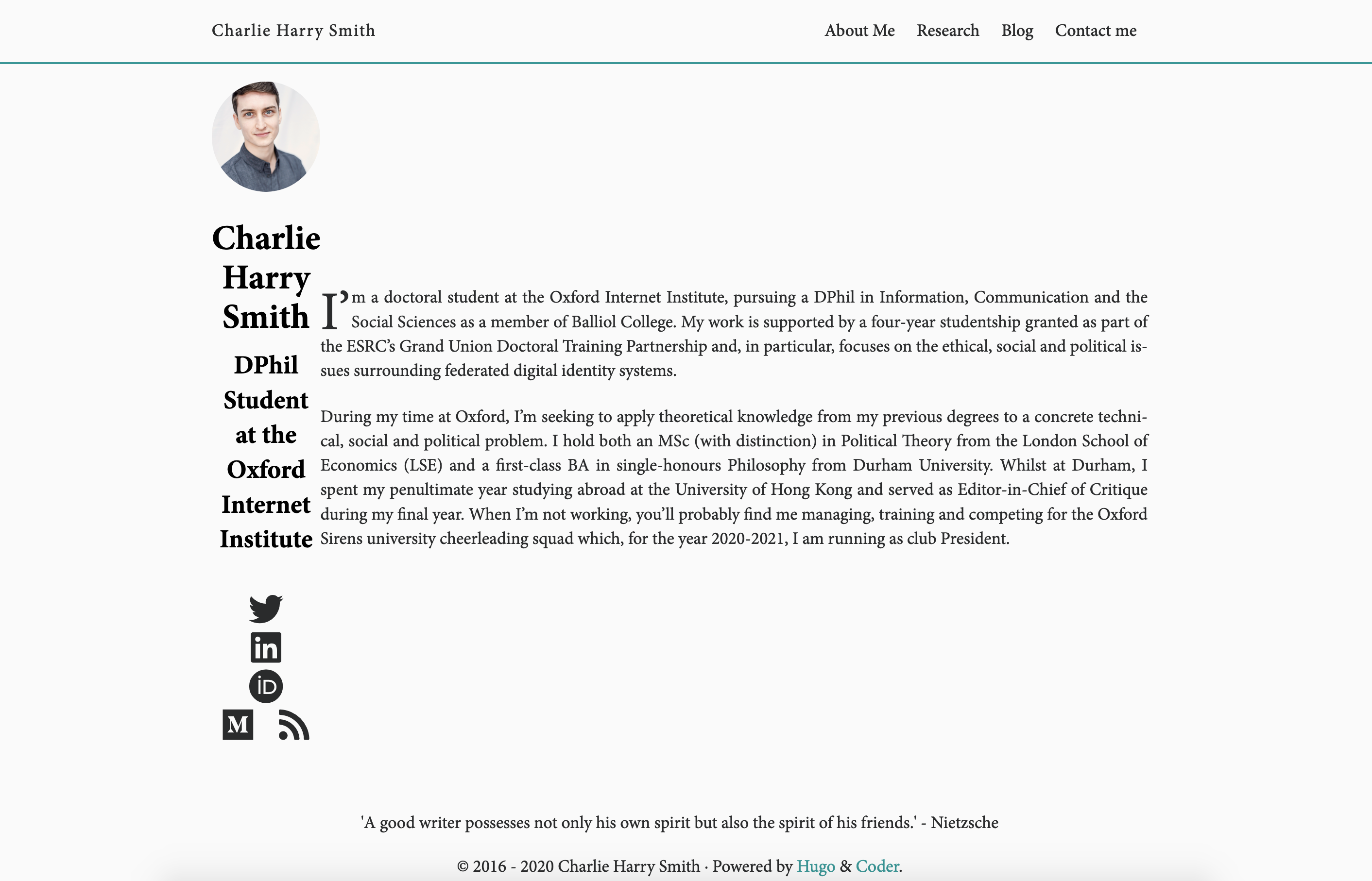
I'm sure I'm making some silly mistake, but can't figure it out myself. I had hoped I'd be able to adapt the code on my own so that I wouldn't have to trouble you! That said, any further help would be very much appreciated.
charlieharrysmith
on 5 May 2020
Hi @charlieharrysmith, use the flex property on the childrens (the two divs in the section).
For example, if you set flex: 1 to the first one and flex: 2 for the second, the <div class="shortbio"> will take up twice as much space as the <div class="about">.
clement-pannetier
on 5 May 2020
Hahaha
Working with flex is kinda tricky. I sometimes struggle to make things work as intended.
luizdepra
on 5 May 2020
Hi @charlieharrysmith, use the flex property on the childrens (the two divs in the section).
For example, if you set
flex: 1to the first one andflex: 2for the second, the<div class="shortbio">will take up twice as much space as the<div class="about">.
Thank you so much for your help. I've now gotten this working! I actually ended up simply adding some more of a margin to the about container as I couldn't figure out flex for the divs!
charlieharrysmith
on 6 May 2020
Related issues
luizdepra
·
6Comments
 vvug
·
4Comments
vvug
·
4Comments
 jemus42
·
3Comments
jemus42
·
3Comments
 systemallica
·
7Comments
systemallica
·
7Comments
 netrules
·
4Comments
netrules
·
4Comments
Most helpful comment
Hi @Tectu,
I tried to do that, here is my result :
I've done that by adding these lines to
/layouts/partials/home.htmlbefore</section>:I used
maxSeeAlsoItemsbecause it was defined to 5 in the config but I think it's better to create a new parameter for this purpose.Also change the first line from
<section class="container centered">to:<section class="container centered column list">.Finally, in the
custom.cssfile or in a SCSS file add this: