Hi Sir @StevenBlack good day! I am a graphic designer and i want to contribute to your good project by designing an icon-logo for it to be able to be more visible and gather interests from users. If you like and want to use the design I will be gladly sending you all the needed files as my gift for free to the project.
Thanks a lot and best regards!
-Tobaloidee :)
*removed my initial image proposal because of similar design with others.
 Tobaloidee
All 36 comments
Hello! Thank you for opening your first issue in this repo. It’s people like you who make these host files better!
![welcome[bot] picture](https://avatars0.githubusercontent.com/in/4141?v=4&s=40) welcome[bot]
on 16 May 2018
welcome[bot]
on 16 May 2018
Before anything else Sir..I will edit my proposal for i have seen similarities with other logo designs..I will update this asap
Tobaloidee
on 16 May 2018
Hi @Tobaloidee, this is great! I really like what you've done here. Nice! I look forward to the update!
 StevenBlack
on 16 May 2018
StevenBlack
on 16 May 2018
Surely Sir! I will show you here my updated design as soon as i get home..do you have any color in mind that you prefer Sir?
Tobaloidee
on 16 May 2018
@Tobaloidee please just call me Steve 😄
Color? You're the artist. You decide.
StevenBlack
on 16 May 2018
Hi Steve! :) here's the updated design.
white on orange


black on orange


blue


I prefer the white on orange but I think you can use it all in different implementations. :)
Tobaloidee
on 16 May 2018
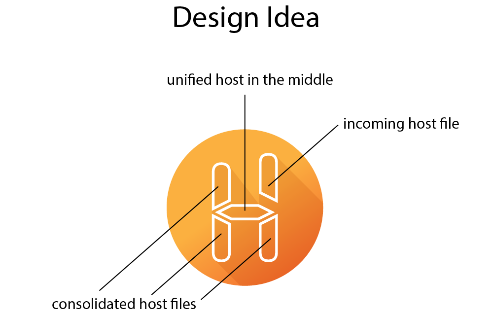
Overall it Shows the letter "h" "H" for the initial of the project which is Hosts
I hope you will consider using it! :100:
Tobaloidee
on 16 May 2018
Hey Steve, how is it going? :)
Tobaloidee
on 18 May 2018
I personally like the blue myself!
 kronflux
on 18 May 2018
kronflux
on 18 May 2018
Hi @Tobaloidee I apologize, been pretty busy.
Let's have a vote! See the next two messages 😄
StevenBlack
on 18 May 2018
Vote for this logo if you prefer it. Only hearts ❤️ will be counted.

StevenBlack
on 18 May 2018
Vote for this logo if you prefer it. Only hearts ❤️ will be counted.

StevenBlack
on 18 May 2018
Nissar @funilrys voted twice 💣 😄
StevenBlack
on 18 May 2018
I like both :smile_cat:
 funilrys
on 18 May 2018
funilrys
on 18 May 2018
Sir Steve, O.C.!
 ScriptTiger
on 19 May 2018
ScriptTiger
on 19 May 2018
Blue is leading! :)
Tobaloidee
on 20 May 2018
@Tobaloidee What do you think about this font instead...in bold?
 anudeepND
on 20 May 2018
anudeepND
on 20 May 2018
used the font suggested by Sir @anudeepND and made a new version of blue with black H


Tobaloidee
on 20 May 2018
but using this new font will take away the similarity with the main design of the 'H' in the logomark.
I based the design from the previous font that i used
Tobaloidee
on 20 May 2018
@Tobaloidee I agree with you, the previous one looks better
anudeepND
on 20 May 2018
but thank you for that font that you suggested Sir @anudeepND i downloaded it and it was nice.
i will use it in my future designs. :)
Tobaloidee
on 20 May 2018
I was actually thinking that previously - why not use the same font for both the logo and the text?
I'd even think somewhere along the lines of a digital clock font for both.
Something like/similar to this?
kronflux
on 20 May 2018
I think it will fit the logomark..I will edit it as soon as i get home Sir @kronflux
Tobaloidee
on 20 May 2018
here it is..


Tobaloidee
on 20 May 2018
@Tobaloidee I really like the first two! I'm wondering how you feel about making the logo match more closely so it's more appropriate!
I threw this together, obviously it's not perfect because I don't have the source material, but it gives the general idea :)

Edit: oops I forgot to raise the right side of the H. but still, general impression xD
kronflux
on 20 May 2018
had a little spare time so I fixed up my suggestion/example!

kronflux
on 21 May 2018
I declare BLUE the winner by a landslide!
I'll try to add this for the next update.
StevenBlack
on 21 May 2018
Can I make a PR Sir and place it in Readme file?
Tobaloidee
on 21 May 2018
@Tobaloidee in readme_template.md, yes please!
StevenBlack
on 21 May 2018
or ill create a folder in the repo and uplaod the needed SVG/PNG files also Sir?
Tobaloidee
on 21 May 2018
@Tobaloidee yes please.
Also, credit yourself in the readme_template for the logo 😄
StevenBlack
on 21 May 2018
Okay Sir Steve! I'll do it now
Tobaloidee
on 21 May 2018
done with the PR #626 thanks so much!! :)
Tobaloidee
on 21 May 2018
Looks good! :D
kronflux
on 22 May 2018
Thanks to you all!! Awesome group of people! :)
Tobaloidee
on 22 May 2018
This is live and online now. It looks great! Thanks everybody!
Closing!
StevenBlack
on 22 May 2018
Related issues
 The-Compiler
·
3Comments
The-Compiler
·
3Comments
 mueller-ma
·
3Comments
mueller-ma
·
3Comments
 AkiraJkr
·
3Comments
AkiraJkr
·
3Comments
 scafroglia93
·
3Comments
scafroglia93
·
3Comments
 mikhoul
·
3Comments
mikhoul
·
3Comments
Most helpful comment
Vote for this logo if you prefer it. Only hearts ❤️ will be counted.