Hexo-theme-next: Tabs tag overflow bug
Hi to all.
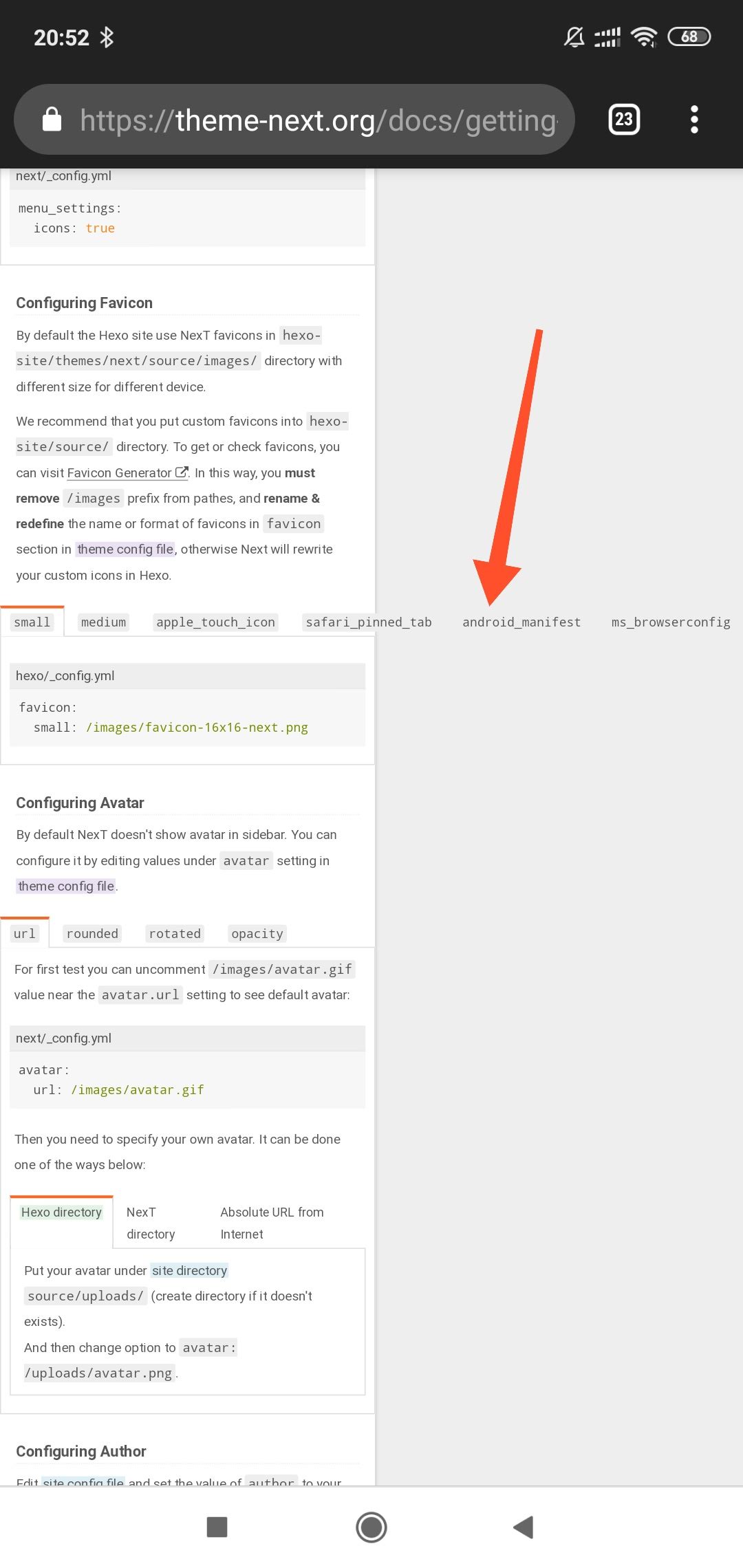
To reproduce the bug you need to open the page "Getting Started" on mobile device. Here is my screenshot:
 online
All 9 comments
Related to screen width? I'm not sure.
 1v9
on 16 Mar 2019
1v9
on 16 Mar 2019
Reproduced on my iPhone ...
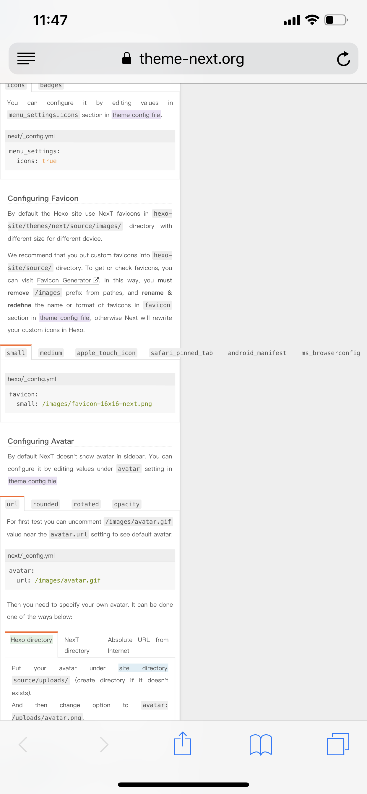
But it looks fine in Chrome's simulator... don't know why
 stevenjoezhang
on 16 Mar 2019
stevenjoezhang
on 16 Mar 2019
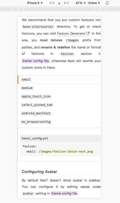
@stevenjoezhang reproduced in simulator responsive mode, drag screen...
1v9
on 16 Mar 2019
Ah... need to update this file: https://github.com/theme-next/hexo-theme-next/blob/master/source/css/_common/components/tags/tabs.styl
to make tabs more responsive
stevenjoezhang
on 16 Mar 2019
Flex:
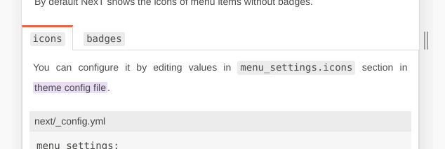
Block:
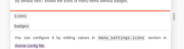
And other borders & marigns in this file...
But I think about that and it seems will be better somehow to determine tabs width & counts and if width of this values longer then viewport width → set tabs as block; if not → stay as is, in flex style.
 ivan-nginx
on 16 Mar 2019
ivan-nginx
on 16 Mar 2019
How about tabs like this:
Using float: left
stevenjoezhang
on 16 Mar 2019

Or vertical? 😹
Referenced:https://getbootstrap.com/docs/4.3/components/navs/#vertical
Example: https://www.dnocm.com/more/tools/
Code:https://raw.githubusercontent.com/JiangTJ/blog/master/source/more/tools/index.md
Just a joke. Ignore it. 😉
 jiangtj
on 16 Mar 2019
jiangtj
on 16 Mar 2019
How about tabs like this:
Usingfloat: left
Seems good too. Need just to fix this bug.
ivan-nginx
on 16 Mar 2019
See also https://github.com/next-theme/hexo-theme-next/commit/eb4388f8b432f7e13b7db035555a5c5f2e3c4744
stevenjoezhang
on 20 Aug 2020
Related issues
 MakiseVon
·
7Comments
MakiseVon
·
7Comments
 Linters
·
3Comments
Linters
·
3Comments
 yidasanqian
·
5Comments
yidasanqian
·
5Comments
 AnkiKong
·
6Comments
AnkiKong
·
6Comments
 dandyxu
·
5Comments
dandyxu
·
5Comments
Most helpful comment
How about tabs like this:

Using
float: left