Hack: U+017F / "Latin Small Letter Long S" is proportional
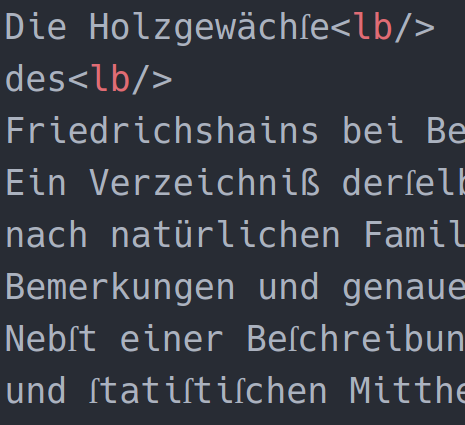
the glyphs for codepoint 0x0174 is too narrow. here's a sample with some occurances:
 funkyfuture
All 18 comments
Thank you very much for the report Frank! U+017F is (unfortunately) not in our release set. I think the problem is that you are seeing the rendering of whatever font is used as the default fallback for missing glyphs and that font has a different width.
We have been largely focused on our ASCII sets since these fonts are targeted towards the display of source code. Can you let us know what language you are attempting to support with the glyph (for an ignorant English speaker who sees multiple points above shapes and panics...) and how you are using the monospaced fonts (e.g. writing text, use in comments in source code, etc).
Appreciate the report.
 chrissimpkins
on 15 Aug 2017
chrissimpkins
on 15 Aug 2017
thanks for your quick and detailed response.
admittedly the Long s isn't of much use nowadays - see the linked article, i learned some new usages :-). in my case, i'm editing xml documents that represent the contents of historic prints. propably there isn't much else to do with it.
funkyfuture
on 15 Aug 2017
Let's see if someone comes along who takes an interest in drawing the glyph and PR'ing into the project. We would be happy to include it to support your work but unfortunately we have to draw the line on some things and this doesn't fall in our target glyph range for these fonts.
When we release the next version (v3.0) you will have a UFO source code base that you can open in any open source font editor to draw the glyph yourself along with a simple shell script build process to develop your own fork of Hack. If this is of any interest to you, keep an eye on the repository for the v3.0 release at which point this will be in place with detailed instructions for those who might want to do such work for their own personal use, to release as a new fork to others, or to contribute back to the Hack project.
chrissimpkins
on 15 Aug 2017
a'ight. thanks for the hints. sure, i'd be glad to contribute when i find the time.
funkyfuture
on 15 Aug 2017
mentioning #164 as it falls roughly in the same usage domain.
funkyfuture
on 15 Aug 2017
Thank you!
chrissimpkins
on 15 Aug 2017
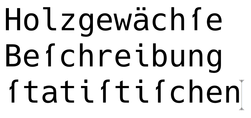
Here’s an approach, what do you think @funkyfuture?
 mynetx
on 30 Sep 2017
mynetx
on 30 Sep 2017
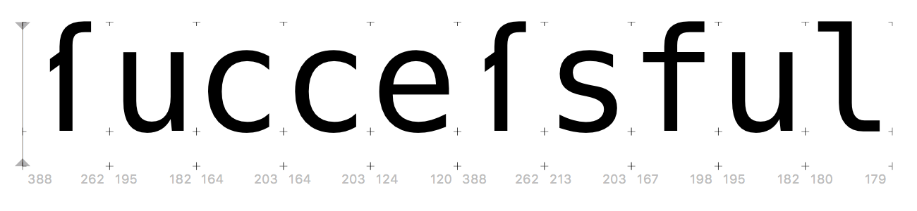
Comparison with f:
mynetx
on 30 Sep 2017
@funkyfuture What are your thoughts about having a descender on this glyph vs. not?
mynetx
on 30 Sep 2017
thanks for the initiative.
i think a straight horizontal mid-bar would better fit into the font. a (half?) descender would then help to discriminate from f.
have you tried a variant with a width like f? afaict, classical fonts had this feature, the proposal has a bit too much spacing imo.
funkyfuture
on 30 Sep 2017
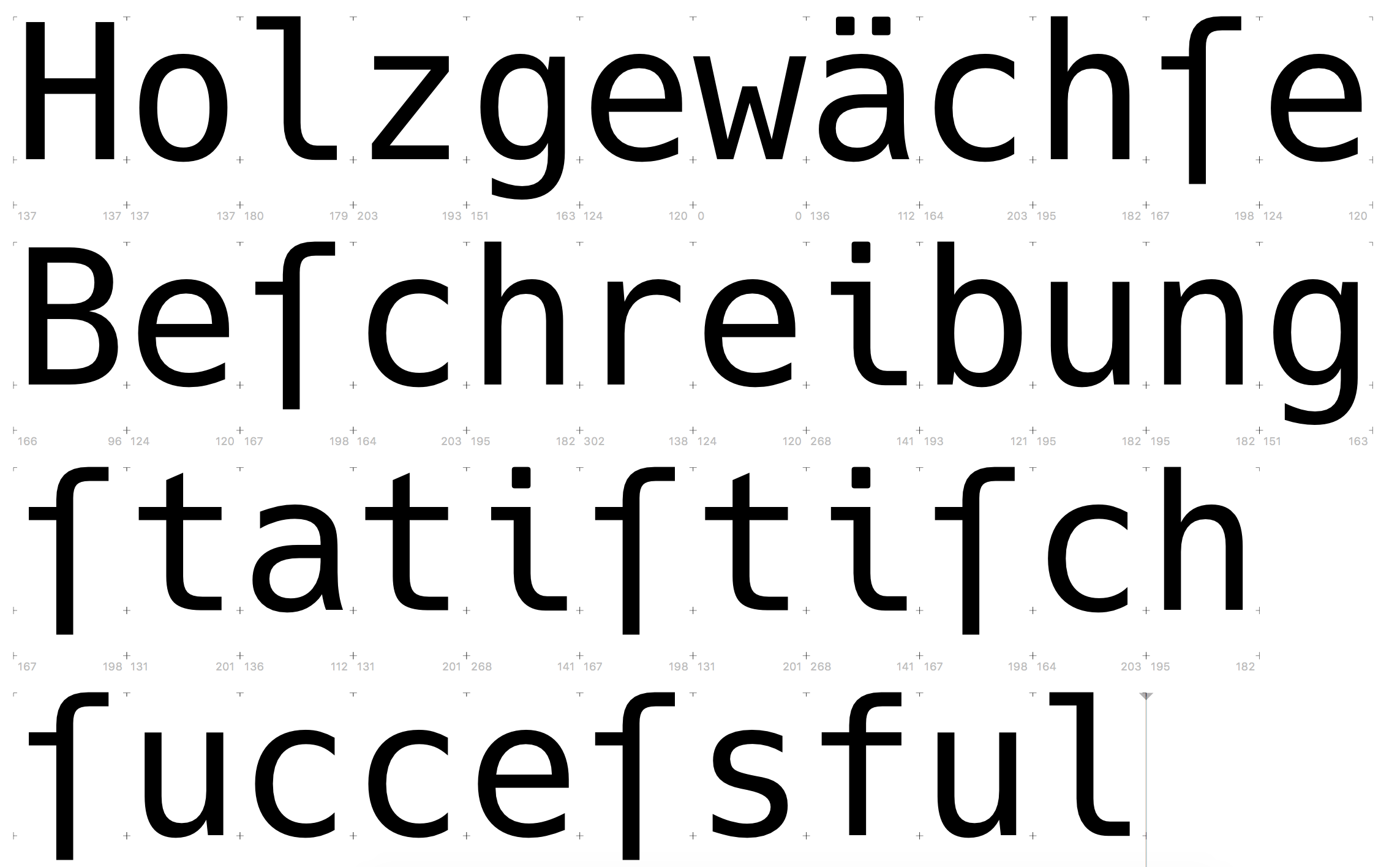
@funkyfuture Like this?
mynetx
on 30 Sep 2017
Or a bit more to the right to compensate for the whitespace due to the missing dash on the right?

mynetx
on 30 Sep 2017
yep, the latter variant fits better before a the c.
one could argue that usually the long s and f had the same height and the descender in the proposal isn't required to distinguish them. but well, the same height was one problem and the emphasis appeals to me. i don't know how the leverage between authenticity and pragmatism is defined for this project.
funkyfuture
on 30 Sep 2017
We are targeting source code here so you are defining it for this glyph :)
Given that this will never be used in source feel free to find the design approach for this glyph that works in the body of text where you use it. I think it would be helpful to build a development set of fonts and have you post images of a text sample so that we can see where we are with an iteration that you agree upon with @jublo’s design (or push a text sample somewhere so that he can build and share images as he works on it).
chrissimpkins
on 30 Sep 2017
@funkyfuture we are also creating an alternate glyph repo for stylistic alt glyphs and it will be possible to create and drop in other alts to build other glyph designs if of any interest. Can make multiple designs of this glyph.
chrissimpkins
on 30 Sep 2017
@funkyfuture These are the current designs, what do you think?
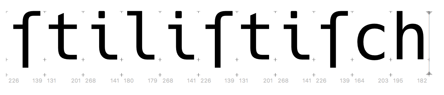

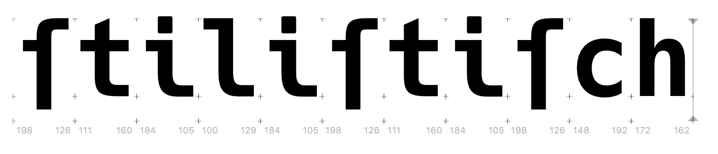
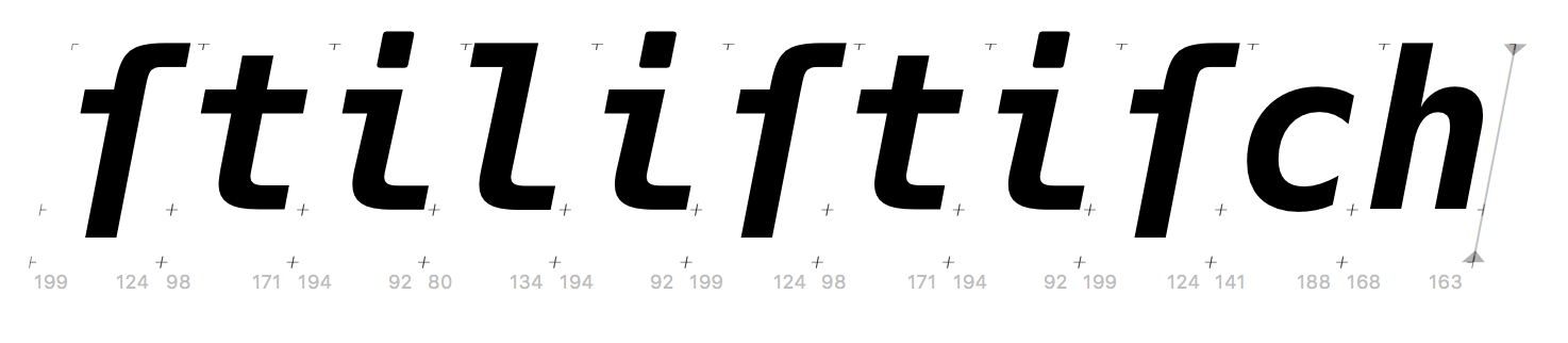
mynetx
on 3 Oct 2017
Complete and merged to dev branch. Slated to be part of v3.001 release.
Thanks @jublo and @funkyfuture
chrissimpkins
on 12 Nov 2017
thank you both for your efforts.
funkyfuture
on 12 Nov 2017
Related issues
 eggsyntax
·
7Comments
eggsyntax
·
7Comments
 hwooo
·
10Comments
hwooo
·
10Comments
 eoli3n
·
14Comments
eoli3n
·
14Comments
 luckydonald
·
8Comments
luckydonald
·
8Comments
 jdw1996
·
10Comments
jdw1996
·
10Comments
Most helpful comment
thank you both for your efforts.